The magic of chromolithography

An alternative approach to colour wood engraving was chromolithography, which became the main means of producing coloured advertising after the introduction of machine printing in the late 1860s. The design was drawn by a team of artists on a set of stones (later plates), each one devoted to a particular colour and parts of the image. These colours were then printed one after another so that they blended visually. The variety of lithographic markmaking and the far greater number of colours used (often 8 to 15 in advertising) meant that the end product could be richer and more subtle than a colour wood engraving. In this print the colours are shown separately in the margin.

Adams’s Furniture polish, [c. 1900], [1 p.], 202 x 326 mm. Ten-colour chromolithography with colour tablets
Adams’s Furniture polish, [c. 1900], [1 p.], 202 x 326 mm. Ten-colour chromolithography with colour tablets. JJ Advertising adds folder (1)
Adams's Furniture polish (detail)
Adams’s Furniture polish (detail)


As many as fifteen hues (ten in this case), printed from as many different stones, were routinely used by advertisers. This proof, still displaying its set of colour tablets, uses stippled dots to fuse the colours.

Like ‘ephemera’, the term ‘chromolithography’ is perhaps off-putting.  Both terms represent, however, items that are both familiar and immediately appealing.

Chromolithography is a magical process, resulting in (at best) beautiful images in colour, the richness of which results from the successive layers of colours and tones inherent in their printing.

Chromolithography was anything but simple: large, sometimes huge, slabs of stone had to be quarried (usually in Bavaria) and transported. The stones had to be prepared for printing. The desired image had to be divided into its component colours and tones for printing, each on a separate stone. All needed perfect registration. It is almost miraculous that it worked, never mind that it became commercially viable.  The (rare) surviving key-line drawings and ‘progressives’ are crucial to understanding the process. Although two colours are combined on each card, the Liebig series of collectable cards devoted to the creation of a twelve-colour chromolithograph shows something of its complexity.  We have this series, from 1906, in Italian.

iebig Chromolithography series (1)
Liebig Chromolithography series (1). JJ Food 10 (11a)
Liebig Chromolithography series (2)
Liebig Chromolithography series (2). JJ Food 10 (11b)
Liebig Chromolithography series (3)
Liebig Chromolithography series (3). JJ Food 10 (11c)
Liebig Chromolithography series (4)
Liebig Chromolithography series (4). JJ Food 10 (11d)
Liebig Chromolithography series (5)
Liebig Chromolithography series (5). JJ Food 10 (11e)
Liebig Chromolithography series (6)
Liebig Chromolithography series (6). JJ Food 10 (11f)

Around 1,881 series of Liebig cards were produced in several languages from 1872 to 1975, with some isolated later series in the 1990s and early 2000s.

It has been a privilege to benefit from the expertise of the world authority on lithography and chromolithography, Michael Twyman, who has identified the printing processes of all the exhibits in ‘The Art of Advertising’ including the number of colours in the (high proportion of) chromolithographs.  These analyses are available through the image captions in the online version of the exhibition and give an insight into typical practices of the time.


E. Ewen & Son: an exquisitely hand-coloured window bill

Colour printing did not immediately end hand colouring in advertising: both methods continued until print runs grew so large that hand colouring became impractical. In this example from the 1820s, all the colour has been added by hand.

E. Ewen & Son's hand-coloured window bill.
E. Ewen & Son’s hand-coloured window bill. JJColl: Window Bills and Advertisements folder 5 (1)
E. Ewen & Son's hand-coloured window bill (detail)
E. Ewen & Son’s hand-coloured window bill (detail)

Relief printed by [John Vandenburgh] Quick, with the letters of the word SOAP wood engraved, this 1820s hand-coloured window bill is one of my favourites in ‘The Art of Advertising’ exhibition. Destined to be displayed in E. Ewen & Son’s shop, it was a one-off, hence the elaborate hand colouring and superior printing.

With the exception of the letter S, which could represent the Ewen manufactory, the illustrations that make up the word SOAP bear little relation to the product. They are of a style often associated with alphabets. I have been unable to discover the significance of the Pink and Blue Saucer Manufactory, and would be delighted if historians of ceramics could shed any light on this.

I have also discovered nothing  in the subsequent work of John Vandenburgh Quick (fl. 1823-1853) approaching this calibre. It was an early work – perhaps a show piece, symbolising his aspirations before the reality of jobbing printing took over. Certainly, it is fitting for a shop patronised by royalty and nobility. We have several examples of his crime broadsides, songs, entertainment handbills and bellmen’s verses in the John Johnson Collection and 39 of his street ballads in the Bodleian’s collections. He produced a series of ‘candle-light amusements’ and is said to have printed peep-shows, dioramas, flap-books and pop-up books.  He did, however, print in interesting places including Hyde Park and 76 feet below high water-mark under the Thames in the Thames Tunnel.

Statue of Achilles inStatue of Achilles in Hyde Park, c. 1822 Hyde Park, c. 1822
Statue of Achilles in Hyde Park, c. 1822. ‘Printed on the spot’. JJColl: Printed on the Ice 2 (3)


The Thames Tunnel Paper, March 25, 1843
The Thames Tunnel Paper, March 25, 1843. JJColl: Printed on the Ice 2 (7)


Exquisite hand-colouring was usually reserved for high-quality prints or for costly items such as valentine cards. In advertising, early exponents of hand-colouring include lottery agents, who used a range of techniques to introduce colour into lottery bills. There are also hand-coloured inn tallies and trade cards, although these are rare. The two examples below are crude in comparison with the E. Ewen & Son’s window bill.  However, they exemplify the desire for colour that was to galavanise printers to experiment with printing in colour.

Lottery bill, hand-coloured
Lottery bill. JJColl: Lotteries vol. 13 (25)
Red Lion Inn. Hand-coloured inn tally.
Red Lion Inn. Hand-coloured inn tally. JJColl: Bill Headings 17 (69)


Advertising Saponine: an example of colour wood engraving

Colour printing began to be widely used in commercial printing from the second half of the 1830s. One approach was to use a set of wood-engraved blocks, each one dedicated to a particular colour. The engraver could produce a range of tones for each colour through lines and other marks engraved on the wood blocks. When printed one after the other the colours blended visually.

Saponine advertisement, 1865
Saponine advertisement, 1865. JJColl: Soap 12 (59)

This modestly sized magazine insert for Harper Twelvetrees’ soap substitute ‘Saponine’ is a fascinating document.  Not only does it include a rare image of a working laundry, but it is also interesting as an example of one of the experimental colour printing techniques that competed with chromolithography.


Saponine detail
Saponine (detail)


In this example, just four blocks – red, yellow, blue and black – create a range of colours, shades and tones.

Tomlinson's Butter Powder, c. 1867
Tomlinson’s Butter Powder, c. 1867. JJColl Food 3 (27)


Soon to be supplanted by the commercialisation of chromolithography, examples of colour wood engraving in advertising are not very common. There are, however, others in the John Johnson Collection, including this advertisement for  Tomlinson’s Butter Powder, from c. 1867.


Harper Twelvetrees was an interesting man. In 1863, as Chairman of the John Anderson Committee, he edited The life of John Anderson, a fugitive slave (published by William Tweedie, London). He was also a staunch advocate of the Temperance Movement. Saponine was produced in his factory in Bromley-le-Bow.

Label for Harper Twelvetrees' Soap Powder, showing his factory.
Label for Harper Twelvetrees’ Soap Powder, showing his factory. JJColl: Window Bills and Advertisements folder 5 (2a)

However, by 1878, he had given up soap making and had moved from Bromley-le-Bow, though not entirely from the East End. His works and East End showroom (the Paragon Show Room) were at Burdett Road, Bow Road (shown in the illustration). However, styling himself ‘Laundry Engineer and Machinist’, he also had a City showroom at Finsbury Circus.

1878 illustrated catalogue for Harper Rowntrees' washing machines, etc.
This 1878 catalogue for Harper Rowntrees’ washing machines, etc. is fully illustrated. JJColl: Ironmongery 2 (12)

His speciality was laundry equipment, such as washing machines, clothes wringers and mangles.  He also made knife cleaners and sold meat, suet and vegetable choppers, lawn mowers, fret-work scroll saws and treadles, lathes, and boot- and shoe-cleaning machines.

He offered free trials and hire purchase for his washing machinery.


An 1878 Harper Twelvetrees washing machine

An 1878 Harper Twelvetrees washing machine


But to return to laundries and the question of soap, the other laundry image in The Art of Advertising exhibition evokes some of the same problems: heat, steam and chapped hands. Harper Twelvetrees’ solution was a soap substitute (presumably, given the name, a saponin) while Lutticke’s appears to be a soap. Both resonate with us today, as we are encouraged to do cold water washes (albeit for different reasons). And Harper Twelvetrees got something else right too: one of our favourite labour-saving devices is surely the washing machine!

Lutticke window bill, c. 1884.
Lutticke window bill, c. 1884. JJ Coll: Window Bills and Advertisements folder 5 (12)

On board the S.S. Euripides. The long voyage from Australia. Guest post by John G. Sayers

Thanks to John Sayers for these insights into the long voyage from Sydney to England.

I can’t resist a group of photographic images related to my collecting passion of Ocean Liners. So, when I saw a combination of a dozen postcard and photograph images taken on board the SS Euripides of the Aberdeen Line as she sailed from Australia to England in 1921, I couldn’t resist. My wallet came out and money flowed to the happy dealer at the speed of light (well, they weren’t very expensive!)

S.S. Euripides. Event or Costume Party
Fig. 1. Event or Costume Party ‘Crossing the line?’ (on verso)
S.S. Euripides. Fancy dress. Crossing the Line
Fig. 2. ‘Crossing the Line?’ (on verso)

There are six photographs and six postcards, with no attribution to any photographer. Several have penciled captions which may not have been made by the original traveler. One gets that impression when a caption has a question mark after it. Figures 1 and 2 carry the caption of “Crossing the Line?” which makes me think that it may be a dealer’s guess rather than reality. Clever costumes, but were they instead for an onboard costume party, which was a normal feature of almost any voyage?

The pirate’s hat in the background to Figure 2, and the elaborate elephant outfit in Figure 1, suggest that it was an event planned by the ship’s crew and carried out by them as the ship ‘Crossed the Line’ i.e. crossed the Equator from the Southern to the Northern Hemisphere. This ceremony, featuring King Neptune, occurred as a matter of tradition and continues to this day. These costumes could have been used many times by the ship, for many ceremonies.

One of the stops on the route to England would have been in Durban, South Africa and this is probably where the photo in Figure #3 was taken. Photos 4, 5, and 6 were all taken ‘at sea’, including the jaunty First Engineer in #6.

Rickshaw ride
Fig. 3. Rickshaw ride


S.S. Euripides. At sea en route to England
Fig. 4. At sea en route to England


S.S. Euripides. At the wheel en route to England
Fig. 5. At the wheel en route to England


S.S. Euripides. First Eng[ineer]
Fig. 6. First Eng[ineer?]


S.S. Euripides. Departure Festivities
Fig. 7. Departure Festivities (1)


Figures 7 and 8, postcards picturing the departure, are wonderful at capturing the emotions of the moment. You can almost watch the streamers float to the dock and hear the good wishes shouted by those on shore to those standing on the deck of the S.S. Euripides. This was an important event, considering the distance to be covered and the long time to be spent and the risks faced at sea.

S.S. Euripides. Departure Festivities (2)
Fig. 8. Departure Festivities (2)


S.S. Euripides: Crew: Dining Room Stewards?
Fig. 9. Crew: Dining Room Stewards?

The men pictured in postcards 9 and 10 are crew, but why would one want photos of groups of the crew? One’s Room Steward perhaps, and one’s Dining Room Steward(s), but why the entire lot of them?


S.S. Euripides: Crew: Cabin Stewards
Fig. 10. Crew: Cabin Stewards

Of course, Sydney to England by sea, with stops at several ports en route, would be a long voyage and a gregarious young man such as the one in Figure 12 would get to know many people. Note that there were no women in the crew. Men only at this stage of passenger shipping.

S.S. Euripides: Dinner event
Fig. 11. Dinner event

One of the bridges to get to know fellow passengers was mealtime and the grouping around the table in Figure 11 gives us a feeling for the moments when the ice was broken. Welcome Dinners, Gala Dinners, and other dining platforms all helped to pass the time. And of course, the Farewell Dinner, when table mates signed each other’s menus and vowed to keep in touch, brought down the curtain on the voyage.

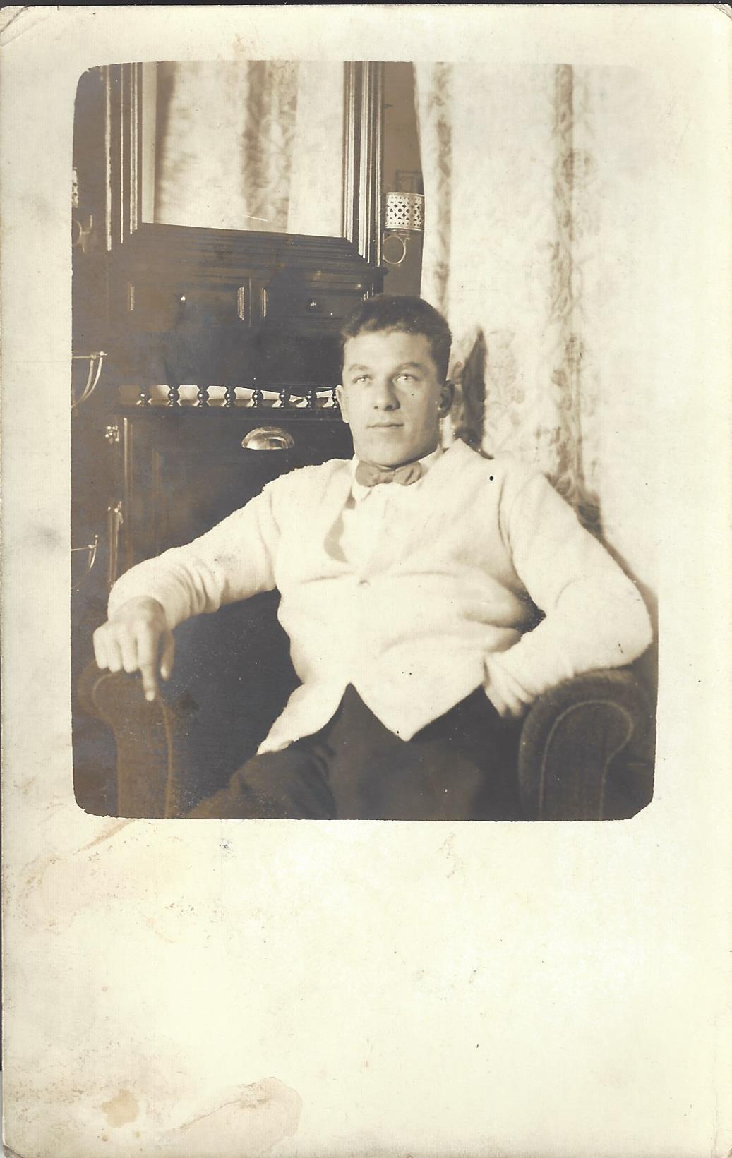
Unfortunately, we do not know the name of the gentleman who made this voyage, but we do have a probable photograph of him on the postcard in Figure 12.

S.S. Euripides: The intrepid traveller
Fig. 12. The intrepid traveller

At the time of this note, the voyage was 96 years ago. The dashing young man, now no longer with us, who had perhaps already made his fortune in Australia, was heading to England to purchase an enormous country estate – or a Town House in London – or to claim an inheritance – or??? We do not know, and we will never know, but at least we have been able to enjoy part of his journey to England, almost one hundred years later!


Lithographic printing: new possibilities

Lithography, was invented in the final years of the 18th century. The process is a chemical one which relies on the principle that water and grease do not mix, rather than difference of relief (as in woodcut, wood engraving and copper engraving). First a design is made on stone (later a metal plate) in greasy ink or crayon or, alternatively, on specially prepared paper for transferring to such a surface. It is then subjected to a chemical process, which reinforces the difference between printing and non-printing areas. The process is extremely versatile, and allows for impressions from type to be transferred to the printing surface. Taking a print involves two procedures: dampening the stone or plate and then rolling up its surface with greasy printing ink. The greasy ink is attracted by the greasy marks and repelled by the damped surface.

In Britain, lithography began to be taken up as an alternative to both
intaglio engraving and wood engraving from the 1820s, especially for
relatively short-run printing.  It was ideal for circulars, giving the appearance of handwritten text, and especially for seamlessly combining images and text, tables and diagrams. Even before the mechanisation of lithographic printing, it was quicker and cheaper than the alternative process for combining text and image in one print: copper-engraving.

This two-sided Jennings advertisement for ‘patent capsules or covers for family jars’ cleverly shows all available sizes in a series of concentric circles on the verso, while the recto combines a table of sizes and prices with illustrations and elegantly curved text.

Jennings patent capsules.
Jennings patent capsules. JJColl: Housing and Houses 9

This mid 19th century two-sided trade advertisement for John Porter’s Grove Iron Works, Southwark shows that lithography was ideal for drawing the delicate straight and curved lines of ironwork. Some firms advertising their products at the Great Exhibition of 1851 used the process in similar ways.

John Porter, ironworks (verso)
John Porter, ironworks (recto)
John Porter, ironworks (recto) JJColl: Window Bills and Advertisements folder 4 (56)

However, the application of monochrome lithography in advertising was not widespread. It was the commercialisation of lithographic printing in colour (chromolithography), aided by the widespread use of powered machines, that was to take the advertising world by storm.


“My Queen” Vel-Vel

“My Queen” Vel-Vel, Felstead & Hunt, London and Manchester, [1887], [1 p.], 258 x 194 mm. Letterpress with wood engraving on coloured paper. J
“My Queen” Vel-Vel, Felstead & Hunt, London and Manchester, [1887], [1 p.], 258 x 194 mm. Letterpress with wood engraving on coloured paper. JJColl: Women’s Clothes and Millinery 3 (7).
Wood engraving, developed in the late 18th century, allowed highly skilled engravers to simulate a range of tones by means of very much finer lines than could be produced by woodcutting. Their technique involved working on slices of wood cut across the grain using a variety of steel tools, such as the graver or burin. As in woodcutting, it is the parts of the block that are not cut away that print. Blocks could withstand long print runs and were frequently printed along with type. Such blocks could be cloned mechanically, making it possible to speed up production.

"My Queen" Vel-Vel detail
“My Queen” Vel-Vel detail

Wood engraving was the mainstay of journal illustration throughout the 19th century. By the 1880s, journal advertising took a multiplicity of forms, from brief (letterpress) newspaper-style inserts to full-page illustrated advertisements such as this. Many such images were ‘borrowed’ from chromolithographed posters and handbills. Engravers re-interpreted both images and text as best they could to preserve the strong branding associated with images. There is no reason to suppose that this is the case here, but this advertisement does reflect a sea-change: the image was dominant, the text subservient. Although this example maintains the verbosity associated with earlier advertising (replacing testimonials with quotations from fashion journals), the letterpress text is imaginatively disposed around the contours of the wood-engraved image.

In the late 19th century, Queen Victoria’s image appeared in many advertisements and countless souvenirs. The 1887 jubilee was a chance to capitalise on her increasing popularity  and perhaps to see the monarch in a new light. In Consuming Angels, Lori Loeb writes: ‘in advertisements her unique political role is rarely highlighted: instead, advertisers promote the leveling theme of her feminine nature’ (p. 85).

Whereas most advertisements state or imply that the Queen is a consumer of the advertised product, this image is unusual in showing the monarch as a potential shopper. There is good reason for that. Despite the brand name “My Queen” Vel-Vel, it is highly unlikely that the monarch would wear substitute velvet, no matter what its stated advantages over the real thing. Her approval is implied, although she is looking elsewhere, unsmiling. She is surrounded by the trappings of monarchy, from the subservience of her attendants to the comfortable décor. These associations are transferred to the product and increase its desirability.

To me, one of the most interesting aspects of advertising is the subtext. In claiming to have overcome deficiencies in products hitherto, advertisements reveal problems that (supposedly) blighted the lives of previous generations. Here, it is the problems of true ‘silk Lyons velvet’ and previous velveteens that are evoked. They were too heavy, prone to spotting and difficult to dry as they should not be exposed to direct heat. The ‘Lee finish’ of “My Queen” Vel-Vel solves these problems and is light enough for evening wear all year round and for fancy dress and theatrical costumes.

The John Johnson Collection is a treasure trove for historians of dress and textiles. Both our ProQuest and Zegami projects enable text searching of advertisements and trade cards respectively. For those who might like to explore velveteen, for example, there are 139 results in the ProQuest database, revealing manufacturers, rivals (such as ‘Louis’ velveteen), retailers, prices, etc.  More unexpectedly perhaps, crime broadsides include descriptions of criminals wearing velveteen and crimes of theft, including an intriguing reference to Thomas Gales (aged 30), sentenced in 1828 in Durham to 8 months’ hard labour for stealing a velveteen jacket.

The ProQuest project is free to all in the UK: http://johnjohnson.chadwyck.co.uk/geoLocSubscription.do

Crime Broadside (detail), Durham, 1828.
JJColl: Broadsides: Murder and Executions folder 2 (10) http://gateway.proquest.com/openurl?url_ver=Z39.88-2004&res_dat=xri:jjohnson:&rft_dat=xri:jjohnson:image:20090318150211kg:1

Or you could search for velvet and velveteen in our Trade Cards project: Zegami

Edward Webbe trade card
Edward Webbe trade card. JJ Coll: Trade Cards 22 (15a)
Trade card for T. Wells
Trade card for T. Wells. JJColl: Trade Cards 21 (101)