
Photomechanical Printing in Colour
![Sparling Cut male catalogue [c. 1926]](http://blogs.bodleian.ox.ac.uk/jjcoll/wp-content/uploads/sites/176/2020/04/Sparling-cut.png)

In the 1890s, after decades of experimentation, colour and photography came together in the form of photomechanical printing in colour. The constituent hues of the original to be reproduced were separated by means of colour filters (red for cyan, green for magenta, and blue for yellow). A combination of three colours could produce an acceptable colour image. Black was sometimes added to produce what would be called CMYK today, but printing in three colours remained the norm for the first few decades of the 20th century. Such methods of colour printing were applied to lithography a little later than to relief printing.
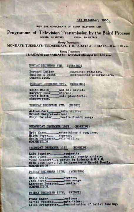
The Sparling Cut Male
The rise of online shopping has changed the way we browse brands and products completely. Wholesale catalogues are increasingly rare, with the whole thing replaced at any rate by an online search. That’s not so much a bad thing — online catalogues are great in many ways. But I can’t shake that nostalgia for the real thing, and I remember fondly the excited flick-through of an Argos catalogue in the run-up to Christmas, and all those glossy, enticing pictures in that ‘laminated book of dreams’, to steal a phrase from Bill Bailey. Argos stopped producing physical catalogues around 2018. But it was all very fun.
Recapturing transient cultural moments like these is at the heart of The Art of Advertising, which explores the production and dissemination of advertisements from the eighteenth to the twentieth centuries. Catalogues are valuable compendia of advertisements in their own right (the oldest date to 15th century Europe) and yet their survival rates are slim: generally speaking, ephemera repositories considered catalogues to be books; libraries saw them as ephemera.[1] Adding to this, mail-order catalogues and advertisements were profuse: ‘junk mail’ of this kind is rarely treasured. Not infrequently, the quality of mail-order items themselves was brought into question, even with the zenith of the department store and the upsurge of ‘reach-me-down’ clothing in the early twentieth century. Accordingly, the catalogue’s status as ‘literature’ has been questionable at best, despite evidence of essentially literary endeavours from at least 1863.[2] To add to this ongoing discussion – and to argue the case for a literary revaluation – I am going to focus on one particular example from the exhibition: The Sparling Cut Male menswear catalogue.

The front cover of The Sparling Cut Male is displayed in the first case of The Art of Advertising, representing contemporary developments in photomechanical printing in colour and the advent of the colour-printed catalogue that is so familiar to us today. A full-colour printed catalogue was uncommon in 1926: it was more normal to have art paper covers printed in colour and the rest of the catalogue in black and white on inferior paper.[3] Sparling Cut was by no means the first company to take advantage of the printed catalogue, and certainly made no revolutionary impact on catalogues and consumer culture at large. In fact, it’s hard to find out anything about Sparling Cut: all evidence suggests a small-to-medium-sized business operating out of two premises in the City, arriving on the scene sometime following the First World War[4] and continuing to occupy advertising space until at least the Second World War[5], before winding up in 1974[6]. The Bodleian holds only two issues: Vol 1. No. 5 and No. 6, which features in The Art of Advertising. No. 5 has colour wrappers, but is printed in black-and-white, making No. 6 even more unusual. As an exemplar of the technical possibilities of the three-colour process, this Sparling Cut catalogue provides a window into the fashion culture of the early twentieth century – a period of rapid sartorial change and development – and these publications are unique, even by modern standards, for their stylish design, comic vision and emphatic textuality.

With this gorgeous front cover for No. 6, Sparling Cut sells before anything else the feeling of wearing a Sparling suit. There’s a touch of Bright Young Things tempered with a pecuniary pun on ‘figures’. And note that twee attribution: ‘Edited by Old Man Sparling in his Sanctum’. Where many catalogues of the period offer little more than descriptive lists dressed up in sales jargon, The Sparling Cut Male distinguishes itself with lengthy interpolations of prose and poetry. Upon opening each issue, the reader meets with a reflective address from the ‘Old Man’ on his literary labour of love. Just look at the foliate capital that crowns the first sentence of this issue:

It’s helpful here to adopt Clare Rose’s conception of the ‘frustrated author’ to describe Old Man Sparling (if indeed he is a real person, and not the creation of a penny copywriter).[7] In the introduction to No. 6, Old Man Sparling has ‘[laid] down the shears in favour of the pen’ and welcomes ‘this editing business’ from his ‘Editor’s chair’. He directs us to ‘my special article on page 4’. Every employee has been ‘schooled in a unique method peculiar to my business’; if anything seems a bit complicated, simply consult ‘your friend’ Sparling. From these first pages alone, Sparling catalogues are evidently a playfully erudite affair.[8]
Its literary contributions are a mix of poems, letters of thanks, musings on fashion, jingles, and satirical fiction. The best of these is a ‘Day in the Life of a Sparling Cut Male’, attributed to an ‘ardent supporter’ of the ‘Sparling Cut cult’. In this page-long story, a young man recounts the life-changing power of a Sparling suit: he arrives at work to be immediately summoned by his boss, who offers ‘my salary doubled’, ‘a seat on the board’, and ‘his youngest and prettiest daughter with an income of £10,000 per year’ — all thanks to Sparling Cut! In a similarly ironic fashion, the front cover for Vol. 5 shows a dapper young man (we assume wearing Sparling) utterly failing to win the attention of a woman. In the article ‘—Then I Woke Up’, Old Man Sparling receives a knighthood for ‘making England the best-dressed country in the world’ but (you can guess from the title where this is going) it is revealed to be a dream. In any view, self-deprecation is an audacious marketing strategy. Somehow, Sparling Cut makes it work. This dry, urbane humour is reminiscent of the Fortnum and Mason catalogues praised by George Bernard Shaw.

Complementing the text are vibrant, full-page colour images. Old Man Sparling explains:
The illustrations in this edition of the “Sparling Cut Male” are from living models wearing “Sparling Cut” clothes, and are the work of that brilliant artist, Mr. Wilton Williams, and to whom we are much indebted for his faithful reproductions.
Wilton Williams (fl. 1915-1930), perhaps best known for his ‘Blackpool’ poster for Great Central Railway, brings here the same vibrant energy to the fore. Thinking about modern catalogues again (I think particularly of the Argos catalogue), part of the magic of those catalogues is not only the visible representation of objects, right there in all their glossy glory, but a kind of emotive mimesis: staged actors bounced with delight on that trampoline you wanted, played the latest games console, built that Lego set you were dying for. Likewise, when you flick through a volume of Sparling Cut you are struck by the sheer activity of its models, who are visibly social, energetic, and (perhaps most importantly) enjoying demonstrable degrees of personal and societal success. Sparling Cut men (and women, too) look like they’re having fun, both at work and at home.

The John Johnson Collection has many menswear catalogues to choose from. By considering how Sparling Cut advertises its products compared to its contemporaries, we learn a lot about changes in fashion in the early twentieth century. As the stuffy formality of Edwardian dress fell out of favour, and a freer sense of style developed alongside relaxed delineations of dress, white-collar men of older dispositions responded with what Maria Constantino calls ‘a mechanised and industrial order’: strictly practical, multi-purpose business suits, in a limited range of dark, muted colours. (One thinks of T. S. Eliot’s crowd over London Bridge in The Waste Land.) For reference, here is a second menswear catalogue from this period, for Clement H. Sunderland, which in contrast to The Sparling Cut Male is practically funereal:

The hallmarks of a more conservative style are evident here, right up to the neoclassical backdrops: double-breasted jackets, a restricted range of trouser pairings, and spats. However, the ‘speeding up of life’ — strongly associated with the rise of the department store, ‘reach-me-down’ mass produced clothing and, for men, a slim, ‘youthful’ body shape — meant that savvy retailers responded with an emphasis on style and colour, sparking ‘the struggle between youth and age’.[9] Single breasted suits with two or three buttons (slightly in at the waist) became fashionable, in a range of colours and patterns. The Sparling Cut Male locates itself firmly on-trend against ‘the Dullness of Yesterday’:

‘Mass-produced’ did not need to mean ‘ill-fitting’, and many outlets provided tailoring services as standard. And just as well: ‘a perfect fitting around the hips’ repeats the assertion that a 1920s suit is not only for working – it is also for dancing.
To finish up, here are two phrases from The Sparling Cut Male. The first is “it’s colour we want in the hum-drum of everyday life.” The second is “express your personality” — a provocatively modern slogan, printed on the back pages. There’s no doubting that Sparling Cut offered a wide range of patterns, colours and style for the fashion-conscious male. However, it’s important not to overstate Sparling’s apparent uniqueness. To understand its place in men’s fashion in the early twentieth century (and also in the history of catalogues) it is useful to think about The Sparling Cut Male in terms of what it is not. Despite the dapper outlook, Sparling Cut never strays into the territory of the dandy or the aesthete. Its branding and artwork are definitively not art-deco or modernist, and its male models preserve middle-class decorum and to all extents and purposes ‘fit in’. In this sense, Sparling Cut toes the fine line between the practicable reality of the suit and the freedom of personal style, without veering wildly in either direction. It emerges as a dual compromise — on the one hand, between the price- and fashion-conscious individual; on the other, between the two aesthetic extremes of the avant-garde and conservativism.
Footnotes:
[1] See Clare Rose, Making, Selling and Wearing Boys’ Clothes in Late-Victorian England (Ashgate, 2010), pp. 90-2.
[2] See the pamphlet On Modern Costume, ‘honestly and avowedly published’ by E. Moses and Son, Ready-made and Bespoke Tailors, London and Bradford, 1863. John Johnson Collection Men’s Clothes 2 (8), online here: http://gateway.proquest.com/openurl?url_ver=Z39.88-2004&res_dat=xri:jjohnson:&rft_dat=xri:jjohnson:rec:20071127120131dt.
[3] With thanks to Julie-Anne Lambert for this information.
[4] Surviving records are slight, and runs of The Sparling Cut Male are undated. Vol. 1, No. 5 can be dated confidently to 1926 from a reference on its introductory pages. This places No. 6 (the exhibition copy) within a year at most, given the pace of fashion. Vol 1. No 14 was sold at an online auction at an unknown date. https://www.worthpoint.com/worthopedia/original-vintage-1920-1930s-mens-218962059. It is worth noting that No. 14 reprints the same illustrations used in Nos. 5 and 6.
[5] A full-page advertisement in Air Force List for May 1940 (https://digital.nls.uk/british-military-lists/archive/96058150?mode=transcription) still utilises the slogan ‘Out-of-the-Rut’, juxtaposed with merry-looking Navy men, perhaps as morale-boosting propaganda in the face of World War II.
[6] https://www.thegazette.co.uk/London/issue/46395/page/10795/data.pdf. This is not to say that Sparling was still in production in 1974.
[7] See John Johnson Collection guest article by Clare Rose, ‘Elias Moses and Son, Minion of the Million 1849’: http://johnjohnson.chadwyck.co.uk/search/displayEssayByID.do?ItemID=66666666666666cr
[8] For an overview of menswear catalogues juxtaposing advertisements with prose, see Clare Rose, Boys’ Clothes, pp. 90-1.
[9] This is an oversimplification of a complicated several decades (see Constantino, Men’s Fashion in the Twentieth Century, particularly page 25 for references to body shape).


