
This population map of the Saxony region of Germany is a recent addition to the map collection. Volksdichte-Schichtenkarte des Königreiches Sachsen nach der Zählung vom 1. Dezember 1900 (Population density layers map of the Kingdom of Saxony after the census of December 1, 1900) shows density of population by colour with two insets for the areas around Dresden and Leipzig from an earlier 1846 census.

Volksdichte-Schichtenkarte des Königreiches Sachsen nach der Zählung vom 1. Dezember 1900, C22:25 (74)
Population maps such as this are, in the field of cartography, a relatively recent product, with the first known examples being published in the early 1800s. Early maps would give tables showing population figures, this example from 1822 has one that is Christian only and colours parts of the World depending on the ‘Degrees of Civilization’.
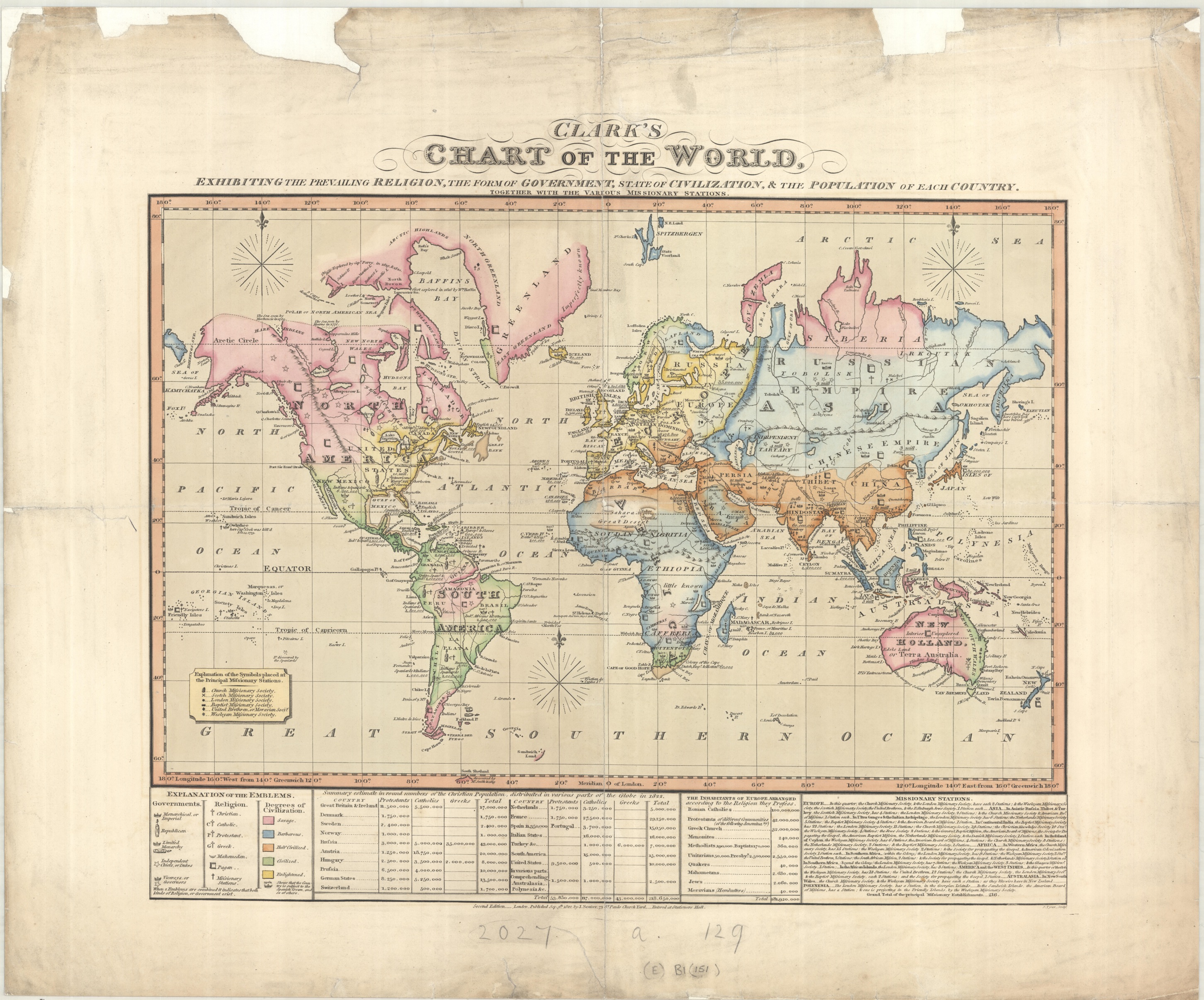
Clark’s Chart of the World, 2nd ed, 1822. (E) B1 (151)
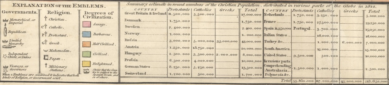
inset of Clark’s Map showing population table and legend
But at the same time different ways to portray population figures were being introduced. This map, from 1849, shows the population of Britain based on figures from the 1841 census by using dots to show sizes of cities, towns and villages as well as shading to show general population density.
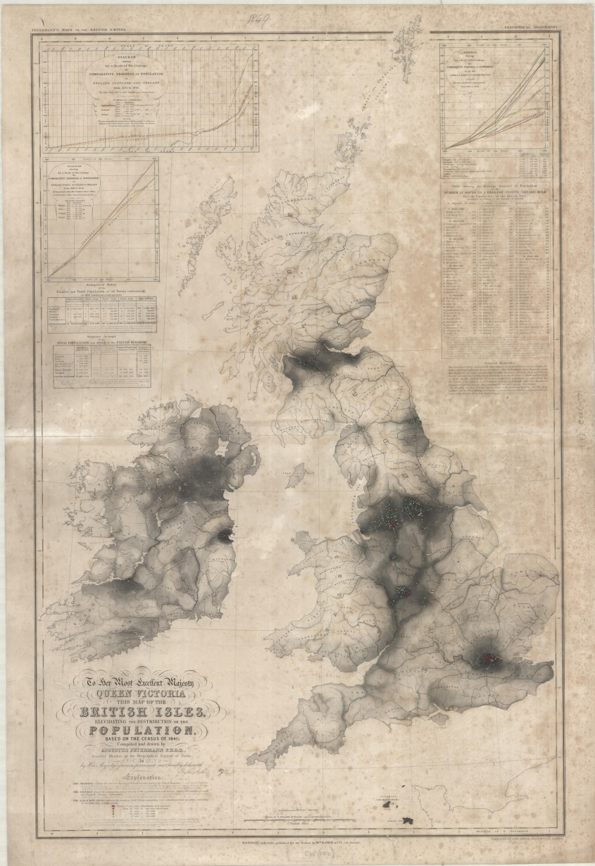
British Isles elucidating the distibution of the population…1849, (E) C15 (157)
Our original map of Saxony uses a technique called isopleth to show the density of population. Isopleth uses lines to show areas of equal value, the lines are similar to contours on a physical map and work on the same principle. The main advantage is that you can see at a glance the heavily populated areas by the colour ranges shown on the graph. That Saxony was, in 1900, a mainly rural area can be seen be the amount of green and brown cover shown.
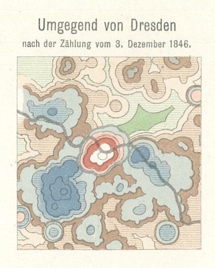
Inset from Volksdichte-Schichtenkarte des Königreiches Sachsen showing Dresden according to 1846 census