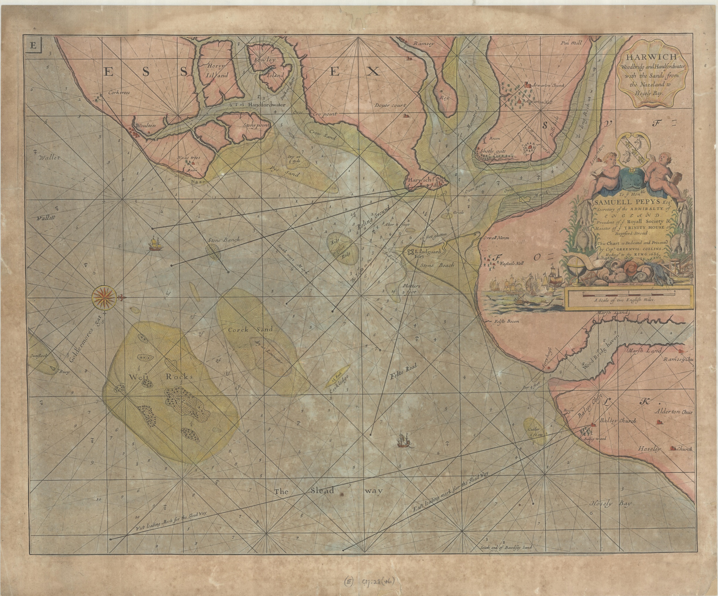
 This map, dated 1686, is the work of Capt. Greenville Collins, Hydrographer to Charles II. Between 1681 and 1688 Collins surveyed the coast of Britain, eventually bringing out an atlas based on this work, Great Britain’s Coasting Pilot; being a new and exact survey of the sea coasts of England, Scotland, and the chief harbours of Ireland… in 1693. This work, which was the first proper survey of the whole coastline, proved to be sufficiently accurate to be still used over a hundred years later. While some were critical of Collins’s maps considering the limitations imposed on survey work of the time they are remarkably accurate, as can be seen in comparison with a later Admiralty Chart of the area published in 1876 (Collins’s map is aligned with west at the top). The tools available to Collins were measuring chains, compasses and lead lines for measuring depths, all of which should ideally be used on a flat and stable surface, things hard to come by on board ship. Navigators on ship would use the lines radiating out from the compass rose (the arrow on a compass rose indicates north) and other points as well as the leading mark lines, which are aligned with prominent landmarks, to find safe passage around a coastal region with numerous hazards; sand-banks, rocks and narrow channels are an obvious example on the map. The numbers are soundings, showing the depth of water at given points.

Extract from England – East Coast, Harwich approaches, Published at the Admiralty 3rd June 1876. Sheet 2025.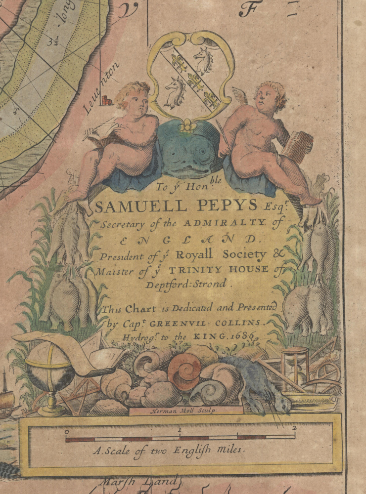
Admiralty charts such as the example here were first published in the early 1800s and continue to be published to this day. They make up the greatest part of the yearly intake of maps into the Bodleian.
The map, as well as being an important example of an early Naval chart, is also of interest due to the dedication in the cartouche. The map is dedicated to Samuel Pepys, who was made Secretary to the Admiralty in 1673, four years after deciding to end his diary writing after concerns about his eyesight.
The cartouche is richly decorated in the style of the time, with fish, shells and a lobster to highlight the nautical theme of the map while the two figures above the dedication by Collins to Pepys are putti. Often winged these chubby children represent here the surveying work that went into the creating of the map, evidence of which is shown amongst the fish and shells.
Harwich, Woodbridg and Handfordwater with the sands from the Nazeland to Hoseley Bay…1686. (E) C17:28 (46)