
On the 26th April 1986 technicians at the Chernobyl Power Plant in the Ukrainian SSR turned off the power to the number 4 reactor, hoping to test back-up generators used to keep the cooling waters circulating in case of a power outage. During the test the power-levels dropped to unexpected and dangerous levels. Following instructions that didn’t allow for such a possibility meant that the test proceeded, leading to a chain reaction releasing a huge amount of energy which immediately vaporized the cooling water, caused a devastating steam explosion and then the escape of a large radiation cloud. Wind conditions and proximity to the site meant that most of this radiation fell on the Byelorussian SSR.
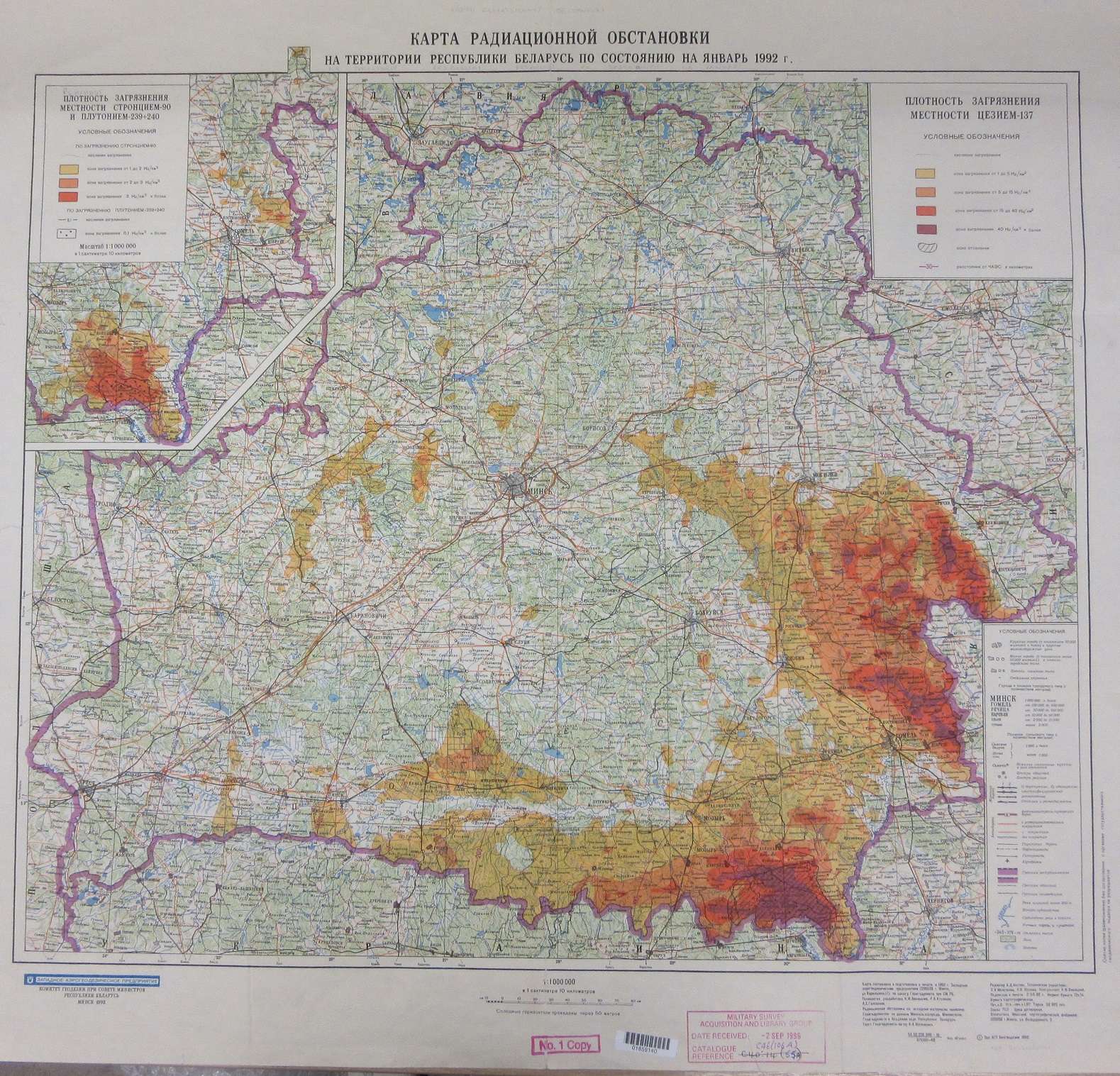
This map, made post-independence in 1992, shows the density of pollution caused by Caesium-137 at different levels of contamination (a radioactive isotype that reacts with water, which as a consequence makes it easy to move around the body. It is one of the two most prominent isotypes released after the accident, and will continue to be a major health hazard in the area for the next two hundred years). The strong use of colours, more reminiscent of coloured-layering, is here used to show dramatically the area of contamination. 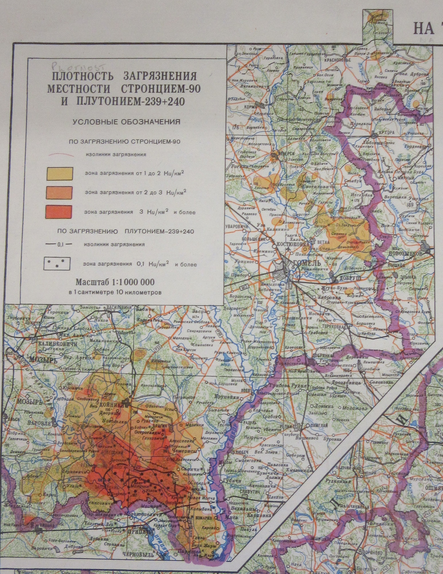 There is also an inset of the area nearest the nuclear site showing strontium and plutonium radiation (Chernobyl is at the bottom centre of the map, Черновыль). What the map doesn’t show, of course, is the human cost to this tragedy. Only the title, ‘…until January 1992’, hints at a lethal problem still in place 6 years after the event. An updated version from 1993 manages to convey this cost though. Text in a number of languages states ‘…a catastrophe broke out – the major break-down of the power unit at the Chernobyl Nuclear Power Station. By its scale, complicity and long-term consequences it is the most severe catastrophe throughout the entire World history of atomic energy use…after the Chernobyl accident Belarus has become the zone of of the ecological disaster‘. The text is in a number of languages; Russian, English, French, German and Polish, and when you carry on reading you realise why. As well as a map to show the spread of radiation following the accident the map is also a plea for international aid, ‘But the extent of the consequences of the catastrophe of the Chernobyl Power Station is so enormous that, it is regrettably, impossible for Belarus to liquidate them alone. The Republic badly needs medicines…The Byelorussian people, guiltless victims of the severe catastrophe, need the help of the international community.’
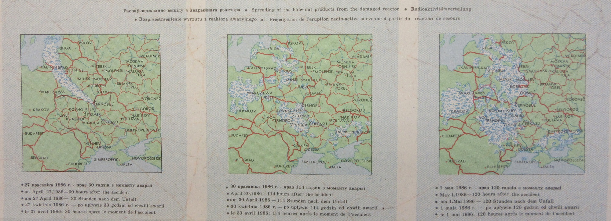
This extract comes from the back of the 1993 map, which includes the appeal for international aid. The three maps show the spread of the contaminated cloud between the April 27 and May 1st.
Maps have played a crucial roll in showing the aftermath of the Chernobyl incident. From tracking the contaminated cloud spreading across Eastern Europe to the more long-term mapping of contaminated lands maps have been the most useful medium to show the immediate and long-term effects of the disaster.
The Bodleian holds maps from the International Atomic Energy Agency, the Office for Official Publications of European Communities and the Hungarian Academy Research Centre for Astronomy and Earth Sciences as well as commercial publishers on Chernobyl and there are a number of interesting websites on the disaster, including Chernobyl Exclusion Zone Map – Chernobyl 35 years later, New mapping of radioactive fallout in Western Europe | EU Science Hub (europa.eu) and ESA – Mapping Chernobyl fires from space
Карtа Радиационной Обстановки на территории Республики по на Январь 1992 г (Map of the radiation situation on the Territory of the Republic until January 1992) 1992 C403 (101). The 1993 map, Republic of Belarus. Review – topographic map with the data on radiation contamination is at C403 (104). Both maps are at 1:1,000,000
Pingback: #Mapping radiation – GeoNe.ws