
March 2021 is a census month, the 22nd since the first in 1801 (the 1941 census was cancelled due to the war*). United Kingdom censuses initially set out to count the number of people and their employment, it wasn’t until 1841, the date of our map, that names were taken. From the 1851 census onwards information such as disabilities and religion was gathered as well. Here is a map showing information from the 1841 census, the rather wonderfully titled ‘Map of the British Isles, elucidating the distribution of the population, based on the census of 1841. Compiled & drawn by Augustus Petermann’.

‘Map of the British Isles, elucidating the distribution of the population, based on the census of 1841. Compiled & drawn by Augustus Petermann’. c1847. (E) C15 (157)
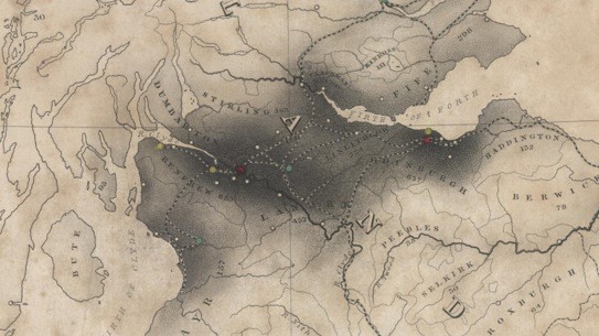
The map works by way of shading and spots. The shading indicates the varying degrees of population over the country, with the darker shading showing an area of denser population, while the coloured dots show towns according to population size (red for towns of 100,000 or more and so-on down to a clear dot for towns of under 10,000). It’s not an ideal way to show a large amount of information but gives an immediate idea of where populations are; London, the Midlands, the Manchester-Liverpool and Glasgow-Edinburgh regions, and of how under populated the country-side was, partly by this point as a result of Enclosure Acts forcing people off the land and into the cities and towns. Here’s an extract showing London in more detail

The numbers shown (204 for Sussex for example) shows the average number of people per square mile, or as the map nicely puts it ‘the number of souls to 1 English (statute) mile’. There is also a table listing population per county.
Text on the map explains how geography has played a part in population. ‘Mountains and valleys determine the main features in the distribution of the population, the latter exhibiting naturally the greater masses’. Petermann gives as an example Scotland, and how with a wide range of Mountainous areas most of the population live in-between the Firths of Clyde and Forth, with a 3rd of the total population occupying a 30th of the land mass. Ireland, by comparison generally has smaller mountain groups, and less of them, so there is a more even spread of population.
The 1801 census asked 6 questions. Broadly speaking these were; how many inhabited houses in each Parish, Township or place, and how many families live in each one, how many people in each parish etc, distinguishing between male and female, how many are employed in agriculture, trade, manufacturing and handicrafts, how many baptisms and burials in the years 1700, 1710, 1720 and so-on until 1800, how many marriages between 1754 and 1800 (1754 chosen as the year when a Marriage Act made the year before came into force), and then finally if there were any questions or notes about any of the previous questions.

Augustus Petermann was a celebrated German cartographer, learning his trade in Germany, then Scotland before moving to London to work in 1847. He became a fellow of the Royal Geographical Society and, which accounts for the dedication in the title, ‘Physical-Geographer Royal’ to Queen Victoria. Unfortunately professional success wasn’t matched in his private life. His first marriage ended in divorce, his second in suicide in 1878.
The Bodleian has a large number of maps and atlases which makes use census information. Census information also began to appear in gazetteers from the 1830s onwards, when, with the availability to compare current to previous figures accurately, population figures for towns could be given. This population map of the Saxony region of Germany is a recent addition to the map collection. Volksdichte-Schichtenkarte des Königreiches Sachsen nach der Zählung vom 1. Dezember 1900 (Population density layers map of the Kingdom of Saxony after the census of December 1, 1900) shows density of population by colour with two insets for the areas around Dresden and Leipzig from an earlier 1846 census. The map uses a technique called isopleth to show the density of population. Isopleth uses lines to show areas of equal value, the lines are similar to contours on a physical map and work on the same principle. The main advantage is that you can see at a glance the heavily populated areas by the colour ranges shown on the graph. That Saxony was, in 1900, a mainly rural area can be seen be the amount of green and brown cover shown.

Volksdichte-Schichtenkarte des Königreiches Sachsen nach der Zählung vom 1. Dezember 1900, C22:25 (74)
*There was a census count in 1966, the first and only time a mid-decade count was made.
Pingback: #Maps: Counting people – GeoNe.ws