Once fought over by the English with claims to territory dating back to the conquest France has seen revolution and invasion as well as the courts of Kings and, for a short time, Popes, and throughout this time maps have played a key role in the development and history of this strategically important country. This is an early and rare printed map, dating from 1592 and the copy held in the Bodleian is one of two thought to exist of the first printing of ‘Gallia’, by the Dutch cartographer Cornelis Claesz. The map has come from a copper plate engraving, which allowed for finer detail and greater artistic reproduction than earlier wood-cut maps and was engraved by Baptista van Doetecum following an initial drawing by the Flemish geographer Petrus Plancius.

Gallia, 1592. (E) C21 (182)
 Despite the text under the main title stating that the map is ‘…is a complete description in French, amended in many places, and distinctly within the limits of the regions’ the area shown covers a region of Western Europe whose border and name dates back to the Roman Empire. The map features a number of compass roses with rhumb lines which would have been used in sailing, though considering how little sea is featured on the map the use of the lines to navigate would have been secondary to sailing close to the coast to complete the journey.
The coastline of France was to change dramatically with a map produced in the 1680s following the discovery and then implementation of the use of triangulation to measure distances. Triangulation works by taking a fixed and measured line and then from the ends of the line fixing on a point in the distance. By measuring the degree of the angle made by the fixed line and the point you can measure the distance to the point, and then can use one of the existing points and the newly measured point to create a further triangle, and so on. This revolutionized the way distances could be accurately recorded and changed the way that countries looked on maps, not always to the satisfaction of those in power. This map is an English copy of one first produced in France in 1684 by members of the newly established Académie des Sciences, the first time a country was mapped using triangulation. Over an outline of how the country had been previously mapped

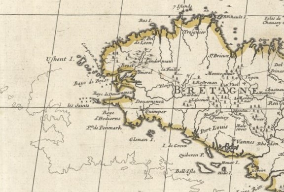 lay a new, and noticeably, smaller France. The King was shocked, suddenly his kingdom had shrunk, and he complained that this new map had cost him more territory than an invading army. The cartouche rubs salt into the wounds, claiming that this was ‘A new map of France, showing…the errors of Sanson’s map compared to the survey made by the order of the late French King*‘ (this map by John Senex was published in 1719, Louis XIV had died four years earlier). Two maps for the price of one, here’s an extract of the map covering Brittany showing the pre and post triangulation coastline. Compare the width of France in the first map to the newly calculated width in the post-triangulation map above.
As is typical of maps of the time the cartouche is rich in allegory, Mercury, winged messenger and god of trade, communication and travel, is often depicted, as is Ceres, goddess of agriculture and abundance. Ceres represents both Summer and, due to her control over the

life cycle within nature, also the course the soul takes through life. Putti surround the two figures, winged spirits who are often shown working at something, in this case appropriately enough surveying and map-making..
A new map of France shewing the roads and post stages thro-out that Kingdom…, 1719. (E) C21 (119)
With thanks to Katherine Parker of BLR Antique Maps for help with information on the Gallia map.
* Nicolas Sanson was the Royal Geographer to the French Kings, active in mapping France during the mid to late 1600s.