Monthly Archives: August 2022

Maps for the Aironauts…engravings by the best masters

At twenty minutes to two on the afternoon of the 8th September 1785 Mr Thomas Baldwin, to the ‘tears of delight and apprehension, the misgivings of humanity, and other sensations of surprize’ of the inhabitants of Chester took flight in a hot air balloon. Ascending to a height of four miles over Chester Baldwin was able to look down on the earth, a true birds-eye view. He wrote of his adventures in a book published the following year, Airopaidia : or aerial recreation, describing the voyage as well as giving a detailed account of the preparation involved in the flight (for instance a canon was fired at 7 am to let people know that the balloon was being inflated), the equipment taken onboard (as well as ballast brandy and feathers to throw out at various times to check wind speed and direction), and, rather worryingly, what to do if you start to descend too quickly. Baldwin also included some lovely original maps showing the views from above the clouds.

This has to be one of the earliest maps to include clouds over the land. The first manned balloon flight was only two years earlier in France, with the first in Britain almost exactly a year before Baldwin’s ascent so Baldwin was one of the earliest to see the earth partly obscured in this way. In the bottom left corner is Chester (‘the gay scene was a fairy-land, with Chester Lilliput‘) with the River Mersey snaking along from right to left. Imposed over everything is a twisting black line showing the route the balloon took over the Cheshire countryside. The maps are beautifully drawn, fully deserving the praise given them in the book, ‘Descriptions of the aerial scenes are illustrated with engravings, by the best masters; two of which are coloured‘. The engraver is named as Angus, a name not listed in map engravers and map-makers dictionaries held at the Bodleian but is possibly William Angus (1752-1821), who specialized in plates for books and prints working out of Islington.

On the next page the book does something rather clever. There is another map, this time a topographic map of the same area naming features not hidden by the cloud-cover but with the same route shown. Both the coloured view and the black and white map are folded, but the black and white map is on an extended piece of paper, meaning that you can have both open at the same time and compare the same area side-by-side, like this

The obvious advantages to cartography from balloon flights came just at the wrong time. Triangulation surveying had recently been introduced to Britain from France, and despite the efforts involved in first of all measuring out an accurate base-line then surveying across the country from this point the results produced maps of sufficient accuracy to make this the favoured method of map-making. Balloons though wouldn’t be forgotten, and were used to survey enemy positions in the early days of the First World War. Where the balloon did give an advantage was in the drawing of panoramas. The ability to draw an oblique view of a town or city was established well before balloon flights (see here) but these maps were drawn from low down, meaning that the buildings nearest the cartographer were given more prominence. The extra height gained from the balloon meant that a greater area could be shown as the angle of the observation was greater, and the area observed was greater. This can be seen to great effect in this wonderful ‘Balloon map of London’

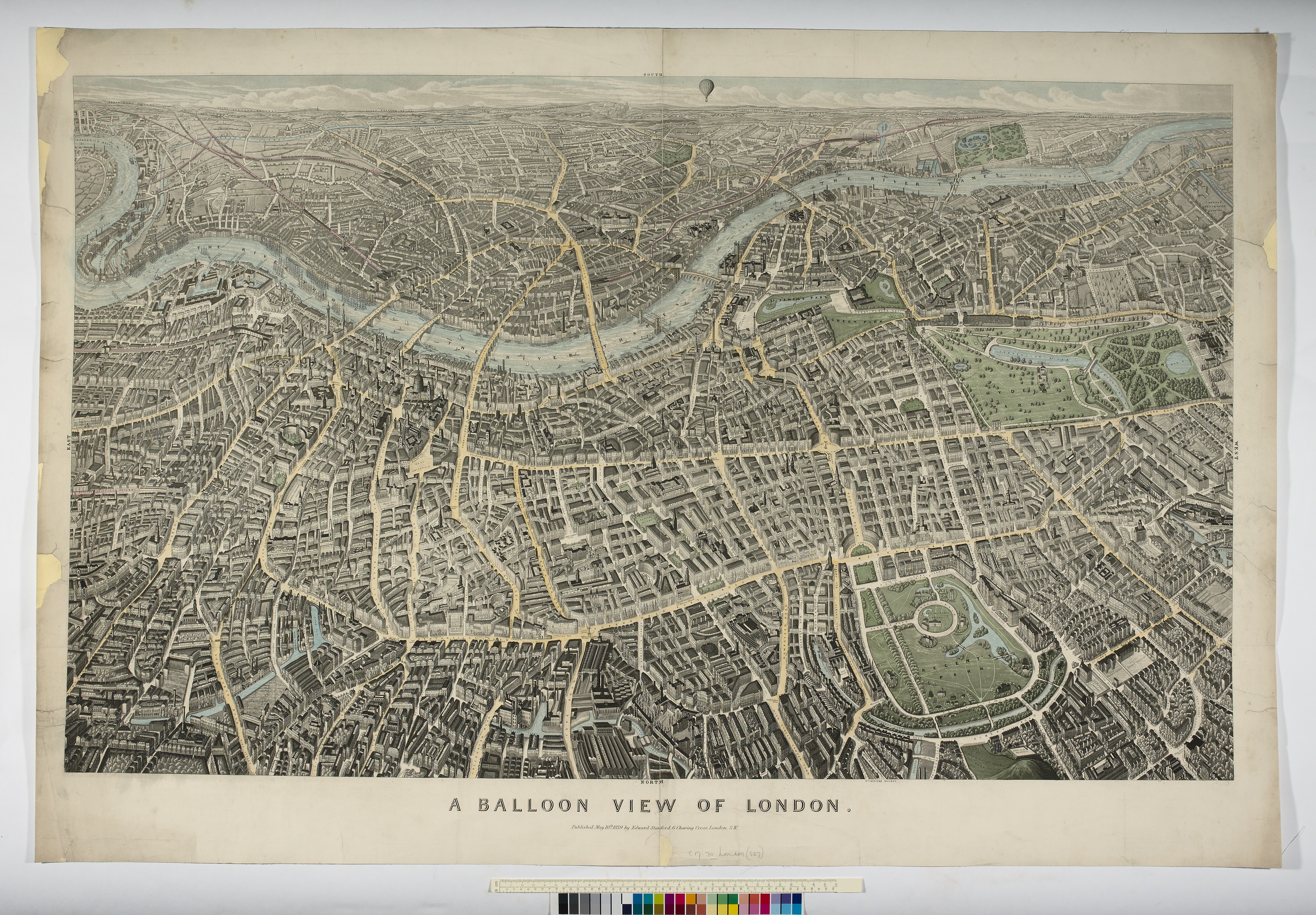
C17:70 London (327), 1859

Despite a balloon appearing at the top of the map the view taken is from the north, with south of the river disappearing into the distance, suggesting this is the viewpoint from another balloon. The balloon featured is a nice bit of decoration in keeping with the theme of the map.

We’ve blogged about clouds on maps before, in this case their use in wartime deception here  and balloons featured in an earlier blog here

Our blogs are usually written after either coming across a map that sparks our interest or of reading of one in a book or journal. In this case the latter, Baldwin’s flight and maps are mentioned in Rachel Hewitt’s excellent biography of the Ordnance Survey, ‘Map of a Nation’.

Airopaida : containing the narrative of a balloon excursion…198 e.80. 1786

…and in less than a quarter of an hour went all to pieces…

Before the introduction of the first Admiralty Chart by the Hydrographic Office of the Navy British- produced nautical charts were published by independent map-makers. In the case of the map featured in this blog Laurie and Whittle. Robert Laurie and James Whittle took over the map making business of Robert Sayer in 1794, and this map, drawn in 1786 but published in 1794, must have been one of the first the duo made. The company still exists today, producing maps and charts under the name ImrayLaurie, Norie and Wilson. Laurie was a skilled artist and engraver and presumably was responsible for the fine cartography and views on display on…

A new chart of the Southern Coast of Africa, from The Cape of Good Hope to Dalagoa Bay; including The Bank of Cape Agulhas, its soundings, currents within and without & c. is a remarkable chart for a number of reasons.

The skills involved in the creation of the map are evident, from the engraving to the information on depths and sea-floor sediments in the Bank of Cape Agulhas to the artistic representation of the view of the Cape of Good Hope.

The map plots the course around the Cape, an important but dangerous part of the journey to and from the Indies for European shipping. To aid in this journey the area to the south of the Cape, the Bank of Cape Agulhas, is prominently featured, showing both the extent of the bank to stop ships running aground and the depths and constitution of the sea floor. Sea depths, called soundings, would have been recorded by lowering rope with a lead weight attached, which may have a waxy substance added to the bottom which would pick up sediment. Judging by the amount of information shown this was considered an important place to survey and was presumably a tricky place to sail over. That the Bank was navigable can be seen by the course that the Worcester took on the outward bound journey from Britain to India in 1786. The Worcester was an East Indiaman (which is a general term for a ship of any European nation with trade links with India) which made a number of journeys to the Indies between 1786 and 1809, journeys which would usually take two years to complete. It may seem strange to focus on the journey of one individual ship, the intention being presumably to show the route taken as an example for those using the chart to plot their own progress round the Cape, as the Worcester has plotted a course to battle against as little head-current as possible. The map also shows the best line for taking advantage of the currents going round the Cape from a westerly direction, giving information on how fast the currents travel as well as the best course to take to make the most of the currents (‘the best track of the ships to avail themselves of the current’). Currents are also shown on the Bank, hence the …currents within and without … part of the title. Two large insets show safe harbours, both detailing rocks, good  anchorage and depths.

In this extract of the Bank of Cape Aguihas the routes of both the Worcester (the straight dotted line in the centre of the image that then goes off at an angle to the bottom right) on the outbound journey while the route to take best advantage of the currents for those heading home follows the line of the three ships. The make-up of the sea floor is clearly shown. The importance in plotting currents, especially in the age of sail, can be seen in the amount of times they feature on maps, both nautical and general. This map, again published by Laurie and Whittle in 1794 shows currents in the Indian Ocean, highlighting the importance of this part of the World for European trade. Unlike the main map in this blog, which would have been made from existing plates in Sayer’s collection this is a copy of a French map from 1776.

A chart of the currents in the Indian Sea during the southwest monsoon, to the northward of the line, 1794. (E) L1 (143)

The map below is an extract from Africa divided into its several regions (1792), by the person that Laurie and Whittle first worked for, Robert Sayer. The pair bought all existing stock and plates and took over his premises when Sayer died in 1794. At the southern tip of the continent is a less detailed portrayal of the Bank.

Ironically, for something that deals with the safe passage at sea, the most dramatic part of the map deals with a shipwreck. ‘On Thursday the 17th July 1755, about a quarter before one in the morning, the Doddington, outward bound East indiaman, struck on a rock about 3 leagues from the Main of Africa, and in 33d. 44m. south latitude. They had doubled the Cape…the time they were lost they saw the breakers, and in less than a quarter of an hour went all to pieces : out of 270 people only 23 were saved. They remained on this rock (which they named Bird Island) six months, and built a ship out of the wreck, the Chief Mate and 16 people all that were left alive, went to Madagascar in her…’. Bird Island is still named thus, and there is a Doddington Rock nearby, on the inset at right Bird Island is just to the east of Algoa Bay. Like the Worcester the Doddington was part of the fleet of the East India Company. Formed in 1600 to look after British trade the EIC eventually colonised large parts of India and Southeast Asia and pretty much ran India for the British Government following the Battle of Plassey in 1757 until corruption  and mutiny forced the Crown to take  control in 1858.

This fold-out map comes from a book (A journal of the proceedings of the Doddington, East-Indiaman, from her sailing from the Downs till she was unfortunately wrecked on some rocks on the East Coast of Africa*)  written by one of the survivors, Mr. Webb, one of the ship’s mates.

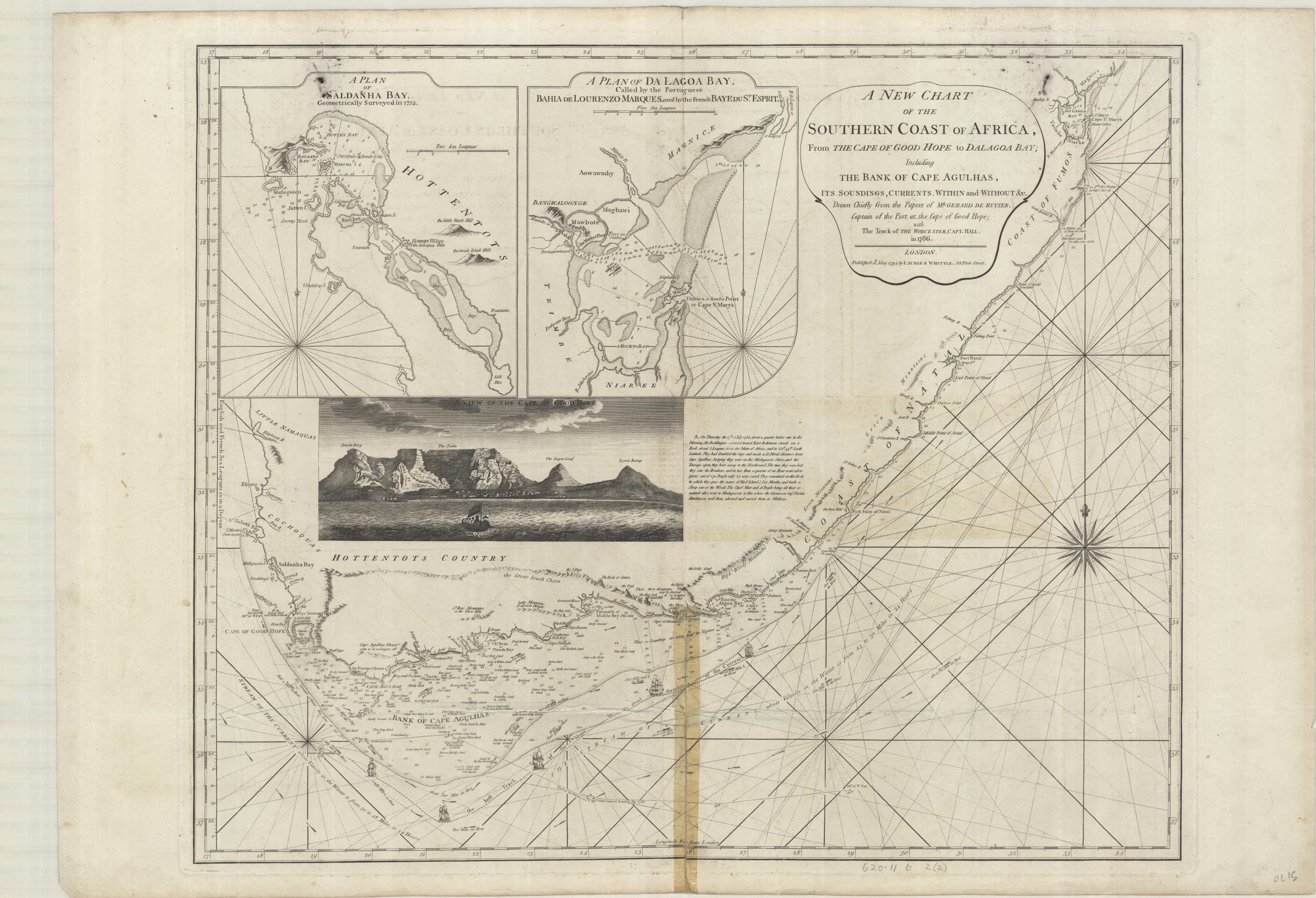
The book describes how the ship set sail on April the 23rd, 1755, taking seven weeks to get to the Cape. Then disaster strikes early on Thursday, July 17th, as the ship is wrecked on Bird Island. Despite breaking an arm and being being told by the Captain that ‘we should all perish’ Webb managed to get to Bird Island and eventually take part in the journey on a boat made from the wrecked remains 6 months later to Madagascar.  On this extract from the map Bird Island is the central rock A while the rock marked F is believed by Webb to be the one the ship first hit before being driven by the high seas onto Bird.

At some point before coming to the  Bodleian the map has been repaired with sellotape, so this will have a trip to conservation to restore it back to its former glory.

If you have enjoyed reading about nautical charts then more can be found here  , a blog telling the story of a chart made for Samuel Pepys, while a blog about a map made by fellow diarist John Evelyn for Pepys can be found here , and a blog about beautifully engraved French charts can be found here

*203 g.233. c.1756

A new chart of the Southern Coast of Africa, from The Cape of Good Hope to Dalagoa Bay; including The Bank of Cape Agulhas, its soundings, currents within and without & c. 1794 620.11 t 2 (2)