Monthly Archives: November 2022

‘…Wonderful things…’

A short blog to mark 100 years to the day that Howard Carter, a team of archaeologists and        local workers cleared the last of the rubble from steps in the Valley of the Kings and found an undamaged door at the bottom. After removing this outer door the door to the tomb of Tutankhamun was revealed. Two days later, November the 26th, 1922, Carter, along with Lord Carnarvon, made a small hole in this door which Carter then peered through. Asked if he could see anything by his patron Carter uttered the most famous words in archaeological history, ‘Yes, wonderful things…’

Nearly 100 years earlier the west bank of the Nile was mapped by the one of the first Egyptologists John Gardner Wilkinson. Wilkinson produced a detailed map on 6 sheets, with the relief beautifully and realistically engraved. Here’s the sheet covering the Valley of the Kings area.

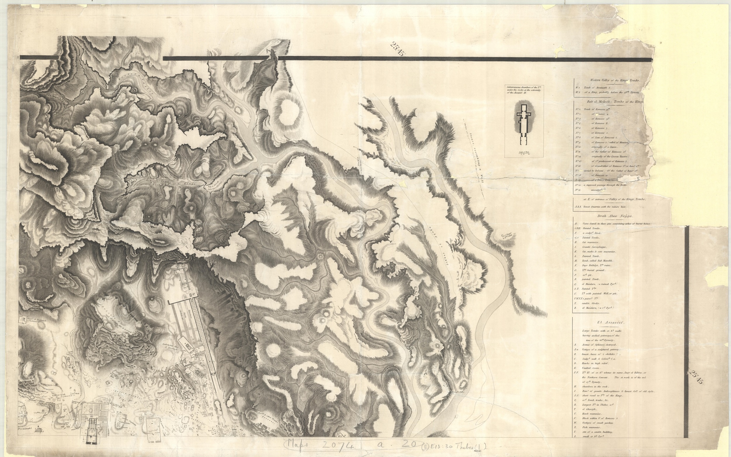
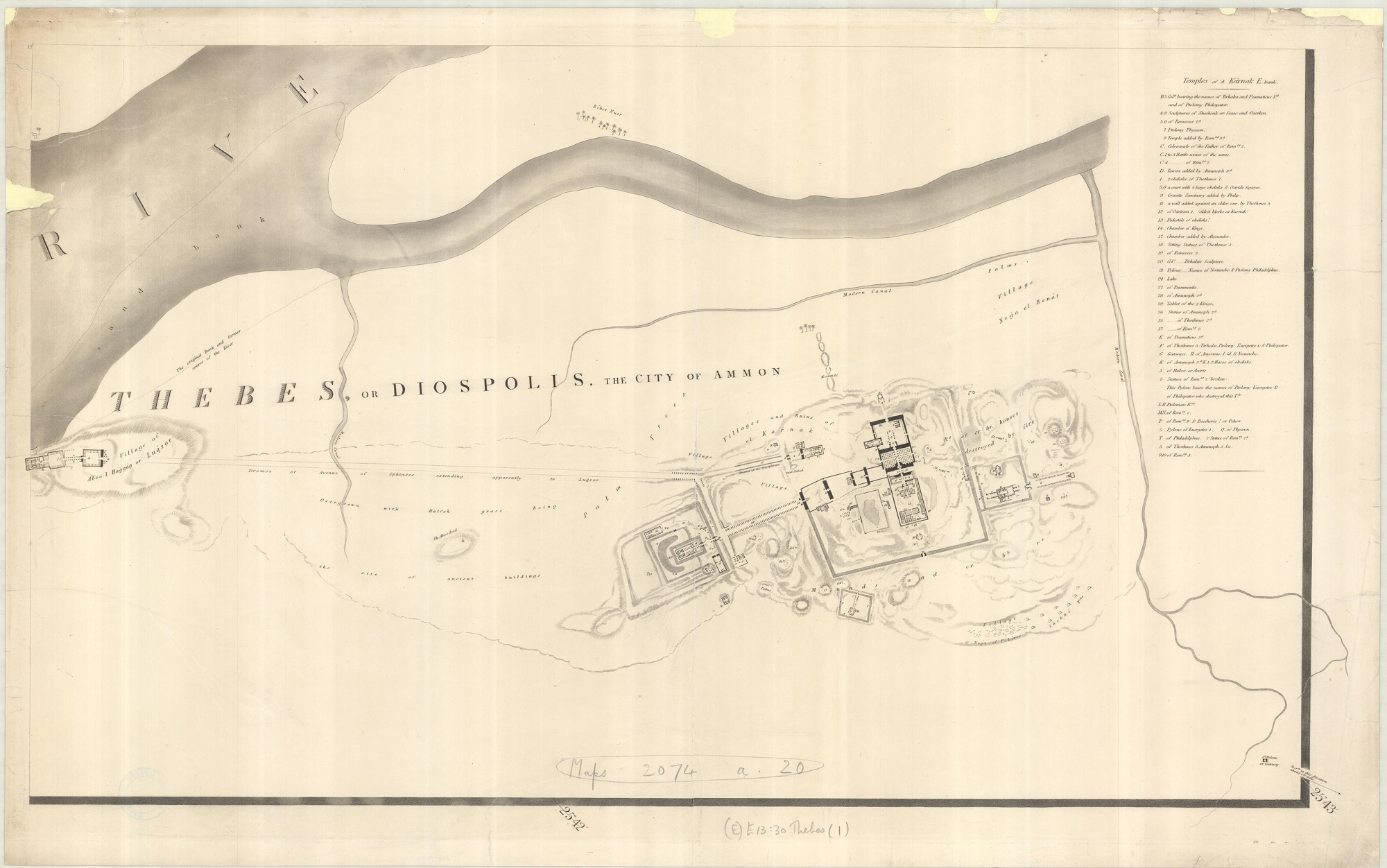
Topographical Survey of Thebes…by J. G. Wilkinson, 1830. (E) E13:30 Thebes (1)

This is an extract from the map showing the Valley above the Temple of Deir el-Bahari.

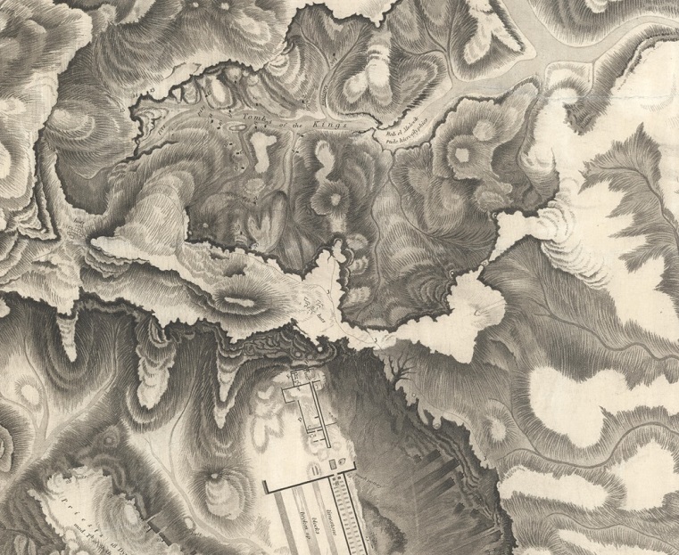
With its use of shading and hachures (the short engraved lines showing direction of slope) you get a real sense of the hills and valleys. Following his death in 1875 Wilkinson’s extensive papers came to the Bodleian, an invaluable resource for the study of Egyptian antiquities before the onset of tourism and removal of objects changed their appearance for ever (The page of hieroglyphs at the sides of this blog come from one of Wilkinson’s note-books, MS. Wilkinson dep d.47). Here’s a beautifully hand-drawn sketch of the Valley of the Kings from Wilkinson’s papers.

Valley of Biban el Molook, or of the Tombs of the Kings of Thebes’. Original manuscript by John Gardner Wilkinson, c1830? MS Wilkinson dep. a.22 (fol. 70).

In this map Wilkinson identifies each tomb with letter; by the time he had drawn and published the ‘Topographical Survey…’ these letters had been replaced by the numbers that are still in use today, as can be seen in this extract from the map. Tutankhamun’s tomb would be found by Carter close to tomb 9, the shared tomb of Rameses V and VI.


Karte der Westlichen und Umgebung von Luķsor und Karnak [Theben] 1909. E13:22 (1)

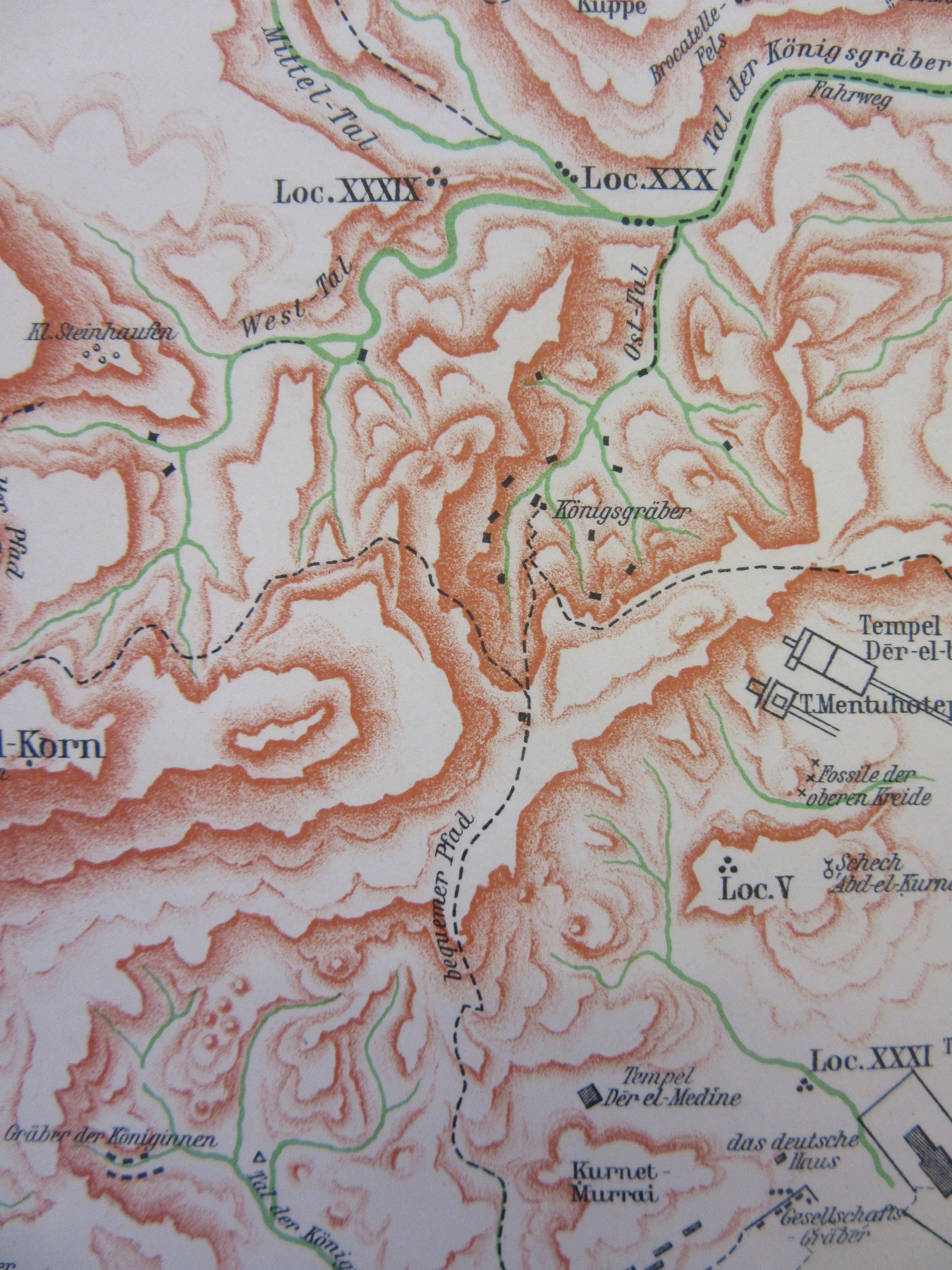
This 1909 German map of Luxor and the surrounding area shows how different the relief is on the west bank of the Nile compared to the east. It’s a land of contrasts, of flat fertile land close to the river and desert and mountain further out, of a land of life and of death. The hilly area centring on the Valley of the Kings (Königsgräber on the map, and extract at right) is rich in tombs of royals, nobles and workers. It’s also a map full of the wonders of ancient Egypt. On the east bank the temple at Karnak, the greatest of all surviving Egyptian temple complexes and on the west bank famous archaeological sites, including the temples of the Ramesseum, Medinet Habu and Deir el-Bahari as well as the Valley of the Kings and Queens.

Here’s another of the sheets from Wilkinson’s map of Thebes with the Luxor and Karnak temples.

The library holds a set of maps showing the area around the tombs, ‘The Theban Necropolis’, published by the Survey of Egypt in in 1924. Frustratingly it doesn’t include the sheet covering the Royal Tombs though one sheet, C-7, does include Howard Carter’s house.

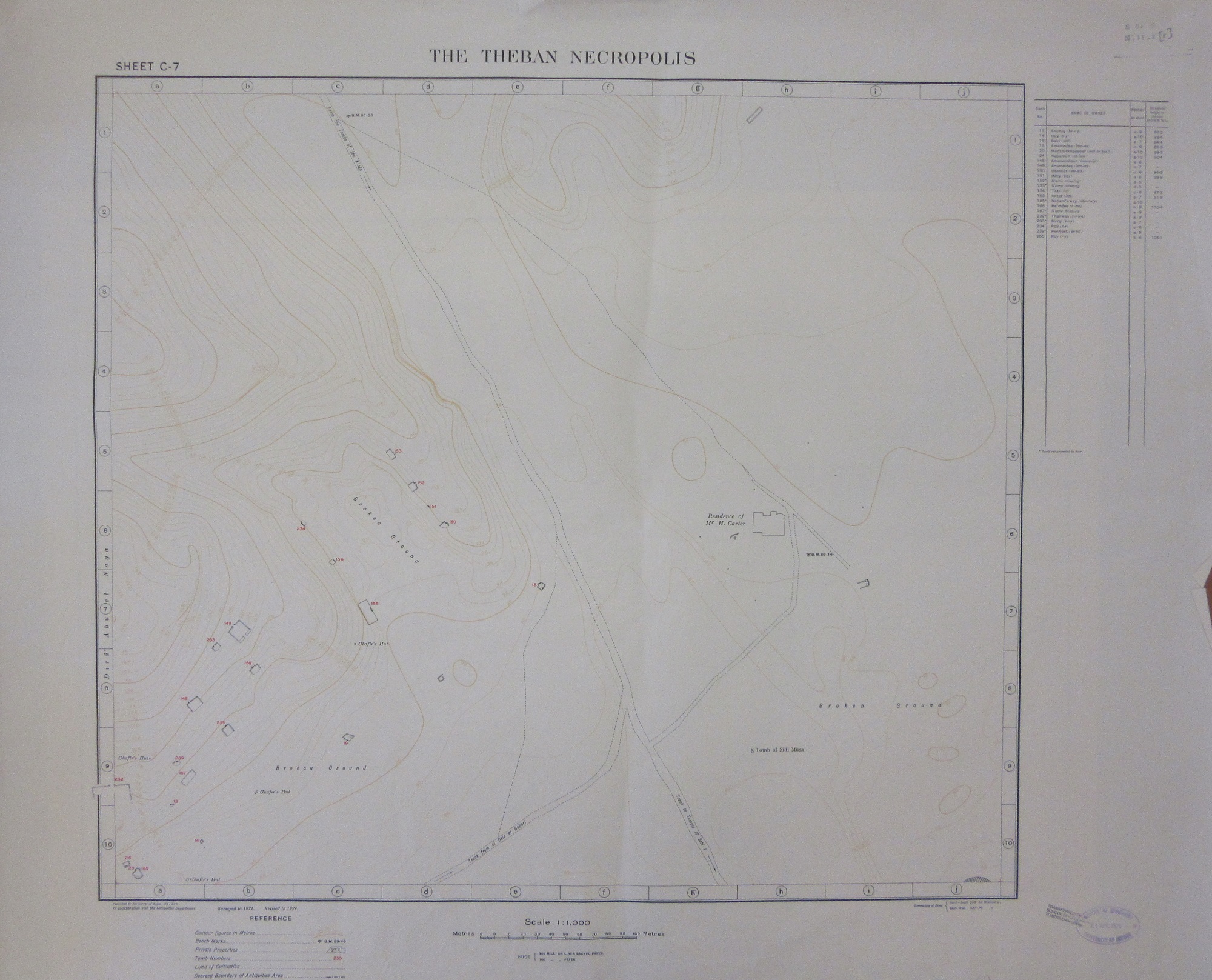
The Theban Necropolis, 1924. E13:30 Thebes (3) sheet C-7

Want to know more about the discovery of Tutankhamun’s tomb? There’s a marvellous exhibition on at the Bodleian until February next year, details here Tutankhamun: Excavating the Archive | Visit the Bodleian Libraries (ox.ac.uk)


An idealised landscape and a common mistake

This Panorama of physiographic types is an intriguing item in itself, and seems to have caused a little confusion both here in the Bodleian and in map libraries across the world. It’s a diagram demonstrating different types of landform in an imaginary landscape, shown both as a perspective drawing and conventional contour map. A similar diagram (for a different imaginary landscape, with different features) appears on the other side.

They are called simply Chart A and Chart B. Precise measurements are provided, and there is an accompanying sheet describing the different landscape features. It was first produced in 1926 by the American cartographer and geographer Armin K. Lobeck, and continued to be reprinted into the 1950s. Above is a detail from Chart B.

The landscape view on Chart B even includes subterranean features.

At the bottom of each chart, in text so small it would be easy to miss, is a succession of surprisingly difficult geographical exercises. These include precise calculations as to the heights and depths of certain features, drawing profiles, calculating past forms of now eroded landscapes and  positions of watersheds, identifying types of lakes, and reasons for the comparative heights of mountain ranges. There are baffling questions such as “What is the significance of the three ridges on the southern end of Whitbeck Mountain?” and “What kind of material probably occurs in Wright Bluffs?” There are also a few human geography questions, about likely sites for natural resources and good places to build cities.

Our attention was drawn to this map by a query on an email discussion list for map librarians (yes, these are a thing) on how the scale should be recorded on the catalogue record. The (notional) scale on both charts has a blank; it is written as 1:     , 000. There is also a scale bar showing that the scale is about one centimetre to a mile, which works out at around 1:161,000. As part of the exercises, the keen geography student was expected to calculate this.  However, map cataloguers across the world had been less observant, ignoring the blank and recording the map with a scale of 1:1,000. A staff member at a library in the United States spotted the error in their own record, and suggested that it was a printing mistake on the map. Other libraries which held the same map, on at least three continents, had the same mistake in their record for the map, including the Bodleian Library. It has now been corrected.

Maps of this sort showing a fictitious landscape for illustrative or educational purposes have been going for a long time; a previous blog post here gives examples from the 1910s and the 1970s. This week I also stumbled across an example from 1812; an educational atlas that begins with a map of an imaginary place to explain the terms and symbols used. This is from The young lady’s and gentleman’s atlas, for assisting them in the knowledge of geography, and the author describes himself as John Adams, teacher of mathematics. Judging by the handwritten names on the flyleaf it was shared by two sisters. It is often easier to explain the world through an idealised landscape rather than through the messiness of real examples.

Panorama of physiographic types / A.K. Lobeck. New York: The Geographical Press, Columbia University, [ca 1940]. O1 (9)

The young lady’s and gentleman’s atlas, for assisting them in the knowledge of geography / John Adams.  London: : Printed for Darton, Harvey, and Darton, 1812. Opie H 1

Maps to justify your existence

Few countries suffered as much as Poland during the Second World War. Historically a country that had undergone numerous border changes, losses of territory (3 forced partitions in 23 years in the late 1700s!)  and caught between two countries with strong ideologues of such differences that an alliance between them would seem absurd if it wasn’t for the conniving geopolitical machinations of German and Russian foreign policies. When German forces invaded on the 1st September 1939, kick-starting the Second World War, Polish forces made a valiant effort to defend their country only for Soviet forces to invade from the east two weeks later. For the Poles there was to be five years of brutal occupation. Here’s a map showing German occupation of Central and Eastern Europe in 1942.  Poland has been swallowed up by the Greater German Reich and the front-line is in Soviet territory with further advances to come before the horrors of Stalingrad and the turning of the war.

Grossdeutsches Reich und angrenzende gebiete, 1942. C1:5 (595)

The reason for this in a map blog? We’ve just started working on some material that’s been at the library for a while, the majority of which are maps of Poland which look at some point to have been removed from an atlas. There’s very little information on the majority of the maps, but some have been published by the Polish Ministry of Industry, Commerce and Shipping, based in London and part of the Polish Government in Exile while others come from the Światowy Związek Polaków z Zagranicy (World Union of Poles from Abroad), an organization set up in the mid 1930s to ensure Poles abroad still felt part of and could help and support the Polish Government. As quite a few of the maps are similar it’s fair to assume that the majority come from these sources. So far so good but the range of themes of the maps is surprising.

As well as maps of contemporary borders and population there are maps covering such diverse subjects as air routes between the wars by Polish Airways, maps on historical borders and territory, maps on the German occupation and maps giving information on industry, agriculture and architecture.

Why the range? It’s hard to be sure but the answer may lie in the fight that the Polish Government had to be recognized in the face of Soviet opposition and British and American Governments willing to give into Stalin’s demands as the cost of keeping the Soviets fighting the Germans before a Second Front could be opened in Western Europe. By creating maps showing changing borders the Government in Exile were hoping to show a legitimate reason for being the rightful possessors of not only a country based on pre-war boundaries but also the legitimate Government to run the country after the defeat of Germany. Take these maps, showing numerous Polish boundaries between 1001 and 1939, thus establishing a long history of a Poland being centred around the immediate pre-war state.

[Polish boundaries and territory changes, 1001 – 1939], 1945? C31 (561)

Polish frontiers in the course of history, C1:4 (204) 1940?

In an unusually colourful example the second map  portrays a Poland that throughout history has grown and been a dominant part of East Europe. Turning the map over reveals it’s actually part of a postcard including defiant text on the role of Poland in Europe, ‘the first country to oppose Hitler’s “New Europe” and goes on to highlight Poland’s perilous situation at the start of the war, ‘the geographical position was, and is, incomparably difficult and dangerous…the map shows how unjust were the Polish frontiers after the last war. This fault is the reason for Poland’s position today. Only a powerful Poland can secure European equilibrium. Our deepest faith will ever be Poland must rise again!’ A postcard is an ideal medium to spread the message included, both in the map and text, a pre-digital age version of a tweet.

Here’s another example, one that combines the current situation in Poland and German aggression with a sense of historical Poland. This map is published by the Min. Informacja i Dokumentacja w Londynie. 

Map of Eastern Poland, Baltic countries and the western part of U.S.S.R. showing German occupation and historic boundaries of Poland, 1943. C1:4 (201)

By creating maps showing such diverse themes shown in this blog the Government were promoting Polish culture, industry and tradition, and leading on from this a Polish identity, putting forward a strong argument for the continuing existence of Poland against Soviet aggression.

Polish airways in 1935, c1945. C1 (1128)

[Poland imposed over British Isles], C31 (562) 1943

To finish, a map that imposes over a map of the British Isles the outline of Poland according to 1938 boundaries.  We have a few maps in the collection here at the Bodleian that does this (an earlier blog featured one of New Zealand). By imposing a country over another like this the cartographer hopes to draw comparisons between the two, in size and in, it’s imagined, a sense of both being long-established nations with traditions and histories, of a country that deserves to be treated equally.