
In 1877 the political satirist Frederick Rose produced the ‘Serio-comic war map for the year 1877′. Rose used the map to compare Russia to an Octopus, the analogy being that Russian tentacles, grabbing hold or in some cases choking various countries, symbolized how Russia was attempting to gain influence over Europe. An earlier blog on cartoon maps featuring this map amongst other examples and can be found here
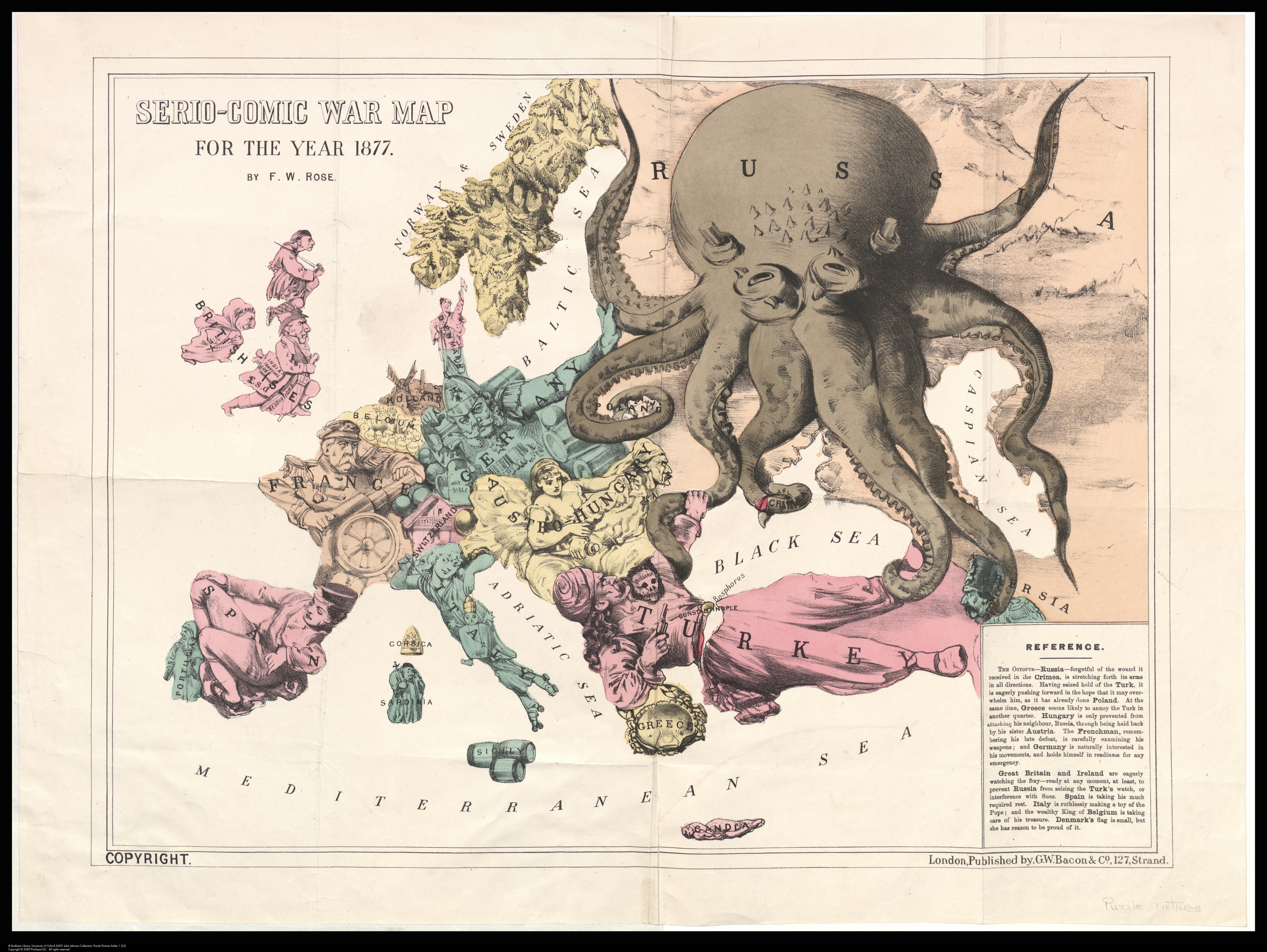
Serio-comic war map for the year 1877 by Frederick Rose JJ puzzle pictures folder 1 [28], 1877
Cartoon maps are good at making a serious point (most deal with expansion and empire building) in an immediately appealing and understandable way. The mix of strong imagery and a history that often seems to repeat over and over again means that they remain relevant long after initial publication. In 1904 Russia and Japan went to war over the fears both had over the other’s areas of influence in Manchuria and and Korea respectively (a blog about a map of the war is here.) and a Japanese student, Kisaburō Ohara, took Rose’s map and extended the area shown further east to include ‘Manturia’ and ‘Corea’ with one of the sinister arms of the Octopus reaching out to the area. On the map China becomes the Empress Dowager Cixi, complete with the bound feet fashionable at the time.
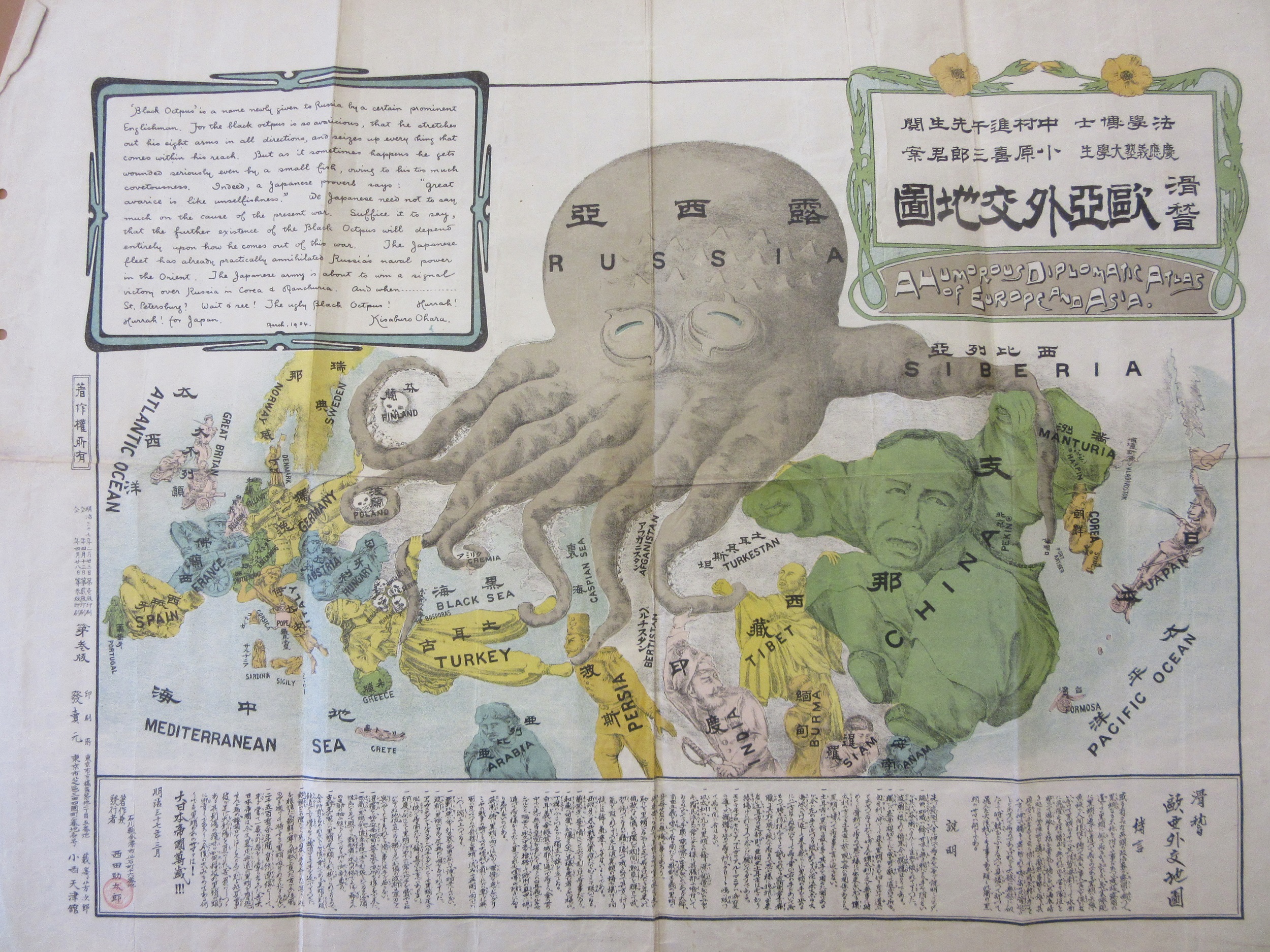
A humorous and diplomatic atlas of Europe and Asia, 1904. B6 (209)
While the majority of the European countries remain with the same national portraits In a change to the Rose original to show what potentially could happen to any country to fall under Russia’s sphere you only need to look at how Finland, Poland and the Slavic countries (which would become Yugoslavia after World War One) are all portrayed by skulls to suggest the effect Russian influence had on these nations.
Text on the map is in both Japanese and English with the English text in the box repeated in Japanese along the bottom. The text starts ‘Black Octopus is a name newly given to Russia by a certain prominent Englishman [i.e. Rose]. For the black octopus is so avaricious, that he stretches out his eight arms in all directions, and seizes up everything that comes within his reach’ and ends on a patriotic note, ‘ Suffice it to say, that the further existence of the black octopus depends entirely on the outcome of the present war. The Japanese fleet has already practically annihilated Russia’s naval power in the Orient. The Japanese army is about to win a signal victory of Russia in Corea and Manchuria. And when…St. Petersburg? Wait and see! The ugly Black Octopus! Hurrah! Hurrah! for Japan!’.
 The 1904 map is a strange mix of quality and some parts definitely work better than others. The new parts, which is pretty much everything east of Persia, have a fresh look and have enough space for the countries to be represented well while with the reduced size of the map from the original Europe is a bit too crowded. Scandinavia in particular looks bad compared to the 1877 version. Italy is intriguing, treating the Pope and the Vatican like a toy on string following the defeat of Rome and the Papal States in the war to unify Italy in 1870.
This map shows the problems throughout Europe dating back to and before the Rose map of 1877, problems which would continue after the end of the Japanese war with Russia. Following the 1870 Franco-Prussian War France and Germany point arms at each other while the large empires of Turkey and Astro-Hungary are both split in two, one by a Russian tentacle, the other by the two different countries, Austria and Hungary, that make up the Empire, both bringing different languages, cultures and groups of people to a large part of Central Europe. The Balkans are a frightening bunch of skulls, a foretaste of what was soon to come with two Balkan Wars and the origins of the First World War. Then there’s the potential for conflict and jealousy over spheres of influence in the Near and Far East.
This is the strength of cartoon maps, the most obvious types of maps apart from those produced by totalitarian regimes where bias plays a part in the way the map looks. Purely judged on cartographic merit it’s a poor map, but in all other aspects; aesthetically, historically, novelty, the map is a wonderful example of its type.