Author Archives: debbie

Maps as scrap paper: an unfinished work from the 1730s

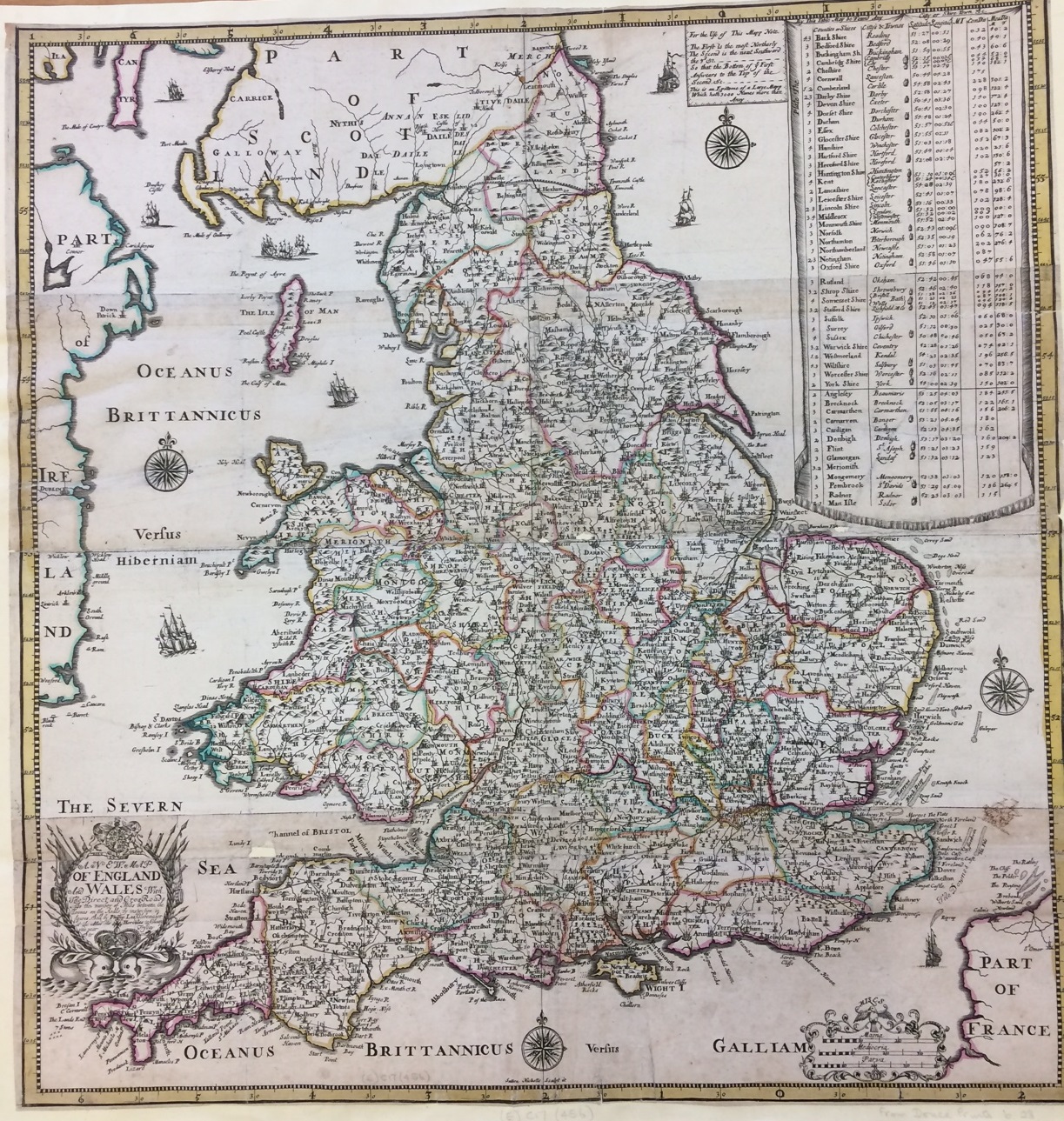
This atlas seems to have had a hard life. The printed maps, dating from the early eighteenth century, are nicely engraved and hand coloured but most are stained and tatty and have been heavily folded to fit into the binding. On closer inspection it is not a published atlas as such, but a collection of separately published maps, in French, Latin or English, bound together. Some of the maps are incomplete, others have been repaired, their tattered edges strengthened with thick paper. Some of the most interesting information, though, is on the backs. The large sheets have been used as scrap paper for pen and ink drawings, maps of parts of the Middle East with detailed latitude and longitude shown in the borders. The back of this map of Tartarie by the respected French mapmaker Guillaume de L’Isle has been used for a map of Syria and Lebanon. 

The latter part of the book contains smaller plain sheets which have been used for sketch maps and for lists of place names and page references. The text is a mixture of English, Arabic and Latin. This map shows an area to the south of the previous one, covering modern day Israel and Palestine. The Sea of Galilee and Dead Sea are marked and the towns of Haifa and Acre (Acca) can be seen on the coast; a few place names on this map are in Hebrew.

There are also some more detailed maps, such as this one of the rivers of southern Iraq showing Basra and Al-Qurnah.

Who was responsible for this work, and why? There is a clue on one of the later pages in two incomplete drafts of a letter asking for money to continue the project. The first begins by explaining that the writer has been unable to visit because of both poverty and ill health, and  explaining: “I have begun to put to the press my Geography of Abulfedah, and near 20 sheetes are work’d off continuing the whole of Arabia and part of Egypte …” before going on to describe his financial needs and his inability to support his family. This is crossed out, and a second draft takes a more optimistic note: “Being pretty well recovered of my late indisposition … when such a fair promise takes effect I’ll go on chearfully in my undertaking, and return my hearty thanks in a dedication …” The reference to the Geography of Abulfedah makes it seem almost certain that this book was the property of Jean Gagnier, who published a translation from Arabic of the “Taqwim al-buldan,” or geographical description, of Abū al-Fidāʾ (or Abulfeda) a fourteenth century Kurdish geographer.  Publication was delayed by lack of money;  Gagnier’s “Descriptio peninsulæ Arabum” appeared in 1740, shortly before the writer’s death, and was incomplete, covering only Arabia and part of Egypt . The letter asking for financial support would appear to have been unsuccessful if it was ever sent.

The published work does not appear to have contained any maps. It’s interesting to see the parallels between Gagnier’s interpretation of Abū al-Fidāʾs work, and earlier European works based on Ptolemy’s Geography. Ptolemy’s work included only geographical description, without surviving maps, but later interpretations and translations included maps based on the written account.  Gagnier seems to have had it in mind to do something similar. Towards the end of the book is a table where Gagnier has compared the latitude and longitude of places (including Baghdad, Jerusalem and Alexandria) as calculated by Ptolemy, Abū al-Fidāʾ and the contemporary mapmaker de L’Isle, perhaps attempting to reconcile them. At least some of the maps were used as source material as well as scrap paper.

Gagnier was brought up in France but lived in Oxford from the early 1700s, teaching Hebrew and Arabic; he also published translations, including a life of Mohammed in Latin based on Abū al-Fidāʾs Arabic text, and a chronicle based on the work of the Hebrew historian Josephus. The Bodleian also holds some of Gagnier’s manuscript notes and preparatory material for his published works. This volume of maps was acquired by the library in 1885, along with a misleading contemporary note attributing the manuscript maps to someone else entirely. Further research in 1913 identified the connection with Gagnier, but it does not appear to have been widely publicised.

[A collection of manuscript maps and notes, apparently created in the preparation of Gagnier’s Descriptio peninsulæ Arabum.] Oxford, [between 1727 and 1740]. Map Res. 73

On the road

As a general rule we do not fold our atlases in half. It would be bad for them, and probably quite difficult. This is a rare example of an atlas that was designed to be folded in half.

It’s an early road atlas to be carried while travelling. When the soft, rather tattered brown leather covers are opened, it reveals that a previous owner has made some notes of place names and distances in the inside of the cover.

The book itself could be folded or rolled, making it smaller and more portable. It is Thomas Kitchin’s Post-chaise companion, and dates from 1767. It has clearly grown accustomed to being folded in half, as can be seen from the weights required to hold it open for photography:

The very earliest road atlases date from the seventeenth century. Previously travellers relied on road books, lists of names that would enable them to ask the way from one town to the next. Arguably the first road atlas was produced by Matthew Simmons in the 1630s, with triangular distance tables (like those sometimes found in modern road atlases) and very tiny maps. The big innovation was John Ogilby’s Britannia in 1675, which used strip maps to show the major roads throughout Great Britain in unprecedented detail; this design continued to be copied for over a century, as can be seen here. Britannia was however a large volume, too bulky to transport easily.

Perhaps surprisingly, it was around fifty years after the publication of Britannia before smaller, more portable versions were produced, and then rival versions by three different publishers appeared around the same time in the 1720s; one of these, by Emanuel Bowen, was reissued in multiple editions into the 1760s. Thomas Kitchin, who produced this work, had been apprenticed to Bowen, and had married Bowen’s daughter before setting up as an independent mapmaker, embarking on a long, prolific and successful career, and being appointed Hydrographer to George III.

Although many road atlases of this period survive, the binding is what makes this one unusual. Its appearance caused a certain amount of excitement in the Map Room as some of us had heard of road atlases being made to this design, but had never seen one before. Unsurprisingly the soft backed versions are less likely to have survived, being less robust and more heavily used than the hardbacks. The fact that this one has the notes relating to a previous owner’s journeys makes it additionally interesting.

Kitchin’s post-chaise companion, through England and Wales; containing all the ancient and new additional roads… by Thomas Kitchin. London: John Bowles, Carington Bowles and Robert Sayer, 1767. C17 e.2a

Further information can be found in County atlases of the British Isles, by Donald Hodson. Vol. 1. Welwyn: Tewin Press, 1984.

Copy, reconstruction or fake?

The Map Room was recently given what appeared to be two facsimiles of early printed maps of Paris from the sixteenth century. The smaller one bears a Latin title, “Lutetia vulgo Paris Anno 1575” – a fairly conventional way of giving both the Latin and vernacular versions of a place name in a map title. It’s a colourful, attractive map, showing Paris inside the city walls with the buildings represented pictorially. In the foreground are views, a rural landscape and a view of the Tour de Nesle, part of the city walls. The map is signed by Josse de Reveau.

So far, this appears a fairly conventional facsimile  – a modern printed copy of an attractive early map. But on closer inspection it becomes puzzling. There is no other trace of Josse de Reveau or of the original on which the map was based. The explanation is that the map is actually a reconstruction, originally made in the 1950s by a French artist; inspired by an engraving from the time of Henri III, who was King of France from 1574 to 1589, Daniel Derveaux copied the style and drew Paris as it was in the sixteenth century. According to the company website (the map is still for sale, along with a number of similar maps and map themed gifts),  “He signed ‘Josse de Reveau’ to make it look authentic.” The name could be an adaptation of Derveaux’s real surname. The map has fooled many into thinking that it is a facsimile of a sixteenth century map, and it is recorded thus in several library catalogues. We have not identified a specific map from which the information was taken.

A second map of Paris in the same category was acquired at the same time. This has an even more complex history in terms of the origins of the information. The title in a scroll design across the top of the maps is “Icy est le vray pourtraict naturel de la ville, cité, université de Parisy;” both the wording and the archaic spelling are copied directly from a large and detailed map of Paris made in the mid-sixteenth century by Olivier Truschet and Germain Hoyau. Some of the decorative elements on this map are taken from the same source. The original is held in the university library in Basel, Switzerland.

The map itself is smaller and simpler than that produced by Truschet and Hoyau, and is largely based on the one published by Braun and Hogenberg in their Civitates orbis terrarum, an atlas of the world’s cities in six volumes which appeared from 1572. The foreground is occupied by human figures; two labourers, two ladies in grand dresses, and two finely dressed gentlemen, one on a horse. There is also a view of Paris along the bottom. We have been unable to identify the source of these images, so at least three, possibly four sources went to make up this composite map. Again there is a fictional cartographer, and this time a publisher as well; “Rossingol execut [made] 1576. A Paris, chez Melchior, Quai du Port au Foin qui regarde l’Ile Nostre Dame” – the publisher and address look authentic and convincing, but are invented. There is no definite evidence as to the origins of this reconstruction; it may well be the work of Derveaux again, but it dates from the 1930s and the company has no record of it.

It is difficult to know what to make of these maps – were they originally made as a deliberate attempt to deceive, a whimsical experiment, or a way of improving access to historical sources? As regards the historical information on the maps, they are fairly useful; the details seem to have been quite closely copied from early maps. Having said which, we should also remember that no map can be relied on entirely to show the landscape as it was at a given time –  but that probably deserves a separate discussion.

Lutetia vulgo Paris Anno 1575. Daniel Derveaux, 1958.  C21:50 Paris (208)

Icy est le vray pourtraict naturel de la ville, cité, université de Parisy. Publisher not identiifed, [1930?] C21:50 Paris (209)

Advertisements: looking around the map

From the late nineteenth century many commercially produced maps featured advertisements  for products completely unrelated to the map. The advertisements can be fascinating in their own right, and a few examples are shown here.

An earlier blog post features a map of the Manchester Ship Canal from 1889, and it’s worth taking a closer look at a few of the advertisements on and around it. This one, for Sanitary Rose Powder, features a graceful woman in a rather classical dress holding the product aloft; it appears to be endorsed by the Queen, but this probably refers to the magazine of that title rather than to Her Majesty.

The target market for this map seems to be fairly comprehensive; it promotes a great variety of items besides soap powder: security locks, toothpaste, local hostelries, furniture, marquees and two different kinds of sewing machine. The inclusion of an advertisement for Musgrave’s patent stable fittings, “adopted by H.R.H. the Prince of Wales and supplied to the best stables in the United Kingdom”, with an illustration of a glossy horse pawing the ground, adds a touch of class.

Advertisements on maps are often an interesting source of social history. A road map of Great Britain produced by the popular weekly magazine “Tit-Bits” around 1920 has a particularly egregious example of advertising on the back panel: it features a health drink called Wincarnis (which is evidently wine with a few additions). It is presented as a solution to “Why married women lose their looks” (the implication is that this will encourage husbands to stray). A few glasses of Wincarnis, starting at 11:30 am and continuing through the day, will help the frazzled wife to regain her equanimity and “within a few days your looks will begin to come back.” There is so much wrong with this to the modern reader that it’s hard to know where to begin, but we can at least say that it would be unlikely to work. Interestingly, the many other advertisements on the map (bike lamps, radio valves, car batteries) appear to be aimed at a masculine market.

There are also examples of maps and atlases produced specifically to promote a product. The Mazawattee Tea Company (established in 1887 and still in business) produced a small paperback atlas of the world around 1900. The maps are general and make no attempt to highlight tea growing areas, but every page has a slogan urging the reader to drink Mazawattee teas (apart from one which urges them to try a brand of cocoa made by the same company). They also published a dictionary, a gazetteer and a guide to the language of flowers, amongst other things.

Sunlight Soap, another company founded in the 1880s and still in business (now a subsidiary) made a innovative promotional map, the Sunlight Quick-Find Map, in the 1930s. An attached ruler and gazetteer could be used to locate “300 important places in the United Kingdom,” including of course Port Sunlight, the model village on the Wirral established by the company for its workers.


Sometimes the advertisements do have a connection with the map. The Italian map below of excursions around Lake Garda, from the 1930s, features many advertisements for local services. An advertisement for Esso fuel portrays Esso as a mythological character, perhaps a Roman god.

The map itself is detailed and practical, and clearly aimed at international tourists; the cover text is in English, French and German as well as Italian. The cover image makes travel to the area look both stylish and desirable. It could easily provoke a wish to visit Lake Garda, ideally in the 1930s and while wearing a cloche hat.


Manchester ship canal – general plan of canal and district. Revised. [Manchester] : J. Heywood, 1885. C17:3 (13)

“Tit-Bits” road map of England and Scotland.  [Edinburgh] : Edinburgh Geographical Institute, [1920s]. C16 (737)

Mazawattee atlas of the World  London : Mazawattee Tea Co., Ltd., [ca 1900]. B1 c.484

Sunlight quick-find map.  [1935] C15 d.200

Gardone Riviera : Lago di Garda (Italia). Gardone Riviera : Agenzia Viaggi Fratelli Molinari, 1932. C25:17 (59)


An idealised landscape and a common mistake

This Panorama of physiographic types is an intriguing item in itself, and seems to have caused a little confusion both here in the Bodleian and in map libraries across the world. It’s a diagram demonstrating different types of landform in an imaginary landscape, shown both as a perspective drawing and conventional contour map. A similar diagram (for a different imaginary landscape, with different features) appears on the other side.

They are called simply Chart A and Chart B. Precise measurements are provided, and there is an accompanying sheet describing the different landscape features. It was first produced in 1926 by the American cartographer and geographer Armin K. Lobeck, and continued to be reprinted into the 1950s. Above is a detail from Chart B.

The landscape view on Chart B even includes subterranean features.

At the bottom of each chart, in text so small it would be easy to miss, is a succession of surprisingly difficult geographical exercises. These include precise calculations as to the heights and depths of certain features, drawing profiles, calculating past forms of now eroded landscapes and  positions of watersheds, identifying types of lakes, and reasons for the comparative heights of mountain ranges. There are baffling questions such as “What is the significance of the three ridges on the southern end of Whitbeck Mountain?” and “What kind of material probably occurs in Wright Bluffs?” There are also a few human geography questions, about likely sites for natural resources and good places to build cities.

Our attention was drawn to this map by a query on an email discussion list for map librarians (yes, these are a thing) on how the scale should be recorded on the catalogue record. The (notional) scale on both charts has a blank; it is written as 1:     , 000. There is also a scale bar showing that the scale is about one centimetre to a mile, which works out at around 1:161,000. As part of the exercises, the keen geography student was expected to calculate this.  However, map cataloguers across the world had been less observant, ignoring the blank and recording the map with a scale of 1:1,000. A staff member at a library in the United States spotted the error in their own record, and suggested that it was a printing mistake on the map. Other libraries which held the same map, on at least three continents, had the same mistake in their record for the map, including the Bodleian Library. It has now been corrected.

Maps of this sort showing a fictitious landscape for illustrative or educational purposes have been going for a long time; a previous blog post here gives examples from the 1910s and the 1970s. This week I also stumbled across an example from 1812; an educational atlas that begins with a map of an imaginary place to explain the terms and symbols used. This is from The young lady’s and gentleman’s atlas, for assisting them in the knowledge of geography, and the author describes himself as John Adams, teacher of mathematics. Judging by the handwritten names on the flyleaf it was shared by two sisters. It is often easier to explain the world through an idealised landscape rather than through the messiness of real examples.

Panorama of physiographic types / A.K. Lobeck. New York: The Geographical Press, Columbia University, [ca 1940]. O1 (9)

The young lady’s and gentleman’s atlas, for assisting them in the knowledge of geography / John Adams.  London: : Printed for Darton, Harvey, and Darton, 1812. Opie H 1

On the last day of September

This panorama of the Manchester Ship Canal was created to mark its opening by Queen Victoria in 1894; the culmination of more than 12 years of campaigning and construction work. This section at the bottom of the map shows the docks and the canal itself which runs almost into the heart of the city of Manchester.

For much of its length the canal is a straight, wide channel; this section from the middle of the panorama shows it cutting out the loops of the River Mersey between Manchester and Runcorn. Beyond this point the canal runs alongside the river, before joining it on the estuary past Liverpool to the sea. The title makes clear that this was a local production, designed, lithographed (printed) and published by J. Galloway & Son of Manchester. Undoubtedly the finished canal, allowing direct access to the city for large cargo ships, was a source of civic pride.

The plan to create a shipping canal linking Manchester to the sea had first been proposed in the early 1880s, in an attempt to reduce costs for traders in Manchester.  This simpler, uncoloured panorama was published in 1883 as part of the campaign, surrounded by quotes from local dignitaries (such as the MPs Jacob Bright and William Agnew, and the Mayor of Salford) and from supportive newspapers.  It argues that “the general industries in this region have to bear excessive taxation in carriage of their merchandise to and from the sea,” referring to the charges imposed by the port of Liverpool and cost of railway transport. It was allegedly cheaper to transport cotton from Liverpool to Glasgow than from Liverpool to Manchester, for example. The proposed route is represented clearly but the campaigners have cunningly foreshortened the straightest part of the canal, perhaps to make it look shorter and easier to achieve. However, as one of the notes on the map points out, the much larger Suez Canal had recently been constructed, to great admiration. So the Manchester Ship Canal was a viable proposition.The plan above was made in the late 1880s, probably once the canal was under construction. The section here shows the relative shallows of the Mersey estuary bypassed by the canal. It is surrounded by advertisements for huge a variety of products, including toothpaste and medicines, and domestic items such as sewing machines and locks; a detailed inset plan of the Manchester and Salford Docks promotes both furniture and ale.

What of the connection with September? The well known nursery rhyme and singing game, “The big ship sails on the Alley Alley-Oh” is popularly believed to refer to the Manchester Ship Canal. The song refers to a ship setting out “on the last day of September,” which comes to grief and sinks “to the bottom of the sea”. Various interpretations of the song have been suggested: one is that a ship that was contracted to set out in September might be under financial pressure to do so even the weather was unfavourable or the ship not seaworthy; it may also have been a reference to the last date a ship could expect to set out and reach Canada before the St Lawrence River began to be blocked by ice. Whatever the explanation, the unhappy ending of the ship does not seem to have deterred generations of children from singing the song.

Panoramic map of the Manchester Ship Canal / designed, lithographed and published by J. Galloway and Son, Manchester, 1894. C17:3 (14)

Bird’s eye view of the Manchester Ship Canal, 1883. C17:3 (49)

Manchester ship canal – general plan of canal and district. Revised. [1889?]  C17:3 (13)

A volume of London

This collection of items relating to London is intriguing; four maps and a view, only loosely related, are bound together; all date from the eighteenth century and have a connection to London and its surroundings. The names of two former owners appear on the flyleaf, dating from the late nineteenth and early twentieth centuries, but the collection may have been assembled earlier.


One of the maps in particular would be a treasure in any circumstances. John Rocque’s map, “An exact survey of the citys of London, Westminster, ye Borough of Southwark and the country near ten miles round,” is a famous and remarkable map. Made in the early 1740s and published in 1746, it covers London and the surrounding area on 16 sheets, from Harrow on the Hill in the northwest to Chislehurst, then in Kent, in the southeast. The map above is the top left hand (or north west) sheet.

As London has grown so much in the intervening two and a half centuries, the area covered by the map is now all within the conurbation of London. At the time, most of the urban area of London was contained within just one of the 16 sheets, while all around the now familiar names of London suburbs appear as rural villages surrounded by fields. With remarkable prescience, John Rocque created a map, in the mid-eighteenth century, of the London of the future. The sheet above shows the rural villages of Harrow on the Hill, Sudbury and “Wembly Green”, with a beautiful compass rose. Below, from another sheet, we see Wimbledon Common (then Wimbledon Heath) much as it might have been in the young days of the oldest Womble, Uncle Bulgaria.


This particular copy is bound into a volume, but the Bodleian also holds a version that has been joined together to form one single massive sheet; this is shown below, with the Map Curator included for scale. The bound version here differs from the other recorded editions of this map, in that it has the title in English only; other copies have it in Latin and French as well, so it’s possible this is a proof state.
To return to the intriguing London volume, it also includes a reduction of the sixteen sheet map to a single sheet, giving an overview that further demonstrates how tiny the urban area of London was then. This was also made and published by John Rocque.


Rocque also made both printed and manuscript maps of individual estates. The next map in the volume, entitled “The plan of the house, gardens, park & plantations of Wanstead in the county of Essex,” was made in 1735. The mansion house at Wanstead had been completed in 1722, to replace an earlier manor house, and was owned by Earl Tylney. He received the title in 1731, so the map celebrates his new status as well as the beautiful house and grounds. The information at the bottom of the map is in French, so perhaps Rocque anticipated an international audience for this map of a new and fashionable estate; the landscaping had been inspired partly by the Palace of Versailles. There is an intriguing feature in the formal garden, shaped like a map of Great Britain.
The Rocque maps are followed by an early example of a facsimile map (or more accurately, a derivative). In 1667 John Leake had made a map showing the City of London, with the extent of the Great Fire the previous year. George Vertue published a copy, slightly reduced but with some additional information, for the Society of Antiquaries in 1723. It shows the City of London, including the city walls and the boundary of the burnt area; a section of the upper left part of the map including the title is shown here.
Finally, there is a design for Westminster Bridge from 1739, a side elevation accompanied by smaller cross sections and plans. This was drawn by Charles Labelye, the engineer responsible for the first Westminster Bridge. The construction of the bridge began in 1739; by the following century it had deteriorated, and was replaced by the current Westminster Bridge in 1862.

Past owners of the volume have also written personal notes on the blank page inside the cover. Samuel Ashton Thompson Yates has written brief notes on the contents of the volume. Thompson Yates was originally called Samuel Ashton Thompson, but added the Yates in accordance with the will of Joseph Brooks Yates, who was his grandfather, in 1867, so presumably acquired the volume after that date. He was a man of some wealth and influence; he went on to make a substantial donation to the construction of the Health Sciences building at the University of Liverpool, built 1894-9. (This information comes from The Centre for the Study of the legacies of British Slavery at University College London, and more can be seen here.)

In the twentieth century the atlas passed to Elizabeth Phebe Merivale, who notes that she was given it by her brother Hugh Bright in 1904. At some point after that, it arrived in the Bodleian Library, where it will remain.

Map Res. 127

The roads of England and Wales

Our previous blog dealt with some of the first road maps aimed at motorists in the early twentieth century. Although people have been travelling by road for thousands of years, road maps themselves are a comparatively recent invention. Until the 1670s and the advent of John Ogilby’s strip maps, most maps did not show roads, Once the idea had been established it was soon extremely popular; it was widely copied in Britain and elsewhere. Amongst the many maps of the roads of England produced in the late seventeenth century, this is a particularly decorative example.

The map is titled “A new map of England and Wales with the direct and cros roads” (cross roads were those linking between the main roads). Distances between settlements are given in miles. Hand colouring of the county boundaries enhances the map but does not detract from the details. Beneath the decorative and closely written cartouche, two angry sea monsters are having a face off. The cartouche explains that the map is “Sold by Philip Lea Globemaker at the Atlas and Hercules in Cheapside near Fryday Street” (addresses were more fun in those days).

Top right there is a table with information about the counties, including the county town for each one; where this was a cathedral city there is a tiny picture of a bishop’s mitre to accompany the name.

The sea is illustrated with small pictures of ships, as was popular on maps of the time. More unusually, a previous owner of the map has tried their hand at reproducing one of these, and a tiny pen and ink sketch of a ship appears in the Channel along with the printed illustrations.

The map was originally published by Phillip Lea around 1689, in an atlas of England and Wales consisting mainly of Saxton’s county maps. This in itself is remarkable since Saxton’s maps were first published in the 1570s; over one hundred years later, the plates were still being updated, edited and reused (in fact their final use was not until about 50 years after this). To accompany these county maps, Lea included two maps of the whole of England and Wales: one general one, and this one which focused on the roads, thus bringing the atlas thoroughly up to date. It was also sold in a slightly later state as a separate sheet, and was available in four separate strips for greater portability; on the complete map, the joins of the four strips are clearly visible.

A new map of England and Wales with the direct and cros roads : also the number of miles between the townes on the roads by inspection in figures. [London] : Sold by Philip Lea Globemaker, [1689?]. (E) C17 (456)

Rocks rediscovered

Geological maps are often some of the most colourful and striking in the collection, especially the early ones on which the different rock types are coloured by hand. Luckily the Map Room receives all the geological maps published in the UK on Legal Deposit (as discussed a couple of weeks ago in this post on electronic Legal Deposit).

Research has been structured differently over the years, and at one time a large quantity of nineteenth century scientific mapping was transferred from the central Bodleian Library to the Radcliffe Science Library. Most of these maps have now been reunited with the rest of the map collection in the Bodleian Map Room, and a set of 39 large bound volumes of early geological maps has just been fully catalogued to modern standards. They include horizontal and vertical sections, detailed large scale geological mapping of certain counties, studies of areas of particular geological interest as well as standard series mapping of the British Isles at one inch to a mile. They have considerably enhanced the collection of early geological mapping.

Some of the most striking are detailed geological maps at the large scale of six inches to a mile; these are available for a few counties across England and Scotland. Most of the maps were based on Ordnance Survey mapping, made by military surveyors as early as the 1850s; the geological survey might be 20 or more years later.The early sheets were coloured by hand, often in astonishingly bright colours. This map of the area around Eastgate in County Durham was geologically surveyed in 1876-1877, published 1880. It’s at a scale of six inches to a mile. Paler blues represent sandstone and shale and the darker blue limestone, with basalt standing out in a vivid red; coal seams are picked out in gold. The maps were published by the Ordnance Survey.

The names of the geological surveyors for each sheet are generally recorded; this particular sheet was “geologically surveyed in 1876-77 by D. Burns, W. Gunn and C.T. Clough … under the superintendence of H.H. Howell.” The same names often come up repeatedly on many sheets. Fortunately, researching them is easy on the Pioneers of the British Geological Survey pages provided by the BGS Earthwise site. This has biographical information for dozens of early surveyors, sometimes including education, publications and even photographs of them in action.

The underlying geology of an area obviously has a profound effect on its landscape. This detailed geological map of Edinburgh from 1864 shows how the area around the castle, which is on a conspicuous hill above the city, is on basalt; the observatory is on another hill (mainly of felstone, now usually known as felsite, another igneous rock) to the east, while most of the surrounding area, coloured in grey, is sandstone.

These nineteenth century maps continued to be reproduced and updated well into the twentieth century, although the colour has long been printed rather than done by hand. This extract is from a one inch map of the area around Wigtown, first geologically surveyed in 1877 although this map was published in 1925.  The Map Room already held a considerable collection of these maps which has been augmented by the addition of the early volumes of geological maps. Modern geological maps continue to be published by the British Geological Survey at the slightly larger scale of 1:50,000.

Geological Survey of Great Britain : Durham. Southampton: Ordnance Map Office, 1880. C15 a.11/15. 

Geological Survey of Scotland : Edinburghshire. Southampton: Ordnance Map Office, 1864. C15 a.11/15.

Wigtown – Geological Survey of Scotland. Southampton: Ordnance Survey, 1925. C18 (33), sheet 4.

Mapping the recent past – electronic Legal Deposit

If you want to see what your town looked like 50 years ago, or even 150, the Map Room can find you a detailed Ordnance Survey map to answer the question. And if you want a really large scale plan showing the same site in the present day, you can buy one via an agent for OS Mastermap. But what about the period in between?

The OS map extract above shows Stratford-upon-Avon in 1889 at a scale of 1:2500. Maps at the same or larger scales continued to be published, updated at intervals, until the late twentieth century. In the 1990s, the OS stopped producing printed maps at the largest scales of 1:10,000, 1:2500 and 1:1250. Present day large scale mapping continued to be produced in digital format, and could still be purchased, but each time the data was updated the previous version was lost. There was a danger that recent history would disappear into a black hole. If a researcher in 2022 wanted, for example, an OS Mastermap of Kendal from 2012, what would they do?

The Legal Deposit Libraries – of which the Bodleian is one* – sprang forward to fill the breach. Working with partner organisation thinkWhere, they negotiated a scheme for the OS to deposit an annual digital “snapshot” of large scale mapping across the whole of Great Britain from 1998 onwards. Northern Ireland, which has its own mapping agency, soon followed suit. The dataset is updated annually. It was an early example of electronic Legal Deposit, preceding the official eLD which began in 2013.

What is electronic Legal Deposit? Under Legal Deposit legislation the Bodleian Libraries, and the other LDLs,  are entitled to a copy of every item published in the UK. Legal Deposit of printed materials has existed in some form since 1662, and thousands of the books, maps, serials, and printed music items in the library are here as a result. Electronic Legal Deposit was based on this; it came into force in 2013 and since then many published items have been deposited in electronic rather than print format. You can read more about it here on the Electronic Legal Deposit Libguide. In most cases, electronic Legal Deposit items are listed on SOLO and can be read on any Bodleian Library reading room computer.  Maps deposited on electronic Legal Deposit usually require specialist viewing software, and can be seen on a dedicated terminal in the Rare Books and Manuscripts Reading Room of the Weston Library. You can log in using your Bodleian Libraries username and password. Extracts can be printed using your PCAS account.

This has recently been updated with a much wider range of maps; as well as the large scale OS maps described above you can see a whole array of different maps of the UK here. There are detailed town plans by XYZ Maps and The Clever Little Mapping Company, large scale coastal charts by Antares, and a wealth of cultural information. There is information from Historic England showing locations of all the listed buildings geographically plotted with links to the website, descriptions and images; Historic Environment Scotland and Welsh preservation organisation CADW show similar information for Scotland and Wales. Also included are World Heritage sites, protected monuments, battlefields and shipwrecks.  The map below shows the locations of listed buildings in Portsmouth.

The maps so far are almost exclusively for areas within the British Isles, but the system is set up to give access to maps from anywhere in the world via a map interface. As an increasing amount of publication is now digital rather than printed, this can only grow.


*The other LDLs are the British Library, National Library of Scotland, National Library of Wales, Cambridge University Library and Trinity College Dublin, in case you were wondering.