Author Archives: debbie

Where are all the women? The case of the Halls

The professions associated with map making have historically been male dominated. In addition, women who were involved are not always recorded. The case of Sidney and Selina Hall, map engravers of London, is an instructive one.

Sidney Hall was born around 1788 and is recorded working as a map engraver from as early as 1809, based in Piccadilly and later in Bloomsbury. He was prolific and highly regarded and produced hundreds of finely engraved maps. He was probably the first map engraver to work on steel rather than copper plates; steel plates were harder to work, but enabled very fine engraving and were more durable.

In 1821 he married Selina Price of Radnorshire; there is uncertainty about the date of her birth but she appears to have been a few years his senior. We might have heard no more of Selina, were it not for the fact that Sidney Hall sadly died only 10 years later, at the age of 42. And yet his engraved maps continued to appear. New works engraved by Sidney Hall were published for decades after his death. Selina Hall, who conveniently shared a first initial with her husband, simply continued to engrave maps and signed them “S. Hall” (this as well as the date can be used to distinguish them from her husband’s work, since he usually signed “Sid.y Hall”), thus continuing to benefit from an established name.

Norfolk, from A new British atlas, 1836. C15 d.39

The first map shown here is from A new British atlas, first published in 1831 by Chapman and Hall. These were available bound in an atlas and as separately published items. The maps early on the alphabetical sequence are signed by Sidney Hall, and the later ones simply by S.Hall, suggesting that Sidney may have died in the middle of the project and his wife continued the work.

Engraving is a highly skilled job, and Selina Hall cannot have learnt it all at once on her husband’s death. It is far more likely that she was an active participant in the business throughout their marriage, but that her contribution was not ackowledged. She was certainly known to her husband’s former business partner, Michael Thomson, who died in 1816, since she is mentioned in his will, so she may have been involved in the map production process for even longer. Selina lived for over 20 years after her husband’s death, continuing to engrave maps, and when she died the business passed to her nephew Edward Weller; she may have been involved in his training.

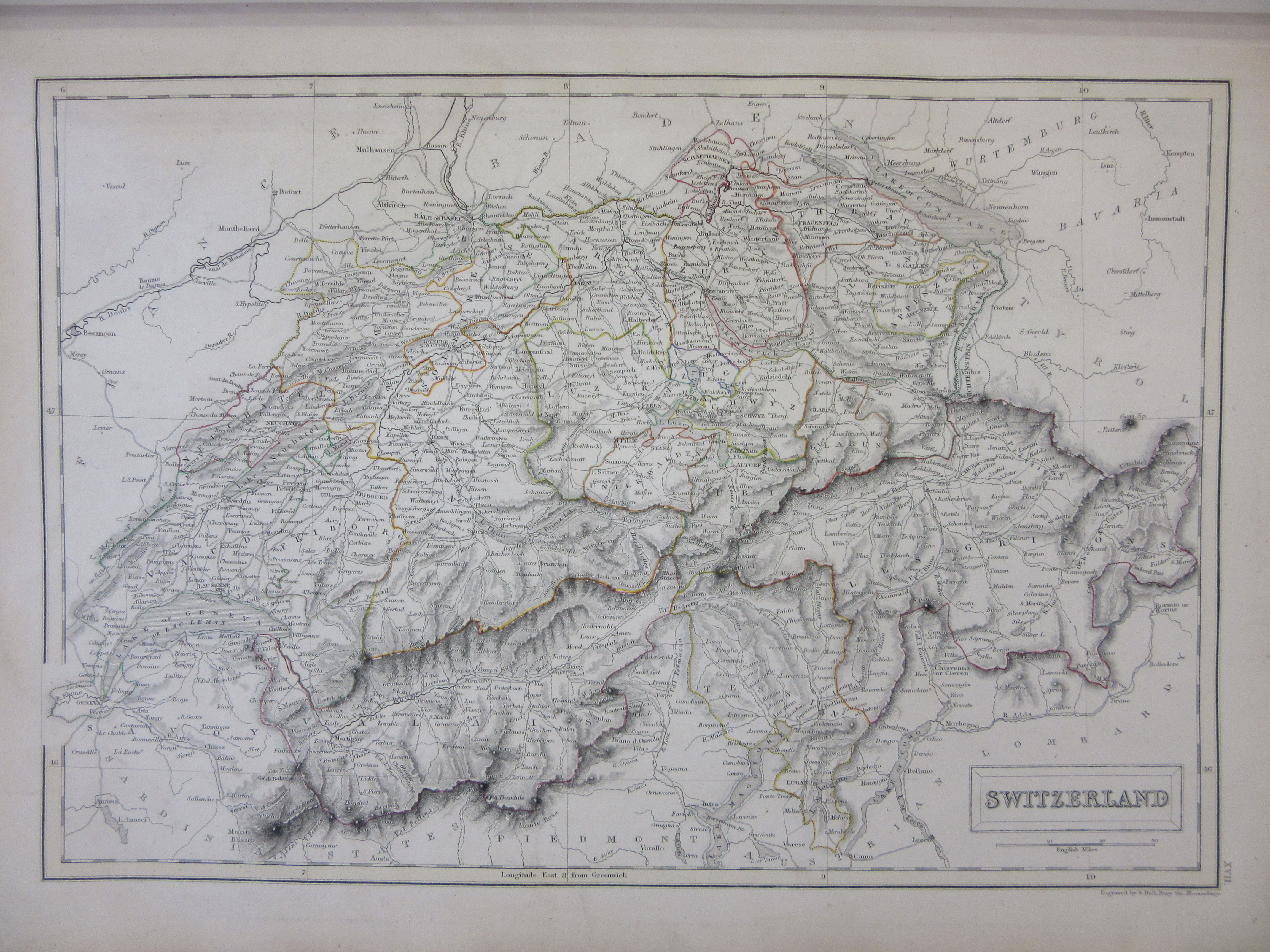
Switzerland. From Black’s general atlas, 1846. Allen LRO 80

Even works produced long after Sidney’s death continued to be attributed to him by researchers until recently, partly because his name was used to promote them at the time. The second map here is from Black’s general atlas of 1846 (first edition 1840); the title page boasts that the maps are “engraved on steel, in the first style of the art, by Sidney Hall, Hughes &c.” The signature S. Hall appears on this one.

Although Selina was an active and talented engraver, were it not for her husband’s untimely death we would have no evidence of her involvement at all. Which immediately raises the question: how many other female map makers, working in similar circumstances, are missing from the record?


Further info:

Worms, L., & Baynton-Williams, A.. British Map Engravers : A Dictionary of Engravers, Lithographers and Their Principal Employers to 1850. London: Rare Book Society, 2011.

Worms, L., ‘Hall, Sidney (1788/9?–1831)’, Oxford Dictionary of National Biography, Oxford University Press, 2008. https://doi.org/10.1093/ref:odnb/50861 (accessed 4 March 2020)

True north

We are used to having north at the top of our maps. This has been the most common orientation for hundreds of years, largely because of the use of the magnetic compass. Compasses do not, however, point exactly north. The northern magnetic pole wanders around the Canadian Arctic, and anyone requiring precise direction for navigational purposes needs to keep this in mind. It is common for maps to have a diagram showing the difference between magnetic and true north, as in this sea chart from 1870 (which also includes a date for the declination and, elsewhere on the chart, the current rate of change).

The discovery that the earth’s magnetic field fluctuates, and does not line up with its geographical axis, is nothing new. European navigators were aware of this issue from the fifteenth century. Edmond Halley had begun charted the magnetic declination across much of  the world at the end of the seventeenth century, and this map by John Senex from 1725, based on his work, shows the “Line of no variation in the year 1700” curving sinuously across the Atlantic. Lines of equal declination – isogonic lines – are marked around it.

This line where magnetic and true north coincide – properly called the agonic – is also in constant motion and we recently heard the exciting news that it is about to reach the Royal Observatory at Greenwich, so compasses there will point to true north for the first time in 360 years. More information can be found here on the website of the British Geological Survey.

London fields

It’s always fascinating to look at early maps of the outskirts of cities, as the landscape has often undergone an incredible transformation. This map of the parish of St Pancras in London is a wonderful example. Made 215 years ago in 1804, it shows the parish as an elongated shape stretching north from what is now part of London’s crowded West End. The first extract here shows part of the northern sheet.
The map is on 2 sheets oriented with west (approximately) at the top. Although north orientation was fairly standard by 1804, it’s not unusual for large scale local maps to be oriented in whichever way most conveniently fits the shape of the paper. The southern extremity of the parish is the junction between Tottenham Court Road and Oxford Street (now the site of Tottenham Court Road tube station) in the west, and Clerkenwell in the east. The streets of Bloomsbury are already densely built up but north of what is now Euston Road is mainly open fields. Camden and Kentish town are separate villages on the main road out of London. The canal, of course, was yet to come and the mainline railway stations that dominate the area now were far in the future. The extract below shows the area now occupied by St Pancras and Kings Cross stations, and the British Library; the main road running from top to bottom is now the Euston Road.

It’s also interesting to see the things that remain, or have left tangible traces. The Polygon, a then recent development of houses  in a circle facing inwards, was fairly recently built when this map was made; its name survives in Polygon Road nowadays. The Royal Veterinary College to the east of Camden was already established and is still there. On the northern sheet,  the more hilly landscape towards Hampstead and Highgate is represented by hachuring; the distinctive shape of the line of ponds across Hampstead Heath hasn’t changed much since 1804. Kenwood House, then the seat of the Earl of Mansfield and recently remodelled, still stands surrounded by its parkland, now managed by English Heritage. The oak tree under which people would gather to hear gospel readings is marked; Gospel Oak is still the name of a London district and a train station.

The map is very detailed and finely engraved; the accompanying written survey, or terrier book, explains that the mapmaker, John Tompson (also described elsewhere as Thompson or Tomson) had made it under the patronage of landowners who had property in the parish, “at the expence of upwards of three years labour.” The terrier is very thorough, listing the landowners, and identifying the individual land parcels (numbered on the map) by their use and area. All individual streets are described and their buildings listed. This is an exceptionally detailed record of an area now transformed almost beyond recognition.

Views from the sea

This collection of nineteenth century French sea charts has already been referred to in this blog last year, in a post dealing with some small scale charts used for route planning. Nearly a year later, I am still cataloguing the collection! The more detailed charts of particular coasts are fascinating too. One of the remarkable features of early sea charts is the coastal views they sometimes include, small thumbnail images showing the appearance of the land from the sea; these have been used for centuries. They clearly had a practical purpose, helping mariners to locate themselves, but they can be things of beauty too. The ones in these French charts are small, detailed, finely engraved views. Similar examples are found on British charts of the same period. 

In some cases these are quite dramatic. This view of the entrance to Grundarfjörður in western Iceland shows a forbidding mountain range. The fineness of the engraving and subtle shading gives the small picture an austere beauty perhaps like that of the landscape itself.

Similarly, this 1856 chart of Dyre Fiord (Dýrafjörður) in the remote north west of Iceland shows a forbidding coastline of dark cliffs. The chart itself, although mainly focused on the sea,  shows the coastal relief and gives an indication of the steep mountains rising around the fjord.

Both of these were engraved by S. Jacobs, who seems to have done a lot of work for the French Dépôt des cartes et plans de la marine. There are a surprising number of detailed French charts of this remote part of Iceland; the next chart in the volume shows the anchorages and the village of Hogdal (Haukadalur) in some detail. The larger settlement of Thingeyri or Þingeyri, marked here as Ting Eyre, was already an important fishing centre.

 The views in this last example are detailed depictions of individual seamarks. This image is from an 1868 chart showing part of the German coast (estuaries of the rivers Elbe, Weser and Jade). Here the natural landscape is flatter, and the distinguishing features that can be seen from the sea are artificial constructions. The pictures include a bell tower as well as lighthouses and buoys, and landmarks like churches and windmills are marked on the chart. The yellow blob at Bremerhaven is a lighthouse – they were all highlighted in colour, by hand, on these otherwise largely uncoloured charts.

All charts from collection B1 a.61. Plan du havre de Grone Fiord, 1858. Carte de Dyre Fiord : (côte N.O. de l’Islande), 1856. Carte des embouchures de la Jade du Weser et de l’Elbe, 1868.  All  published in Paris by the Dépôt des cartes et plans de la marine.

Playing with maps

The idea that playing cards could be illustrated with maps is a bit surprising, since maps tend to be on fairly large pieces of paper, and most playing cards are pretty small. However, early playing cards were often designed to be decorative and to serve an educational purpose as well as being for card games. So geographical subjects could feature, and these sometimes included maps.
The 39 historic counties of England, and 13 of Wales, together make up the convenient number 52 – the same as the number of cards in a standard pack. This perhaps inspired the first known example of geographical playing cards, a set made in England featuring all the counties, by the mysterious “W.B.” in 1590. Few of these survive and the Bodleian doesn’t hold any. The card maker is believed to be a W. Bowes, probably related to Ralph Bowes who received a monopoly to import playing cards in 1578, but attempts to identify this individual and establish a more precise relationship have been unsuccessful.


In 1676 the mapmaker Robert Morden issued a set of playing cards with maps of all the counties, each one showing a reasonable amount of detail for an area a little over 5cm square. Each little county map shows the main towns, roads, major rivers, and a scale bar, and is accompanied by information on the length, breadth and circumference of the county, and latitude of the main town and its distance from London. Small changes to the plates show that the set was reissued at least twice by 1680; the names of adjacent counties were not on the original version. The maps were also sold bound as a small atlas without suit marks. They were copied and the set issued again by John Lenthall, a playing card seller, around 1717. There was even a later version of the same set published in the 1780s, nearly a hundred years after they first appeared. The cards illustrated above are both from Lenthall’s issue of the cards.


Later in the same year that Morden issued his first set of county playing cards, William Redmayne published a competing set. The maps are very small and poorly drawn, and the suit marks (positioned in the middle of the cards) almost obscure the maps. They do however have more extensive text, with facts about the geography and history of the counties included. Differences in style between suits suggest that more than one engraver was involved, so perhaps the set was produced in a hurry. Despite the limitations of the maps, these must have sold reasonably well as a second set with minor changes came out the following year; again John Lenthall acquired the plates and issued a set some time in the 1710s. Lenthall sold many packs of cards of different designs; contemporary advertisements show that he had over 40 packs for customers to choose from. The cards shown above, from Redmayne’s second issue of the set, show the difference in style and in the amount of written information between cards.
Geographical cards with maps of countries around the world also existed, with the 4 continents then known to Europeans (Africa, Asia, Americas, Europe) serving as the 4 suits. But maps of the English counties seem to have been particularly popular. The maps shown are from the Bodleian’s John Johnson Collection of Printed Ephemera; the shelfmark is Douce Playing Cards: English Geographical.
There is a detailed analysis of map playing cards of this type published by the Map Collectors’ Circle (“Playing cards depicting maps of the British Isles, and of English and Welsh counties,” by Sylvia Mann and David Kingsley. Map Collectors’ Series No. 87, 1972)

The shortest distance between two points

We came across this map, on a very unusual projection, while processing a previously uncatalogued set of nineteenth century French sea charts produced by the Dépôt des cartes et plans de la marine. Most are standard nautical charts, but this one – part of a set of three – is extraordinary.  The world appears to have been turned inside out; the chart is centred on the central Atlantic, and the land masses are progressively larger and more distorted the further they are from this point. The other two charts represent the Pacific and Indian Oceans in the same way.

The title makes the chart’s purpose clear: ‘Carte pour la navigation par l’arc de grand circle’. A great circle is, technically, the point at which the surface of a sphere intersects with a plane passing through its centre. In practical terms, a great circle drawn on the surface of the Earth between 2 points will be the shortest distance between those points (the Earth is not, of course, a perfect sphere, but it is close enough for this to be of use).

Navigational charts are traditionally drawn on the Mercator projection. This has the great advantage of showing a line of constant bearing (rhumb line) on the Earth’s surface as a straight line on the map. This is the simplest course to navigate, as mariners have known for many hundreds of years, but it is not the shortest. The shortest route is a great circle, and this requires constant adjustment of direction to stay on course. Sailing ships were limited by the challenges of winds and currents, and early steam ships by the need to refuel, but from the 1870s this principle began to have more practical applications. A straight line drawn on this orthodromic chart is a great circle course between the two points it connects, enabling navigators to plan their great circle journeys relatively easily. These charts were published in 1879. 

Charts of this sort do not appear to have passed into common use, and there could be several reasons for this. For one thing, the difficulties of plotting a great circle course are sufficient to outweigh the advantages for all but the longest ocean crossing journeys. Mariners continued to use rhumb line navigation well into the late twentieth century, by which time GPS systems had come into use. When a great circle course was followed, for sea or air travel, it was calculated in advance, sometimes using a chart of this sort. The course would then be plotted onto a Mercator projection chart where it was easier to follow. 

The usefulness of great circles can be seen most clearly on a modern map of long distance air travel. This is why aeroplane routes from, say, London to San Francisco always appear oddly curved when viewed on a map, with the route going much much north than you would expect. This is a great circle course, and the shortest way to connect two distant cities. A demonstration can be seen on this useful site http://demonstrations.wolfram.com/GreatCirclesOnMercatorsChart/.

The charts were created by Gustave Hilleret, a naval lieutenant and teacher at the École supérieure de guerre navale, who also published books on navigation. The projection is the Gnomonic projection with Equatorial aspect; the charts’ Bodleian shelfmark is B1 a.61/1 [39-41].

The Great Game

This map of the north west frontier of India reveals some fascinating political manoeuvres. Produced in 1889 and titled simply ‘Afghanistan’, it shows the boundaries between British India and Afghanistan. It was made during the period sometimes described as the Great Game, when the imperial ambitions of Russia and Great Britain were fought out in the border regions of Afghanistan. 
The map is accompanied by a letter, dated 1890, from W.J. Cuningham of the Foreign Office in Simla, which makes clear that the map was intended to publicise the British view of the boundaries, but unofficially and in a rather underhand way.
The letter begins by explaining that a new official map of Afghanistan is to be produced, which shows the established boundaries, ‘… to the publication of which exception cannot be taken by other countries.’
The accompanying map – ‘unofficially prepared, for confidential use’ shows the actual situation on the ground, and the territories controlled by Afghanistan, Russia and British India. The map is a Survey of India unpublished proof, and boundaries, some of them complex, are marked by hand in colour.
The third part of the letter is most interesting. Having explained the need for an uncontroversial ‘official’ map, and a more controversial, secret, unofficial one, there follows the clear instruction to give an unofficial briefing to commercial cartographers. They should be given access to this unofficial map, as ‘it may be advisable to communicate to them the approximate boundaries, which … we should prefer to have marked in their maps.’ Commercial publishers were to be encouraged to produce maps showing the situation on the ground; in particular, they were ‘to indicate, as certainly not within Afghanistan, the belt of frontier tribes which intervenes between India and Afghanistan.’
The situation the map shows is a complex and confusing one. There is no key, but Afghanistan is outlined in blue, India in red and Russian territory in green. Between the red and blue lines there are territories enclosed by neither and marked ‘Frontier tribes’ – the Survey’s finely hachured relief making clear that the area is mountainous and inaccessible. The border between Afghanisatan and Pakistan now runs through the region; it was divided by the Durand Line in 1896 and is still disputed today.

A lady’s cruise

The Map Room recently acquired an intriguing map entitled ‘A lady’s cruise in a French Man-of-War.’ It shows a route beginning on the Malay Peninsula, which goes southeast through what is now part of Indonesia, to the coasts of Australia and New Zealand, and across the Pacific Ocean calling at many islands including Tonga and Hawaii, eventually ending up in California. The map was produced to accompany a book of the same title, in which Constance Gordon-Cumming gives an account of her travels in 1877 accompanying the Bishop of Samoa across his extensive diocese.

Constance Gordon-Cumming travelled widely throughout her adult life and published many works about her journeys, illustrated with reproductions of her accomplished watercolours. Titles include ‘At home in Fiji,’ ”Two happy years in Ceylon,’ and ‘Granite crags of California.’ She spent time with various bishops, the first governor of Fiji, and with General Ulysses Grant and his wife. Wealthy, well-connected, unmarried and independent, she appears to have had an unusually good time for a woman of her generation.

This particular work includes many observations on the societies she visited; their activities, traditions, homes and beliefs. When describing the animal worship of the Pacific islanders she shows a surprising degree of empathy, drawing parallels with the animal worship of the Anglo-Saxons still revealed in ancient English place names and in features such as the White Horse of Wantage. She criticises the massive international trading company Godeffroy of Hamburg: in Samoa their employees were encouraged to cohabit with female companions from the local community who they were strictly forbidden to marry, and were also advised to obstruct and exclude all missionaries. Throughout the book Gordon-Cumming describes the landscapes, the individuals she meets, the pleasures and privations; the book is really a succession of anecdotes, but an informative and good-humoured one. 

Maps and accounts like this, describing the route of a traveller, are not uncommon; the fact that the traveller in question was female makes this book more unusual. Although the title of the map and book refer clearly to ‘A lady’ as the subject (uniquely amongst her works), Gordon-Cumming’s name appears only as ‘C.F. Gordon-Cumming’ on the cover and title page, without a title or full name which would make her sex obvious; without looking closely one would conclude that the writer was a man. Possibly this was deliberate to make her books marketable;  J.K. Rowling had a similar experience far more recently, a fact which is worth remembering this International Women’s Day.

A silk escape map

The story of silk escape maps in the second World War is now deservedly well known. The maps, printed on silk as a resilient alternative to paper, were carried by Allied air crews to help them find their way home if they came down in enemy territory. Similar maps continued to be produced after the war, and the Bodleian has a small collection of maps produced in the 1940s and ‘50s. However, the recent arrival of a silk map in the Bodleian Map Room caused a certain amount of interest.  

For one thing, this map appears actually to be on silk. So called ‘silk maps’ were initially printed on silk that had been judged to be below the standard required for parachutes in the early 1940s. But once silk supplies ran out they were made of acrylic material that just isn’t as nice. This one is soft and silky and would make a lovely scarf.

The style of the map is reminiscent of the British silk escape maps of WWII. It has a utilitarian look – it was designed to be functional rather than marketable – with different islands on insets identified by letter codes. The lettering style, layout, and presence of print codes but absence of standard publication information are all typical of WWII era silk maps. It is however in only 2 colours (brown for the hill-shading, black for everything else) –  British silk maps from the same period were more often printed in 3 or more colours.

The map shows ‘Celebes’ – part of Indonesia and known as Sulawesi officially since 1945 – and surrounding islands. The map was made by the RAAF (the Royal Australian Air Force); copies are held in map libraries in Australia and the US, tentatively dated to 1943. It is the first Australian silk map to be acquired by the Bodleian. Its condition shows the resilience of this apparently fragile material – apart from a few loose threads at the edges, it looks as good as new.

Want to know more about the story of silk map production?

This website http://www.silkmaps.com/ gives general background on silk military maps
This article (beginning p.30) explains the role played by MI9 http://www.defencesurveyors.org.uk/Images/Ranger/Ranger%20Volumes/Ranger%20Summer%202009.pdf
The article ‘Wall tiles and Free Parking’ http://www.mapforum.com/04/april.htm tells some of the story behind the silk maps’ production in Britain and their use in a POW camp.

For a more detailed account, the book ‘Great escapes’ by Barbara Bond (Glasgow: Times Books, 2015; ISBN 9780008141301) is a fascinating read.

Oxford Bus & Cycle Map

Bus & Cycle map cover

Many Bodleian Library staff commute by bicycle and a number are keen cyclists, so the arrival of a new edition of the Oxford Bus & Cycle Map was greeted with enthusiasm in the Map Room, especially the side of it showing cycle routes. The map was produced by Richard Mann of Transport Paradise, whose site offers advice on improving urban transport with examples from Oxford and elsewhere. The cycle map is an innovative product in that it attempts to show two complete cycle networks. A quieter one (suitable for family and leisure cycling) is shown in blue, with routes through quiet streets or away from the roads altogether, through parks and beside the river. Meanwhile the main cycle commuter routes are shown in red; a complete, joined up network, with dotted lines to identify those parts of it where cycle provision is poorer, rather than a patchy network of good cycle routes – a pragmatic approach, since the cyclist will have to find a way even when it is less than ideal. An extract showing the city centre is shown below.

cycle map city centre inset

The clever design of the bus map on the reverse does a good job of unscrambling Oxford’s sometimes confusing bus route network. Four colours – red, blue, green and yellow – are used to group the main routes, to make it easier to follow them visually through the concentration of routes in the city centre. The frequency of services is indicated by solid, dashed or dotted lines.

Oxford’s centre is constantly busy, thronged with crowds of students, tourists and locals. Travelling into it by car is slow and parking is expensive. Use this map instead!

Oxford bus & cycle map. Oxford: Transport Paradise, 2015. C17:70 Oxford (249)