Author Archives: stuart

…and in less than a quarter of an hour went all to pieces…

Before the introduction of the first Admiralty Chart by the Hydrographic Office of the Navy British- produced nautical charts were published by independent map-makers. In the case of the map featured in this blog Laurie and Whittle. Robert Laurie and James Whittle took over the map making business of Robert Sayer in 1794, and this map, drawn in 1786 but published in 1794, must have been one of the first the duo made. The company still exists today, producing maps and charts under the name ImrayLaurie, Norie and Wilson. Laurie was a skilled artist and engraver and presumably was responsible for the fine cartography and views on display on…

A new chart of the Southern Coast of Africa, from The Cape of Good Hope to Dalagoa Bay; including The Bank of Cape Agulhas, its soundings, currents within and without & c. is a remarkable chart for a number of reasons.

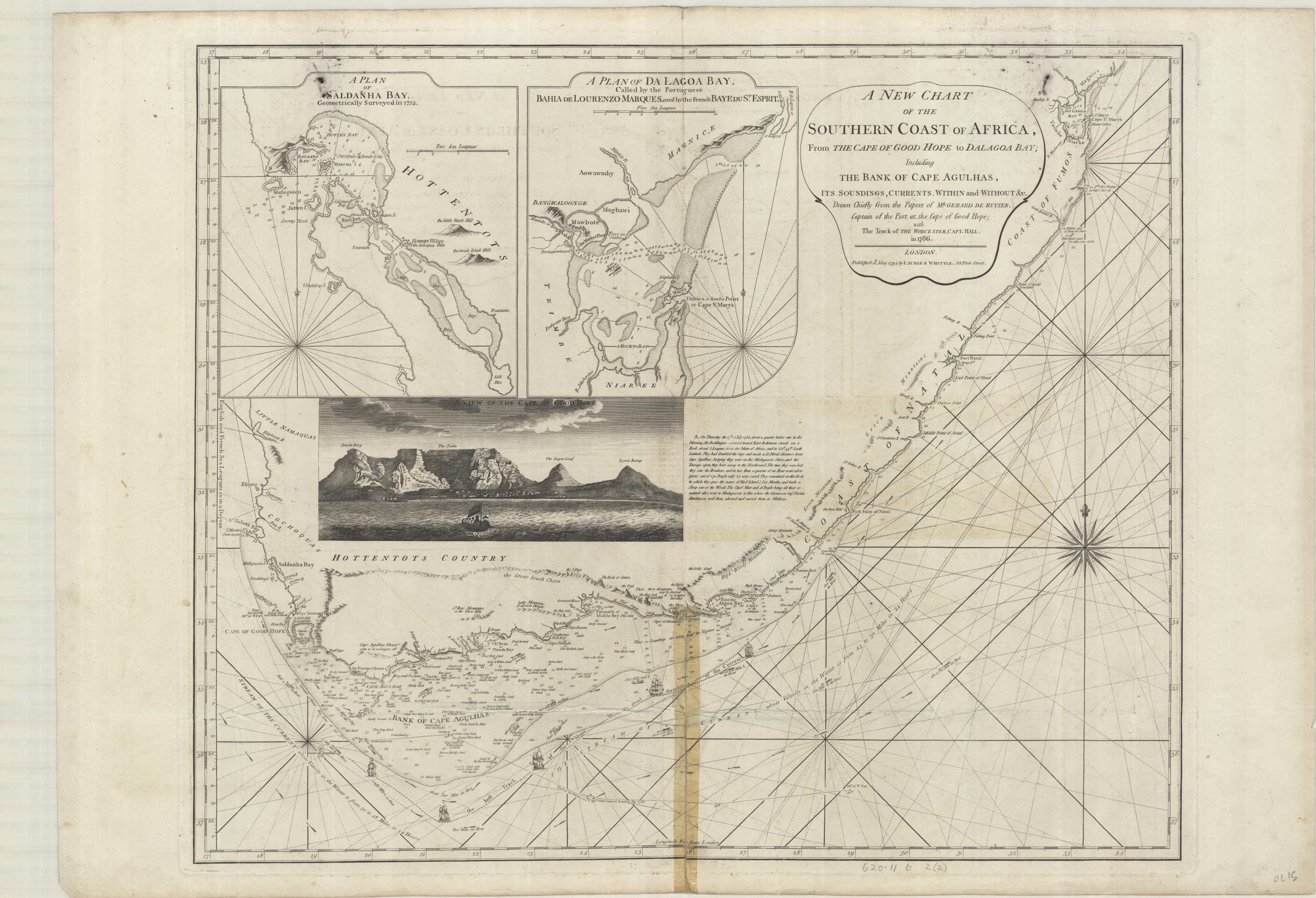
The skills involved in the creation of the map are evident, from the engraving to the information on depths and sea-floor sediments in the Bank of Cape Agulhas to the artistic representation of the view of the Cape of Good Hope.

The map plots the course around the Cape, an important but dangerous part of the journey to and from the Indies for European shipping. To aid in this journey the area to the south of the Cape, the Bank of Cape Agulhas, is prominently featured, showing both the extent of the bank to stop ships running aground and the depths and constitution of the sea floor. Sea depths, called soundings, would have been recorded by lowering rope with a lead weight attached, which may have a waxy substance added to the bottom which would pick up sediment. Judging by the amount of information shown this was considered an important place to survey and was presumably a tricky place to sail over. That the Bank was navigable can be seen by the course that the Worcester took on the outward bound journey from Britain to India in 1786. The Worcester was an East Indiaman (which is a general term for a ship of any European nation with trade links with India) which made a number of journeys to the Indies between 1786 and 1809, journeys which would usually take two years to complete. It may seem strange to focus on the journey of one individual ship, the intention being presumably to show the route taken as an example for those using the chart to plot their own progress round the Cape, as the Worcester has plotted a course to battle against as little head-current as possible. The map also shows the best line for taking advantage of the currents going round the Cape from a westerly direction, giving information on how fast the currents travel as well as the best course to take to make the most of the currents (‘the best track of the ships to avail themselves of the current’). Currents are also shown on the Bank, hence the …currents within and without … part of the title. Two large insets show safe harbours, both detailing rocks, good  anchorage and depths.

In this extract of the Bank of Cape Aguihas the routes of both the Worcester (the straight dotted line in the centre of the image that then goes off at an angle to the bottom right) on the outbound journey while the route to take best advantage of the currents for those heading home follows the line of the three ships. The make-up of the sea floor is clearly shown. The importance in plotting currents, especially in the age of sail, can be seen in the amount of times they feature on maps, both nautical and general. This map, again published by Laurie and Whittle in 1794 shows currents in the Indian Ocean, highlighting the importance of this part of the World for European trade. Unlike the main map in this blog, which would have been made from existing plates in Sayer’s collection this is a copy of a French map from 1776.

A chart of the currents in the Indian Sea during the southwest monsoon, to the northward of the line, 1794. (E) L1 (143)

The map below is an extract from Africa divided into its several regions (1792), by the person that Laurie and Whittle first worked for, Robert Sayer. The pair bought all existing stock and plates and took over his premises when Sayer died in 1794. At the southern tip of the continent is a less detailed portrayal of the Bank.

Ironically, for something that deals with the safe passage at sea, the most dramatic part of the map deals with a shipwreck. ‘On Thursday the 17th July 1755, about a quarter before one in the morning, the Doddington, outward bound East indiaman, struck on a rock about 3 leagues from the Main of Africa, and in 33d. 44m. south latitude. They had doubled the Cape…the time they were lost they saw the breakers, and in less than a quarter of an hour went all to pieces : out of 270 people only 23 were saved. They remained on this rock (which they named Bird Island) six months, and built a ship out of the wreck, the Chief Mate and 16 people all that were left alive, went to Madagascar in her…’. Bird Island is still named thus, and there is a Doddington Rock nearby, on the inset at right Bird Island is just to the east of Algoa Bay. Like the Worcester the Doddington was part of the fleet of the East India Company. Formed in 1600 to look after British trade the EIC eventually colonised large parts of India and Southeast Asia and pretty much ran India for the British Government following the Battle of Plassey in 1757 until corruption  and mutiny forced the Crown to take  control in 1858.

This fold-out map comes from a book (A journal of the proceedings of the Doddington, East-Indiaman, from her sailing from the Downs till she was unfortunately wrecked on some rocks on the East Coast of Africa*)  written by one of the survivors, Mr. Webb, one of the ship’s mates.

The book describes how the ship set sail on April the 23rd, 1755, taking seven weeks to get to the Cape. Then disaster strikes early on Thursday, July 17th, as the ship is wrecked on Bird Island. Despite breaking an arm and being being told by the Captain that ‘we should all perish’ Webb managed to get to Bird Island and eventually take part in the journey on a boat made from the wrecked remains 6 months later to Madagascar.  On this extract from the map Bird Island is the central rock A while the rock marked F is believed by Webb to be the one the ship first hit before being driven by the high seas onto Bird.

At some point before coming to the  Bodleian the map has been repaired with sellotape, so this will have a trip to conservation to restore it back to its former glory.

If you have enjoyed reading about nautical charts then more can be found here  , a blog telling the story of a chart made for Samuel Pepys, while a blog about a map made by fellow diarist John Evelyn for Pepys can be found here , and a blog about beautifully engraved French charts can be found here

*203 g.233. c.1756

A new chart of the Southern Coast of Africa, from The Cape of Good Hope to Dalagoa Bay; including The Bank of Cape Agulhas, its soundings, currents within and without & c. 1794 620.11 t 2 (2)


Road maps, but not as you’d imagine

Two contrasting road maps from the early to mid 1700s. One, by ‘Emanuel Bowen, Geographer to his most Sacred Majesty K. George the 2nd’ is straightforward. By including approximate coastlines and county boundaries Bowen is able to map roads in a conventional way, as in they go where you’d imagine them to.

A new and accurate maps of the roads of England, 1748. Gough Maps England and Wales 29

This certainly isn’t the case with the second map. George Wildey, selling prints and maps from the ‘west end of St. Paul’s Churchyard’,  sets out in linear form a guide which ignores the natural curves of the roads shown and includes in order the towns passed through on main and side routes. The map also includes information on market days, distances between towns and if the town or city has a special status (university, post town, bishopric).  With it’s straight lines it could almost be a map of the Roman roads.

The grand roads of England c1720. Gough Maps England and Wales 18

Bowen shows things geographically and with roads crossing over other roads, as they do on the ground, meaning locations aren’t forced to appear out of place. On the Wildey map because of the rigid need to show things in a straight line and to keep things as clear as possible locations, especially in the crowded western side of the map, are forced into strange places. Wildey also doesn’t show distances between places, instead he gives an idea only by the miles between one location and the next. Take Bristol. This busy port appears as expected on a route coming west out of London which when it gets to the city branches out to Exeter and Banbury. Bristol also appears at the top left, at the end of a route that leaves Chester travelling south through Ludlow and Hereford. This Bristol is located on the map between Hollyhead and Hollywell (Holyhead and Holywell) in North Wales. Gloucester as well crops up in a few stranger places, and again it’s when side routes branch out from hub cities. Wildey’s map becomes less a cartographic object and more an itinerary, a list showing to get here you need to first go here, and here, and here.

According to the text in the cartouche Bowen’s map is made ‘according to Ogilby’s survey’. This is the famous  set of maps published in 1675 by John Ogilby. We blogged about his remarkable life, the maps that made him famous and the possible hidden agenda behind them here http://blogs.bodleian.ox.ac.uk/maps/2020/11/12/measuring-distances-a-wheel-or-a-chain/ 

Bowen’s map does include some cartographic peculiarities. Shipping routes across the Channel to join up with Calais and Helevoet Sluys (now Hellevoetsluis, South Holland) show as if they are roads across the sea, in the case of Calais an early taster for a later tunnel under the water. Bowen also includes notes on features to look out for when travelling, ‘Remarkable things worthy a curious traveller’s observations on some of the principal roads described in this map’. For instance, ‘Near Basingstoke is Basing House belonging to the D. of Bolton. Tis famous in history for withstanding several sieges in the beginning of the Civil War till at last was taken in storm by Cromwell and burnt. His being enraged at the words LOVE LOYALTY wrote with a dyamond in all its windows’.

Wildey’s map appears confusing and unconventional but the theory behind it is good and has survived today in maps which show information such as travel routes where the need to give clear information overrides any need for geographical accuracy. The most famous example being also one of the most used maps to have been published, the London Underground map.


Same but different

Location names get repeated throughout the World. Old and New York, Egyptian and Elvis Memphis, the list goes on and on. No one pair or group can have such a distance between them, and such a difference in what they are, as the Milky Way.

Der Südliche Sternenhimmel, c1899. A1 (42)

The Milky Way is one part of the Spiral Galaxy that includes our Solar System. Stars in their billions, so numerous that they appear as a river of milky light in the night sky. It is thought that there are as many planets as stars amongst the light. As with everything in the Universe size and distance defies belief, the width of the Milky way visible from Earth is 1000 light years across (light travels at 186,282 miles per second, 299,792 km, so in one year light travels 5.88 trillion miles, 9.46 trillion km. A trillion is one million million).

Here’s the Milky Way in two maps. First is a German map of the Southern Hemisphere from circa 1899 by the prolific Justus Perthes publishing house in Gotha. And then a later English map of the Northern Hemisphere from George Philip and Son in 1959. This is one part of a larger map which includes an equivalent  map of the Southern Hemisphere, a larger map of the Middle Heavens and lists and charts of stars and clusters. It’s easier to see from the Philip map how the Milky Way got its name.

Philips’ Chart of the Stars, A1 (10), 1959

The Milky Way is also a narrow bit of water between Noir and Kempe Islands at the western side of the Tierra del Fuego. It gets its name for the same reason, a milky appearance from a frothy stretch of white water. A book published in 1847, the North and South Atlantic Memoir, describes it as ‘a space of sea, in every part of which rocks are seen just awash with, or a few feet above, the water; on them the sea continually breaks’. The gentle name belies a dangerous passage between the islands with rocks clearly seen on the chart, a danger to any passing ship.

This extract comes from an Admiralty Chart of the Magellan Strait from 1887. The names on the chart give an indication of the hard landscape and dangerous sailing which abound. ‘Useless Bay’, ‘Desolate Bay’, ‘Famine Reach’, and the high number of narrow channels, many of which lead to a dead-end, show how hard it must have been for early explorers to navigate as opposed to sailing round Cape Horn. No wonder Magellan took so long to find a passage through.

Magellan Strait (formerly Magalhaen) sht 554, 1887

This chart shows the skills involved of the surveyors who measured, took soundings, kept records as well as lived onboard ship in such a harsh environment and the cartographers who then transferred this jumble of information on to a map. One of these surveyors was Commander Robert Fitzroy, of His Majesties Ship Beagle. This was Fitzroy’s first journey through Tierra del Fuego, his second, and more famous, was with Charles Darwin aboard as a companion and scientific officer. It was on this voyage that Darwin, after making numerous studies on the natural history of the lands explored on the voyage formed his theory of natural selection. In his book ‘The Voyage of the Beagle’ Darwin wrote ‘We passed out between the East and West Furries: and a little further northward there are so many breakers that the sea is called the Milky Way. One sight of such a coast is enough to make a landsman dream for a week about shipwrecks, peril and death…’. Fitzroy went on to become an expert on meteorology, forming what would become the Met office in 1854 and created ways to predict weather patterns, something which he gave a new name to, forecasts. A fervent Christian Fitzroy was horrified by the publication of Darwin’s ‘Origin of the Species’, the effect it would have religious beliefs and his role in helping Darwin form his theories by taking him on the Beagle voyage. Depression ran in his family, and Darwin’s fame together with financial difficulties and trouble with the Met Office led to Fitzroy taking his own life in April 1865.

Darwin’s importance can be seen in this  extract from the chart, with Darwin Sound and Beagle Channel appearing on a map just under 30 years after Darwin published his ground-breaking work.


Woodcuts

The easiest way to get round the age-old problem of portraying a three dimensional landscape on a flat piece of paper? Make a map that in itself is three dimensional. Freed from traditional European conventions dating back to Ptolemy peoples from different cultures could, and did, express themselves and their surroundings in a way alien to those with a ‘European mindset’ that made sense to those with a shared culture. Examples are numerous, ranging from the stick charts made by Polynesian navigators to the Medicine Wheels of North America, which enabled their builders to predict seasonal changes by astronomical observations (European prehistoric stone circles had a similar function). It is this freedom that enables the cartographer to use what ever material is suitable, as the Inuit hunter Kuniit has done with these maps made from wood, an ideal medium to portray a rocky and indented coastline.

The maps were made in a settlement on Greenland’s eastern seaboard, Ammassalik, by Kuniit, who sold them to the Danish Naval Officer and Arctic explorer Gustav Holm during Holm’s expedition to south-eastern Greenland using traditional Inuit boats between 1883 and 1885. The originals are in the Greenland National Museum and Archives, these are facsimiles made for the 23rd International Conference of the History of Cartography, held in Copenhagen in 2009.

At first these two maps appear hard to interpret, but a little bit of reading sheds some light. The surrounding coastline is a jumble of Fjords and off-shore islands, and it is this area north of Ammassalik that the two pieces map. The broader of the two shows the coastline while the longer the off-shore islands. Small nodules mark the places, according to Holm’s interpretation, where old settlements were sited and which proved good places to land a boat while the grooves over the ridges (shown here) show places where kayaks and small boats could be portaged around headlands when the seas were blocked by ice.


One of the more interesting aspects about the maps is how they portray the coastline, because the wooden blocks mirror the way the coastline wraps around the land. When used to journey around the inlets and islands north of Ammassalik the blocks would be continually turned to face the direction of the land shown on the blocks, north being very much a moveable concept. Also, the top features on both sides of the broader piece represent areas furthest away from each other on the map, as you drop down the wooden block, on both sides, the locations get closer together. Compare the blocks to the maps of the area, shown here, in this extract from Fishing chart of Southern Greenland & adjacent seas, 1906. M4:7 (1)

The top part of the thinner of the two wooden maps corresponds to Storö (a) on the paper map. As you drop down the wooden map the features match up with the paper as if you were sailing around them, so for insistence the penultimate island on the wooden map matches up with the island Morene (to the left of b) on the paper, so despite starting at the top with a northern orientation you now need to rotate the wooden block to face south to get it to match up with the coastline of Morene.

The same principles work with the larger wooden block. The top right corresponds with the northern side of the inlet above Storö  (1), with the first inlet on the wooden block representing the small fjord above Storö (2). The right-hand side carries on down the coastline, ending up with the last section matching the small peninsula above the island of Stenö. Then the left-side of the larger block starts at the far extreme of the wooden blocks range, with the top sections representing the headlands above the settlement of Sermiligaaq (4) before ending opposite Morene (5). As can be seen there is a natural flow to the wooden blocks in harmony with the land they map. A fluid approach to orientation allows for a design that is as uncomplicated as possible, despite first appearances.

The question is though how useful this would be to the Inuits of the area. To be be able to map an area so well would suggest that for your own use you wouldn’t need to map it in the first place. So were these blocks made as a navigational aid for Holm, who presumably had existing maps and charts of the area already, or with the onset of European exploration in the region were they made to sell, as souvenirs in much the same way that the majority of the Polynesian stick charts that exist today were made towards the end of the nineteenth century for European explorers?

Gustav Holm wrote a number of articles in the Danish journal ‘Meddelelser om Grønland’ (Notices of Greenland) about his travels around King Christian IX Land, which were illustrated with a number of sketches, photographs and a map. One of the sketches is of the wooden blocks, where it can be seen that there was a third made, which covers the area around Ammassalik between the fjords Sermiligaaq (Sermiligak on the map, top right) and Kangerdlwarsikajik (Kangerdluarsikajik on the map). Identifying places isn’t easy as spelling isn’t consistent across available maps, with places even spelt in slightly different ways between the text and the maps in Holm’s articles!

As can be seen in these sketches of the three wooden blocks the two blocks that were reproduced for the 2009 Conference have numerous references next to key points which correspond with a page of text next to the image. The image on the left doesn’t have these, and in the text is given the briefest of mentions (‘Fig. 3 represents the halfway between the fjords Sermiligaaq and Kangerdlwarsikajik’) which suggests that when It was given to Holm it was either too old or too inaccurate to be of use. It certainly doesn’t have the sense of newness that the middle and right-hand maps have.

This map and image of the wooden blocks come from ‘Meddelelser om Grønland’, 1888. Gen. Per 22

Information on the maps came from the The History of Cartography, vol. 2, book 3, Cartography in the traditional African, American, Arctic, Australian and Pacific Societies, edited by David Woodward and G. Malcolm Lewis,1998 G24 B1.100 (2iii)

The coastline 100 km northward from Ammassalik, East Greenland made by the Inuit hunter Kuniit from the Umiviik settlement in Ammassalik Fiord, 2009 M4 d.1


Te pito o te henua

5. [April, 1722]. Saw a turtle, floating weed, and birds. About the 10th glass in the afternoon watch the African Galley, which was sailing ahead of us, lay to wait for us, making the signal of land in sight…a low flatish island lying away to starboard, about 5 1/2 miles off…and to the land the name of Paásch Eyland, because it was discovered by us on Easter Day.

This extract from the log of Mynheer Jacob Roggeveen dated the 5th of April 1722 describes the first sighting by Europeans of one of the most intriguing as well as isolated lands in the World, Easter Island, Rapa Nui, the Navel of the World (Te pito o te henua). The nearest inhabited land, Pitcairn Island is over a thousand miles away, mainland South America over two thousand. Easter Island is very remote, making the journey there by the original Polynesian explorers  all the more remarkable (there is some doubt as to when this was, with some believing it to be as early as 800, others as late as 1200, roughly the same time that New Zealand was first populated).

This copy of an admiralty chart from the Hydrographic Office of the British Navy dates from 1868, and gives no indication of the mysterious stone monuments found on the island, unlike this earlier map which comes from the voyages of Captain Don Felipe Gonzalez, in the ships San Lorenzo and Santa Rosalia. Gonzalez named the island San Carlos, and drew both the map after taking soundings and also the perspective, including some of the statutes, the Maoi,  the ‘ídolos uamados moay’. The letters off-shore on the smaller plan relate to the make-up of the sea bed.

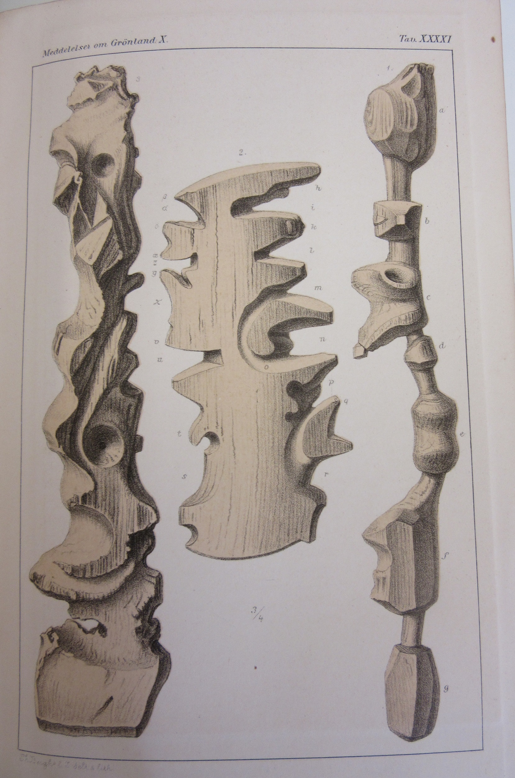
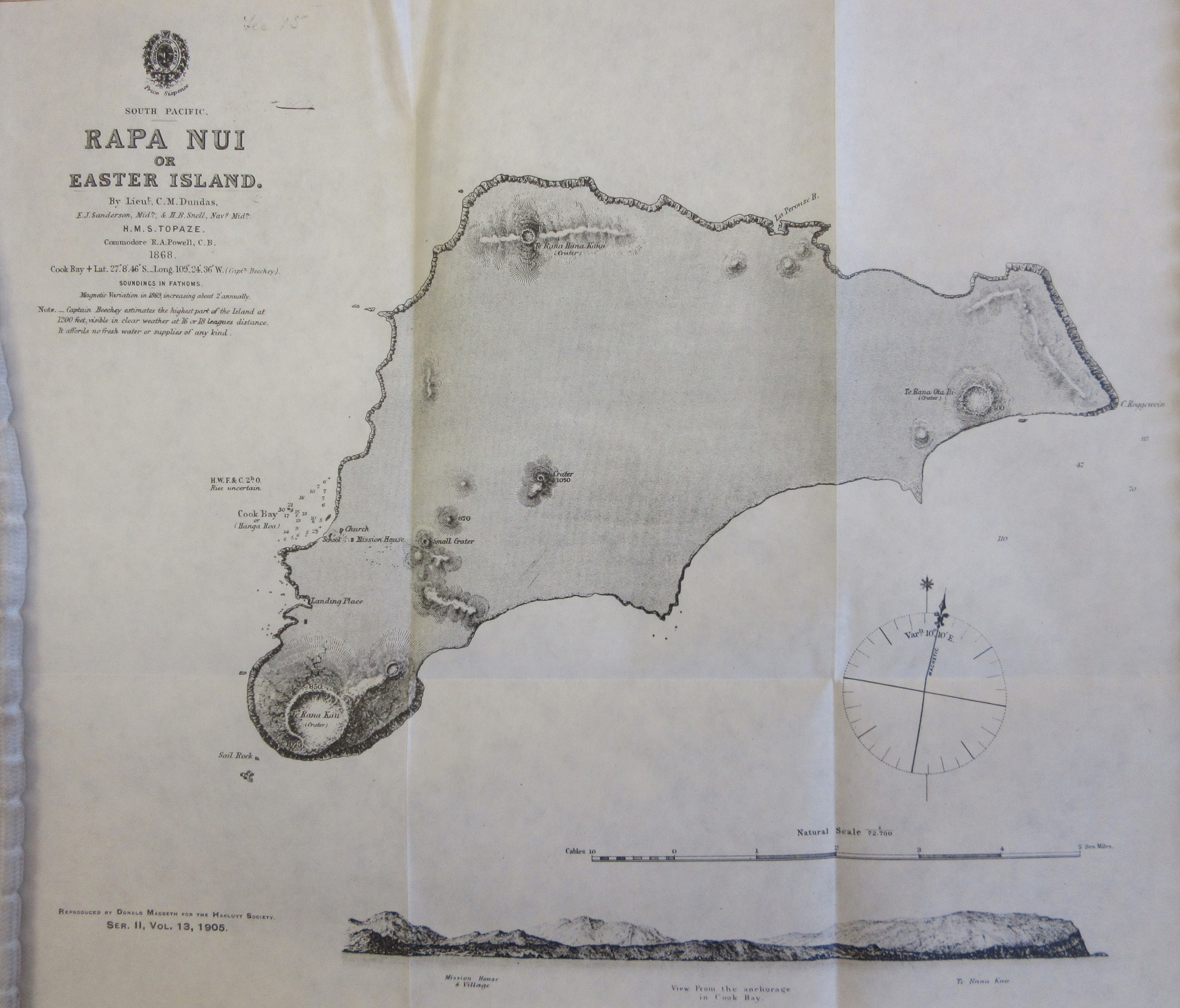
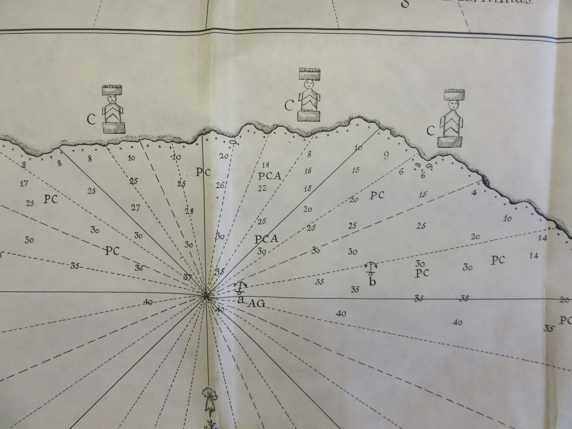
These maps come from a remarkable collection of reproductions of original books on early exploration and travel published by the Hakluyt Society. Formed in 1846 and originally intended to be called the Columbus Society at the first meeting it was decided that Sir Richard Hakluyt (1552-1616), a writer and collector of travellers tales, better reflected the goals of the Society. The first chairman was the famous geologist Sir Roderick Murchison. This image shows Roggeveen measuring one the Maoi, one of the 887 listed either on the island or in museums throughout the World.

The Voyage of Captian Don Felipe Gonzalez to Easter Island, 1770-1; preceded by an extract from the official log of Jacob Roggeveen in 1772′ 1903. G31 B1.1 / NS 13.


A very dark Dark Ages

The Ordnance Survey are justifiably famous for the Explorer and Landranger maps that guide us on so many walks and journeys.  They have also, for the last 100 years, produced specially themed historic mapping. The first was a map of Roman Britain in 1924, soon followed by maps of XVII Century Britain and the one featured in this blog, Britain in the Dark Ages. All the maps had text attached and all featured beautiful covers designed and drawn by Ellis Martin, an artist working for the Ordnance Survey who has featured a number of times on our blogs (here, and here)

The library has acquired some old pre-publication material from the Ordnance Survey via a recent donation of maps. Along with some surveyor drawings there are a number of early attempts in design for these historical maps, most show markings where errors have been made but this early attempt at the Dark Ages map took us by surprise. It isn’t hard to see why this was rejected and a whole new design sold to the public instead.

Dedicated with great disrespect and contempt…

In a collection that has it’s fair share of strange maps (‘Naughty Norman’s London sex map’ anyone?) this has to be one of the strangest.

A new & exact map of Toryland, with the dangerous rocks & shoals of all the Jacobite Islands lying in the same parralell with the Red Sea, whose lattitude is 1588 & longitude 1714. Dedicated with great disrespect & contempt to the Knight of ye Warming Pan & King of No-Land ye Pretender & all his Brainless adherents’. 

Where to start? The Knight of the Warming Pan was James Francis Edward Stuart, the Old Prentender, the son of the last Catholic King of England, James II. His mother, Mary of Modena was considered past child-bearing age (a stately 29 at the time of the birth) so it was suspected that a baby had been smuggled into the bedchamber in a warming pan, in an attempt to keep a Catholic succession in place. 1588 is the date of the Spanish Armada while in 1714 George Louis, a Lutheran Prince from Hannover in Germany who was the closest relative to the recently deceased Queen Anne became George I. The fact that the crown was now in the hands of a foreign national who didn’t speak English didn’t go down well with James, who would have been King if his father hadn’t been deposed during the ‘Glorious Revolution’ of 1688, restoring Protestant rule with William III, William of Orange as was.

The Jacobite Rebellions were attempts in the Seventeenth and Eighteenth Centuries to restore the House of Stuart to the throne. This map is a cartoon satire against that, the ‘dangerous rocks and shoals’ that surround Toryland are symbolical of the dangers that sailors face when navigating around dangerous shores while Toryland itself is full of warnings about what a Catholic monarchy would mean; ‘Restoration of Abby land’ (as in a return to the Abbeys and Monastery’s in place, and all the supposed corruption and indulgencies associated with them from before the Reformation), the Bishoprick of Rome, arbitrary government and absolute monarchy amongst others. The islands and shoals surrounding are also full of danger; No parliaments, loss of trade and no juries featuring here amongst others, as well as the island of ‘D-m me I’m in high church, & ye Presbyterians are Sons of Whores’.

Nearly off the map is Whig Island, a land of Protestant and English  tradition. Here we find safety in ‘Magna Charta’ land, ‘Parliamentary Right’ and ‘Hannover Succession Rock’.

Like all maps trying to make a serious point this works because it looks like, and uses, standard mapping practise. The compass rose is an example. Traditionally used to show the compass directions in this case the compass points to people prominent in the Jacobite movement.

The compass also has a dual meaning. In mapping terms it shows direction, shows the right and wrong way to go, and this can be compared to a moral compass, which has the same purpose, to show the right and wrong way to live your life. Other stock mapping traditions can be seen in the way that rocks and dangers are portrayed, the use of crosses is both common on nautical charts of the day to show rocks but also has religious overtones while the language in the title is similar to that of other maps, ‘Great disrespect and contempt’ mirroring the dedications on many maps to rich and influential people (see here for example)

There are a number of variations of maps making a point by pretending to be a serious cartographic work, a blog about a religious example can be found here, while political versions can be found here. These ‘imaginary maps’ have a long cartographic tradition, and can be seen to have their origins in the maps painted on the walls of Egyptian Tombs to show the departed souls the way to the underworld and continue with Thomas More’s map of Utopia through to the cartoon maps linked above to famous recent examples such as the classic Guardian April Fools from 1977 April fool – San Serriffe: teaching resource of the month from the GNM Archive, April 2012 | The Guardian Foundation | The Guardian

fol. Delta 755

The voyage of the Hero

Admiralty Charts have a reassuring familiarity about them. The Hydrographic Office of the Admiralty first started publishing maps in 1800 and this map from 1860 uses cartographic conventions still in place today. This sense of timelessness comes from the charts concentrating on hydrographic information; soundings, rocks, beacons and so on, features that don’t alter over time. Almost all our cartographic charts in the Bodleian come from legal deposit in pristine condition. I say almost because we do have a number of donated charts as well. What is special about this particular donated map is that it is a chart that has been used, a course has been plotted of a voyage made between July and August of an unspecified year by an unknown ship. A chart used as intended.

North Atlantic Ocean, published at the Admiralty, 18th June, 1860. B1 a.19

The challenge is to try and discover more about the journey, which really comes down to when and what ship? All we have to go on when looking at the chart is the route, from Southampton across the Atlantic to Quebec, with positions at noon each day from July 10th to August 18th. A seemingly impossible task but there is a clue separate from the map. The chart is one of a number bound up in a volume with the simple title Charts of the Gulf & River St. Lawrence by Capt. H.W. Bayfield, R.N and on the contents page there is a hastily written note in pencil that is the key to the mystery . Sir Henry Acland has a strong connection with Oxford and the Bodleian. Born in Exeter in 1815 Acland became a Fellow of All Souls College and then in 1851 Physician to the Radcliffe Infirmary and Radcliffe Librarian in the Radcliffe Camera which had been, since built, the home of the Radcliffe Science Library. It was during Acland’s time as Librarian that the collection of books moved to a new Radcliffe Science Library and the Camera became part of the Bodleian. This explains Acland’s close relationship with the Bodleian, and the reason why he donated the set of nautical charts to the library in July 1880.

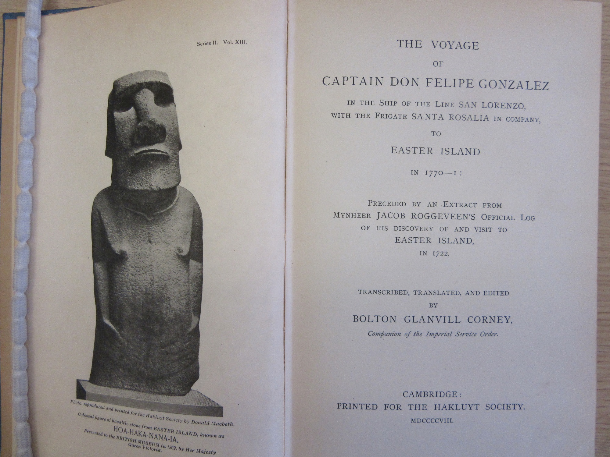
An extract from the chart showing the route taken to Quebec, sailing through the wonderfully named Gut of Canso (also called the Gut of Canseau) between Nova Scotia and Cape Breton Island.

Research into Acland’s life then explains the rest. In 1860 he became physician to H.R.H. the Prince of Wales (who later became Edward VII) just before he went on an official trip to Canada and the United States  onboard H.M.S. Hero, the first time a Prince of Wales had made this journey. The map charts the daily position of the Hero as it voyaged across the Atlantic.

The Gut of Canso (here called Canseau) taken from one of the other charts in the volume. The numbers are soundings while the yellow colours show the positions of lights, which could either be fixed (indicated by the letter F) or revolving (the letter R).

In Oxford Acland is famous for a map made six years before the voyage of the Hero. In 1854 he produced a report on a series of Cholera outbreaks in Oxford which had led to a number of fatalities. It came with a map which highlights the poor sanitary conditions in parts of the city (the areas shaded in green) , the parts of the Thames contaminated and unsafe to drink and the locations where there were cases of Cholera (more on the map can be found here). 

Map of Oxford to illustrate Dr. Acland’s memoir of cholera in Oxford in 1854… 1854. C17:70 Oxford (15)

The Acland Hospital, so long a feature on the Banbury Road in Oxford and now at the Manor Hospital in Headington was built as a memorial to Acland’s wife Sarah. A daughter, also called Sarah, was an early photographer, some of her work can be found in the Museum of the History of Science in Oxford.

In the year after the voyage a book was privately published by Gardner D. Engleheart. ‘Journal of the progress of H.R.H. the Prince of Wales through British North America and his visit to the United States… (203 a.333)’. The book includes illustrations and text about the visit and, helpfully for the purpose of this blog and identifying the map, a log of the journey out giving positions at noon on each day as well as a number of different diary entries from the voyage. So for instance we learn that the Royal Yacht (the Hero) ‘with the Prince Consort sailed at 4 a.m.’, presumably to catch the tide. Then, far more dramatically, from a different diary on the 12th ‘Man overboard! The gun-room steward jumped out of one of the ports, in a fit of temporary insanity, and was drowned! Every effort was made to rescue him, but he would not be saved.’

Dryness pleaseth…

This beautiful map of the Bedford level lying between The Wash at the top of the map and Cambridge at the bottom shows the distribution and use of land of the Great Fens, an important wetlands site that had been drained in the seventeenth century.

To the most noble the Governor, the Bailiffs, and Conservators of the Great Level of the Fens, called Bedford Level, this map of the said Great Level and parts adjacent is most gratefully dedicated by Samuel Wells. 1829 (E) C17:17 (7)

The draining of the Fen has a long history. Initially the celebrated Dutch engineer Cornelius Vermuyden was commissioned by King James to drain the fen. This at first proved unsuccessful and then Francis Russell, 4th Earl of Bedford, who owed a great deal of land in the area, came to an agreement with Charles I to drain the Fen after which the Duke and a group of fellow investors in the project, known as ‘Adventurers’, would share in the division of the land with the King, each to their own according to the size of the investment made.

 Vermuyden planned and then organized the  digging of the New Bedford River, which ran parallel to the Old River, with a flood plain between the two. These are the two straight lines that run from the middle bottom left to middle top right, draining into the River Great Ouse and then eventually into the sea at King’s Lynn. A new company was formed to handle the administration of the levelling called the ‘Bedford Level Corporation’, and it is their coat of arms that can be seen on the map. Their motto is, appropriately enough, ‘Dryness pleaseth’.


The map is cloth-backed, which would have made it easier to unfold and fold up again any number of times without weakening the paper and causing damage. The effect of the folding and then storing the map has led to ‘ghosting’. This is when the imprint of the image appears faintly as a mirror image on its opposite fold, most attractively illustrated in this image with the faint ghost of the compass rose appearing above the true rose. The map was made to accompany a two volume work, The history of the drainage of the Great Level of the Fens, called the Bedford Level; with the constitution and laws of the Bedford Level Corporation, by Samuel Wells, Register of the Corporation, and published in 1830. This is a comprehensive history of the Fens and the drainage going back to the Roman occupation.

The map shows different levels of land; from that owned by the investors (the numerous plots in red)  to land outside of the Great Level (in blue). The green and yellow show higher ground, and hence land that didn’t need to be drained, both inside (green) and outside (yellow) the level. A map that shows plots of land either for sale or as a record of ownership is called a cadastral map. In the second volume of Wells’ history of the Fens he lists each plot giving information on ownership, size (in acres, rods and perches) and the amount of tax paid on the plot twice yearly. Cadastral maps, especially ones as old as this, are important for a number of reasons. Not only do they give an accurate record of the land at the time the map was made they also give a historical record of land ownership at a particular time.  As with all old maps that list names of people they’re also a wonderful link with our past.

Samuel Wells owned lot VII in Methwold Common

To show how long the levelling of the Fens had been going on here’s an extract from A mapp of ye Great Levell of ye Fenns extending into ye countyes of Northampton, Norfolk, Suffolke, Lyncolne, Cambridg & Huntingdon & the Isle of Ely as it is now drained, described by Sr Jonas Moore (Gough Maps Cambridgeshire 2). The map was published in 1684 and shows how the plot boundaries and identifying numbers have remained constant over the two hundred years between the two maps (the 1684 image has been stitched together for the purpose of this blog from two adjoining sheets).

Jonas Moore was an interesting character, one of those figures that start from humble beginnings to achieve things of lasting fame (born in Lancashire to poor parents it was said that his older brother was  ‘bewitched’ to death by one of the Pendle Witches). Mathematician, astronomer, surveyor and Ordnance Officer, as well as creating this map of the Fens he also designed and built a stone pier in Tangier when the Moroccan port was briefly held by the English.

Cornelius Vermuyden sailed to England in 1621, arriving from a Holland transformed by the draining of low-lying land. After draining and reclaiming wetlands at Canvey and around the Isle of Axholme, Vermuyden was commissioned by the Crown to drain the area of the Great Fens, bringing to an end a way of life supported by wildfowl, peat and withy cutting that had been in place for centuries. Vermuyden wrote one of the earliest works on draining the Fens in 1642, a turbulent year if ever there was one. This image comes from collection of pamphlets about the drainage of the Great Level simply titled ‘Fens’, which includes 19 pamphlets ranging in date from Vermuyden’s in 1642 through to 1775 and is part of the great collection of books, maps and plans belonging to Richard Gough that came to the Library in 1809 (more about Gough and the map of Britain named after him here)

Modesty didn’t seem to hold Vermuyden back. In the introduction to the work he lets us know that not only  have others tried to do what he achieved, but he had the King’s support throughout. ‘Divers persons of quality heretofore have been desirous to attempt the drayning of the great and vast levell called the Great Fennes, but they found not onely the worke but also the composing of an agreement very difficult, for they could not attaine to so much as to make a contract for the generall drayning thereof, until of late years king James of blessed memory, did undertake (by a law of sewers) that great worke, who for the honour of the Kingdome (as his Majesty told me at the time) would not suffer any longer the said land to be abandoned to the will of the waters, nor to let it lye wast and unprofitable.’


Teberda

The Teberda Nature Reserve is one of the most visited reserves in all of Russia, which is pretty impressive considering how far south it is, down on the Georgian border. Located on the slopes of the Caucasus Mountains it’s a suitable hilly environment, as can be seen on this wonderful tourist map of the area.

Showing a hilly region pictorially is a common way of drawing maps as it highlights the relief in a more immediate way than a ‘birds-eye view’ (more blogs on relief and pictorial mapping here  here, and here.)

The map is produced by the cartographic division of the Soviet Union, the Glavnoe Upravlenie Geodezii i Kartografii (GUGK). You’d imagine something state run in a Soviet society to be an unimaginative organization producing efficient but dull maps. With the GUGK this couldn’t be further from the truth, their use of bold colouring and uniform text styles make their maps instantly recognizably while at the same time both informative and aesthetically pleasing, and the Teberda map is a case in point. The map has been made with south at the top, this has enabled the cartographer to show off the region and hills to its best advantage, a decision no doubt influenced by the way the hills, especially those to the west and north of the valley floor, all seem to come towards the viewer, while at the same time giving a clear view of the main north-south road system between the two main resorts (Teberda at the bottom and Dombay towards the top right). The soft pastel colours and clever use of occasional shading give a sense of altitude and also, in the higher points, a hint of snow.

On the reverse of the map is text about the region and a panorama of the higher mountains found at the top right of the main map. There’s also a lovely cover, highlighting the mountainous landscape along with the beauty on show.

Теберда – Домбай (Teberda – Dombay), 1963. C40:9 (129)