Author Archives: stuart

United Nations Memorial Cemetery, Pusan, Korea

Sometimes the simplest maps can often be the most effective. This map shows the boundary line plan of the United Nations Memorial Cemetery in Pusan (now Busan), South Korea, containing the graves of 2,300 servicemen who died during the Korean War. The site is set over 35 acres and is the only United Nations cemetery in the World.

The map is at the rather unusual scale of 1:100ft, indicating the small size of the area being mapped. There is a small inset map of the area in the bottom corner which shows the cemetery in a rural setting, 60 years later Busan is now a busy port city and the area is a small green area in a built-up and busy city.

The boundary map gives distances between the changes in direction of the boundary in feet. This contrast between on the one hand the lack of topographical information shown and the precise measurements given is down to the combined survey work involved in making the map by the joint survey team of the United Nations Command and the Republic of Korea Army.

Pusan, Korea. Boundary line plan, United Nations Memorial Cemetery, 1959. SP 85

Happy Christmas

This image comes for sheet Oxfordshire L.3 of the first edition Ordnance Survey County Series maps of England and Wales at 1:2,500. It is of the wonderfully named Christmas Common, in the Chilterns.

There are a number of suggestions for the name, a possible truce at Christmas during the Civil War or for the number of Holly Tree coppices in the area though a local family called Christmas sounds the most likely.

There are 8 place names which begin with Christmas listed in the gazetteer for the Ordnance Survey 1:50,000 series, including the wonderful Christmaspie in Surrey (this image from the 3rd ed OS 1:2,500 sheet Surrey XXIII.13, 1910. Only the first edition was available in colour as well as black and white).

Happy Christmas everyone.

Landsat patterns

This map of the Arctic Circle is overlaid by a network of lines and circles representing orbital flight paths and ‘nominal scene centres’ (the middle point of the image taken) for the Landsat

satellites 1, 2 and 3 launched between 1972 and 1978. On the reverse is the same map showing the same information for Landsat 4, launched in 1982. Landsat satellites take what is called remote sensing images from space  (remote sensing being a way of capturing an image of or studying  an area or object without any physical contact). The manned Apollo programme experimented with remote sensing before an unmanned satellite, called Earth Resources Technology Satellite, was launched in 1972. This was soon renamed Landsat and we are now up to Landsat 8, launched in 2013. These satellites have captured millions of images, and these are made available at the U.S. Geological Survey ‘Earthexplorer’ site (https://earthexplorer.usgs.gov/). Text on the map explains how the system works. Landsat uses a grid called the Worldwide Reference System, a lattice of 251 paths (the thick lines) and 119 rows (the circles) which intersect at geographic locations and it is at these points that the image centres. Red marks indicate levels of cloud cover.

With different ranges of dates and images available Landsat has proved a valuable resource for the study of climate change, agricultural development and change in natural development.

To balance things out here’s the Landsat map for the bottom of the World

Index to Landsat Worldwide Reference System (WRS), 1:10,000,000. Published by the United States Geological Survey and the National Oceanic and Atmospheric Administration 1981-82. B1 (99a)

A revolutionary new year

Two intriguing maps of the Channel, both with something special about them.

The first uses hachures (lines on a map to indicated hill slopes) around the coasts which has effect of making the land stand out.

The effect is lovely even if not representative of the actual height of land. The map, titled ‘3d [as in third] chart of the coast of France, including the British Channel’  comes from ‘Le Petit Neptune Français; or, French Coast Pilot, for the coast of Flanders, Channel, Bay of Biscay, and Mediterranean’, published in 1793 by W. Faden, Geographer to his Majesty and to his Royal Highness the Prince of Wales. The book was published 4 years after the start of the French Revolution and just a year after the new French Republic was founded. Despite this the book has an innocent intent, a Coast Pilot is an aide for navigation and sailing and this map includes the familiar rhumb lines and compass rose that are found on sailing charts, and there seems to be no mention of any danger in sailing around and into France along the tidal rivers in the book.

The Paris Observatory is shown, an important building at a time when France was one of the leading cartographic nations. The building pre-dates the Greenwich Observatory and was the site of the Paris Meridian, which has in the past competed with Greenwich to be the main meridian. The map also features along the bottom of the page a cross-section of the land in relation to the sea floor between the Isles of Sicily and Orford Ness.


A French alternative to the Faden map is a map of the Channel by the French ‘Ministre de la

Marine’. What is interesting about this map is the dates given, ‘ I’ An VII de la République, nouvelle edition de I’ An XI’. Following the start of the Revolution a new way of recording  years was implemented but as this introduced towards the end of 1793 there is no year one, year two goes from 22nd September 1793 to 22nd Sept. 1794 with the years numbered after this. Our map, ‘Carte réduite de La Manche’, was first published in year VII (1799) and then reprinted in XI (1802), during the planning and build up of resources for a possible invasion of Britain by Napoleon which was called off in 1805. It is one of the few maps in the library dated this way.

The map has seen better days, as can be seen be this burn mark just above Rouen.

Le Petit Neptune Français; or, French Coasting Pilot…’ 1793. W. Faden Vet A5 d.570.

Carte redutie de La Manche… 1802. (E) C2:5 (34)

Heliometer Domes and OS maps

The Ordnance Survey 1:500 map series are amongst the most detailed of all town plans. Dating from the 1880s and covering all towns with a population over 4,000, at this scale roofs come off important buildings to show the layout of the rooms underneath. While going through the maps covering Oxford this intriguing building appeared, the Heliometer Dome, part of the Radcliffe Observatory buildings.

The Observatory moved to Pretoria in 1934 hoping for clearer skies than could be found in Oxford, the buildings are now part of Green Templeton College. As well as showing on a beautiful map the Heliocentre has other cartographic claims for appearing in a map blog as it was a device crucial for measuring distances in space. The telescope in the Heliometer has a split lens, one of which is fixed in position, the second adjustable, thus producing a double image of either nearby stars or either sides of the Sun. By moving one of the lenses these images can be superimposed and then the different lengths of the lenses can be measured which will give the difference in distances between stars, a concept called parallax.

The Heliometer Dome circa 1860.

This next map is an extract from Robert Hoggar’s celebrated map of the city from 1850. At a scale slightly less detailed then the Ordnance Survey (1:528 as opposed to 1:500) at the top of this blog, like the OS map Hoggar maps individual trees and outbuildings, unlike the OS Hoggar includes contour lines.

Plan of the City of Oxford. 1850 (E) C17:70 Oxford (1)

This last image is the front cover from a record of the magnitude of stars according to their observable light recorded at the Observatory in 1853.

We’ve blogged about Parallax before http://blogs.bodleian.ox.ac.uk/maps/2015/07/10/parallax/  and about Ordnance Survey 1:5000 town plans as well http://blogs.bodleian.ox.ac.uk/maps/2018/03/01/pretty-in-pink/

Soviet flags and emblems

Published in Moscow in 1987 by the Main Directorate of Geodesy and Cartography of the Council of Ministers of the USSR this atlas of the USSR includes the usual topographic and

thematic maps you’d expect, including this physical map of the USSR.

The treats inside though are the pages Immediately after this physical map. Over the next 17 pages, following an organizational chart showing how all the states are joined to the Soviet

system with the flag and emblem of the  Soviet Union there follows flags and emblems for, amongst others, Belorussia and the Uzbek Soviet Socialist Republic

and the Russian Soviet Federative Socialist Republic and the Ukrainian Socialist Soviet Republic.

 The flag and emblem for Latvia features the sea, befitting for a country that has some of the busiest sea ports onto the Baltic and with an important fishing industry

 while the colourful flag and emblem for Kirgiz Soviet Socialist Republic (Kyrgyzstan) shows the mountainous nature of a country where 80% of the land is part of a mountain chain.

The similarity of the flags and emblems shows an obvious central party influence. All feature the Hammer and Sickle, symbol of solidarity between the agricultural and the industrial worker as well as the Red Star, which for the Soviets was a symbol of the Red Army.

Atlas SSSR (атлас ссср), 1987. C40 e.4


KA-BOOM!!!!

With the eruption of its volcano on the 26th of August 1883 the landscape of the island of Krakatoa changed in an instant. Over two thirds of the island disappeared in the explosion,

unleashing a tsunami that killed at least 36,000 people in the immediate area and created waves of sufficient power to register on tidal readings as far away as the English Channel.

New chart of Sunda Straits, 1883. D32 (103)

This map is a remarkable record of the changes caused by the eruption and subsequent tsunamis, made by Captain Morris of the Australian steam-ship ‘Chyebassa’ on the 2nd of September 1883, 136 years ago today. Morris states on the map how “We came through the Sunda Straits after the earthquake and found the Southern or Main Channnel perfectly clear. Flat Cape light is not burning, though the lighthouse is standing. Anjer and Anjer lighthouse is completely swept away [as can be seen in this extract from the map showing both the previous and post-eruption coastline]. The coast is very difficult to recognize, the whole of the trees which lined the shoreline are gone…The Government have a steamer cruising off Flat Cape, to warn vessels not to take the Bezee Channel, as it is completely blocked. There is also a vessel for the same purpose off Nicholas Point. We put Batavia [modern Jakarta] pilot on board the ship off Flat Cape for the “Roma”; after passing Nicholas Point, you must take the Northern passage, as all the buoys are away in the South pass”.

The explosion of Krakatoa was a truly global event, and news of the eruption was transmitted around the world via the telegraph cable (called on the map a submarine cable) which linked Java with the World by the cable laid through the Straits which connected Australia to London via Singapore. A message sent from Java could get to London in as little as three hours. Global in another way, as countries as far away as England and the United States felt the effects of Krakatoa in less violent ways. Sunsets were affected by the dust thrown up into the atmosphere and the remnants of the Tsunamis that swept the region were recorded on tidal gauges as far away as the English Channel while changes in weather patterns were registered in Los Angeles.

In 1888 the Royal Society of London produced a richly illustrated report, ‘The eruption of Krakatoa and subsequent phenomena’ (Vet A7 c.45) which gave detailed accounts, causes and the effects caused the eruption.  Included are watercolours of the sunsets over Chelsea

and a map of the reach of the waves caused by the explosion, that proved so devastating to those near the volcano, throughout the World

The introduction to the report gives some idea as to the confusion and damage to lives and property caused by Krakatoa.

‘ During the closing days of the month of August, 1883, the telegraph–cable from Batavia carried to Singapore and thence to every part of the civilised World the news of the terrible subterranean convulsion – one which in its destructive results in life and property, and in the startling character of the World-wide effects to which it gave rise, is perhaps without parallel in historic times.

As is usual in such cases, the first report of this tremendous  outburst of the volcanic forces appear to have been quite misleading and altogether unworthy of credence. Nor is this to be wondered at. The towns and villages along the shores of the Sunda Strait were, during the crisis of the eruption, enveloped in a terrible darkness, which lasted many hours, and, while thus obscured, were overwhelmed by a succession of great sea-waves; those who succeeded in saving their lives amid these appalling incidents were, it need scarcely be added, not in a position to make trustworthy observations upon the wonderful succession of phenomena occurring around them’.

Opposite this page is the illustration of the volcano at the top of this blog post.


The Atlantic Charter

Created by the artist and cartographer MacDonald Gill this map is one of the most aesthetically pleasing items in the collection.

The “Time and Tide” map of the Atlantic Charter, 1942 B1 (174)

Tide and Time was a weekly political and literary magazine starting in 1920.

Not only is it visually stunning the map is also an important historical document. Created in 1941 to promote the post-war aims of the Allied Countries by Sir Winston Churchill and President Franklin D. Roosevelt the charter committed participating nations to 8 points, all of which are stated on the map. This is an idealized view of the World, with agriculture and local industry prominent. Despite the state of the War in 1942 Germany is portrayed without any hint of hostilities currently taking place but is instead basking in the rays of the Sun like any other nation.

In the bottom corner is a quote from the Book of Isiah setting out the hopes and ambitions of the signatories to the Charter. Swords have been replaced by weapons of the War then taking place but the image powerfully portrays the sentiment intended.

Gill created a number of maps, including one of the earliest of the London Underground, but also has a link with the First World War. He designed the font used on Commonwealth Cemetery gravestones.

Churchill and Roosevelt met off the coast of Newfoundland in 1941, with Churchill traveling across the Atlantic on board HMS Prince of Wales. The journalist H.V. Morton accompanied him and wrote a book about the meeting between the two leaders that led to the creation of the Charter.

Atlantic meeting (1943) Bradford e.737

Morton’s book included a map of the route on the inside cover. Morton was a journalist with the Daily Express in 1923 when he reported on the opening of the tomb of Tutankhamun in the Valley of the Kings before The Times, who had paid for exclusive rights to the expedition.

An earlier blog post (July 2015) features a map showing the voyages and journeys Sir Winston Churchill made while Prime Minister during the War which included in the top corner pictures of the ships and planes used, including the Prince Of Wales

[Extracts from] Dunkirk to Berlin, June 1940 – July 1945. Journeys undertaken by the Rt. Honble. Winston S. Churchill, O.M., C.H., F.R.S., M.P., Prime Minister of Great Britain in defence of the British Commonwealth and Empire, 1947. B2 (101)

The Charter was such an important event that there was even music written in honour of it

Atlantic Charter, grand march (1942) Mus.120 d.15


Not a map

The map collection at the Bodleian is arranged by area, and identified by letters and numbers. A is for maps of the Universe, B the World and so on down to N which is for the Antarctic. Further subdivisions within these letters give you individual countries, so for instance England is C17 (the C is for Europe). The system doesn’t end at N though, for there is one further section full of maps which either are of places that don’t exist or are cartographic items without a map on. 

This is the O section. Included in O are maps of Middle Earth and Narnia, of Ambridge and the Island of Sodor (the Archers and Thomas the tank Engine respectively, in case you were wondering). There are also instructional diagrams for drawing maps. Neither have maps on but both have a simple beauty to them, and hark back to an age of plane-table surveying and pencil and paper work.This first example (Land forms & their representation on contoured maps, c1970, O1 (33)) gives examples of different types of profiles and land forms with accompanying examples of how these forms would be reproduced on maps with contours. This map is part of the general collection, the second example is in a frame and hangs on the wall in the Map Office. While the first example shown hasn’t any publishing details apart from the name ‘T.H. Hughes, F.R.G.S.’ in the corner the second example is published by the Army Signal School, in Dunstable, and would have been used as a teaching aid for training Military cartographers.

The School was at Dunstable for a brief period from 1916 until just after the end of the First World War. The Bodleian also has cartographic training manuals for the Austrian and German Armies.


D-Day

We’ve blogged about D-Day mapping before, with detailed beach and German defences maps featuring here http://blogs.bodleian.ox.ac.uk/maps/2015/09/ and http://blogs.bodleian.ox.ac.uk/maps/2014/06/ but the 75th anniversary of the landings gives us another chance to show some of the items relating to Operation Overlord in the Bodleian. D-Day involved putting onshore over 175,000 troops, 4,500 guns and tanks and another 15,000 vehicles, all transported across the channel by over 11,000 ships. With planning starting in late 1943 maps would play a crucial roll in the organization, movement and attacking abilities of the Allied forces to make the operation a  success. Nearer the time enemy troop deployment and defences were plotted onto existing mapping (see examples in the links at start of this piece) but in the early stages of planning the operation non-military aspects had to be studied and considered. Two examples are shown here from the Office of Strategic Services, the United States Intelligence Agency which after the war became the C.I.A.

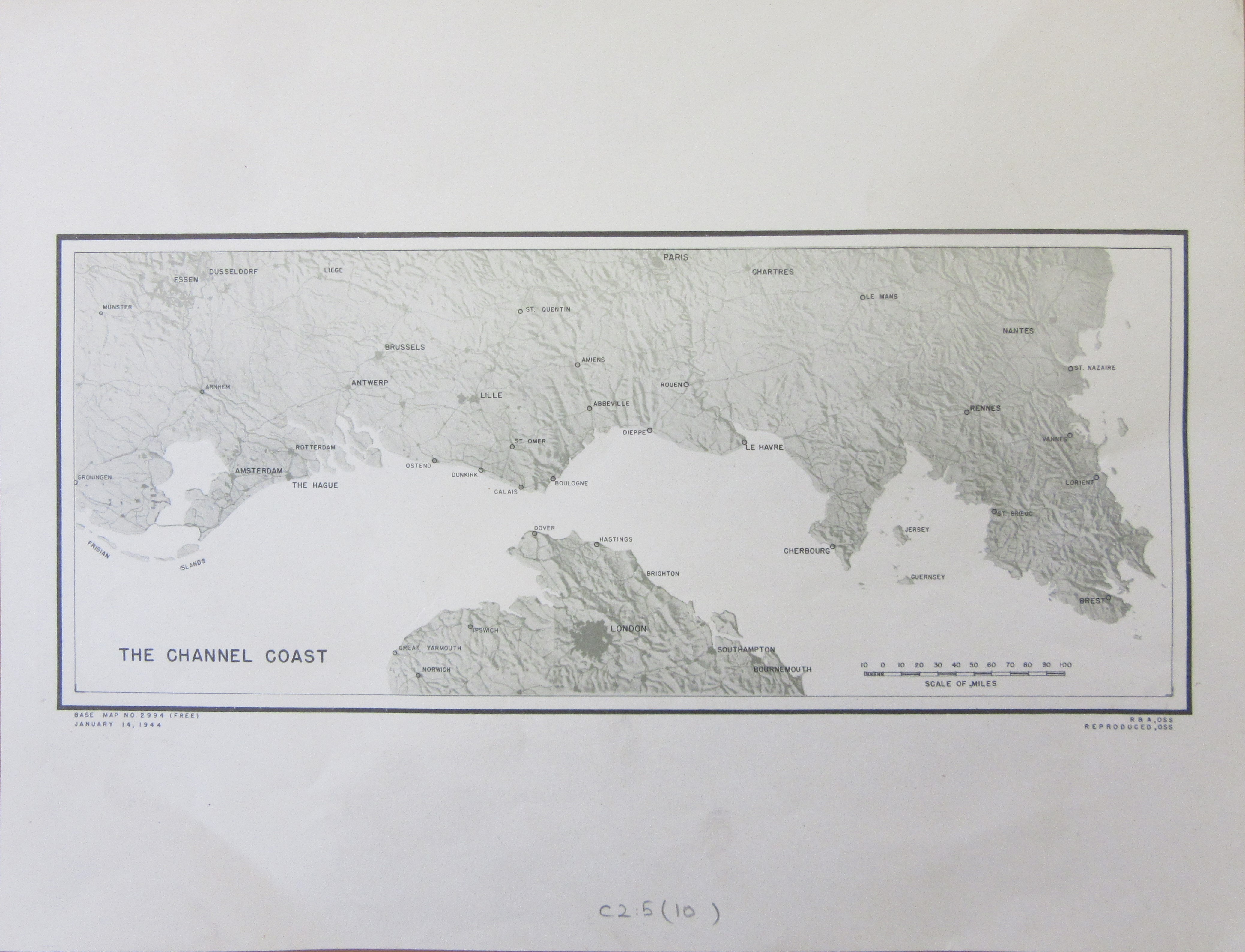
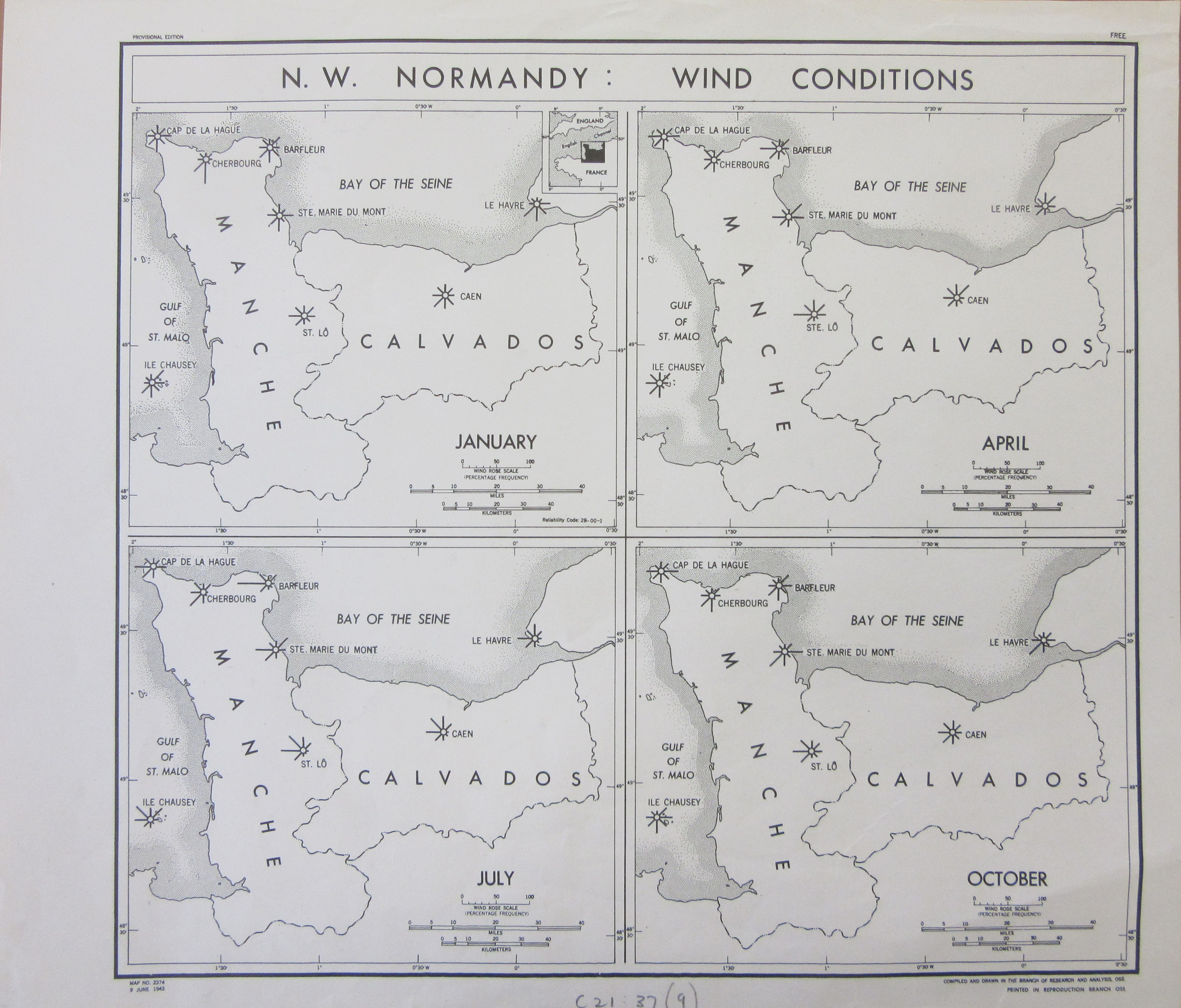
The Channel Coast Jan 1944 C2:5 (10) and N.W. Normandy wind conditions June 1943 C21:37 (9)

The first map gives a different perspective of the routes across the Channel and illustrates nicely the different options available, and the distances involved, to Allied Command on where to cross the Channel. The second map is one of a number produced by both the American and British Intelligence Departments dealing with the purely practical information needed to plan the invasion, in this case wind conditions but there are similar maps for tides and inland flooding in Normandy.

The OSS was also involved, along with the British Intelligence Agencies, in a major deception campaign to convince the Germans that the landings would take place anywhere else than on the Normandy beaches. Codenamed Bodyguard, creating new and totally fictitious divisions and artillery, false radio transmissions and leaking information to double-agents meant the Germans were fooled into believing in a build-up of Allied forces in Britain which didn’t exist.

Grossbritannien und Irland mit standorten des engl. Heeres 1944 C15 (468)

This map of Britain made by the German General Staff dates from the 15th of May, 1944 and shows what the Germans thought was the deployment of troops three weeks before D-Day. As well as English Army positions (in red) it also shows American (in black) and French (green).

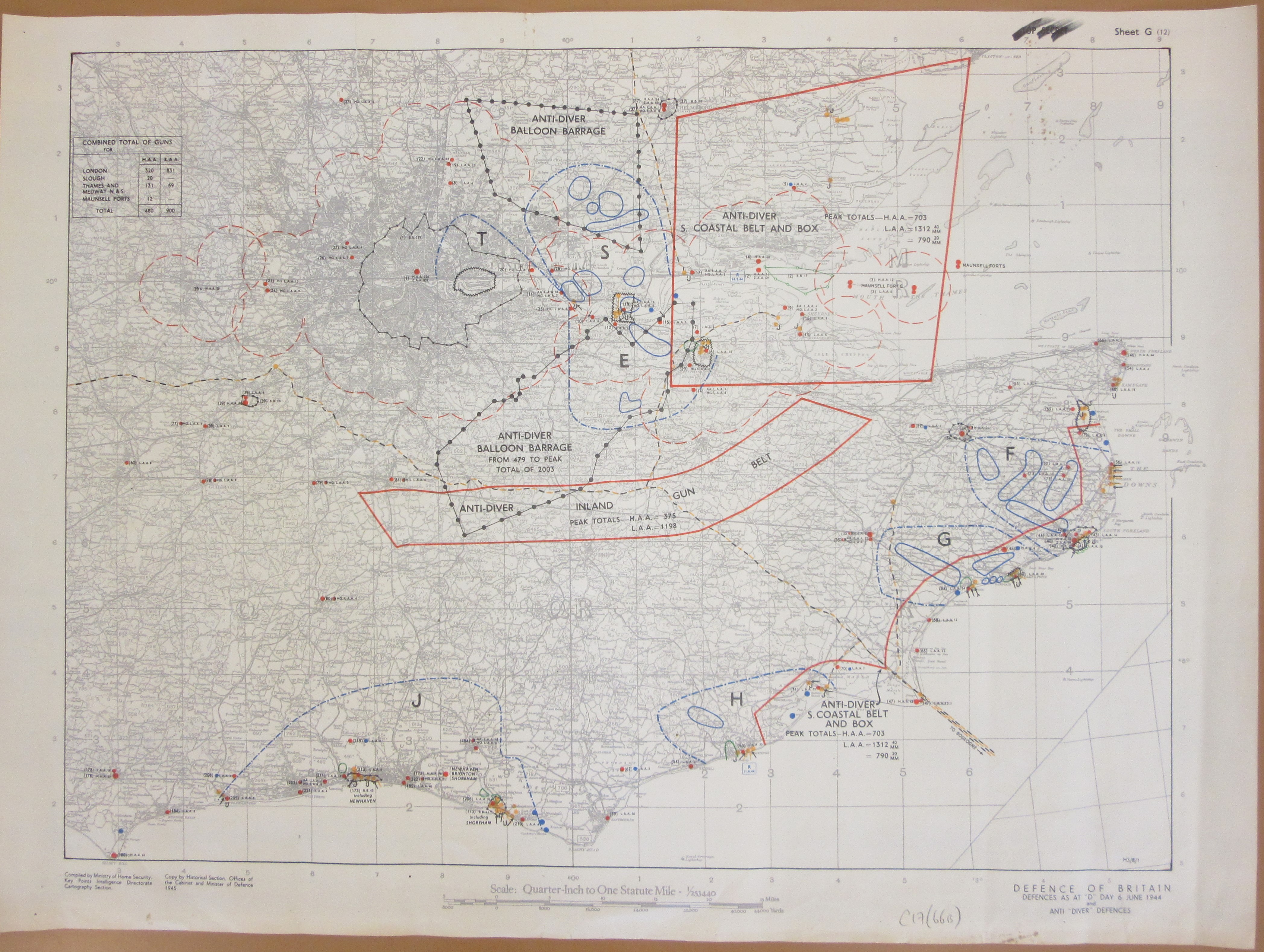
Defence of Britain, defences as at “D” Day 6 June 1944 and anti “diver” defences 1945 C17 (66B)

This British map shows defences and positions on D-Day itself with divisions and defences (“Diver” was the codename for the  V-1 rocket, first launched by the Luftwaffe in 1944)

One of the earliest actions on the 6th of June was the landing near the bridges over the canal and River Orme near the village of Benouville, the famous glider attack on Pegasus Bridge.

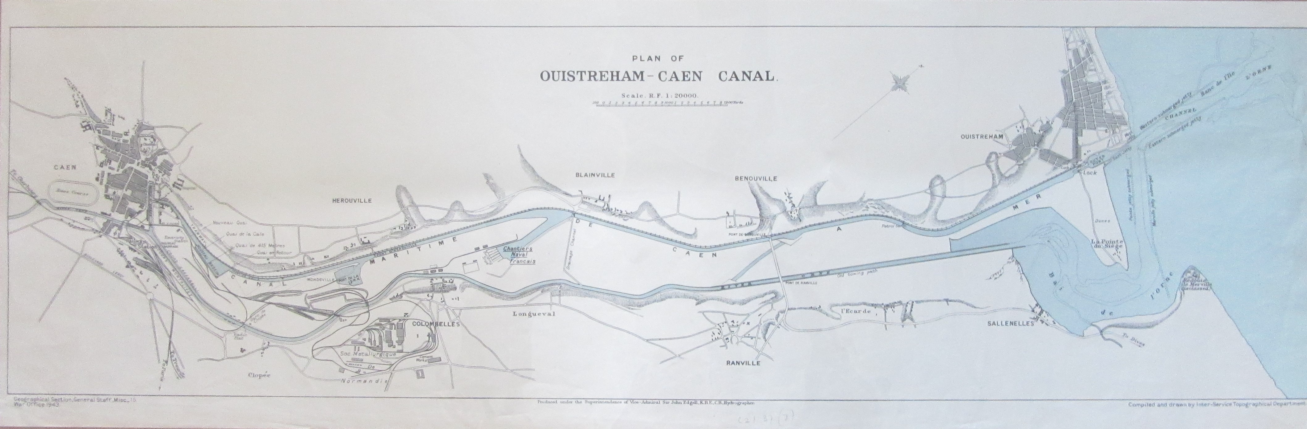
Plan of Ouistreham-Caen Canal 1943, C21:37 (7)

Capturing the bridges were crucial if the advance on Caen was to succeed. The above map is from the British cartographic department, the Geographical Section, General Staff,  while below is a German map of the same area with an extract of the bridge area.

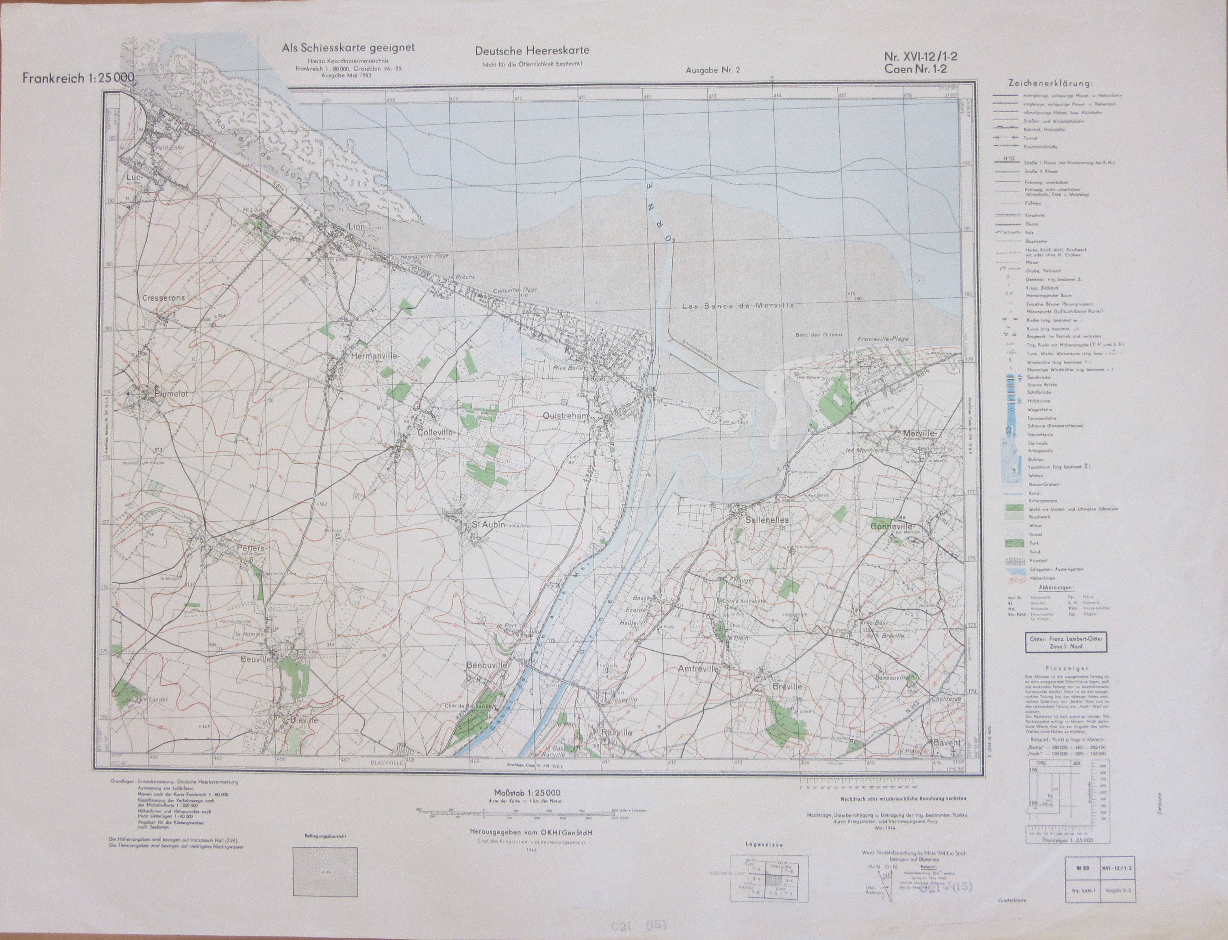
Frankreich 1 : 25 000 Nr XVI-12/1-2 Caen May 1944, C21 (15).


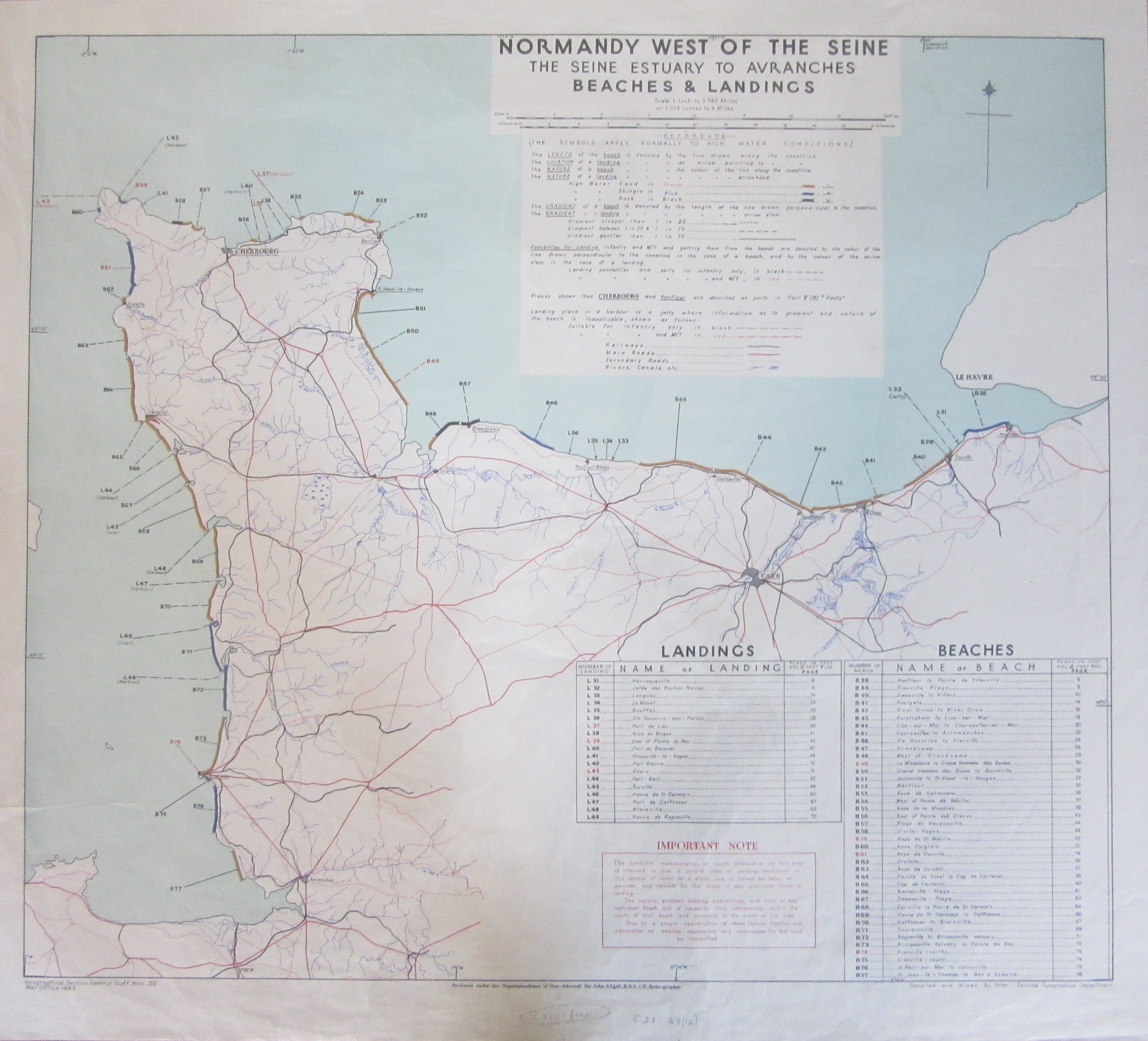
Normandy west of the Seine, the Seine Estuary to Avranches, beaches & landings, 1943 C21:37 (12)

Finally a wonderfully simple but hugely informative map from the early stages of planning showing potential landing beaches. Gradients, geological conditions and length of beach are shown by colour and length of markings and direction of lines. This map shows the levels of planning for the invasion that were already in place in 1943. This extract shows the area of the beach landings on the 6th of June 1944.

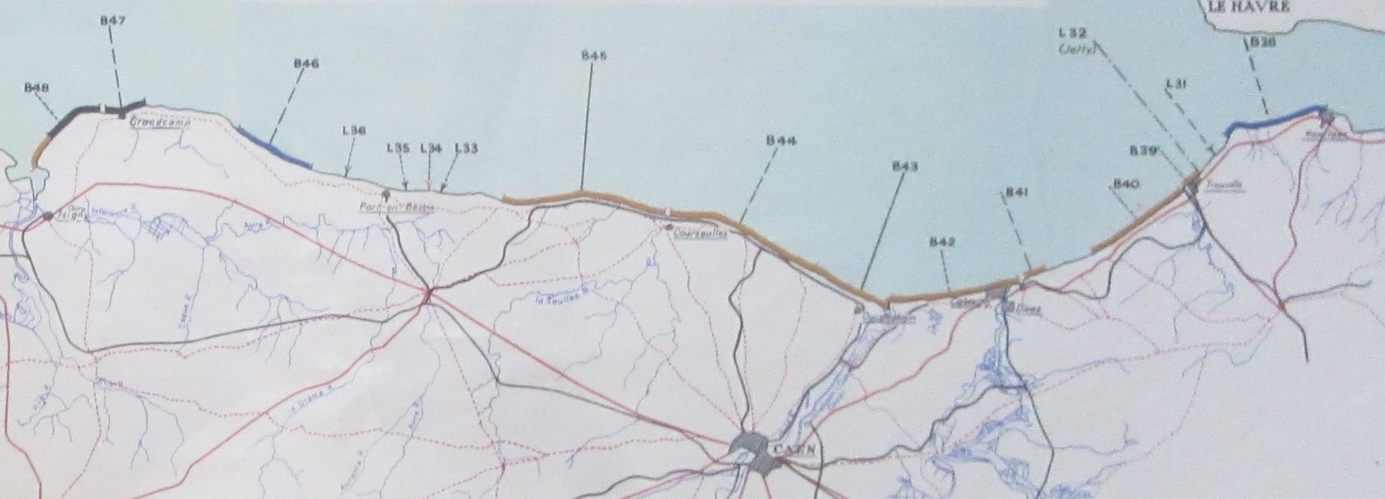
Sword beach is nu B43, Juno B44, Gold B45, Omaha B46 and Utah B49.

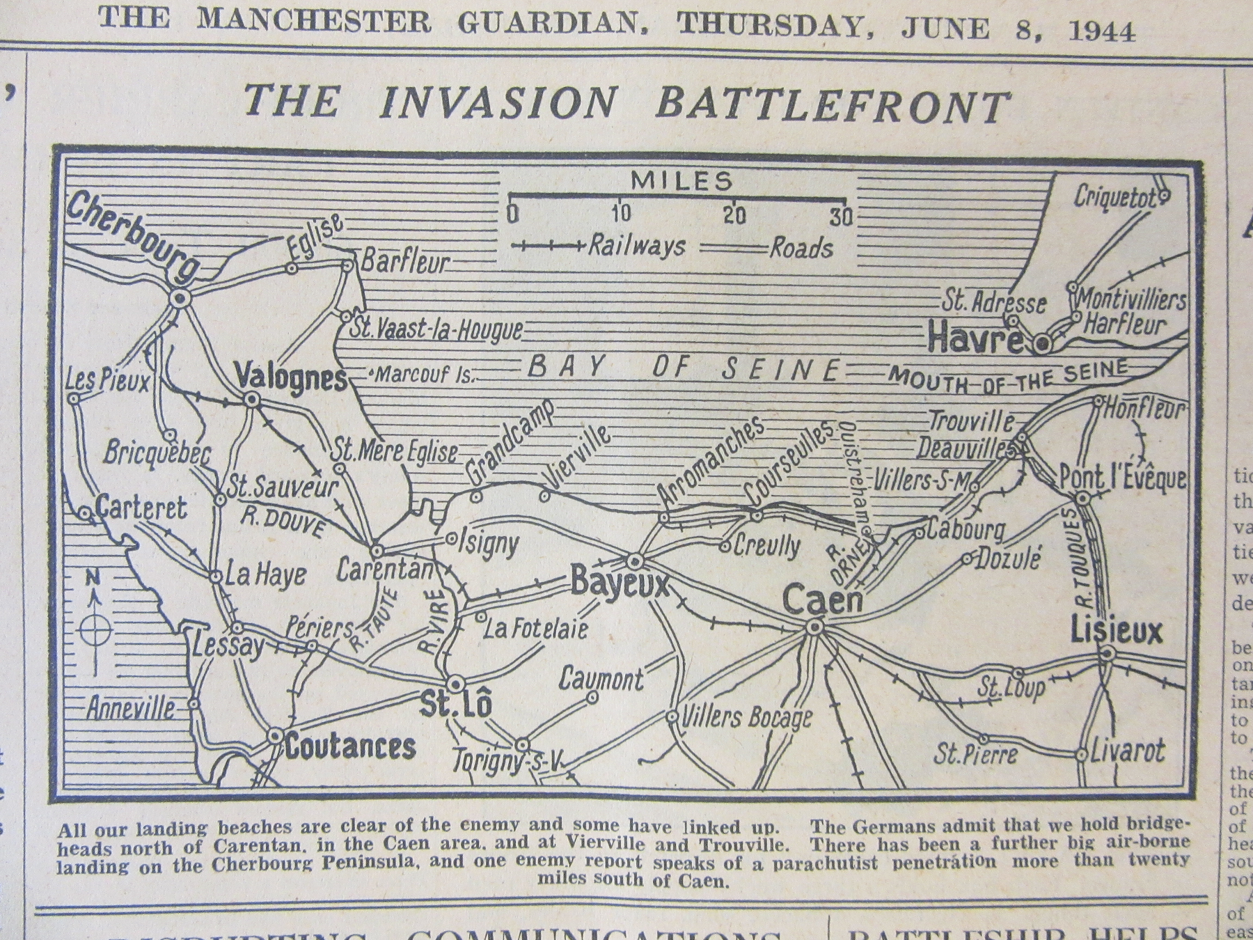
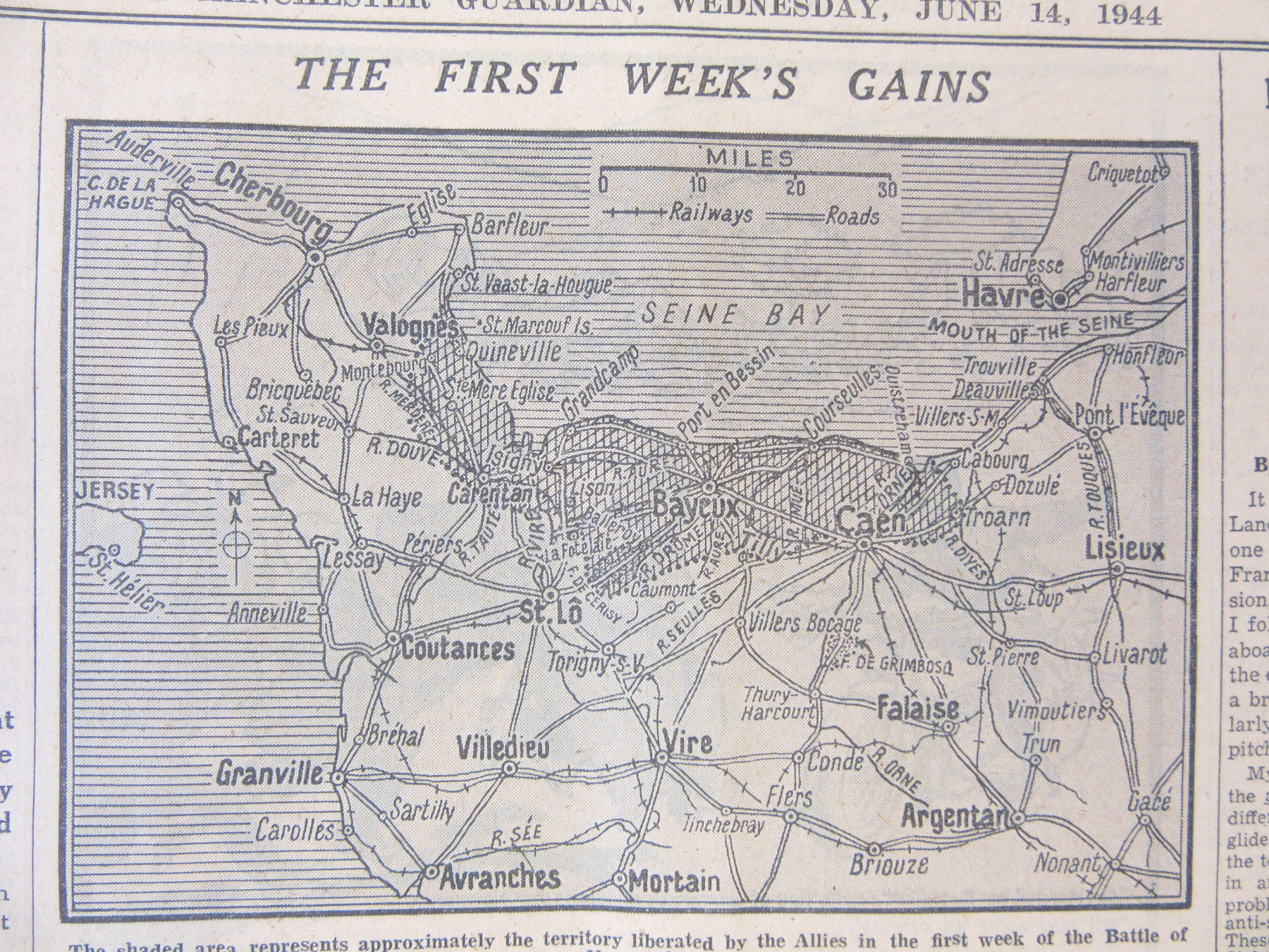
This is the Guardian from the 7th of June. Coverage of the advances made by the Allied Forces through Europe and into Germany continued until the end of the war,

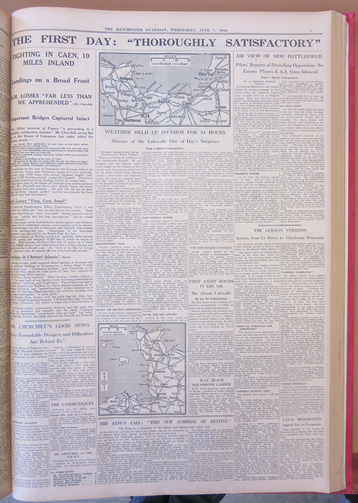
often with maps illustrating the present situation at the time (the main war news on the 6th is on the advance through Italy and the recent Allied capture of Rome. French news is limited to reports on the considerable damage done to the French railway system by Allied bombing). These next three maps are from the few weeks following on from D-Day.


These maps and the full page image are from The Manchester Guardian, Jan-June 1944.  N 22891 a.8