Category Archives: Art

Copy, reconstruction or fake?

The Map Room was recently given what appeared to be two facsimiles of early printed maps of Paris from the sixteenth century. The smaller one bears a Latin title, “Lutetia vulgo Paris Anno 1575” – a fairly conventional way of giving both the Latin and vernacular versions of a place name in a map title. It’s a colourful, attractive map, showing Paris inside the city walls with the buildings represented pictorially. In the foreground are views, a rural landscape and a view of the Tour de Nesle, part of the city walls. The map is signed by Josse de Reveau.

So far, this appears a fairly conventional facsimile  – a modern printed copy of an attractive early map. But on closer inspection it becomes puzzling. There is no other trace of Josse de Reveau or of the original on which the map was based. The explanation is that the map is actually a reconstruction, originally made in the 1950s by a French artist; inspired by an engraving from the time of Henri III, who was King of France from 1574 to 1589, Daniel Derveaux copied the style and drew Paris as it was in the sixteenth century. According to the company website (the map is still for sale, along with a number of similar maps and map themed gifts),  “He signed ‘Josse de Reveau’ to make it look authentic.” The name could be an adaptation of Derveaux’s real surname. The map has fooled many into thinking that it is a facsimile of a sixteenth century map, and it is recorded thus in several library catalogues. We have not identified a specific map from which the information was taken.

A second map of Paris in the same category was acquired at the same time. This has an even more complex history in terms of the origins of the information. The title in a scroll design across the top of the maps is “Icy est le vray pourtraict naturel de la ville, cité, université de Parisy;” both the wording and the archaic spelling are copied directly from a large and detailed map of Paris made in the mid-sixteenth century by Olivier Truschet and Germain Hoyau. Some of the decorative elements on this map are taken from the same source. The original is held in the university library in Basel, Switzerland.

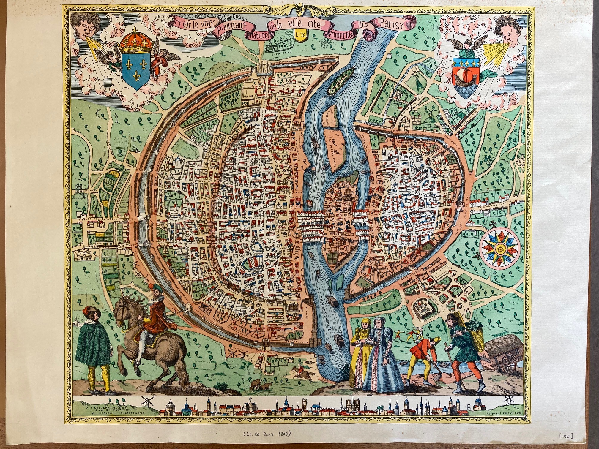
The map itself is smaller and simpler than that produced by Truschet and Hoyau, and is largely based on the one published by Braun and Hogenberg in their Civitates orbis terrarum, an atlas of the world’s cities in six volumes which appeared from 1572. The foreground is occupied by human figures; two labourers, two ladies in grand dresses, and two finely dressed gentlemen, one on a horse. There is also a view of Paris along the bottom. We have been unable to identify the source of these images, so at least three, possibly four sources went to make up this composite map. Again there is a fictional cartographer, and this time a publisher as well; “Rossingol execut [made] 1576. A Paris, chez Melchior, Quai du Port au Foin qui regarde l’Ile Nostre Dame” – the publisher and address look authentic and convincing, but are invented. There is no definite evidence as to the origins of this reconstruction; it may well be the work of Derveaux again, but it dates from the 1930s and the company has no record of it.

It is difficult to know what to make of these maps – were they originally made as a deliberate attempt to deceive, a whimsical experiment, or a way of improving access to historical sources? As regards the historical information on the maps, they are fairly useful; the details seem to have been quite closely copied from early maps. Having said which, we should also remember that no map can be relied on entirely to show the landscape as it was at a given time –  but that probably deserves a separate discussion.

Lutetia vulgo Paris Anno 1575. Daniel Derveaux, 1958.  C21:50 Paris (208)

Icy est le vray pourtraict naturel de la ville, cité, université de Parisy. Publisher not identiifed, [1930?] C21:50 Paris (209)

Hurrah! Hurrah! for Japan

In 1877 the political satirist Frederick Rose produced the ‘Serio-comic war map for the year 1877′.  Rose used the map to compare Russia to an Octopus, the analogy being that Russian tentacles, grabbing hold or in some cases choking various countries, symbolized how Russia was attempting to gain influence over Europe. An earlier blog on cartoon maps featuring this map amongst other examples and can be found here

Serio-comic war map for the year 1877 by Frederick Rose JJ puzzle pictures folder 1 [28], 1877

Cartoon maps are good at making a serious point (most deal with expansion and empire building) in an immediately appealing and understandable way. The mix of strong imagery and a history that often seems to repeat over and over again means that they remain relevant long after initial publication. In 1904 Russia and Japan went to war over the fears both had over the other’s areas of influence in Manchuria and and Korea respectively (a blog about a map of the war is here.) and a Japanese student, Kisaburō Ohara, took Rose’s map and extended the area shown further east to include ‘Manturia’ and ‘Corea’ with one of the sinister arms of the Octopus reaching out to the area. On the map China becomes the Empress Dowager Cixi, complete with the bound feet fashionable at the time.

A humorous and diplomatic atlas of Europe and Asia, 1904. B6 (209)

While the majority of the European countries remain with the same national portraits In a change to the Rose original to show what potentially could happen to any country to fall under Russia’s sphere you only need to look at how Finland, Poland and the Slavic countries (which would become Yugoslavia after World War One) are all portrayed by skulls to suggest the effect Russian influence had on these nations.

Text on the map is in both Japanese and English with the English text in the box repeated in Japanese along the bottom. The text starts ‘Black Octopus is a name newly given to Russia by a certain prominent Englishman [i.e. Rose]. For the black octopus is so avaricious, that he stretches out his eight arms in all directions, and seizes up everything that comes within his reach’ and ends on a patriotic note, ‘ Suffice it to say, that the further existence of the black octopus depends entirely on the outcome of the present war. The Japanese fleet has already practically annihilated Russia’s naval power in the Orient. The Japanese army is about to win a signal victory of Russia in Corea and Manchuria. And when…St. Petersburg? Wait and see! The ugly Black Octopus! Hurrah! Hurrah! for Japan!’.

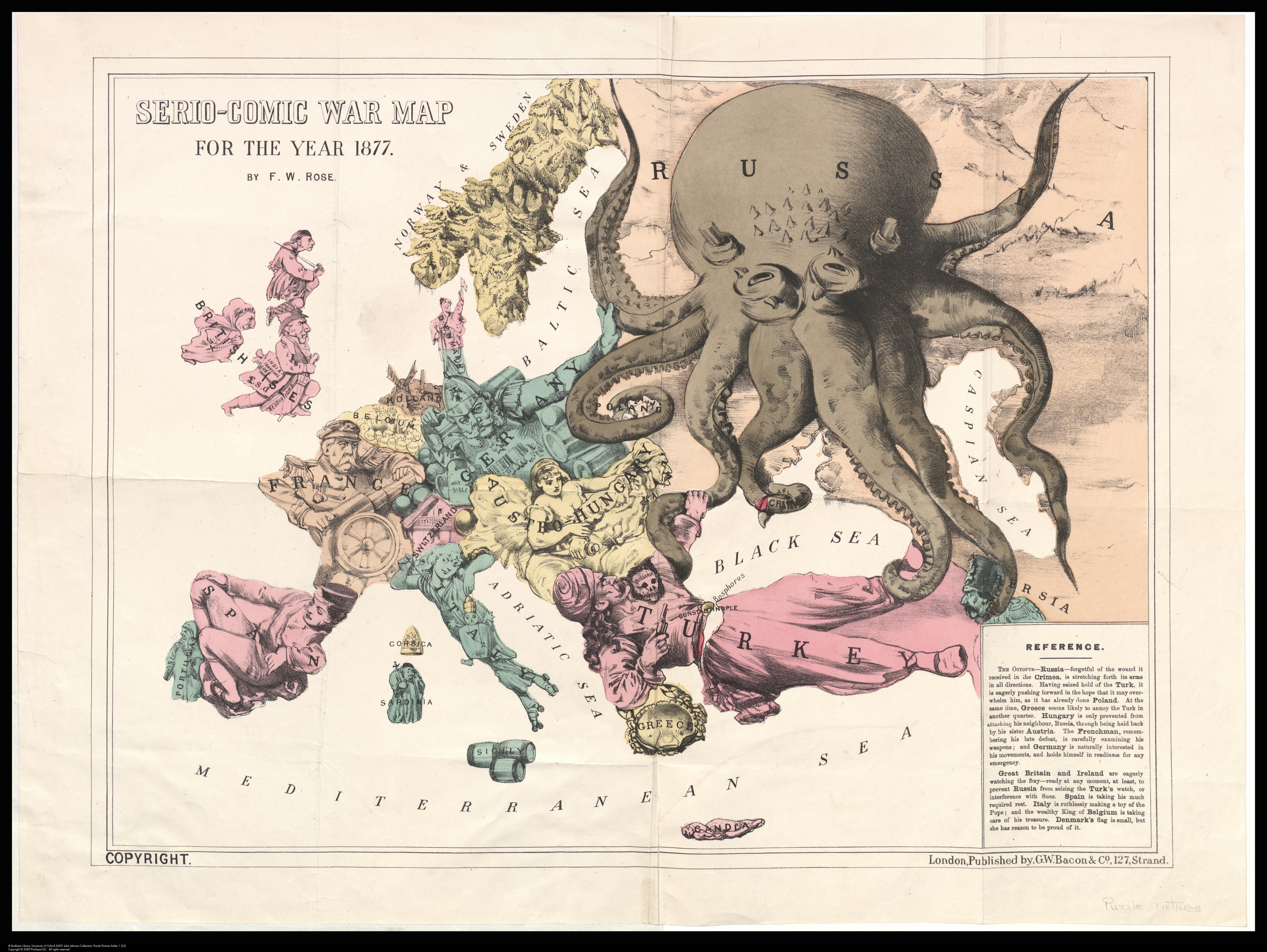
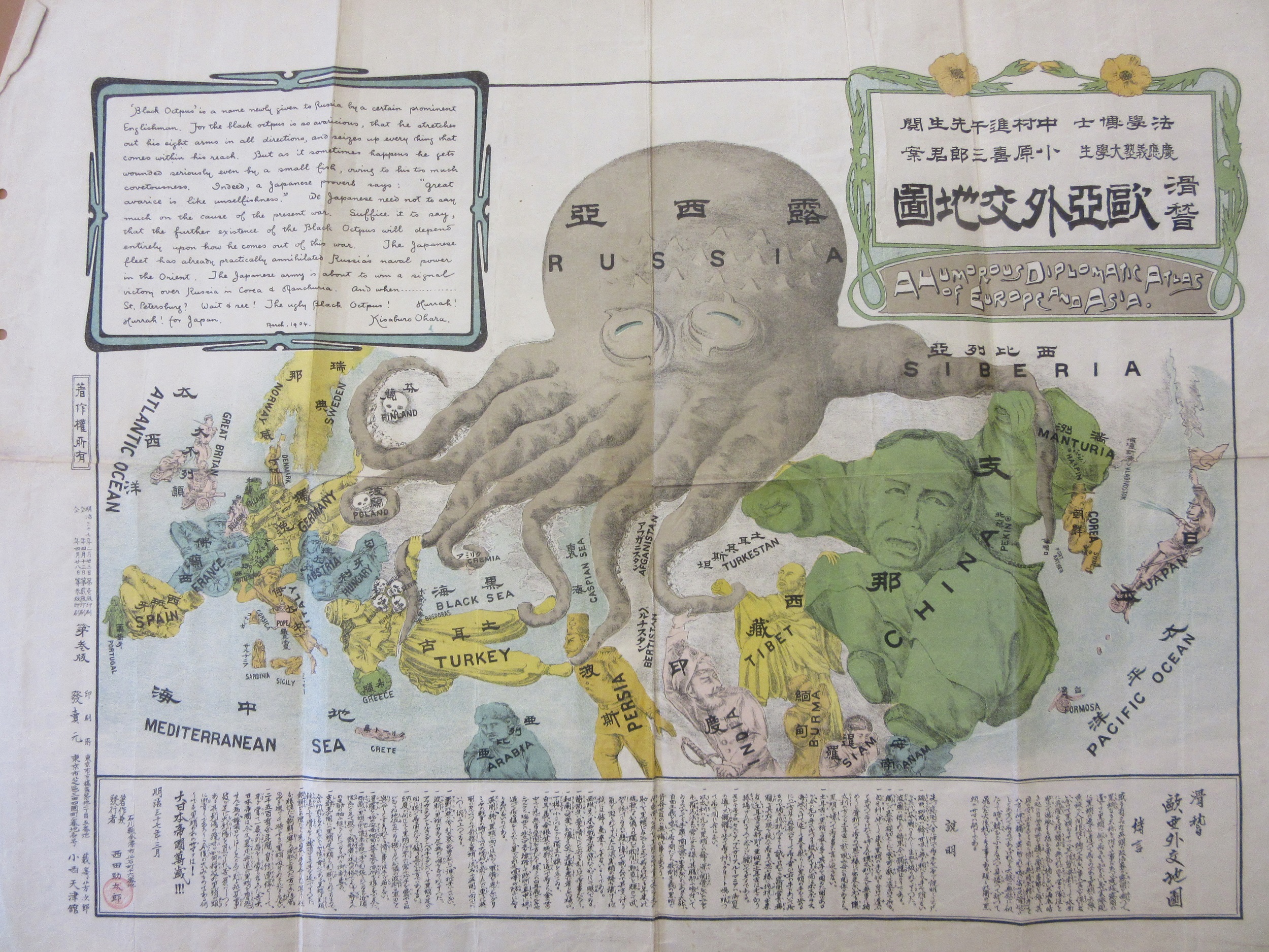
The 1904 map is a strange mix of quality and some parts definitely work better than others. The new parts, which is pretty much everything east of Persia, have a fresh look and have enough space for the countries to be represented well while with the reduced size of the map from the original Europe is a bit too crowded. Scandinavia in particular looks bad compared to the 1877 version. Italy is intriguing, treating the Pope and the Vatican like a toy on string following the defeat of Rome and the Papal States in the war to unify Italy in 1870.


This map shows the problems throughout Europe dating back to and before the Rose map of 1877, problems which would continue after the end of the Japanese war with Russia. Following the 1870 Franco-Prussian War France and Germany point arms at each other while the large empires of Turkey and  Astro-Hungary are both split in two, one by a Russian tentacle, the other by the two different countries, Austria and Hungary, that make up the Empire, both bringing different languages, cultures and groups of people to a large part of Central Europe. The Balkans are a frightening bunch of skulls, a foretaste of what was soon to come with two Balkan Wars and the origins of the First World War. Then there’s the  potential for conflict and jealousy over spheres of influence in the Near and Far East.

This is the strength of cartoon maps, the most obvious types of maps apart from those produced by totalitarian regimes where bias plays a part in the way the map looks. Purely judged on cartographic merit it’s a poor map, but in all other aspects; aesthetically, historically, novelty, the map is a wonderful example of its type.

Sleigh miles

Few people can have more need of a map than Father Christmas. Who else travels the World, at night, visiting every house in every city, town and village? Who else does this but once a year, a long enough gap to forget which turn to take, which lane to go down? Who else makes these journeys on a sleigh drawn by 8 reindeer with no sat-nav, no googlemaps on a smart phone?

To celebrate a cartographic Christmas here’s a selection of map-themed cards collected by map staff at the Bodleian in recent years.


Here’s a card with an old map underlying the Christmas theme, showing the type of map that Santa might have used in days gone by.

Has there ever been a more sampled map than the classic London Underground map? Here’s two cards on the theme


We have Henry Cole to thank for Christmas cards. The first director of what would become the Victoria and Albert Museum commissioned the artist John Callcott Horsley to design the first card in 1843, with a thousand copies printed off and sold under his pseudonym Felix Summerly. Cole was also involved in the setting up of the Penny Post and is credited with designing that most iconic of stamps, the Penny Black. Christmas cards form part of the John Johnson Collection here at the Bodleian, one of the most important collections of ephemera in the World. Find out more about John Johnson, including finding aids, catalogues and blogs here.

A blog on Christmas cards written by the Librarian of the John Johnson Collection Julie Anne Lambert can be found here and more blogs on Christmas ephemera in the collection can be found here .  Amongst the treasures held at the Bodleian are original pieces by J.R.R. Tolkien,  some of the Father Christmas letters that Tolkien sent to his children can be found here and here

There is a lovely map of Santas throughout the World published in the 1950s by the General Drafting Company which can be found here Vintage Map Shows Santa’s Journey Around the World | National Geographic and of course, there’s the famous NORAD tracking Santa site Official NORAD Tracks Santa (noradsanta.org)

Who doesn’t believe? Happy Christmas everyone

Do [not] touch

People have always tried to make sense of their surroundings and plot where they are in the world, often in graphic form. Maps are inherently two dimensional but efforts have been made throughout time to create three-dimensional tactile maps. Primarily they are aimed at visually impaired users but they can also serve to understand relief and the environment in a holistic way. It is unclear when tactile maps started appearing but this lovely example of England and Wales is the earliest in our collections, produced in 1925. It primarily shows relief and rivers but also locates major towns but does not name them.

The development of tactile writing systems really took off in the 19th century with the development of basically embossed versions of roman letters, such as the Moon System but alongside was the use of a logical system of dots representing the letters such as braille.

This globe, which is undated but looks like it was made in the 1960s? uses prominent dots to depict capital cities in Europe but also a chain of mountains in Asia which must be confusing.  You can also see the rivers have been exaggerated and the equator marked to aid orientation.

Tactile maps conventionally were made using thermoforming or vacuum forming which uses heat or a vacuum to fix a material such as plastic or paper over a mould to create a stable physical object. These are very successful but they come with their downside – unlike paper maps they cannot be folded up and put in your pocket. The Royal National Institute for the Blind produced several maps with the Central London map as a typical specimen. With embossed roads and braille labels it is limited in detail so what its purpose is unclear. Was it produced for reference or as a wall map?

What is the future for mapping for blind or visually impaired people? Much work has been done by tech companies with smartphones and hand-held devices. Google Maps can speak directions and even tell you where safe road crossings are while you are using it. Haptic technology is used to generate a hybrid tactile map – for example the signal from your fingers will cause the map to vary when you cross a boundary, such as a road; or come across a symbol, maybe a bank. Although 3D printers can also be used to create maps but do not overcome the portability issue.

The library has a several tactile maps in the collection but this one was particularly challenging as it had no text to identify it. Coming originally from the MOD sample collection it has a red acquisition stamp and a tentative “Torquay” in ball point pen. I could not identify it with a modern map of that area so bit the bullet and tried transliterating the braille labels. It turned out that it needed turning around and it represents the Goswell Road/City Road area of Islington in London!


The Lake District’s topography lends itself very well so this is an attractive example. Designed as a hanging wall map in four sections it has been executed beautifully with using wooden strips glued together which have been sculpted to form the peaks and trough: shorelines, rivers and names have been burnt in to orient the sighted.  Entered into the BCS Awards which not only is it easy on the eye, it has a beautiful feel demonstrating that this is inclusive and appreciated by everyone not only as a map but as original creative piece. The perfect example of aesthetics and technique.


England and Wales. [S.n., S.l.], 1925 C17 (220)

A simplified system of embossed reading for the use of the blind : invented by WIlliam Moon, LL.D. &c. [London] : Moon Society, 1937 Rec. c.185

[World globe in braille]

[Torquay]. [London] : [Royal National Institute for the Blind], [1979] SP 55

Central London. [London] : Royal National Institute for the Blind, 1970. SP 56

Lake District National Park. [Sheffield] : From the Workshop. BCS Awards.

The things you find when you tidy up

Over a decade ago, the Bodleian Map Room moved its collections out of what was then the New Bodleian Library, for the building to be completely redeveloped into the shiny new Weston Library. Anything uncatalogued was given a barcode and brief record to locate it in the new storage facility in Swindon. It was while tidying up the last few of these that we stumbled across this beautiful panorama of the Grampian Mountains. Everyone loves a panorama, so here it is, showing a view across the Scottish landscape.  The hills grow increasingly faint into the distance.  Settlements can be located by the wisps of smoke rising from them, presumably from peat fires.

In the foreground a picturesque rocky outcrop is surrounded by colourful heather; this is captioned beneath “The summit of Benclach, 2359 feet above the sea.”

It’s described as “A view of the Grampian Mountains, taken from the Summit of Benclach the highest of the Ochill Hills, a station in the Trigonometrical Survey of Great Britain, situated 28 miles north west from Edinburgh.” There’s a lot of cartographic history packed into that title. The Ordnance Survey has origins going back centuries, but the Roy Map of Scotland from the 1740s and ’50s is often seen as the immediate forerunner to the systematic survey of the whole of Great Britain begun at the very end of the eighteenth century. The survey started at the south coast, mapping the country at 1 inch to a mile, and worked northwards. It took decades to cover England and Wales, and the first published maps OS maps of Scotland were later still. However, the initial Trigonometrical Survey which worked its way up Britain, plotting exact locations by a process of triangulation, had reached southern Scotland by the 1810s. The panorama was both drawn and published by James Gardner, previously “employed on the Trigonometrical Survey”.

From 1823 Gardner was established in London as a publisher and seller of maps, and sole agent for the sale of Ordnance Survey maps; he retired in 1840 and the business passed to his son. The mention of his earlier role as a surveyor probably indicates that the view was made to be accurate rather than simply an artwork, and certainly seems to show a pride in being involved in this great scientific endeavour. There is an outline diagram underneath which names the mountains, settlements and other features, making the panorama informative as well as beautiful.

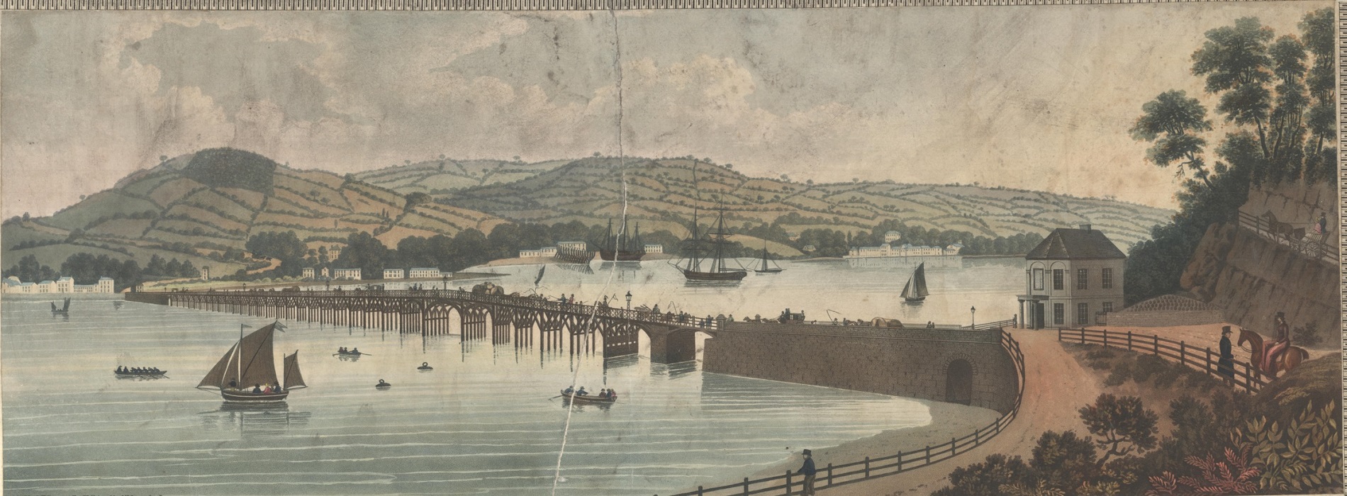
The point of origin is probably Ben Cleuch in the Ochil Hills. There is a note stating that it covers “about 85 degrees of the horizon” – nearly a quarter of a circle, stretched out to a view almost two metres long. The view was engraved by Daniel Havell in London, and printed in colour, a quite early example of a colour lithograph.


A view of the Grampian Mountains, from the Summit of Benclach the highest of the Ochill Hills / delineated and published by J. Gardner … 1820. C18:5 (93)

Sail away to Christmasland

Everyone has heard of Christmas Island, but have you heard of Christmasland? The (fictional) island appears on this cartographic Christmas card from the 1930s. Christmasland: Captain Jolliman’s voyage of discovery in ye “Friendship” (see what they did there?) shows a route from Humdrum Drearyland, with its Workaday Coast, to Christmasland.

The island has many seasonal placenames such as Mistletoe Bay, the Forest of Greetings (the forest symbols being, appropriately enough, Christmas trees), Welcome City, Kiddies Country and the Coast of Old Friends. The River Gin and the River It combine to form Cocktail River (hurrah!) and there are various plays on words relating to place names, such as Port Wine, and the Sound of Bells. The captain’s route continues past Pudding Point, through the Financial Straits, amongst the Hangover Rocks and past Resolution Point to New Years Land.

Cartographical allegories like this have been produced for centuries. Maps along these lines illustrating the “land of love” or themes around courtship and marriage became popular in seventeenth century France, and soon spread to other European countries including England. Allegorical maps with a morally improving theme also appeared, illustrating the spiritual journey through life. In the eighteenth and early nineteenth century allegorical maps as games were also popular. Meanwhile, in the nineteenth century, the Christmas card was gaining in popularity, as outlined in this recent blog from the Bodleian’s John Johnson collection.  But Christmasland, combining the two, may be a one off.

The card was donated to the Map Room recently, after it was spotted in the Oxfam shop in Chipping Norton by a Bodleian reader. Such ephemeral material often doesn’t survive so it was a welcome addition to the collection.


The card is printed inside with an address in Hillcrest Avenue, Pinner, then as now a pleasant road in an affluent commuter town on the outskirts of London. It is signed by hand, and dated Christmas 1936. There is also a quotation:

Hope shall brighten days to come
And memory gild the past

From a poem by the Irish writer Thomas Moore. These words, and a printed greeting with

Remembrance and kind thoughts for Christmas with good wishes for your happiness in the future

is something we need in the current difficult times. Happy Christmas!

Overlooking a city

It’s not uncommon to see a map that makes you go “Wow!” at first sight. Generally the early printed and manuscript maps in the collection are most likely to inspire this response, but this recently acquired map of Buenos Aires, printed in 1950, had much the same effect when I first saw it.

More of a birds-eye view than a map, it almost gives the feeling of flying over the city. The layout of Buenos Aires in a regular grid pattern enhances the sense of perspective. Many features are shown pictorially including major buildings, parks, monuments and boats in the port in the foreground. The sea is coloured a beautiful dark blue. Overall the colour scheme is simple, the map being printed in black plus 5 colours. All along the bottom of the map is a view of the city.

It’s the work of Viktor Cymbal (surname sometimes rendered Tsymbal), a Ukrainian artist and designer who lived in Buenos Aires for much of his life from his late twenties, although he spent his final years in New York. More information can be found about him here.

The style is somewhat reminiscent of the work of Macdonald Gill, another artist whose work (like that of Cymbal) included both maps and illustrations for advertisements. In particular the simple colour scheme, pictorial elements, and the lettering style and yellow scroll devices as labels are interesting to compare. Gill featured in an earlier blog post focusing on a map made in 1941, just nine years before this one.

The map was made at a time when Argentina was flourishing under popular president Juan Domingo Péron and his even more popular wife Eva. The railway station at bottom right bears the president’s name.

El corazon de Buenos Aires/ Viktor Cymbal. Buenos Aires : Editores Peacock y Calegari, 950.  H3:35 Buenos Aires (19).

A map, a view and an elevation

This beautiful map of the Teign Estuary incorporates three different ways to show off the new bridge across the river linking the village of Shaldon with the important Devonshire port and seaside resort at Teignmouth.

The bridge, completed the year before the map was published, was just over 1,670 feet long, making it the longest wooden bridge in the country at the time. A swing-bridge at the Teignmouth end allowed ships through to the estuary.

The map is a work of self-promotion, designed to show the route of a new road which had been proposed by Roger Hopkins, Civil Engineer and Mineral Surveyor, who designed and built the bridge and made the map. To show off Hopkins skills as an engineer and surveyor the bridge features prominently, not only on the map but both in a portrait

and then in profile; the former to show the beauty of the design within the context of the setting, the latter to show off the surveying and engineering skills of Hopkins.

In the title Hopkins reminds the viewer that it is he that ‘projected, designed and executed…’ the bridge and then goes on, as his ‘most humble servant’, to dedicate the map to the Duke of Clarence, Lord High Admiral of the United Kingdom. As can be imagined the Lord High Admiral was the head of the Royal Navy and the holder was usually drawn from the Royal Family (the current High Admiral is Prince Philip). Three years after the publication of the map the Duke of Clarence became William the IV.

By showing evidence of his surveying and engineering skills with the views of his bridge Hopkins sets out why he is qualified to propose his new road, despite there already being a road from Newton (now Newton Abbot) to Shaldon. Hopkins road would be far more direct, transporting the produce from the mills in the town to the port at Teignmouth. Despite the beauty and surveying and engraving skills on show Hopkins was ultimately unsuccessful, the road only existed on paper and twenty years later the railway came to South Devon, and Newton Abbot was linked to Teignmouth along the northern side of the Teign.

Map of the towns of Teignmouth and Newtonand the country lying between them, showing the advantage of a proposed… road… from actual survey made by R. Hopkins, 1828 (E) C17:25 (41)

The art of the Ordnance survey

Sales catalogues aren’t usually the most visually interesting of things, often only giving a list of that years products. What raised up the catalogues of the Ordnance Survey between the wars is the art that illustrated these catalogues, art that was mirrored in the covers of the maps produced by the company.

The covers and art work inside are mainly the work of two artists, who were also responsible for a large number of the most iconic of OS map art. Arthur Palmer joined the OS in 1891 aged 16 and worked for the company until retiring in 1935. Initially employed as a photo-writer (a photo-writer took the negatives created from a draughtsman’s work and tidied up any damage caused by scratches and dust specks which could obscure names and features), then in the Publications division. Palmer was also a gifted artist, and his work features in a number of classic designs, including this cover for a 1″ sheet of Oxford from 1921

and this cover from one of the catalogues of the large scale mapping.

The second artist was Ellis Martin. Martin, unlike Palmer, was employed purely as an artist by the OS to design not just map covers but fonts, promotional material and even company Christmas cards. His designs were less romantic than Palmers and his pen and ink work in particular was of the highest quality, as can be seen by this image of a hiker studying an OS map, a regular feature of Martin’s work. The hiker appears in various guises and as fashions changed so did the image, with the more formal cap and boots of the 1918 designs being replaced by this more practical working attire in 1933. The hiker featured in one of Martin’s most famous covers, that of the ‘Popular Edition’ maps of the 1930s. The use of the hiker, outdoors and ready to walk, is important for a number of reasons. It gives not only an impression of the type of countryside featured on the map inside, even if that is an idealized view, but also is a selling point, this is the ideal map for this type of activity.

Martin’s cover for the 1923 small-scale map catalogue is at the start of this article. A typical Martin scene which evokes both a sense of time and place with a simple design. The lady standing at the back of the car is Martin’s wife, Mabel.

This is another example of a cover by Martin showing his design skills. There is a book on the open shelves in the Map Reading Room on OS art, Map cover art, G24 C16.13.


The Atlantic Charter

Created by the artist and cartographer MacDonald Gill this map is one of the most aesthetically pleasing items in the collection.

The “Time and Tide” map of the Atlantic Charter, 1942 B1 (174)

Tide and Time was a weekly political and literary magazine starting in 1920.

Not only is it visually stunning the map is also an important historical document. Created in 1941 to promote the post-war aims of the Allied Countries by Sir Winston Churchill and President Franklin D. Roosevelt the charter committed participating nations to 8 points, all of which are stated on the map. This is an idealized view of the World, with agriculture and local industry prominent. Despite the state of the War in 1942 Germany is portrayed without any hint of hostilities currently taking place but is instead basking in the rays of the Sun like any other nation.

In the bottom corner is a quote from the Book of Isiah setting out the hopes and ambitions of the signatories to the Charter. Swords have been replaced by weapons of the War then taking place but the image powerfully portrays the sentiment intended.

Gill created a number of maps, including one of the earliest of the London Underground, but also has a link with the First World War. He designed the font used on Commonwealth Cemetery gravestones.

Churchill and Roosevelt met off the coast of Newfoundland in 1941, with Churchill traveling across the Atlantic on board HMS Prince of Wales. The journalist H.V. Morton accompanied him and wrote a book about the meeting between the two leaders that led to the creation of the Charter.

Atlantic meeting (1943) Bradford e.737

Morton’s book included a map of the route on the inside cover. Morton was a journalist with the Daily Express in 1923 when he reported on the opening of the tomb of Tutankhamun in the Valley of the Kings before The Times, who had paid for exclusive rights to the expedition.

An earlier blog post (July 2015) features a map showing the voyages and journeys Sir Winston Churchill made while Prime Minister during the War which included in the top corner pictures of the ships and planes used, including the Prince Of Wales

[Extracts from] Dunkirk to Berlin, June 1940 – July 1945. Journeys undertaken by the Rt. Honble. Winston S. Churchill, O.M., C.H., F.R.S., M.P., Prime Minister of Great Britain in defence of the British Commonwealth and Empire, 1947. B2 (101)

The Charter was such an important event that there was even music written in honour of it

Atlantic Charter, grand march (1942) Mus.120 d.15