Category Archives: Oxford

Urbs in Rure

In the mid-nineteenth century Oxford was still a small town dominated by the University but surrounded on three sides by water which had the effect of curtailing expansion of decent housing but by 1850 a series of circumstances led to the development of the North Oxford suburbs, in the St Giles parish. The population of the town grew sharply between 1821 and 1841, the Great Western Railway arrived in 1844 and, later in the 1870s, University fellows were allowed to marry thus leaving their college lodgings to live nearby. St John’s College owned a large tract of land, known as St Giles Fields which it had acquired in 1573 from George Owen, physician to Henry VIII to the north of the town. The middle class of professionals with disposable wealth were growing, housing was required so the time was ripe to develop this land.

The first attempt came in 1852 when architect Samuel Lipscomb Seckham (who went on to built Bletchley Park) was asked by the College to submit drawings for a new suburb to the north of the town. This terraced crescent of handsome Italianate houses with communal garden, rather in the style of Bath, became Park Town, the earliest planned development in Oxford.

This was the forerunner to the later developments of Walton Manor and Norham Manor. Once again Seckham produced this drawing for the what was to be called Walton Manor. As you can see most of the large villas are in his preferred Italianate style except for one which oddly shows elements of Victorian Gothic. This was not as successful with only one of the residences being built – still currently at 121-123 Woodstock Road.

The Walton Manor estate plan was revived in 1859 with Seckham still in charge but with the plan considerably changed. The following year an adjoining piece of land was offered for sale to become the Norham Manor estate by St John’s College. Initially Seckham was to manage both estates but William Wilkinson an architect from an auctioneering family of Witney, nearby, was awarded the supervision of Norham Manor. Wilkinson’s practice was prospering but involved church restorations and work for the rural gentry on domestic and agricultural buildings rather than villas and terraces.

His vision for the estate can be seen clearly from this view which was painted by him in c.1860. In this incredibly detailed watercolour you can see it has been conceived as a gated community of large suburban villas for the wealthy middle classes. By the mid-1860s Wilkinson had taken over the whole of the North Oxford suburb development and was building his pièce de resistance, the Randolph Hotel (1862-64). This Oxford landmark is still standing in its Gothic splendour.The large individual residences of both Norham Manor and Walton Manor were largely complete by 1870 so attention was turned to the smaller semi detached and terraced houses which give the area its character today. However, not everyone was a fan – Thomas Sharp of Oxford Replanned (blog here) felt the area was an ‘architectural nightmare’.

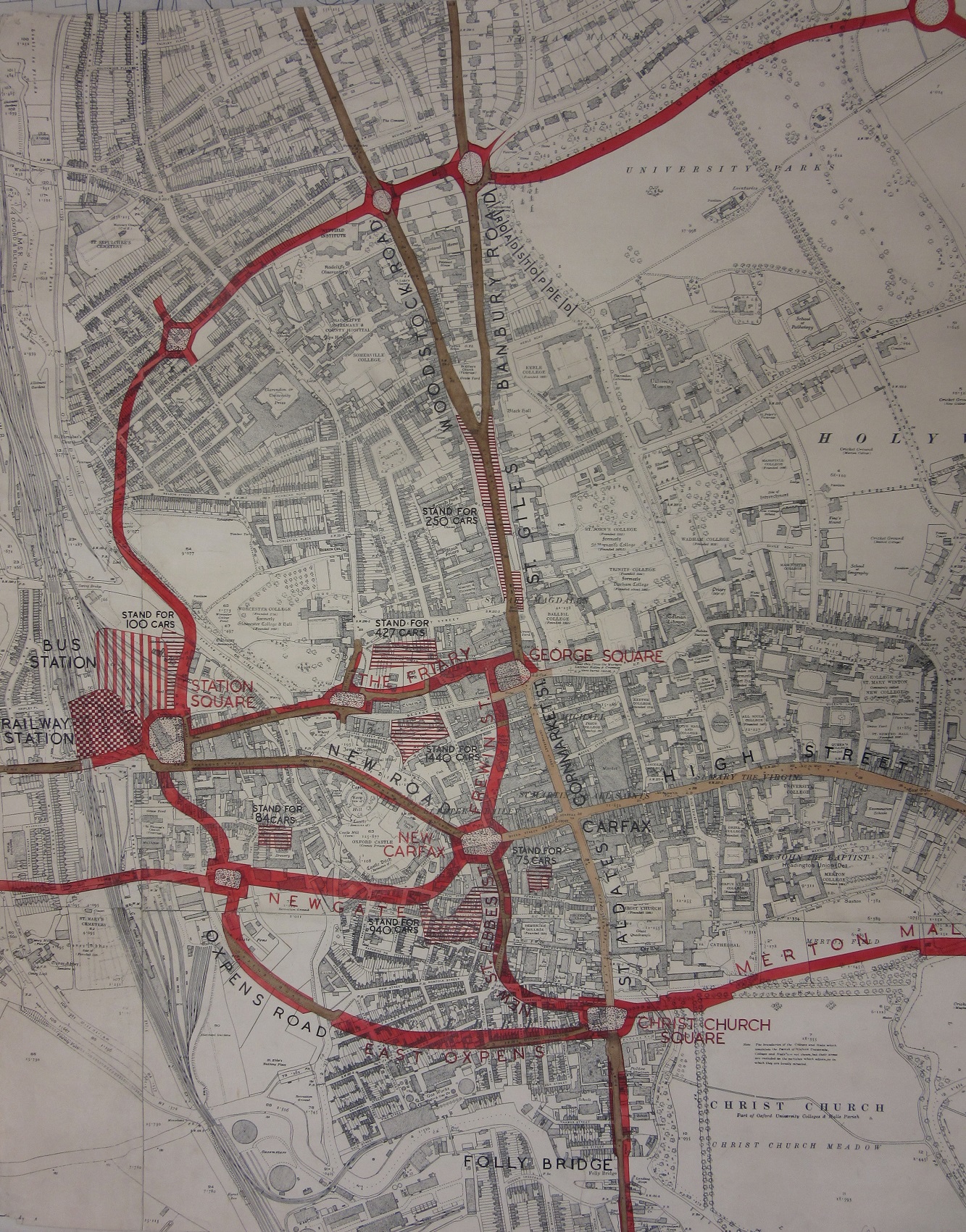
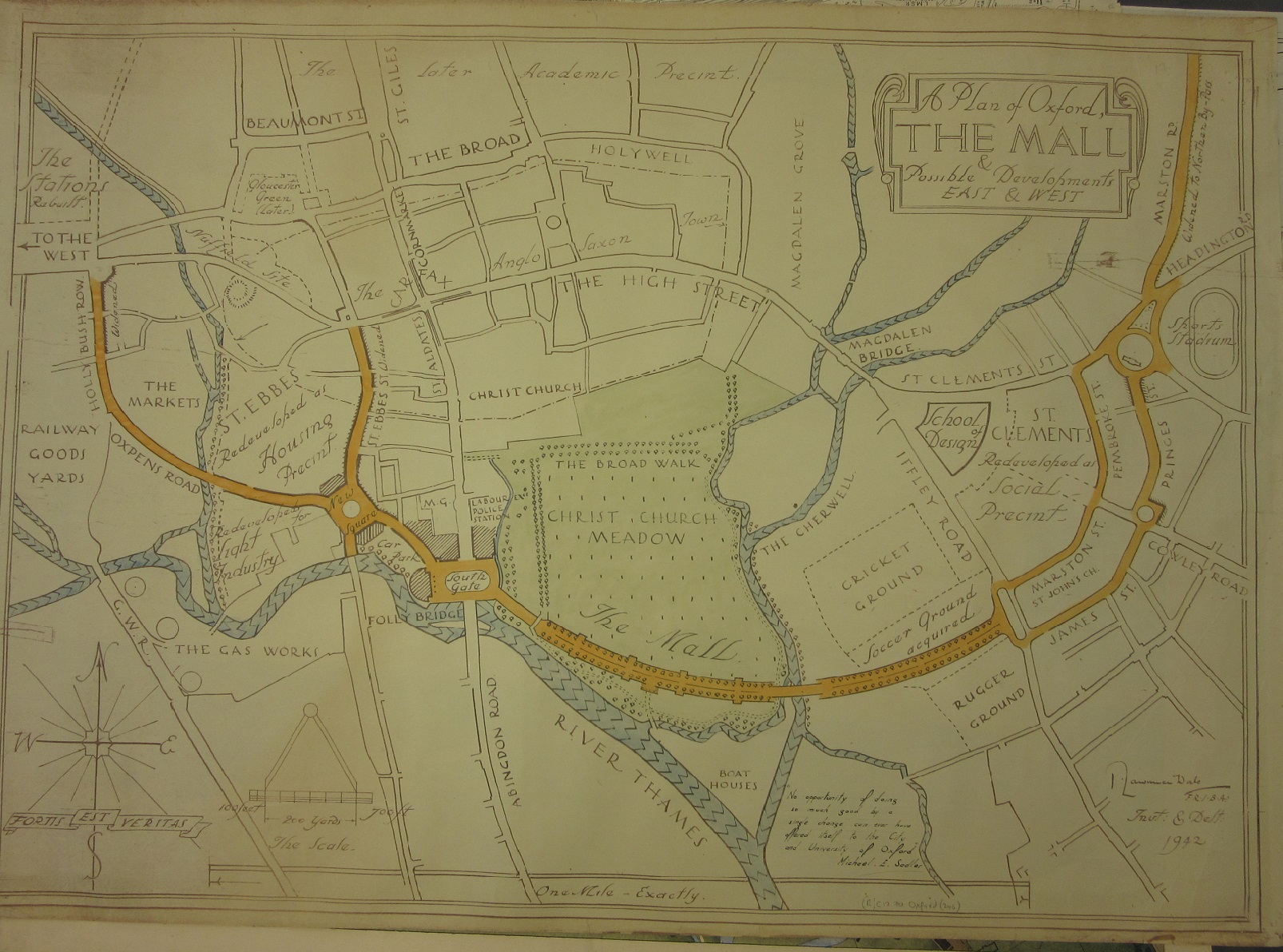
The spread of development can be seen clearly in the map record.


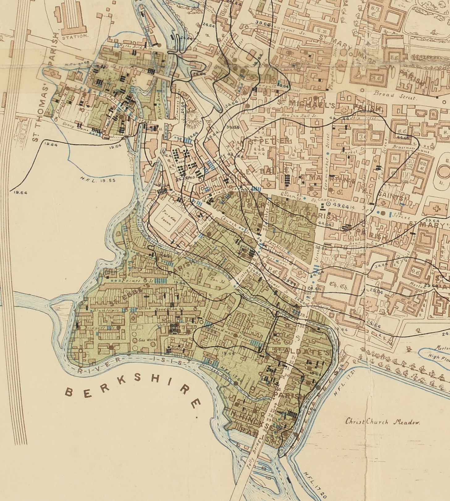
Ordnance Survey 1st edition 25” Oxfordshire XXXIII.15 1876
Bird’s eye view of the Walton Manor Estate [1854] C17:70 Oxford (103)
Proposed Norham Manor Estate [c.1860] MS. Top. gen. a. 22
Plan of an Estate called Park Town [1853] C17:70 Oxford (30)
T. Jeffreys. Plan of the university & city of Oxford 1767 Gough Maps Oxfordshire 17
Alden’s new plan of the city and university of Oxford 1888 C17:70 Oxford (5)
Plan of Oxford 1902 C17:70 Oxford (6)
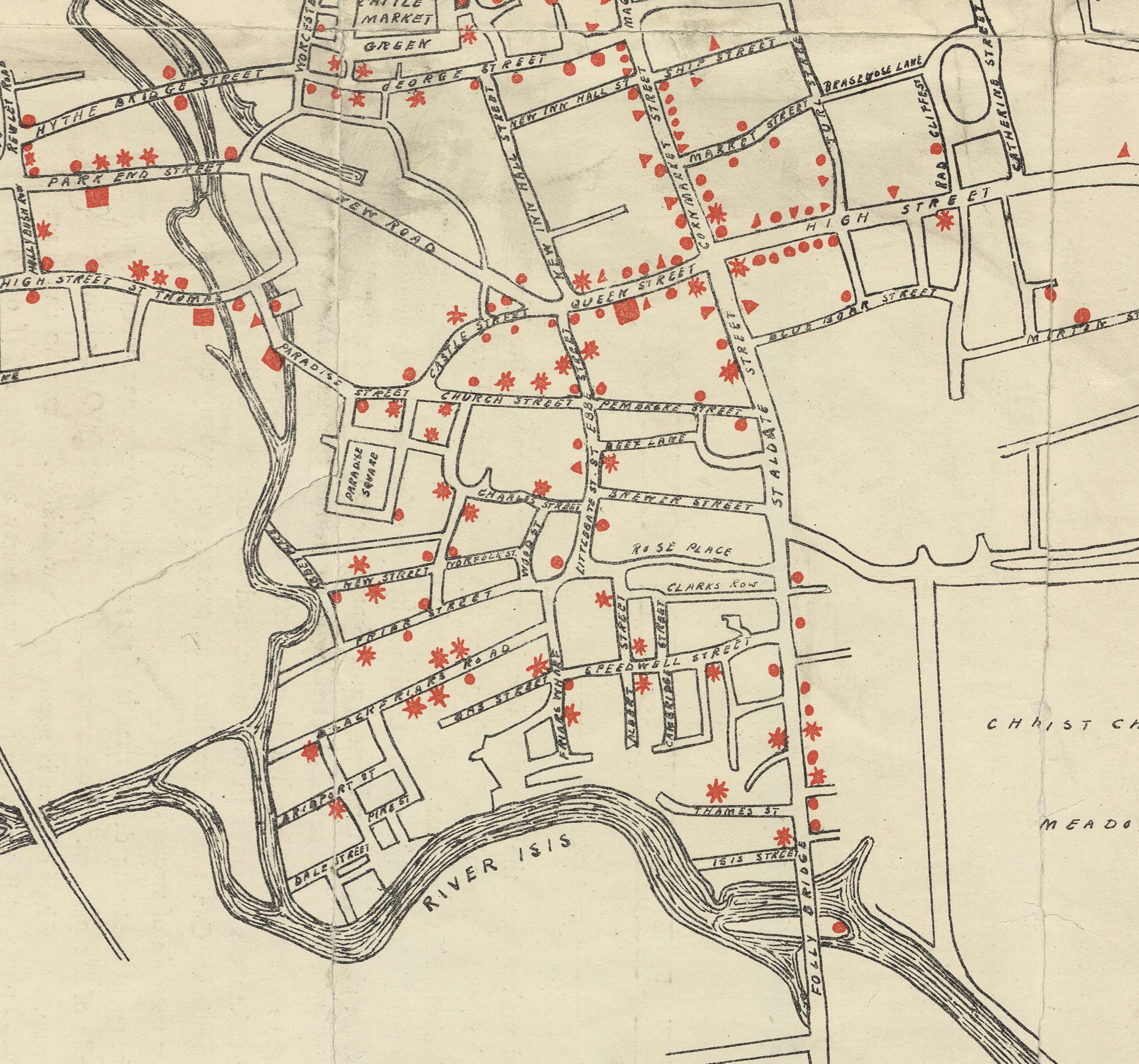
Plan of the city and university of Oxford [1949] C17:70 Oxford (36)

The voyage of the Hero

Admiralty Charts have a reassuring familiarity about them. The Hydrographic Office of the Admiralty first started publishing maps in 1800 and this map from 1860 uses cartographic conventions still in place today. This sense of timelessness comes from the charts concentrating on hydrographic information; soundings, rocks, beacons and so on, features that don’t alter over time. Almost all our cartographic charts in the Bodleian come from legal deposit in pristine condition. I say almost because we do have a number of donated charts as well. What is special about this particular donated map is that it is a chart that has been used, a course has been plotted of a voyage made between July and August of an unspecified year by an unknown ship. A chart used as intended.

North Atlantic Ocean, published at the Admiralty, 18th June, 1860. B1 a.19

The challenge is to try and discover more about the journey, which really comes down to when and what ship? All we have to go on when looking at the chart is the route, from Southampton across the Atlantic to Quebec, with positions at noon each day from July 10th to August 18th. A seemingly impossible task but there is a clue separate from the map. The chart is one of a number bound up in a volume with the simple title Charts of the Gulf & River St. Lawrence by Capt. H.W. Bayfield, R.N and on the contents page there is a hastily written note in pencil that is the key to the mystery . Sir Henry Acland has a strong connection with Oxford and the Bodleian. Born in Exeter in 1815 Acland became a Fellow of All Souls College and then in 1851 Physician to the Radcliffe Infirmary and Radcliffe Librarian in the Radcliffe Camera which had been, since built, the home of the Radcliffe Science Library. It was during Acland’s time as Librarian that the collection of books moved to a new Radcliffe Science Library and the Camera became part of the Bodleian. This explains Acland’s close relationship with the Bodleian, and the reason why he donated the set of nautical charts to the library in July 1880.

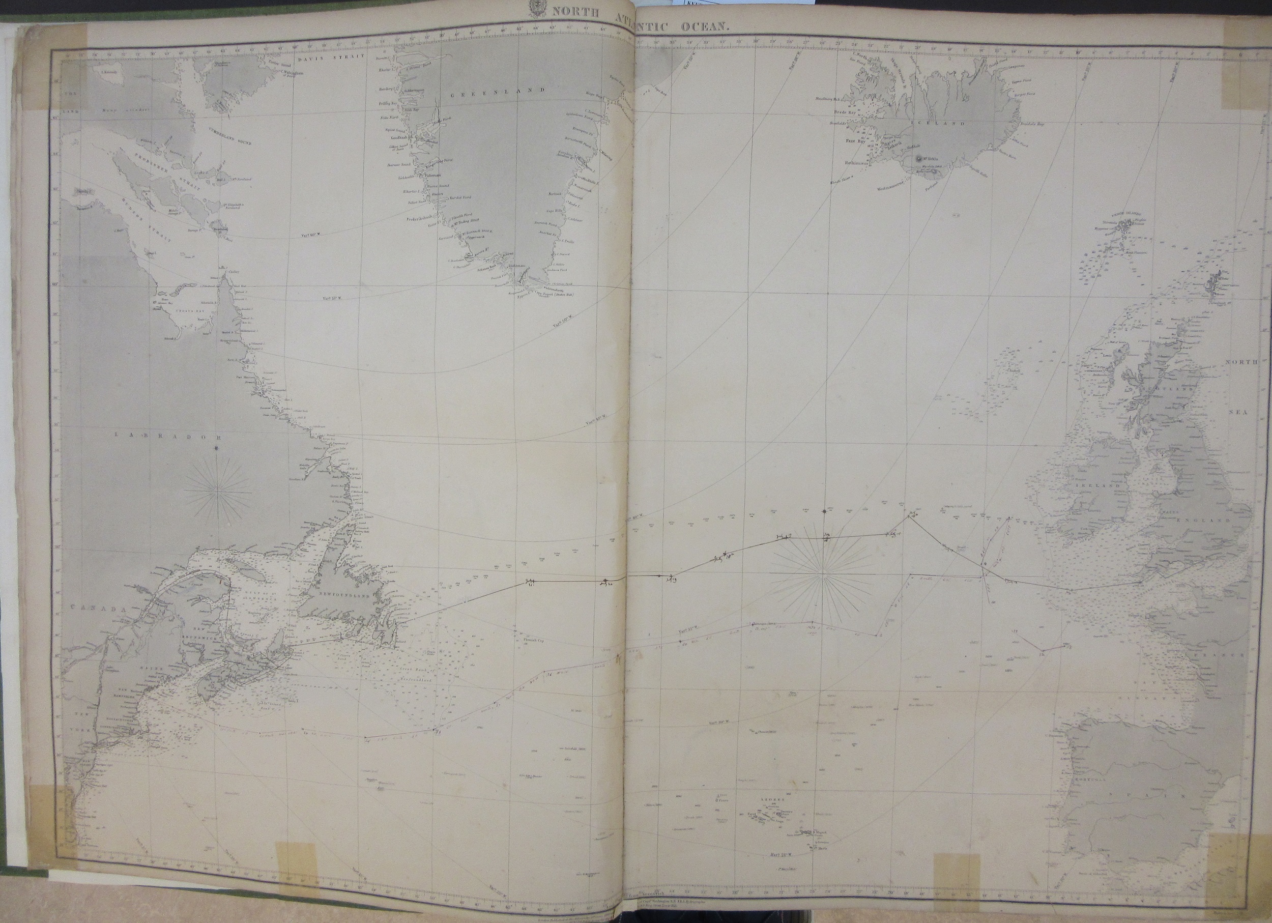
An extract from the chart showing the route taken to Quebec, sailing through the wonderfully named Gut of Canso (also called the Gut of Canseau) between Nova Scotia and Cape Breton Island.

Research into Acland’s life then explains the rest. In 1860 he became physician to H.R.H. the Prince of Wales (who later became Edward VII) just before he went on an official trip to Canada and the United States  onboard H.M.S. Hero, the first time a Prince of Wales had made this journey. The map charts the daily position of the Hero as it voyaged across the Atlantic.

The Gut of Canso (here called Canseau) taken from one of the other charts in the volume. The numbers are soundings while the yellow colours show the positions of lights, which could either be fixed (indicated by the letter F) or revolving (the letter R).

In Oxford Acland is famous for a map made six years before the voyage of the Hero. In 1854 he produced a report on a series of Cholera outbreaks in Oxford which had led to a number of fatalities. It came with a map which highlights the poor sanitary conditions in parts of the city (the areas shaded in green) , the parts of the Thames contaminated and unsafe to drink and the locations where there were cases of Cholera (more on the map can be found here). 

Map of Oxford to illustrate Dr. Acland’s memoir of cholera in Oxford in 1854… 1854. C17:70 Oxford (15)

The Acland Hospital, so long a feature on the Banbury Road in Oxford and now at the Manor Hospital in Headington was built as a memorial to Acland’s wife Sarah. A daughter, also called Sarah, was an early photographer, some of her work can be found in the Museum of the History of Science in Oxford.

In the year after the voyage a book was privately published by Gardner D. Engleheart. ‘Journal of the progress of H.R.H. the Prince of Wales through British North America and his visit to the United States… (203 a.333)’. The book includes illustrations and text about the visit and, helpfully for the purpose of this blog and identifying the map, a log of the journey out giving positions at noon on each day as well as a number of different diary entries from the voyage. So for instance we learn that the Royal Yacht (the Hero) ‘with the Prince Consort sailed at 4 a.m.’, presumably to catch the tide. Then, far more dramatically, from a different diary on the 12th ‘Man overboard! The gun-room steward jumped out of one of the ports, in a fit of temporary insanity, and was drowned! Every effort was made to rescue him, but he would not be saved.’

When one name leads to another

Most of the blogs here are fairly easy to write. You have the map, you have enough knowledge to write about the map, and if not books in the library will help. Occasionally you start looking into something where one clue leads to another, where one name stands out or where something doesn’t seem right.

This seemingly innocent small atlas , with three maps from the U.S. Geological Survey at 1:125,000, looks at first glance to be a simple presentation to friends.

But the dedicator, Albrecht Penck, is a familiar name. Penck was a German geographer and geologist who was the instigator of the acclaimed mapping series the International Map of the World. At the 5th International Geographical Congress in Berne in 1891 Penck proposed that there should be a standard map coverage of scale and design covering the World, and after further discussion in following congress meetings a design and a way of producing the maps was agreed on at the London Congress in 1909. More on the IMW series of maps can be found here

As for why Penck was sending out best wishes from the Townshend Ranch, that is more of a conundrum. He travelled to the United States a number of times but there seems to be no biographical information about a trip to Colorado. The story takes another twist when you look into the Townshend Ranch, which annoyingly doesn’t actually appear on any of the three maps in the atlas, something not helped by the fact that the ranch was by Black Squirrel Creek, and there are a number of different creeks in El Paso County with this name (the extract on the right is just one of two Black Squirrel Creeks on the three sheets in the atlas, Big Springs Sheet, Colorado, 1:125,000 1900). Born in England in 1846 Richard Baxter Townshend emigrated to the United States in 1869, moving around the south west before building a ranch alongside the creek. Townshend returned to England after making money in the States, married and eventually got a tutor’s position in Wadham College, across the road from the Bodleian here in Oxford. He wrote about his adventures in ‘Tenderfoot in Colorado’, first published in 1923.

The maps are published by the United States Geological Survey (U.S.G.S.). The rather bland description ‘U.S. Geological Survey, J.W. Powell, Director’ doesn’t do justice to a remarkable man. Born in New York to English parents Powell had explored most of the major rivers of the Eastern United States before signing on as a cartographer and engineer with the Union army in 1861. During the Battle of Shiloh the following year his right arm was blown off, making his subsequent achievement of being the first man to sail down the Colorado and Green Rivers, passing through the Grand Canyon on the way, even more remarkable.

Townshend’s story didn’t end there though, as his name continues to ring out every time the ‘Enigma Variations’ is played. Townshend was a close friend of Edward Elgar, who dedicated the third of the Variations to ‘R.B.T.’


The first of these next two images comes from ‘My friends pictured within‘ by Edward Elgar, (17402 d.799) which shows the people Elgar dedicated the different variations to. The second image is the start of the score to variations No. 3, dedicated to R.B.T. This is from the first published copy of the score from 1898 (Mus 221 c.40)*.

The Townshend Ranch, El Paso County, Colorado U.S.A.’ 1908 F6:14 b.1

  • Thanks to colleagues from our excellent Music Department here at the Bodleian

Drink up

Between July 2019 and this March the Bodleian put on a major map exhibition, Talking Maps, curated by Jerry Brotton and Nick Millea. With the World now spinning on a different axis we thought it would be good to relive some of the exhibition highlights and for the next few months staff will pick personal favourites to include in our Map Department blog.

It seems appropriate (or cruel, depending on whether your glass is half full or half empty) considering the lockdown to start with a map which deals with going to the pub. The Drink Map of Oxford is one of the most popular maps we have, it features in a lot of ‘show and tells’ map staff put on and was a popular subject during our lunch talks when the exhibition was on.

Drink map of Oxford 1883. C17:70 Oxford (7)

Over a simple skeleton plan published in 1883 the location of 319 pubs, breweries, beer houses and other licensed premises are shown using four different red symbols. Most pubs are on the main streets of the city (note how many are on the High Street for instance), while the breweries are close to the castle where there is easy access to water. Beer houses are where residents have applied for a licence to sell alcohol out of their houses to supplement income and are usually on side and residential roads, while other licensed premises are the Wine Merchants and groceries selling to the colleges and the public.

There are some intriguing aspects to this map. The first is the lack of University buildings shown, making this the only one of over 300 maps of the city held at the Bodleian with no hint of a University. There are a couple of reasons for this. Being a skeleton plan buildings aren’t included to keep the map as simple as possible (the railway is there as it is an important part of the city make-up, and also, more importantly, there is a pub in the terminal building as well). The second reason is that students weren’t allowed into the city pubs. Colleges would have had their own bars and some even brewed their own beers. Another aspect to the Drink Map is the wonderful irony in something which shows just where you can get a drink in Oxford but which is published by one a number of Temperance Societies in the city at the time, the rather grandly named Oxfordshire Band of Hope and Temperance Union. Temperance Societies were concerned about the problems alcohol was causing for the Working Class, causing problems such as poverty, crime, the breakdown of the family and church attendance. Text on the back mentions the effect of all this drinking in such a renowned city, ‘drunkenness abounds in our midst, and its attendant evils, crime and pauperism, are ever calling our attention. Can this be wondered at seeing we have up to three hundred places licensed by law for the sale of strong drink?’  The text goes on to make two claims about the city that don’t quite stand up too much investigation. The first is that the city is so overpopulated with drinking establishments that it has 50% more than any other comparable town. While there certainly is a lot in Oxford compared to now there was a lot everywhere. Post Office directories for towns such as Reading show similar numbers. The second claim is that the city magistrates come from the middle and upper class residents who tended to live in the north of the city, and while they were happy to give licences to places in the poor areas aren’t so keen to do so closer to home, hence the disparity between the north and other parts of the city on the map. Like the comparison with other towns this accusation doesn’t stand up when you use the directories. Kelly’s Post Office Directory for Oxford 1883 lists the names and addresses of the 16 magistrates in office for that year, with only a few living in the north of the city. Some magistrates live on the High Street while one even lives next to a beer house in St Clements. What is closer to the truth about the lack of pubs in North Oxford both then and now is that St Johns College owed most of the land and they were putting restrictions in place on the use of land in sale and leasing agreements which included the sale of alcohol.

There is an important companion to the Drink map that makes an equally strong social statement about Victorian Oxford. Dr. Acland’s map of major cholera outbreaks in 1832, 1849 and 1854 to

Map of Oxford to illustrate Dr. Acland’s memoir of cholera in Oxford in 1854… 1854. C17:70 Oxford (15)

accompany a report in 1854 is one of the earliest disease maps published in England. The map shows areas of poor or no drainage, the contaminated sections of river and the individual cases of outbreak and it is the areas of poor drainage that draw comparison with the Drink Map. The areas that feature strongest on the one map, the over-crowded working class districts of Jericho, St Ebbes, St Clements and Osney Island which are all heavily overlaid with red symbols are the same areas shaded to show areas of poor and no sanitation and drainage on the other.

The St. Ebbes area on both the Drink and Cholera maps. Most of this area has been redeveloped and is now the Westgate Shopping Centre.

These are two important maps of the history of the city, coming at a time when the population had grown considerably from the late 1790’s onward’s with the arrival of the canal, the move out of countryside by agricultural labourers following enclosure and the coming of the railway. This increase in population put pressure on the working-class areas with the inevitable problems highlighted in both maps; disease, poor housing, poor sanitation and over-crowding.

These are also wonderful maps full-stop. The cholera plots an illness which was for the time still hard to treat in a city using as their main source contaminated river water while the Drink Map is a serious attempt to highlight an important problem but now, without the social implications involved, looks like a Victorian version of a pub guide.

‘Further outlook stormy’

Driving in and around Oxford has long been an inconvenient experience. Various measures have been introduced over the years; blocking off access to some roads, restricting traffic on others. It is perhaps fortunate that the most ambitious of post-war planning never took place, considering the destruction that would have been caused to some of the prettiest parts of the city. Oxford Replanned was a scheme devised by Thomas Sharp, a planning consultant to the City Council, after the 1939-45 war. Sharp was appointed following work in a number of areas destroyed or damaged during the Blitz. Designed to take traffic away from the High Street by building new roads to the south of Merton College through Christ Church Meadow and then linking up with the Botley Road via a new layout of roads and squares between Queens Street and the Railway Station, the scheme was controversial from the start, something that Sharp himself predicted. In his book ‘Oxford Replanned’ Sharp states in the introduction ‘The task has proved to be an onerous one, and now it is completed I cannot with certainty expect that the result will be generally acceptable even in its main features, let alone in all its details. indeed I know very well that some of the suggestions I make will rouse bitter opposition in some quarters’. The Oxford Times were keen supporters of the plans, even though they could see the reaction the plans would cause, “further outlook stormy”, was their prediction as early as February 1948.

Overview of the city, from ‘Oxford Replanned’, 2479115 d.77.

Sharp passionately believed that radical steps needed to be taken to relieve the pressure on the High Street, which would bring ‘…some peace back into the old heart of the city’. To achieve this he set out a plan that involved  knocking down the large building belonging to Magdalen School between Cowley Place and the River, and building a bridge over the Cherwell at an angle to

Extract from a map showing proposed new bridge and road layout from the Plain (R) C17:70 Oxford (246)

Magdalen bridge which would take a new road from the Plain over the river and through Merton Field and Christ Church Meadow. This would then link up with a square south of Christ Church and then leading onto the Railway Station and Botley Road. For Sharp there were two main benefits to this scheme, the easing of traffic through the High already mentioned and the clearing of the slum areas around the castle. Sharp also envisaged a new building programme, with schools, council buildings and housing centred around public squares where previously there were slums and narrow streets.

Plan from ‘Oxford Replanned’ showing the proposed new road linking the plain to the square by Christ Church

As can be imagined Sharp’s plans were met with some opposition, though many recognized the need to improve the traffic issues that were apparent even then. Sharp appeared at a number of meetings throughout 1948 as his book was published and an exhibition of the proposals was held in the City. Most memorable was the an Oxford Union debate on the 4th of March, which was disrupted by the letting off of smoke bombs, though this seems to have been a student prank than any protest as a motion to support the plan was carried 173 votes to 50.


The new proposed layout overprinted onto an Ordnance Survey 6″ map of the city. (R) C17:70 Oxford (246).  As can be seen in this map Sharp proposed major changes to the layout of the city to the north of the High Street as well as the south.

Sharp’s plans updated those of Lawrence Dale, who published a book in 1944 called ‘Towards a plan for Oxford City’. Like Sharp Dale wanted to move traffic away from the High Street, though Dale doesn’t seem to have any connection with the Council or planning in general. His book is a mixture of strange motives, his plans seem to have been born out of frustration at an attempt to fly a kite on Christ Church meadow in 1942 thwarted by a notice at the entrance banning beggars, those poorly dressed and those flying kites from entry, while amongst his more outlandish ideas is the moving of the University out of Oxford to the estate at Wytham, leaving the college buildings to tourists and soldiers on leave or wounded from fighting in the war. As can be seen from a plan made by Dale his road goes nearer the river than Sharp’s proposals.

Lawrence Dale’s map from 1942 showing his proposed layout of a road over the meadows. (R) C17:70 Oxford (246)

The pictures shown throughout this blog are a mixture of maps and plans that were made for the production of a book written by Sharp in 1948 that sets out his proposals, ‘Oxford Replanned’. This book is a treasure trove of old photographs, plans and pictures and writings both of the city as it was immediately post-war and of how it could be if Sharp’s proposals were accepted. The maps and plans are in a number of different formats and media, and have recently undergone valuable conservation work, as some of the material, particularly the dyeline paper mapping and heavily painted plans, were not that stable.


The proposed square linking the new road from the Plain with the Railway Station, from ‘Oxford Replanned’.

Ultimately Sharp’s plans were rejected. Who’s to say we’re better off now without them? People can walk in the beautiful grounds of Christ Church and Merton unimpeded by road traffic, fumes and noise but at the same time the High Street is often clogged with traffic and the infrastructure of the road suffers from the traffic on it.


Page from ‘Oxford Replanned’ showing an idealistic view of the proposed road going through Christ Church Meadow.

[Maps from] Oxford Replanned,  1942-1956. A set of 19 maps, plans and prints, (R) C17:0 Oxford (246)

Oxford Bus & Cycle Map

Bus & Cycle map cover

Many Bodleian Library staff commute by bicycle and a number are keen cyclists, so the arrival of a new edition of the Oxford Bus & Cycle Map was greeted with enthusiasm in the Map Room, especially the side of it showing cycle routes. The map was produced by Richard Mann of Transport Paradise, whose site offers advice on improving urban transport with examples from Oxford and elsewhere. The cycle map is an innovative product in that it attempts to show two complete cycle networks. A quieter one (suitable for family and leisure cycling) is shown in blue, with routes through quiet streets or away from the roads altogether, through parks and beside the river. Meanwhile the main cycle commuter routes are shown in red; a complete, joined up network, with dotted lines to identify those parts of it where cycle provision is poorer, rather than a patchy network of good cycle routes – a pragmatic approach, since the cyclist will have to find a way even when it is less than ideal. An extract showing the city centre is shown below.

cycle map city centre inset

The clever design of the bus map on the reverse does a good job of unscrambling Oxford’s sometimes confusing bus route network. Four colours – red, blue, green and yellow – are used to group the main routes, to make it easier to follow them visually through the concentration of routes in the city centre. The frequency of services is indicated by solid, dashed or dotted lines.

Oxford’s centre is constantly busy, thronged with crowds of students, tourists and locals. Travelling into it by car is slow and parking is expensive. Use this map instead!

Oxford bus & cycle map. Oxford: Transport Paradise, 2015. C17:70 Oxford (249)

History of the Map Room

While maps and atlases have come into the library from its earliest days the map collection began in earnest in 1800, following a decision made to start the purchase of English and Foreign maps. In 1813 the Curators of the library ordered a large table to be made to hold the increasing collection of maps and atlases, which had grown in size with the bequest in 1809 of the collection of Richard Gough, which included the world famous map of Britain, the ‘Gough Map’, dating from the 1370s and the earliest map in existence showing a road network.

449x222_GoughMap

The main part of the collection though has been, from the start, the printed maps of the Ordnance Survey, published from 1801 onwards and which comes into the library under the legal deposit arrangement of 1610. This was followed in the second half of the nineteenth century by the hydrographic charts published by the Admiralty, and by 1882 it was reckoned that the library was receiving between three and four thousand sheets a year from these two organizations alone.

For many years the collection was held in the Douce Room (now part of the Lower Reading Room) where it was felt that ‘In default of means of dealing with them and of space for their storage, maps, it is to be feared, were regard as an encumbrance’. (1)

The collection moved from the Douce Room in 1887, into the Moral Philosophy School room in the Old Schools quadrangle. Fitted out at a cost of £480 this space was soon cramped and it wasn’t until the completion of the New Library in 1939, and with it a large purpose-built room on the east side of the building with storage areas set aside in the stacks on the same floor that the Map Department had finally a proper home.

Increased storage in the New Bodleian bookstack was soon put to good use. Throughout the Second World War and after the library has been fortunate in receiving from the Geographical Section of the War Office, and more recently the Ministry of Defence, a large number of maps from both the Allies and Axis forces, giving the Bodleian not only maps of historical interest but also detailed mapping of parts of the world that the library had poor cover of up until the arrival of these donations.

Bodley’s map collection was held in the New Library until 2010 when, along with all the other material held by the library, the maps, atlases and globes moved to purpose-built accommodation in Swindon. With over a million maps to call on the collection is stored in a controlled environment in drawers with space to let the collection grow, through material published in Great Britain that comes to the library via the legal deposit agreement of 1610 and the large number of donations the Bodleian receives each year. While the Ordnance Survey continues to be the make up a great part of the collection donations from the Ministry of Defence means the library has a large amount of material dealing with Britain’s military and colonial past, from trench maps from the western front to tribal maps of Africa.

  1. Craster, E. History of the Bodleian Library 1845-1945, 1952. Pg 81, X1.11.