Category Archives: Travel

Reflections on the Alps

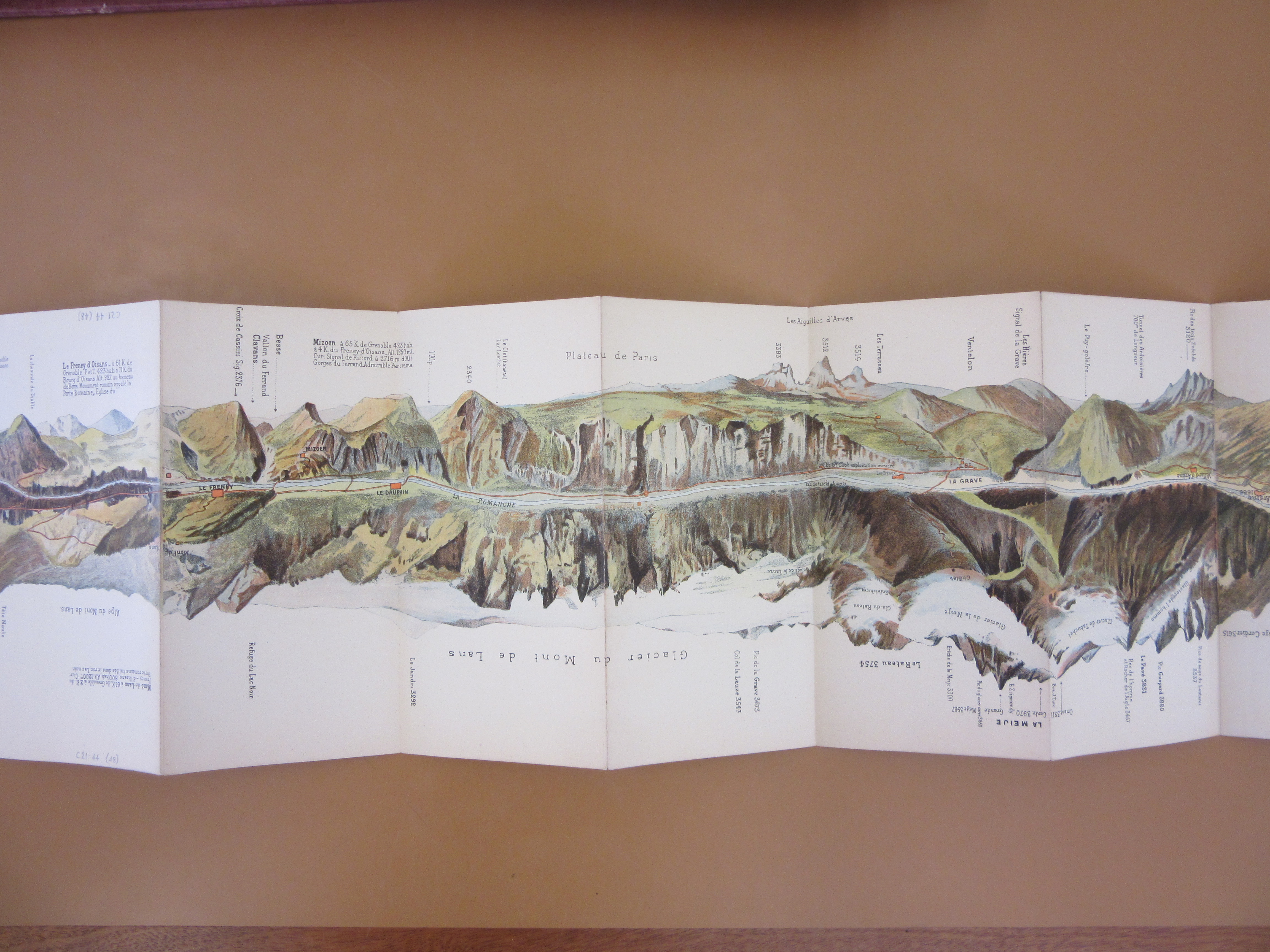
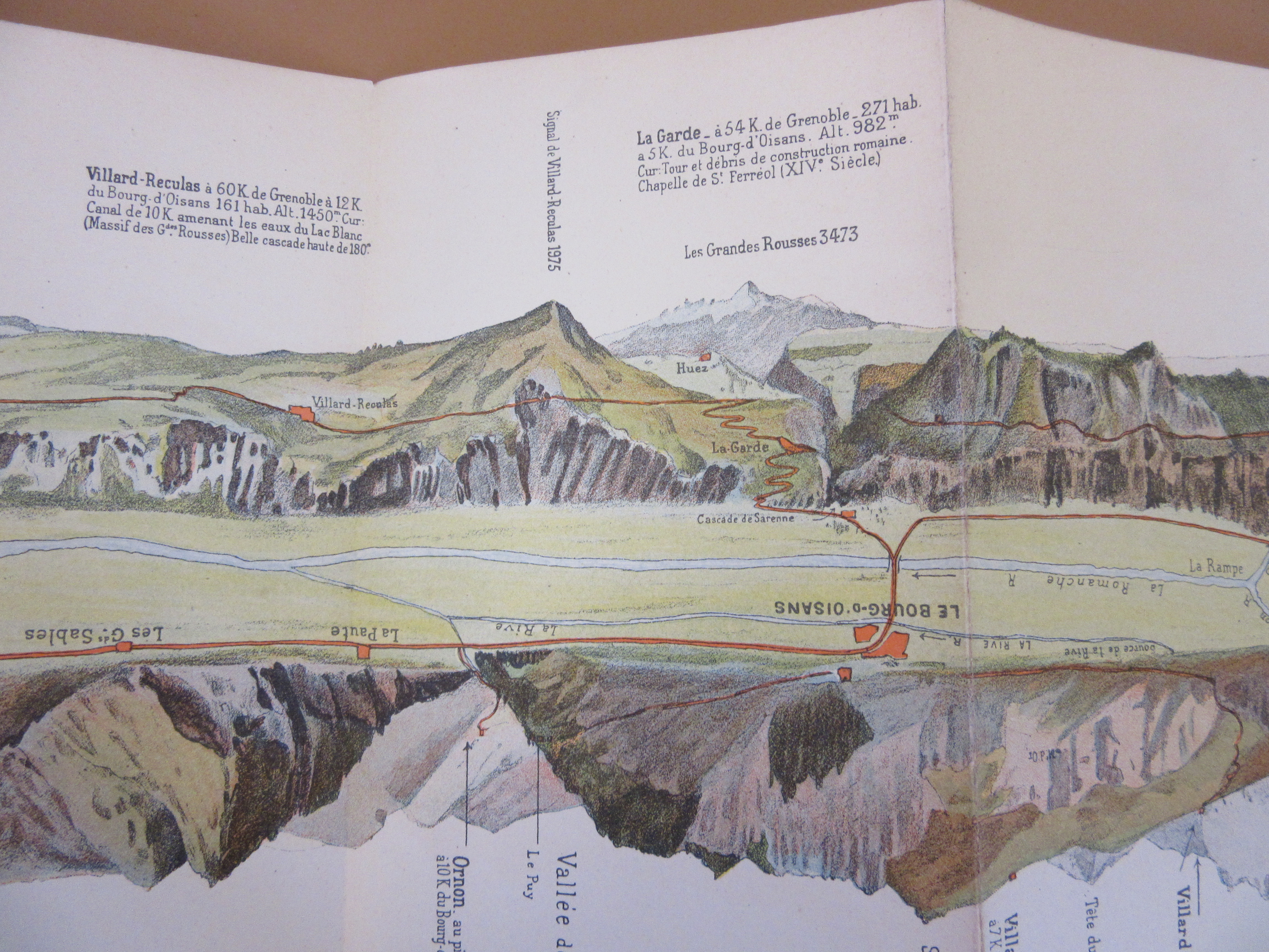
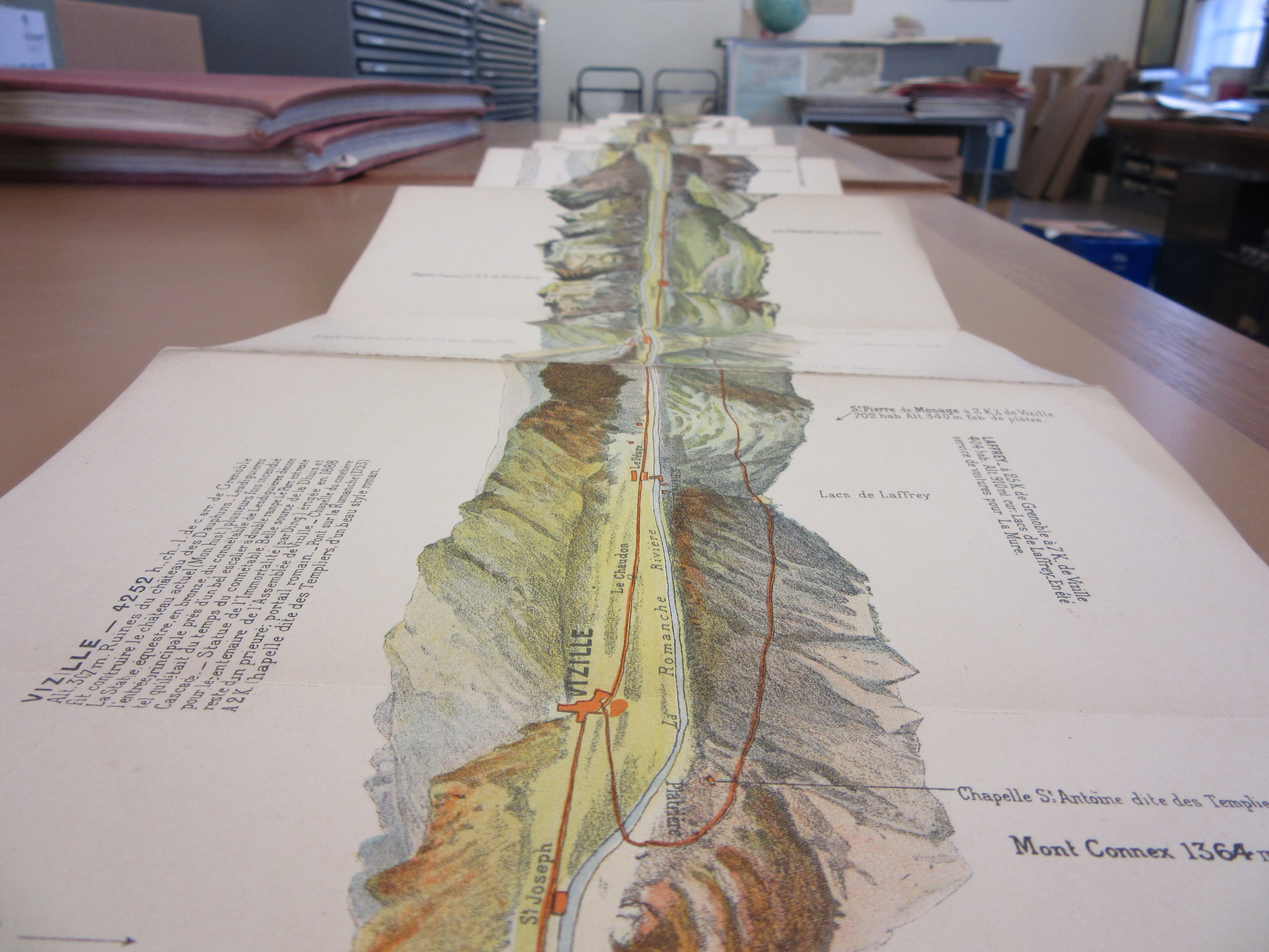
December 11th is United Nations International Mountain Day, so we’re celebrating with this unusual Alpine panorama.  This map of an Alpine road appears at first glance to be a view of mountains reflected in water.  Closer examination shows that a road runs along the centre of the map; it is printed on a long strip, folded concertina style, with the road shown as a straight line and panoramic views of the mountains on either side. Unusual formats like this have been used in other Alpine maps, to address the challenge of portraying a long vista on paper; a panorama of the view from the summit of Mont Blanc featured in an earlier blog post.

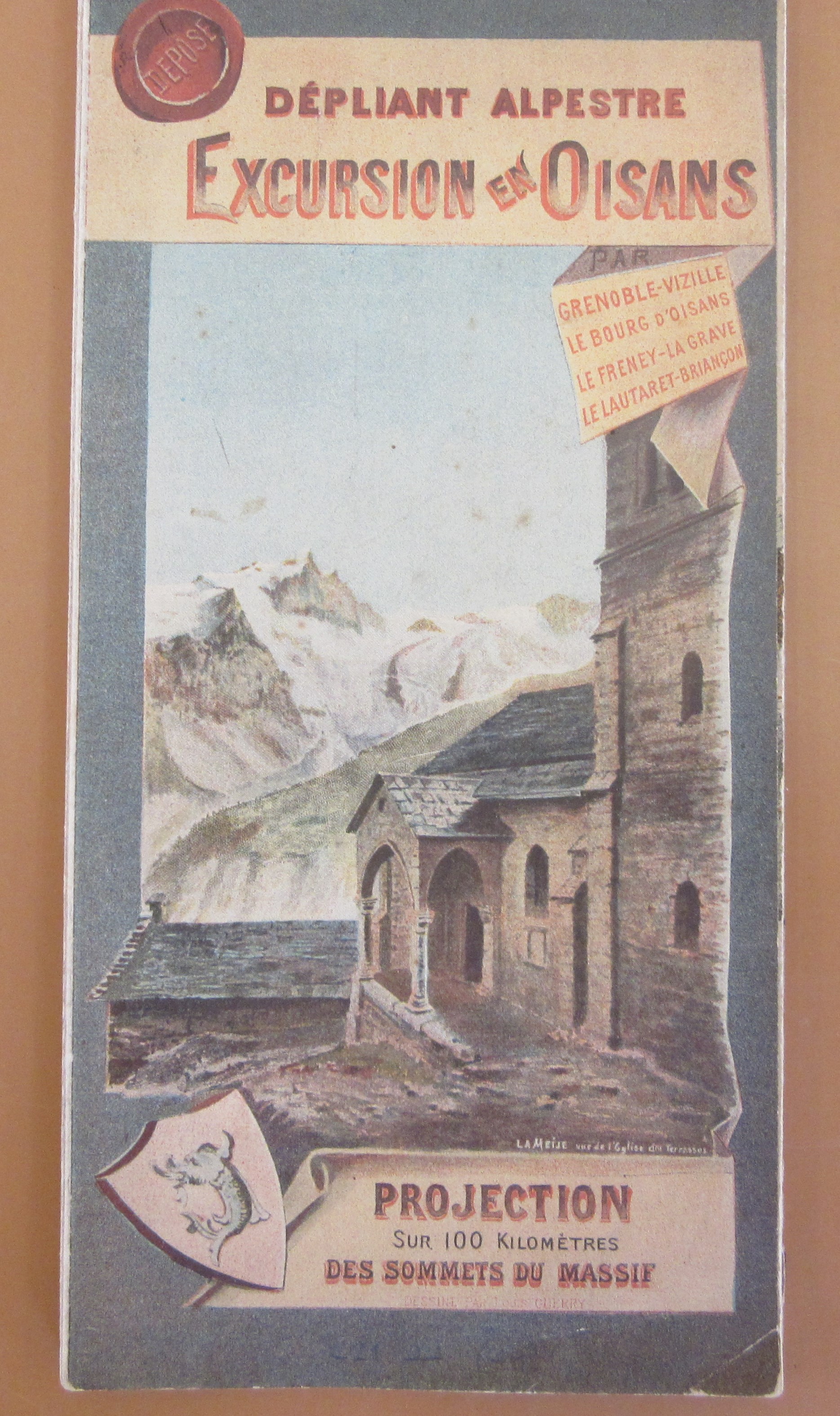
The map was drawn by the poster artist Louis Guerry, and published in Grenoble in 1896 by Joseph Baratier. It shows the road between Vizille and Briançon in France, close to the border with Italy. Side roads wind off into the mountains and small Alpine settlements are marked along the way. Highest and most dramatic of the mountains is La Meije, with five peaks and glaciers flowing down either side; it was one of the last major Alpine peaks to be climbed, and also features on the cover illustration (above). Other names, such as Galibier and Alpe d’Huez, will be familiar to fans of the Tour de France cycle race;  the road up to Alpe d’Huez did not at this time reach all the way to Huez itself, which appears as a high isolated village.

This copy came to the library recently, a donation from the grandson of Thomas Arthur Rumbold. When Rumbold joined the Alpine Club in 1902 he was their youngest member. His application shows an impressive list of climbing experience from the late 1890s; it includes  mountains in the French, Italian and Swiss Alps, many of them “without guides”, and rock climbing in the Allegheny Mountains in Virginia. The map was donated along with Rumbold’s trench maps from his time serving in WWI, which were a welcome addition to our collection. Happily, Rumbold  survived the war; he went on to become Secretary to Sir George Schuster, Governor of the Bank of England. He also found time to enjoy more Alpine fun in the snow (see below) and eventually became the oldest member of the Alpine Club!

Thomas Rumbold and friends enjoying St Moritz. Photo shared by his grandson.

The map folds into a small cover with a conventional route map on the back.

The map when extended is over 2 metres long.  As we admired it in the Map Room office, we reflected that in these times of Covid restrictions it is rare to find a map so long that more than one person can look at it at once while social distancing.

Dépliant Alpestre : Excursion en Oisans. Projection sur 100 kilometres des sommets du Massif / dessiné par Louis Guerry. Grenoble : Joseph Baratier, [1896]. C21:44 (48)

You can see more about this map at the website of the Bibliotheque Dauphinoise.

Measuring distances, a wheel or a chain?

John Ogilby has to be one of the most interesting of all the cartographers. Before turning to making maps aged 66 he had at various times been a dancer and dance instructor, theatre manager and publisher, with career changes usually the result of misfortune of some kind. His dance career ended after suffering serious injury during one performance, his career in the theatre in Dublin came to an abrupt end due to Irish rebellion against the English in 1644 and then finally he lost most of his publishing stock in the Great Fire of London.

It was the fire that set Ogilby on a new path as a cartographer. After mapping the devastated city to aid in redevelopment Ogilby embarked on the project that would not only give him lasting fame but introduced a new way of mapping  roads. In 1675 Ogilby published the Britannia, an atlas of 73 routes at a scale, for the first time, of one inch to the mile (1:63,360). As can be seen from this example Ogilby revolutionized the way maps were shown by only focusing on the relevant information for the road user and by making the best use of space while creating maps full of useful information and easy to understand.

Miles are marked on the road maps with furlongs in between the miles shown by dots (a furlong being the length of a furrow in a common field, by Ogilby’s day there were 8 to a mile). Compass roses show north and hills are drawn in a way to show if you are travelling up hill or down. The cartouche includes figures surveying and using tools that would have been used to map out the route and recorded the miles.

The wheel on the end of the stick was called a way-wiser that recorded each turn of the wheel on a dial,  while underneath that a winged figure called a Putto is using a Gunter’s chain, invented in 1620, which was laid along the ground to measure distances. The chain measured 66 feet divided into 100 links, ten chains length was a furlong, 80 a mile.  The figure on the horse is holding a compass.

Ogilby died the year after the publication of Britannia, but his work stayed in print, first through the efforts of his step-grandson William Morgan (who like Ogilby was appointed ‘His Majesty’s Cosmographer’), and then through, acknowledged or often not, the works of later cartographers, all making use of such a rich and inventive source of information.

There is one more intriguing chapter to the story. Ogilby was closely allied with Charles II, and there is a theory that Britannia was published to help with a proposed invasion from France to restore the Catholic faith in the country. For some the emphasis that Britannia places in routes to poorly populated ports and locations in Wales and the West Country and the publication date being so close to a signing of a secret treaty with France (so secret it didn’t come into public knowledge till 1820) shows that this was a road map with a hidden agenda, and it is only with this agenda in mind that some of the seemingly random things shown on the maps; a house in the middle of nowhere, mines in one location but not others for instance, begin to make sense.

In the corridor outside the Map Office here at the Bodleian nine portraits are hung. Two are of cartographers; John Speed, the famous Tudor map maker, and John Ogilby, both of whom originally were named in their picture. Ogilby’s name has at some point been painted out, this may be due to changing fashions as none of the other, later, seven portraits name the person in the picture. We can’t be sure though if his name has been erased deliberately, another layer of mystery attached to a man who had more than his fair share throughout his life.

Britannia, volume the first, or, an illustration of the Kingdom of England and Wales by a geographical and historical description of the principal roads thereof…1675. Vet A3 b.10


Sending cabbies in circles

Joachim Friederichs map of London takes an interesting approach to measuring distances. A series of circles covers the whole map, each one representing ½ a mile in diameter, making it possible, according to the cartographer, to ‘merely count the number of circles between one point and another you have at once the distance travelled’.

The Circuiteer, or distance map of London: invented by J. Friederichs, particularly adapted for cab conveyance c1850. (E) C17:70 London (359)

Measuring distances in maps is a long established practice; from simply putting in distances along roads from point ‘a’ to ‘b’ to concentric circles at a set distance radiating out from a central location to the scale bars and grids so familiar to us from our Ordnance Survey maps. With so many maps of London published Friederichs map stands out with it’s unusual approach.

As well as a distance guide the map serves as a proposal to right what the author sees as a serious case of wrong-doing, the over-charging by Hackney Carriage drivers. In text accompanying the map Frederichs writes ‘The monstrous imposition practised by Cab-Drivers upon the public have long been the subject of general complaint, but of all the plans hitherto suggested to remedy the abuse – and they have been many – not one has been found to ensure. The purpose the Circuiteer, or Distance Map, at least offers  a certain protection against such extortions, as the reader will be enabled to judge for himself, from the following concise explanation.’

The text goes on to give examples of proposed fares, considered reasonable, by mile as opposed to by route, and suggests the buying of pre-paid tickets instead of paying cab fares.

Hackney Carriage fares have featured on numerous maps of the City. This example, A new and exact plan of the cities of London and Westminster & the Borough of Southwark…whereunto are added the rates of Hackney Coachmen and watermen with several other embellishments. By Robert Sayer, 1775. (E) C17:70 London (72),  has, as well as a wonderful map of the City, a small box in the bottom corner giving a ‘Table of Rates’ at both a shilling and eighteen-penny and rates for the Thames watermen. The map also has insets of the major buildings and shows the Ward boundaries.


A map, a view and an elevation

This beautiful map of the Teign Estuary incorporates three different ways to show off the new bridge across the river linking the village of Shaldon with the important Devonshire port and seaside resort at Teignmouth.

The bridge, completed the year before the map was published, was just over 1,670 feet long, making it the longest wooden bridge in the country at the time. A swing-bridge at the Teignmouth end allowed ships through to the estuary.

The map is a work of self-promotion, designed to show the route of a new road which had been proposed by Roger Hopkins, Civil Engineer and Mineral Surveyor, who designed and built the bridge and made the map. To show off Hopkins skills as an engineer and surveyor the bridge features prominently, not only on the map but both in a portrait

and then in profile; the former to show the beauty of the design within the context of the setting, the latter to show off the surveying and engineering skills of Hopkins.

In the title Hopkins reminds the viewer that it is he that ‘projected, designed and executed…’ the bridge and then goes on, as his ‘most humble servant’, to dedicate the map to the Duke of Clarence, Lord High Admiral of the United Kingdom. As can be imagined the Lord High Admiral was the head of the Royal Navy and the holder was usually drawn from the Royal Family (the current High Admiral is Prince Philip). Three years after the publication of the map the Duke of Clarence became William the IV.

By showing evidence of his surveying and engineering skills with the views of his bridge Hopkins sets out why he is qualified to propose his new road, despite there already being a road from Newton (now Newton Abbot) to Shaldon. Hopkins road would be far more direct, transporting the produce from the mills in the town to the port at Teignmouth. Despite the beauty and surveying and engraving skills on show Hopkins was ultimately unsuccessful, the road only existed on paper and twenty years later the railway came to South Devon, and Newton Abbot was linked to Teignmouth along the northern side of the Teign.

Map of the towns of Teignmouth and Newtonand the country lying between them, showing the advantage of a proposed… road… from actual survey made by R. Hopkins, 1828 (E) C17:25 (41)

Rails and Railways

The Reshaping of British Railways seminal report is always remembered but the accompanying maps are generally not.  These rather ordinary maps represent a huge shift in the transportation provision of the country as the railways were contracted.  The maps are stylistically simple but hugely important.

The report authored by Richard Beeching was published in 1963 by the British Railways Board as a response to the government’s requirement to make the aging railway system more efficient.  The streamlining process, as everybody knows, involved cuts to much of the network. Beeching’s proposals closed 5000 miles and over 2300 stations so ending public use of a third of the existing network.  Beeching championed the expansion of the road network and envisioned the loss making rail services being replaced  by bus services.


Three decades later views had changed of railways had changed and large infrastructure projects were planned once more.

The Channel Tunnel carrying a railway direct to continental Europe was an ambitious joint venture with the French and the accompanying rail link was the first high speed link in the country (HS1).  Railways were back in as a fast and efficient way to travel.  The accompanying plans show the difficulties of fitting in new rail tracks into the congested part of London.

Nowadays with the roads congested and the climate suffering some of Beeching’s closures are looking to be reversed.  The Ashington, Blyth and Tyne line in has been granted funds to develop proposals to reopen to aid connectivity in the North East and take pressure off local roads.


Now railway passenger numbers are at record levels so can we look forward to more maps of Beeching reversals?

The Reshaping of British Railways M05.E08183

Channel Tunnel rail link. Plans and sections C17:38A b.1

The Grand Junction Railway

This is one of the earliest Railway maps held in the Bodleian. Dating from 1839 the map shows the route of the Grand Junction Railway which at the time of the map ran from Birmingham north to join up with the Liverpool to Manchester Railway, a journey of 82 miles.

Drake’s map of the Grand Junction Railway, 1839. (E) C17:5 (18)

As well as showing the route the map also has a distance chart showing the miles from Birmingham and, important from the point of view of having as flat and level a route as possible, a height profile. The map also has a lovely vignette just underneath the title of a train in motion. Maps started to feature railways at the start of the 1800s but these were horse-drawn. The first steam powered engine, George Stephenson’s Locomotion,  was on  the Stockton to Darlington Railway in 1825.

While the Library has a large number of railway maps the Drake is one of the few we have that comes with a timetable. Included on Drake’s Railway Sheet of the Grand Junction… is information

on fares and times along the route. A first class journey from Birmingham to Liverpool would cost 21 shillings (approximately £60, a first-class ticket today is twice this amount) and take four and a half hours. There is also another picture of an engine and first and second class carriages and cattle (horses cost 2 shillings).


Views from the sea

This collection of nineteenth century French sea charts has already been referred to in this blog last year, in a post dealing with some small scale charts used for route planning. Nearly a year later, I am still cataloguing the collection! The more detailed charts of particular coasts are fascinating too. One of the remarkable features of early sea charts is the coastal views they sometimes include, small thumbnail images showing the appearance of the land from the sea; these have been used for centuries. They clearly had a practical purpose, helping mariners to locate themselves, but they can be things of beauty too. The ones in these French charts are small, detailed, finely engraved views. Similar examples are found on British charts of the same period. 

In some cases these are quite dramatic. This view of the entrance to Grundarfjörður in western Iceland shows a forbidding mountain range. The fineness of the engraving and subtle shading gives the small picture an austere beauty perhaps like that of the landscape itself.

Similarly, this 1856 chart of Dyre Fiord (Dýrafjörður) in the remote north west of Iceland shows a forbidding coastline of dark cliffs. The chart itself, although mainly focused on the sea,  shows the coastal relief and gives an indication of the steep mountains rising around the fjord.

Both of these were engraved by S. Jacobs, who seems to have done a lot of work for the French Dépôt des cartes et plans de la marine. There are a surprising number of detailed French charts of this remote part of Iceland; the next chart in the volume shows the anchorages and the village of Hogdal (Haukadalur) in some detail. The larger settlement of Thingeyri or Þingeyri, marked here as Ting Eyre, was already an important fishing centre.

 The views in this last example are detailed depictions of individual seamarks. This image is from an 1868 chart showing part of the German coast (estuaries of the rivers Elbe, Weser and Jade). Here the natural landscape is flatter, and the distinguishing features that can be seen from the sea are artificial constructions. The pictures include a bell tower as well as lighthouses and buoys, and landmarks like churches and windmills are marked on the chart. The yellow blob at Bremerhaven is a lighthouse – they were all highlighted in colour, by hand, on these otherwise largely uncoloured charts.

All charts from collection B1 a.61. Plan du havre de Grone Fiord, 1858. Carte de Dyre Fiord : (côte N.O. de l’Islande), 1856. Carte des embouchures de la Jade du Weser et de l’Elbe, 1868.  All  published in Paris by the Dépôt des cartes et plans de la marine.

Golden Globes

Globes in various forms are an everyday sight but intriguing none the less.  Like maps there are increasingly being looked at in an aesthetic light, but were designed with a clear educational function.  An early example the ’Erdapfel’ or ‘Behaim globe’ constructed between 1490 and 1492

was thought to have come to the attention of Christopher Columbus before his famous voyage.  He would have consulted flat paper maps but it is only on a globe can you appreciate the directness of the Great Circle route. They also “contrived to solve the various phœnomena of the earth and heavens, in a more easy and natural manner” so said George Adams in his Treatise describing the construction and explaining the use of new celestial and terrestrial globes. (1777)

Globes were traditionally made using gores – 12 or 16 shaped paper or vellum strips pasted to a sphere with ‘calottes’ or caps to cover the inevitable untidiness at the joins at the north and south pole and subsequently mounted at 23½° off the vertical to replicate earth’s tilt in space. To maintain this angle lead shot was used to balance. Some globes were manufactured to be portable whereby they can be disassembled in 48 pieces.

Modern self-supporting globes use sections that bear very little resemblance to the elegant gore. The traditional skill of globe making has been revived recently by Greaves & Thomas a small company specialising in the production of all manner of globes “spanning cartographic history from 1492 to the present day”.

The Bodleian has never restricted itself to collecting justbooks and manuscripts. Indeed it was Sir Thomas Bodley who purchased a pair of extravagantly expensive terrestrial and celestial Molyneux globes (1592) and subsequently bemoaned the fact they were getting ‘slurred’ (smudged) and so their upkeep would become a continuous charge.  This proved to be the case as the Bodleian accounts show payments made to the joiner in 1629, 1636 and in 1644 for mending one or other of the globes.  This pair was discarded in favour of a pair of Blaeu globes which can be seen on a contemporary print by David Loggan of Duke Humfrey’s Library in 1675. It appears these were also rejected in favour of a more modern (and smaller) pair of John Senex globes dating from 1728.  It is this pair which reside in the Rare Books and Manuscript Reading Room of the Weston Library.  .

Today globes are more likely to be found as blow ups, pop ups or large installations.

Examples of this more public structure can be found in Boston, Massachusetts as the Mapparium in the Mary Baker Eddy Library and De Lorme’s Eartha globe in Yarmouth, Maine but equally the inflatable globe functions well as a ball on a beach. ‘Three dimensional atlases’ are now being published as pop ups of hemispheres, illustrating text wonderfully for younger readers. Miniature globes were regarded as children’s toys with some educational value but the most peculiar is the ostrich egg. Sadly the Bodleian does not possess one of these wonderful objects but given its delicate structure it is only a decorative piece.

Mapparium photo credit: https://flic.kr/p/2dhfXcJ

Egg photo credit: https://commons.wikimedia.org/wiki/File:Bellerby_%26_Co_Egg_Globe_Commission.jpg


Boats and Maps

Maps come in all sorts of shapes and sizes and one recent purchase by the Rare Books Section was not one I’d seen before.  The artist’s book The last voyage by Tracey Bush is based on a poem by a seventeenth century wit John Taylor who undertook a journey in a paper boat with two stockfish tied to canes for oars from London to Queenborough on the Isle of Sheppey in Kent.  The map is fashioned into a hand folded paper model of a boat which is accompanied by a booklet with extracts of the poem In praise of the hemp-seed written by Taylor to describe his journey. The booklet and boat are made entirely by hemp paper and are contained in a folder secured by a small piece of hemp rope.

This artistic use of maps is increasing with the popularity of maps as visual objects and you can see them everywhere – mugs, mouse mats and even the former First Lady’s dress. What is it about maps that is so appealing?  Is it the potential for a journey? The depiction of something (generally) real? Or do they just make pretty things to look at? Whatever the draw it has been going on for centuries as can be seen by Leo Belgicus which was first drawn in 1583 by Michaël Eytzinger, an Austrian cartographer.  He depicted the Low Countries as a lion rampant facing east, an image which was popular in various forms for many years.

As was closer to home James Gillray’s caricature of England as an old woman seated on a sea creature.  Otherwise it is the content, rather than the appearance of the map which is more important – who hasn’t seen advertisements for items personalised with a map of a significant location in cufflinks, necklaces and puzzles.

Whatever it is in this age of technology maps remain relevant as practical items (an Ordnance Sheet doesn’t require a mobile phone signal) and an artefact thus still fulfilling the Encyclopaedia Britannica’s definition of cartography as ‘the art and science of graphically representing a geographical area, usually on a flat surface such as a map or chart. It may involve the superimposition of political, cultural, or other non-geographical divisions onto the representation of a geographical area.’

The shortest distance between two points

We came across this map, on a very unusual projection, while processing a previously uncatalogued set of nineteenth century French sea charts produced by the Dépôt des cartes et plans de la marine. Most are standard nautical charts, but this one – part of a set of three – is extraordinary.  The world appears to have been turned inside out; the chart is centred on the central Atlantic, and the land masses are progressively larger and more distorted the further they are from this point. The other two charts represent the Pacific and Indian Oceans in the same way.

The title makes the chart’s purpose clear: ‘Carte pour la navigation par l’arc de grand circle’. A great circle is, technically, the point at which the surface of a sphere intersects with a plane passing through its centre. In practical terms, a great circle drawn on the surface of the Earth between 2 points will be the shortest distance between those points (the Earth is not, of course, a perfect sphere, but it is close enough for this to be of use).

Navigational charts are traditionally drawn on the Mercator projection. This has the great advantage of showing a line of constant bearing (rhumb line) on the Earth’s surface as a straight line on the map. This is the simplest course to navigate, as mariners have known for many hundreds of years, but it is not the shortest. The shortest route is a great circle, and this requires constant adjustment of direction to stay on course. Sailing ships were limited by the challenges of winds and currents, and early steam ships by the need to refuel, but from the 1870s this principle began to have more practical applications. A straight line drawn on this orthodromic chart is a great circle course between the two points it connects, enabling navigators to plan their great circle journeys relatively easily. These charts were published in 1879. 

Charts of this sort do not appear to have passed into common use, and there could be several reasons for this. For one thing, the difficulties of plotting a great circle course are sufficient to outweigh the advantages for all but the longest ocean crossing journeys. Mariners continued to use rhumb line navigation well into the late twentieth century, by which time GPS systems had come into use. When a great circle course was followed, for sea or air travel, it was calculated in advance, sometimes using a chart of this sort. The course would then be plotted onto a Mercator projection chart where it was easier to follow. 

The usefulness of great circles can be seen most clearly on a modern map of long distance air travel. This is why aeroplane routes from, say, London to San Francisco always appear oddly curved when viewed on a map, with the route going much much north than you would expect. This is a great circle course, and the shortest way to connect two distant cities. A demonstration can be seen on this useful site http://demonstrations.wolfram.com/GreatCirclesOnMercatorsChart/.

The charts were created by Gustave Hilleret, a naval lieutenant and teacher at the École supérieure de guerre navale, who also published books on navigation. The projection is the Gnomonic projection with Equatorial aspect; the charts’ Bodleian shelfmark is B1 a.61/1 [39-41].