Category Archives: Uncategorized

Prussia pausing…

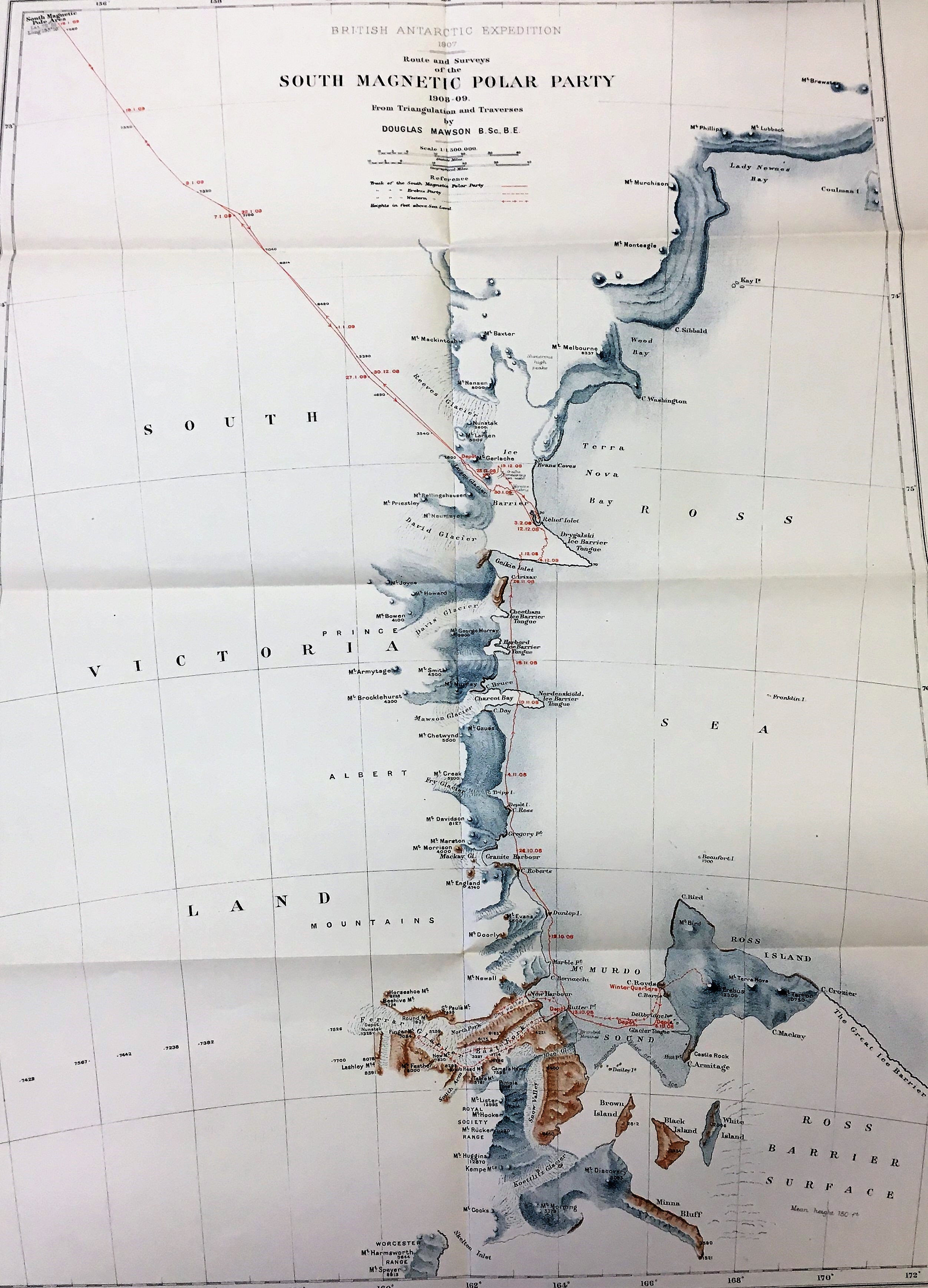
Few maps manage to combine cartography, history and sheer bonkersness with such good effect as Prussia pausing, or the accurate armistice demarcation line. In the map the neck and face of a lion are overprinted on a map of France like some animalistic Victorian ectoplasm to show the areas occupied by German forces at the end of the Franco-Prussian war of 1870-71.

Prussia pausing…1871. C21 (110)

A brief bit of history. Strengthened following victory against Austria in 1866, combined German states invaded and defeated France in a war that started in the summer of 1870 and was won by early 1871. At the start of the war the German forces fought as the North German Confederation, of which Prussia was the largest and most dominate state. The end of the war led to the forming of a united Germany and the wide-spread copying of the military tactics used. Soon after the defeat the English publisher Edward Stanford published Prussia pausing… on Valentine’s Day 1871. The critical nature of the map (Attention is drawn to the extraordinary coincidence of the Armistice boundaries representing the outlines of a carnivorous animal typical of the relentless veracity of Prussia…)  wasn’t mirrored in political circles, who still viewed France as the main competitor in  global trade and empire, while, remarkably considering future events, not looking on Germany as being strong enough to offer a threat to British interests.

A lion traditionally represented strength and courage but also cruelty and death. From the concept of strength comes another use of the lion, as a symbol of imperialism or statehood. This is one of the reasons for one of the most famous of all zoomorphic (as in the use of animals to suggest or represent a non-animal action) maps, the Leo Belgicus. 

Leo Belgicus, facsimile of 1650 edition, C27 (146)

There are a number of versions of this famous map, dating from the late 1500s to the mid 1600s, and the lion could be shown as either fighting or not depending on the current state of the Dutch war with Spain to gain independence. The lion was drawn in a way that represented the areas we know now as the Netherlands and Belgium and, more importantly, was represented on the arms of some of the seventeen provinces that made up the Low Countries.


First destroy this map…

Using maps for  games is nothing new, we’ve blogged a number of times about card (here) and board (here) games but this is a first, a game you can only play if you destroy the map first.

Secret rivers…c2020 C17:40 (277)

Secret Rivers family game is a leaflet produced by the Museum of London Docklands. When you follow the instructions and tear along the perforated lines you have ten cards for each of the rivers; the Thames, Neckinger, Tyburn, Walbrook, Westbourne, Lea, Peck, Fleet, Effra and Wandle, which then can be used in a Top Trumps style card game. So the Thames will beat the Neckinger on length, 215 miles compared to 3 but the Neckinger has a greater pong rating 80 points for stinkiness compared to just 38 for the Thames.

It’s a lovely idea, and the map is very much secondary to the text/cards on the reverse.

An earlier map of London covering the same area shows how early London’s rivers had been hidden away.

Map of the country twelve miles round London 1847 (E) C17:40 (72)

Of the ten on our Museum map only the Thames and Lea (the river that divides the counties of Hertfordshire and Essex), are visible, the others are either too small to show or had already been drained and forced underground by the time C. Smith & Sons made their map in 1847.

Map staff would like it known that they resisted the urge to play the game!

A horse?

Chalk figures on hillsides are not uncommon especially in southern Britain but they still retain the air of mystery. What are some of them?  Who created them? Why are they there? They also caused an issue on maps.  Early modern cartographers drew maps but out of necessity gathered information from other surveyors. This is where errors crept in.  Imagine an surveyor of the Berkshire Downs at Uffington saying “well, there’s this white horse on the side of the hill”.  The prehistoric ‘horse’ famously does not look like a horse therefore the misunderstandings can be seen as a result, most notably the Sheldon tapestry map of Oxfordshire which has a truly majestic (and enormous) white horse striding over the side of the hill.


Richard Hyckes who designed the tapestry was not to know the reality was rather different.


The error was repeated by John Rocque albeit with a more modest horse.


It wasn’t until the Ordnance Survey surveyed the country was the Uffington White Horse depicted as it truly is.


The Cerne Abbas Giant is actually a giant cut into the chalk of Dorset, rather a famous one. He is  younger than the horse but his beginnings are still shrouded in mystery but possibly something to do with former Cerne Abbey nearby. For some reason he was only represented as lettering by Isaac Taylor 1765.

However, the Ordnance Survey somewhat sanitised him when the 25” was published in 1888.

The Long Man of Wilmington in East Sussex was not so problematic, so much so that he didn’t appear at all until the OS came along. The map by Thomas Yeakell and William Gardner (1778-1783)  ignores him completely – whether they were unaware of the chalk figure or merely swerved the opportunity of representing it history does not tell us.


Sheldon tapestry map of Oxfordshire  [1590?] (R) Gough Maps 261

John Rocque. A topographical map of the county of Berks (1761) Gough Maps Berkshire 6

Ordnance Survey 2nd edition 1:2500 Berkshire XIII.14 1899

Isaac Taylor. Dorset-shire. 1765 Gough Maps Dorset 11

Ordnance Survey 1st edition 1:2500 Dorset XXXI.2 1888

Thomas Yeakell, William Gardner. The county of Sussex. 1778-1783. Gough Maps Sussex 14

Ordnance Survey 3rd edition 1:2500 Sussex LXVIII.15 1909

Beavers

Talk in the news of beavers roaming across Welsh gardens brings this map to mind…

A new and exact map of the Dominions of the King of Great Britain on ye continent of North America containing Newfoundland, New Scotland, New England, New York, New Jersey, Pensilvania, Maryland, Virginia and Carolina. According to the Newest and most Exact Observations by Herman Moll, Geographer. 1715 (E) F1:4 (5)

…because it has a lovely, if not fanciful, inset picture of the Beaver in action.

‘A view of ye industry of ye Beavers of Canada in making Dams to stop ye course of a rivulet , in order to form a great Lake, about which they build their habitations. To effect this : they fell large trees with their teeth, in such a manner as to make them come cross ye rivulet, to lay ye foundation of ye Dam; they make Mortar, work up, and finish ye whole with great order and wonderfull  dexterity. The Beavers have two doors to their Lodges, one to the water and the other to the Land Side. According to French Accounts (Moll’s spelling and grammar used).

The King was George I, and Herman Moll was the cartographer (more on Moll here, and here). This map was originally part of a larger work, The World Described, an atlas of thirty large double-sided beautiful maps, which were sold both separately as well as numerous editions of the atlas. The map featured here was soon known as the ‘Beaver map’.  While the main map deals with the Thirteen colonies of the British the insets, apart from the Beaver picture, show the complex mix of colonial claims in North America. This inset shows, just under 100 years before the Louisiana Purchase nearly doubled the size of the United States in 1803, how close together Spanish, French and British claims were, and this is without any mention of Native American lands.


Bacon, lamb – the strange and wonderful maps of Operation Clipper

Launched in November 1944 Operation Clipper was a combined British and American attempt to reduce a salient around the German town of Geilenkirchen before the start of a larger operation, Operation Queen, to capture the Ruhr Valley. The operation started with an artillery bombardment, and it’s this phase of the attack that these strange and wonderful maps were for. Some shown here are so lacking in topographic detail that it’s questionable whether they should be called maps at all.

It’s probably better to call them accompaniments to existing maps, in this case the Geographical Section, General Staff (G.S.G.S.) 1:25,000 series 4414. The featured sheets are transparent, and need to be used with the appropriate sheet in the G.S.G.S. series. When overlaid the different sections on the transparency correspond to the areas on the map where different artillery units, in this case the 43rd Division, were to concentrate their fire. Presumably the names are the targets for the different guns in the artillery unit.

Here’s the transparency laid over the map for the area, a specially printed sheet consisting of a number of different maps from the G.S.G.S. 4414 series covering the town of Geilenkirchen (1944? C22 (15e)).

This is for phase 4 of the battle, there are other, similar, maps for the first 3 phases, though as these phases are on one sheet with no information about what accompanying topographic maps they relate to it’s hard to see how they work with existing mapping.

Stranger still is this…,well, a map?

A clue to it’s use might be in the faint title ‘Operation “Clipper”, no fire line’ though this is so faint that there is a small chance this is just a bleed-through from another sheet. As expected a ‘no fire line’ is a line beyond which artillery doesn’t aim for unless specifically instructed.

So, are these maps? in a collection the size of the Bodleian’s it’s inevitable that some of the material held is at the edge of what we would call a traditional map. Items such as this pretend to be a map but turn out to be a warning on current events while this map pretends to be a railway guide but is anything but. And then there’s one of the most famous ‘maps’ of all, Harry Beck’s map of the London Underground.

Map of London’s underground railways, 1933 C17:70 London (579). This is the first pocket edition of Beck’s map of the London Underground.

Is this a diagram more than a map, as it shows the underground stations in order along lines unrelated to their actual topographical actual position and distance relation to other stations? Not only does the ‘map’ show locations and lines not visible on the ground it also famously ignores topographic accuracy to simplify what would make for a messy image if truly represented. But what Beck’s diagram and all the subsequent public transport maps with similar designs lose by ignoring topographic reality they more than make up for with their ease of use. With these diagrams it’s easy to make your way from A to B when using a confusing system easily. Which is surely what we want most from our maps.

Operation Clipper maps from ‘Germany 1:25,000’ various maps of Operations Clipper, Plunder and Shears, 1944-45. C22 (15e)


The Free State of Ikaria

Maps often come with extras; a street index with a town plan, a distance table with a road map or just general tourist information for example but in what is a first for us we’ve just catalogued a map which has a musical score, complete with lyrics and scales.

Chartēs tēs nēsoy Ikarias is a map of the island of Ikaria, in the North Aegean. According to legend the island gets its name from Icarus, who fell into the sea near the island after the wax holding his wings together melted when he flew too close to the sun. The island is actually called Icarus on some old maps, like this example from Richard Kiepert’s ‘Karte von Kleinasien’ (D30 (76))

The map has been created by Georgios Nik. Poulianos, a teacher in the coastal village of Eydilos and includes a text box describing how in July 1912 Ikaria rebelled against Ottoman rule and for 5 months declared itself an independent nation, with its own flag, stamps and anthem, and it’s this anthem, written by K.A. Pashou, that appears on the map.

With so much of our maps of Greece and Greek Islands being either modern tourist maps or Allied and Axis mapping from the Second World War it’s good to have something to counter that. From the song to the link with a brief attempt at independence to the cartographer being a local school teacher this map is both a fascinating glimpse into life on Ikaria and an example of the pride that the Islanders had in their recent history.

With thanks to Greek colleagues in our Admissions Department for help with this blog.

Cycling Then and Now

The recent changes to the Highway Code set us thinking about the origin of cycling maps and their development. We have maps going back to 1887 but cycling routes were described purely by text earlier than that with this Walks in Epping Forest. A handbook to the forest paths with cycling and driving routes dating from 1885.

They still hadn’t really got into their stride twenty years later with this account of a route from Witney to Charlbury indicating the amount of puff require by the use of manicules.


Interestingly, early advertisements for cycle hire and repair used the language associated with horses; ”warehoused and cleaned” could easily have been “stabled and groomed”. The maps being sold for cycling just showed main roads – which with the absence of many cars were sufficient.

This is map by Mason & Payne shows routes suitable for cycling in 1888 but today they are mainly major A roads with many being dual carriage ways, not really conducive for a pleasant ride through the country.


Many did not show relief, rather crucial for a cyclist, but this Bacon’s Cycling Map does show generalised relief in the form of hachures but also railway stations to facilitate cycle touring.

Cycling as a hobby has increased especially in recent years but modern maps and apps are very different from those early examples.  Cycle information is generally overlaid on to a topographic background usually in layers showing you what to expect every metre of the way.

The same route is shown thus


Unlike Bacon’s map, it is quiet roads and cycle tracks that are highlighted and sought out to make any expedition safer and more enjoyable. All sorts of analysis and interactive data is also available at the swipe of a finger and there is a sharing element promoting online competition rather than just the satisfaction of making it to the pub at the end first.


What probably hasn’t changed is the search for relief from any cycling-induced injuries or soreness as this early advertisement shows.

Walks in Epping Forest (1885) Johnson g.417

The Roads Round Oxford (1896) Vet. A7 e.505

Bacon’s Cycling Road Map of England and Wales. Sheet 5 (1887) – C17 (73)

Mason and Payne’s Cycling Map of the British Isles … (1888) – C15 (180)

OS route courtesy of Stuart Ackland

Strava route courtesy of Nick Millea

Witney to Banbury courtesy of cycle.travel.co.uk


Going South

The early 20th century was the Heroic Age of Antarctic Exploration with the competition between a handful of men really pushing the boundaries of discovery and survey. Ernest Shackleton was at the forefront of this but it wasn’t until after the Nimrod Expedition which he led from 1907 to 1909 that he was able to write about it.

The Expedition, named after the aging ship, Nimrod, was short on funds, lacking experience and preparations were rushed.  Finally the difficulties were overcome and team were underway southwards. The main target was to be the first men to the South Pole. Once the team arrived in Antarctica there were a range of geographical and scientific objectives to be undertaken but there would be long periods of inactivity due to the season and weather. However, Shackleton had put some thought to what the team could do in the long dark winter months.  He took along a printing press with which all the members of the Expedition wrote a book, Aurora Australis.


The challenges of writing, illustration, printing and binding this work in the frigid temperatures cannot be overstated and became the first book published in Antarctica. Published at ‘The Sign of the Penguin’ (Cape Royds) the extreme cold meant the printing ink became thick and difficult to work.  It can be imagined that to include maps in this work would just be too difficult. However, about one hundred of these volumes were produced and bound by another expedition member, Bernard Day, using recycled horse harnesses and Venesta boards from the packing cases.

Each copy retains stenciling indicating the provisions packed in that case which gives each copy a name.  The lettering on the Bodleian’s copy is “Kidneys”.

An Australian member of Nimrod Expedition, Douglas Mawson, created the maps of the expedition from surveys he and other members undertook. A geologist at the University of Adelaide by profession, he was ideally placed to do this work.

The maps show the Expedition’s Winter Quarters at McMurdo Sound, Cape Royds, and their routes on land and ice.  The style of the maps is attractively spare but almost illustrative. Printed in colour, the depiction of relief is mainly pictorially stippled with the names of the features are a mixture between prosaic (Brown Island, Snow Valley) and commemorational such as Mount Evans, Mount Doorly, both named by Captain Scott during the earlier Discovery Expedition after colleagues. Also notice the Royal Society Range – it’s always good to keep your sponsors onside. The routes show the first ever ascent of Mount Erebus, the second highest volcano in Antarctica, and the route southwards. It is poignant that the route stops not at the South Pole but at the map edge, dated “16.1.09 Lat. 72° 25’ Long. 155° 16’.”. However, this was the furthest south anyone had reached at that time.


The maps were drawn once the party returned to England and were issued in The heart of the Antarctica by Ernest Shackleton which was published in 1909 as a weighty two volume work.

The heart of the Antarctic  2036 d.17,18

Aurora Australis Broxb. 51.14

Treasure Unearthed!

Treasure Unearthed!

Shelf checking a printed book collection I came upon an uncatalogued atlas which looked very interesting.  Although it had engraved and letterpress title pages for Visscher’s Atlas Minor it was, in fact an atlas factice of mainly seventeenth century maps from atlases of various publishers. It is contained in the Bodleian’s collection of books belonging to John Locke (1632-1704), philosopher and influential Enlightenment figure.

Locke was awarded his master’s degree from Christ Church, Oxford in 1658 and developed into polymath and in 1668 was elected as a Fellow of the Royal Society but his interests also covered amongst others medicine, political theory and religious tolerance and influenced by Bacon, Descartes and Hobbes.  Throughout his life he wrote and disseminated his ideas on this range of subjects so it is no surprise that he would have amassed a collection of maps.


After his death in 1704, his library was left to his cousin Peter King, later Lord King when in 1947 the Bodleian bought some of the books and manuscripts. The remainder were found at Ben Damph Forest, the seat of the Earl of Lovelace (as Lord King later became) and were later bought by Paul Mellon who then presented this collection to the Bodleian in 1978.


The volume itself contains 48 maps, charts and plans produced and published by the leading cartographers contemporary with Locke, so along with Visscher, Frederik de Wit, Carel Allard and Peter Schenk also featured.  Additionally included is an ephemerides by Jean Baptiste Coignard which would have sat well with the maps. Map number 15 A New Chart of the Sea Coasts Between England and Ireland by Richard Mount is uncommon and unusually oriented with west at the top.

The binding is the original vellum with blind stamped border and corner pieces; and large ornament with evidence of ties. There is a spine title in manuscript (Locke?) Visscher Atlas. There is a circular red morocco bookplate with a gilt image of stook of corn and lettering “Oak Spring, Paul Mellon” indicating its later provenance.


Atlas factice of mainly Dutch 17th century maps  Locke 22.1

Found in a box


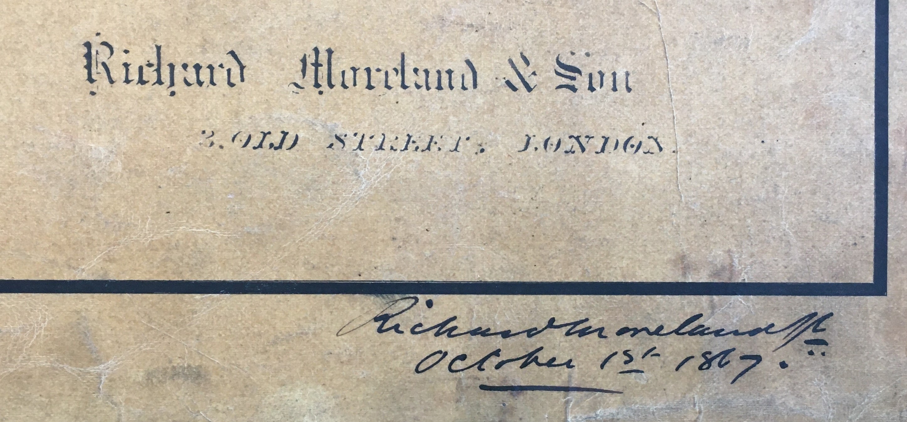
Looking through a box of uncatalogued maps, plots and diagrams I came across several manuscript architectural plans of the Midland Grand Hotel, London. Now named the St Pancras Hotel it is an iconic landmark on the Euston Road next to that other celebrated edifice of red brick, the British Library. The plans, drawn to show the girders, were by engineer Richard Moreland of Old Street in 1867 at a scale of 10 feet to 1 inch (1:120). You can see all of the modern internal features with the Grand Staircase and the popular Ladies Coffee Room. There are even manuscript pencil marks denoting dimensions which indicate these were some sort of working drawings.


The hotel is a masterpiece of high Gothic designed by Sir Giles Gilbert Scott who beat ten other architects for the commission, even though his design was far bigger and far more expensive that Midland Railway Company specified. The competition was launched in 1865 for a 150 bed hotel but it was finally completed in 1876 with 300 rooms. With its very high standard of fixtures and fittings the Midland Grand soon acquired a reputation as a luxurious upmarket hotel – even better than the celebrated Langham in Portland Place. This luxury didn’t come cheap costing nearly £500,000 to construct it charged the sum of 14 shilling a night – an average week’s wages for an agricultural labourer.

MS. Maps England a. 3