Category Archives: Uncategorized

Old map, new use

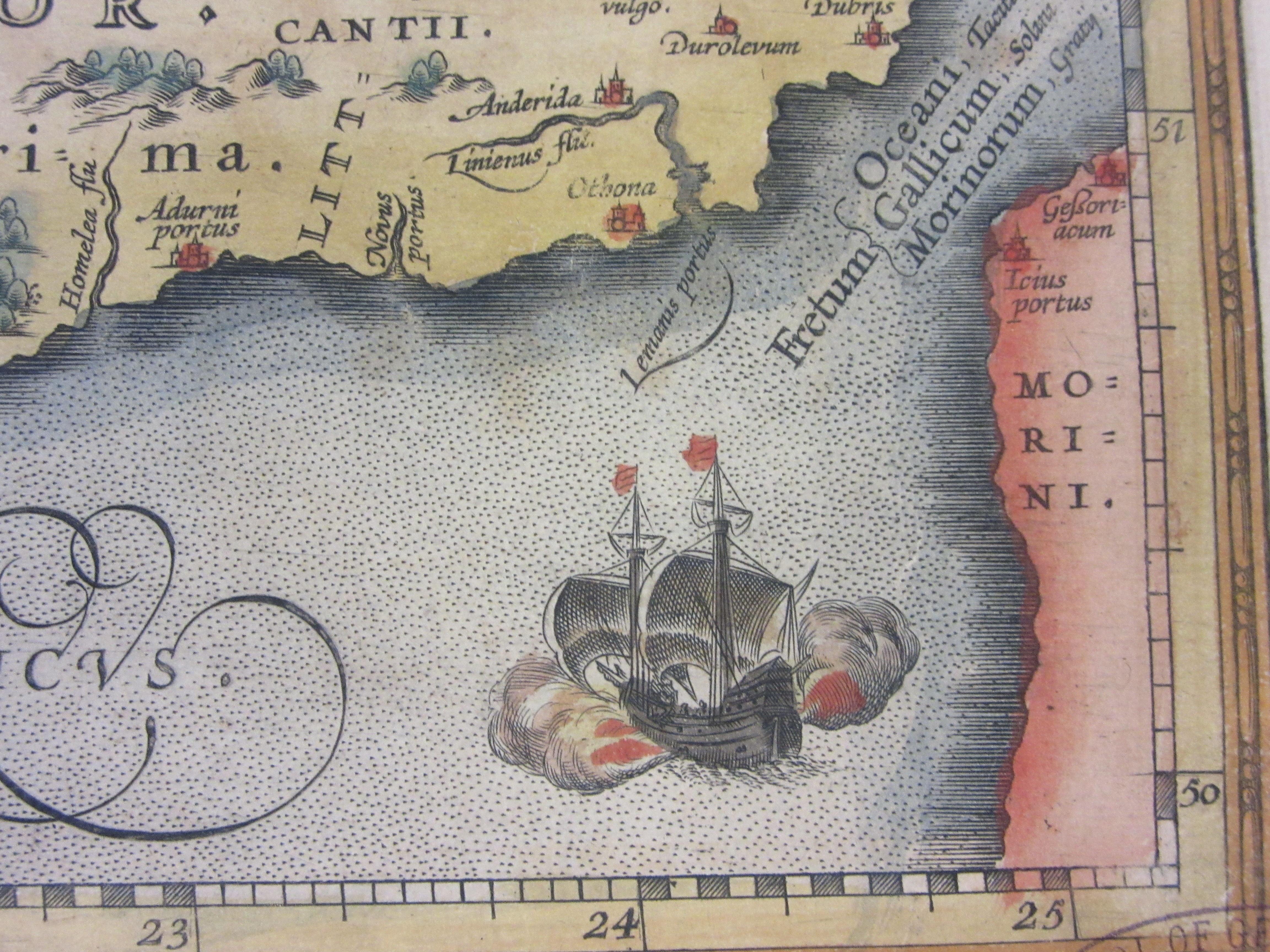
This is an interesting example of re-using old stock. James Wyld published in 1845 a ‘Post map of Europe’, showing routes of communication throughout Central Europe.

The map was printed by using a technique called copper-plate engraving. The image would be incised onto the plate which is then inked, the top surface is cleaned leaving the ink in the cuts, paper is then pressed down onto the plate. This plate could then be stored and re-used as needed, either in producing further editions of a popular map or, in this case, by changing some of the details and producing a new map at minimal cost. Being a soft metal meant that it was easy to alter or even remove information.


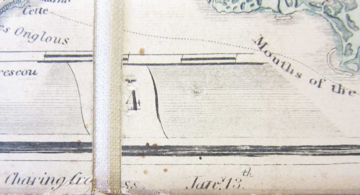
Images from both the original (top) map and new version (bottom) showing the changes to the date

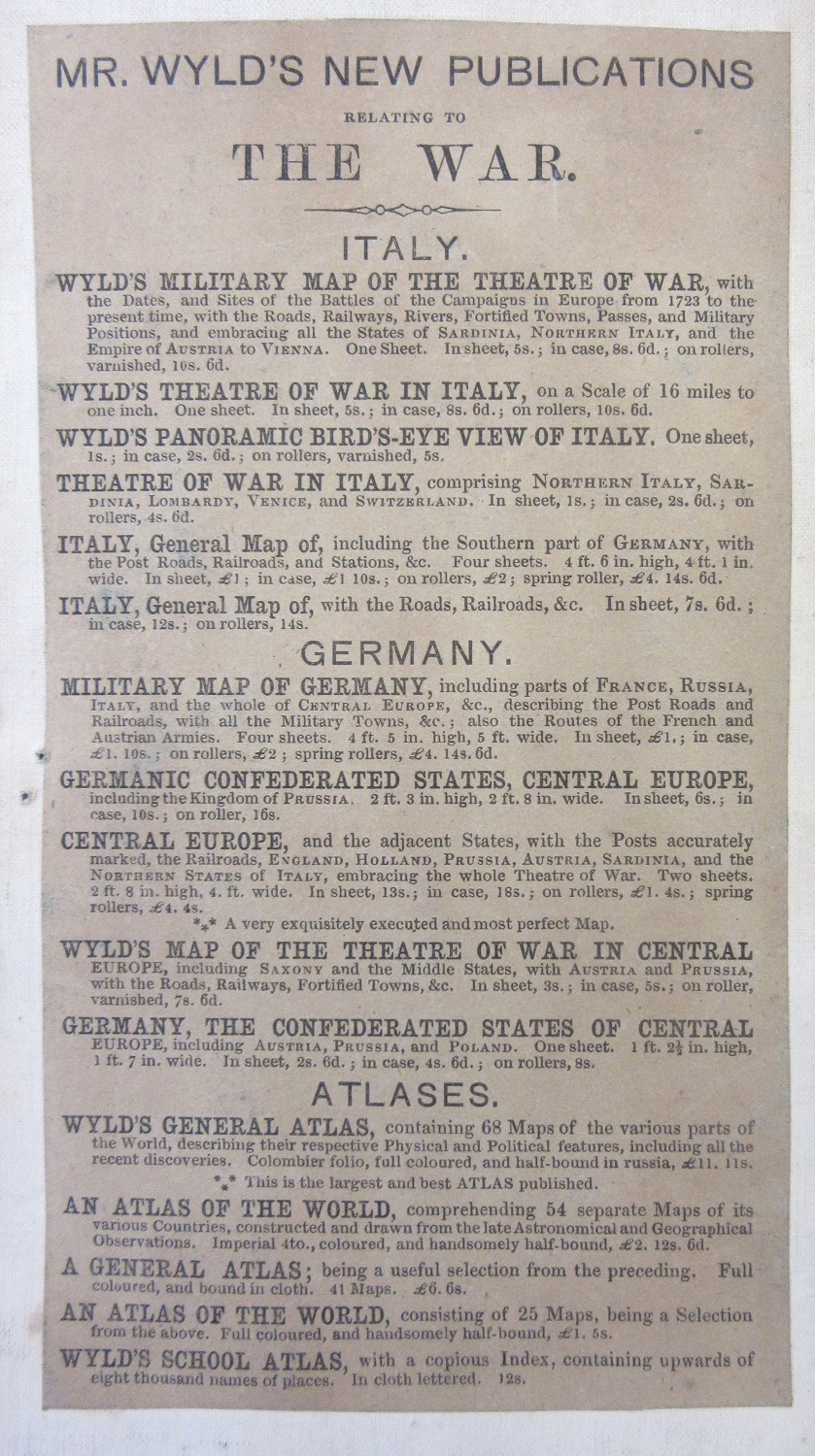
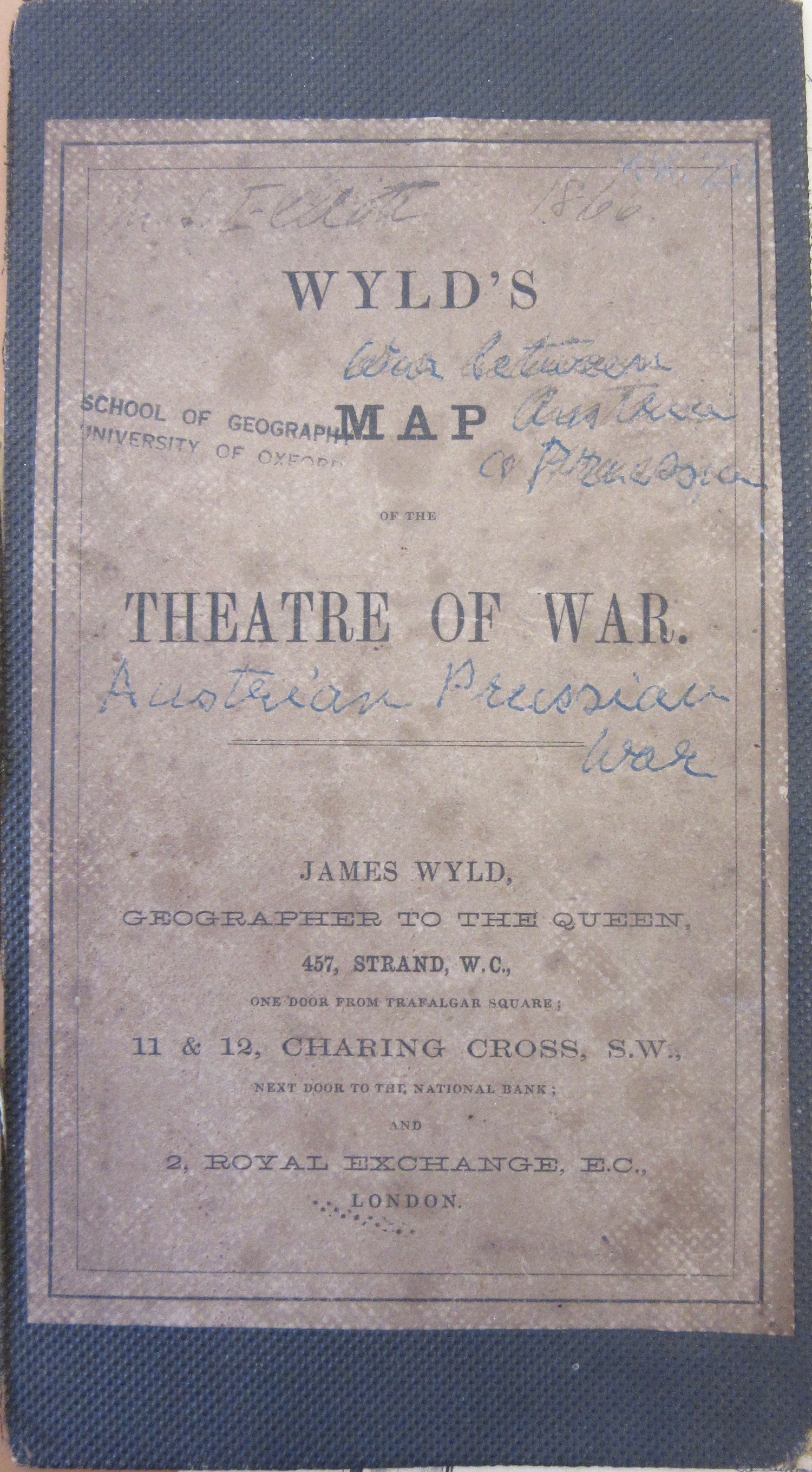
Front and back covers for the new map, the only real change, along with the removing of the year published, in the map.

Wyld’s Post map, with the removal of the year originally published and given a new cover (but not a new title on the map), becomes ‘Wyld’s map of the theatre of war’, the war being between Prussia and Austria in 1866. The outcome, a relatively easy victory for the Prussian Army in seven weeks led to the creation of the North German Confederation. Following war with France in 1870 the remaining German states joined this Confederation, creating a Germany that was to last until the end of the First World War. Wyld’s map illustrates well the confusing make-up of the different states before unification.


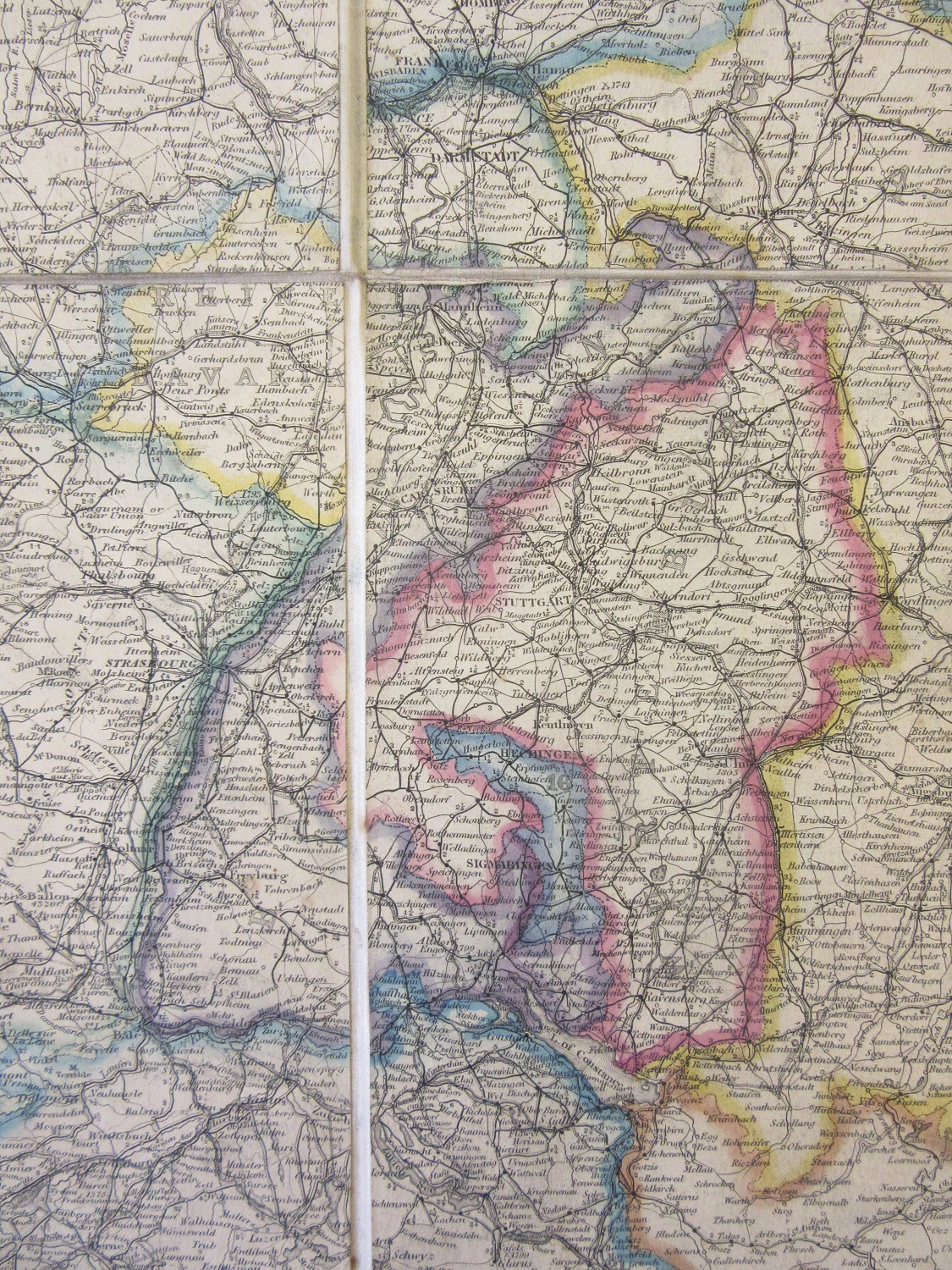
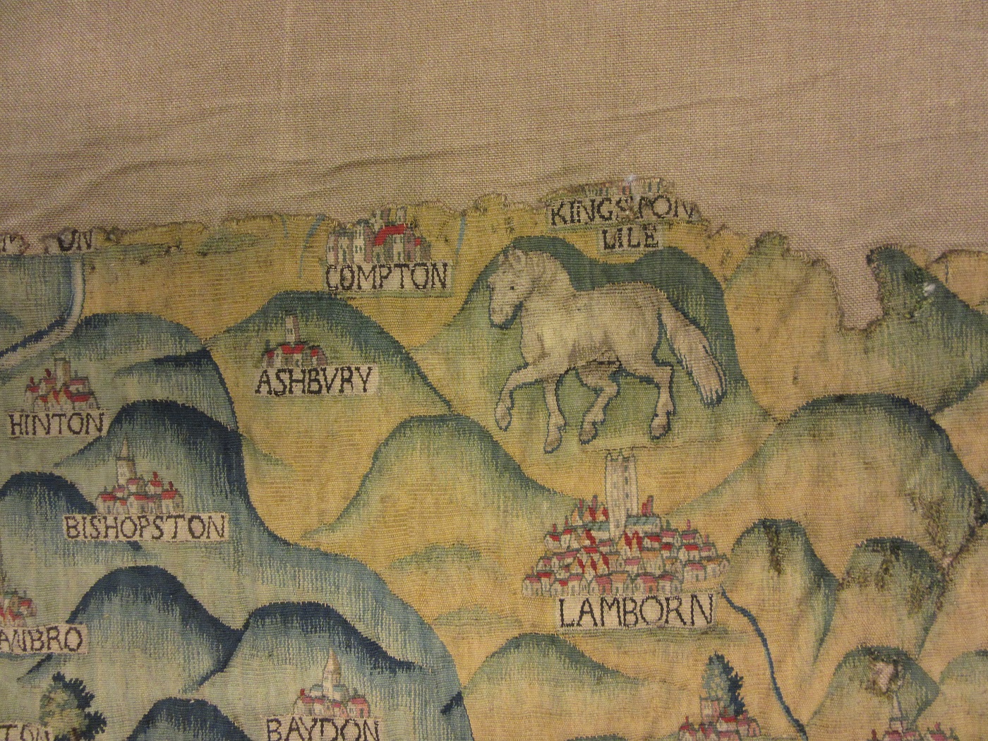
German states. This photo shows how maps intended to be stored folded were protected by being cut into rectangles and then stuck onto linen. If left as a complete map the paper on the folds would quickly deteriorate, linen was a lot more suitable and long-lasting folded. 

James Wyld was the middle of three cartographers, father, son and grandson, all called James. The father was Geographer to George IV and William IV while the James who produced this map was Geographer to Queen Victoria. As well as produced a large number of maps he also created

and exhibited a ‘Monster Globe’ for the Great Exhibition in 1851. This was a giant model of the Earth which was viewed from the inside.


The things you see on maps

Strict segregation on the Côte d’Azur. Caveman on Ile de Port-Cros, nudists on the Ile du Levant, according to this map of the French Riviera.

Pictorial representation on maps is reasonably common (see the blog post in November 2017, ‘Something we should not forget’), nudity isn’t.

Côte d’Azur, Hyéres et les Iles d’Or c1970. C21:41 (57)

Fire

Blandford Forum is a market town in north-east Dorset. The attractive Georgian architecture and the neat lay-out of the centre of the town are the result of a devastating fire that started on the 4th of June 1731. This map, printed soon after, dramatically shows the condition of the town in the immediate aftermath of the blaze, all the dark shaded buildings were destroyed leaving few still standing. The box at the bottom tells the story. Starting in a tallow chandlers house (A on map) at 2pm the fire soon spread to the houses between the chandler’s house and the church (B)  before spreading to the properties across the road. The text ends ‘The church by the care of some of the inhabitants was preserved till about 11 at night tho’ the spire which was now covered with lead took fire within side about 4 in the afternoon which was soon extinguish’d but the fire flying over and thro’ it at every crevice, some sparks whereof lay latent till about 2 in the morning, then broke out in the middle isle under the lead, where ’twas impossible to extinguish it without engines which were already burnt many hours before, & the inhabitants so tired with much fatagues that before morning ye church was entirely destroyed ye poor remains being scarcely fit for a foundation’.

A plan of the town of Blandford with the adjacent villages of Briantstone & Blandford St Mary describing the damages in each place by the dreadfull fire which happened there on 4th of June 1731 [1731?] Gough Maps Dorset 8

Fires, and the damaged caused, do give the opportunity for re-developing, for improving road lay-out, building material and sanitation. The creators of this map, the rather unfortunately named Bastard brothers, were also the local architects, and they rebuilt Blandford with a new and improved market place, school and church. The new layout can be seen in this image of the town taken from the first edition of the Ordnance Survey, from 1888

Sheet Dorset XXV 7, 1st ed Ordnance Survey, 1888

The most famous of urban fires though is the Great Fire of London, which fanned out of Pudding Lane late in the evening of the 2nd of September 1666 and soon consumed most of the buildings within the old walls, as these maps of the damage show.

A map or groundplot of the citty of London and the suburbs thereof, that is to say all which is within the jurisdiction of the Lord Mayor…which is exactly demonstrated the present condition thereof, since the last sad accident of fire. The blanke space signifeing the burnt part & where the houses are exprest those places yet standing. 1666 Gough Maps London 7

London has a long and painful history of great fires, from the destruction caused by Boudicca in AD 61 to accidental fires in 961, 1087, 1135 1299, 1444, 1561 1619, 1698, 1716, 1725, 1748, 1814, 1834, 1838, 1861, 1874, 1882, 1917 and 1936, and these are just the major fires, there have been many smaller but damaging accidents as well.

Several propositions and schemes were offer’d the rebuild the City of London after the great fire1666…1666 Gough Maps London 11

The above is one of many different designs for the rebuilding of the city after the great fire. Proposed by Valentine Knight the scheme called for a rigid street pattern but with a greater amount of water in the shape of a canal flowing through the city. This map was printed a remarkable 18 days after the fire started. Despite further plans submitted by such notable figures as Sir Christopher Wren in the end a design based on the old lay-out was implemented, but with greater distances between houses and set rules on building materials.

A plan of all the houses destroyed & damaged by the great fire which began in Exchange Alley, Cornhill, on Friday March 25, 1748. 1748 (E) C17:70 London (317)

A map of another of London’s great fires, that of March 1748. As with the map by Valentine Knight this was produced very quickly after the incident, a mere 8 days between the fire and publication.

Finally an inset from ‘An exact surveigh of the streets lanes and churches contained within the ruines of the city of London…’ (1669 (E) C17:70 London (643) which shows the fire from Southwark.

St. George’s Day and dragons

It’s Saint George’s Day on the 23rd, which gives us a chance to show some items related to England’s Patron Saint and his most famous action, killing the dragon. While there are numerous sites claiming to be the location of the slaying the one closest to the Bodleian is Dragon Hill, just below the Uffington White Horse.

This image comes from sheet XIII.14 of the 1st Ed. County Series for Berkshire (1879) by the Ordnance Survey. The area is rich with archaeological remains. An Iron Age hill-fort and the White Horse are just above Dragon Hill while further along the ancient track the Ridgeway is the Neolithic Long Barrow Waylands Smithy. Dragon Hill is a natural chalk hill which at some point has been levelled, possibly in the Iron Age. Legend has it that the patch of chalk on top where no grass will grow is the place where the dragons blood was split.

This image of White Horse Hill from the north comes from A letter to Dr. Mead concerning some antiquities in Berkshire…By Francis Wise (1738), (Gough Berks 3 (20)), a pamphlet which incorrectly states the Horse was cut to celebrate a nearby victory over the Vikings by the Saxons in 871. Wise writes of the Dragon Hill ‘Between the Ickleton Way and White-Horse Hill, under the horse, stands a large barrow, which the common people living hereabouts call “Dragon Hill”; and they have a tradition “that here St George killed the dragon”. The horse too is brought into the legend, as belonging to the Saint, who is usually pictured on horseback. They shew besides a bare place on top of it, which is a plain of about fifty or sixty yards over where the turf, I don’t know by what means, can gain no footing; which they imagine proceeds “from venomous bloud that issued from the dragon’s wound”. The image of the horse in the Wise pamphlet looks nothing like the abstract figure overlooking the Vale of the White Horse. A similar view of the horse comes from the Oxfordshire Sheldon Tapestry. Dating from the 1590’s the tapestry will be in display in Blackwell Hall in the Summer of 2019. The horse should be on the other side of the hill, but some considerable artistic licence has been introduced to show the both the horse and the geographical layout of the land.


Another pamphlet from Gough Berks 3, explaining the origins of the Saint George figure. And to finish, extracts from The history of the life and martyrdom of St. George, the titular patron of England: with his conversion of Arabia by killing the dreadful Dragon, and delivering the Kings Daughter, a poem published in London in 1664, Wood 536 (4), with the title page from a History of Saint George…from the same volume.


Olympic and Commonwealth Games maps

With the Commonwealth Games taking place on the Gold Coast and the recent donation of a map of the XIII Winter Olympics in Lake Placid in 1980 it seems a good opportunity to show some maps of various Olympic and Commonwealth Games sites from the collection.

XIII Olympic Winter Games 1980, Adirondack Region, New York, U S A, special edition metric topographic map 1980, United States Geological Survey. F6:40 (112)

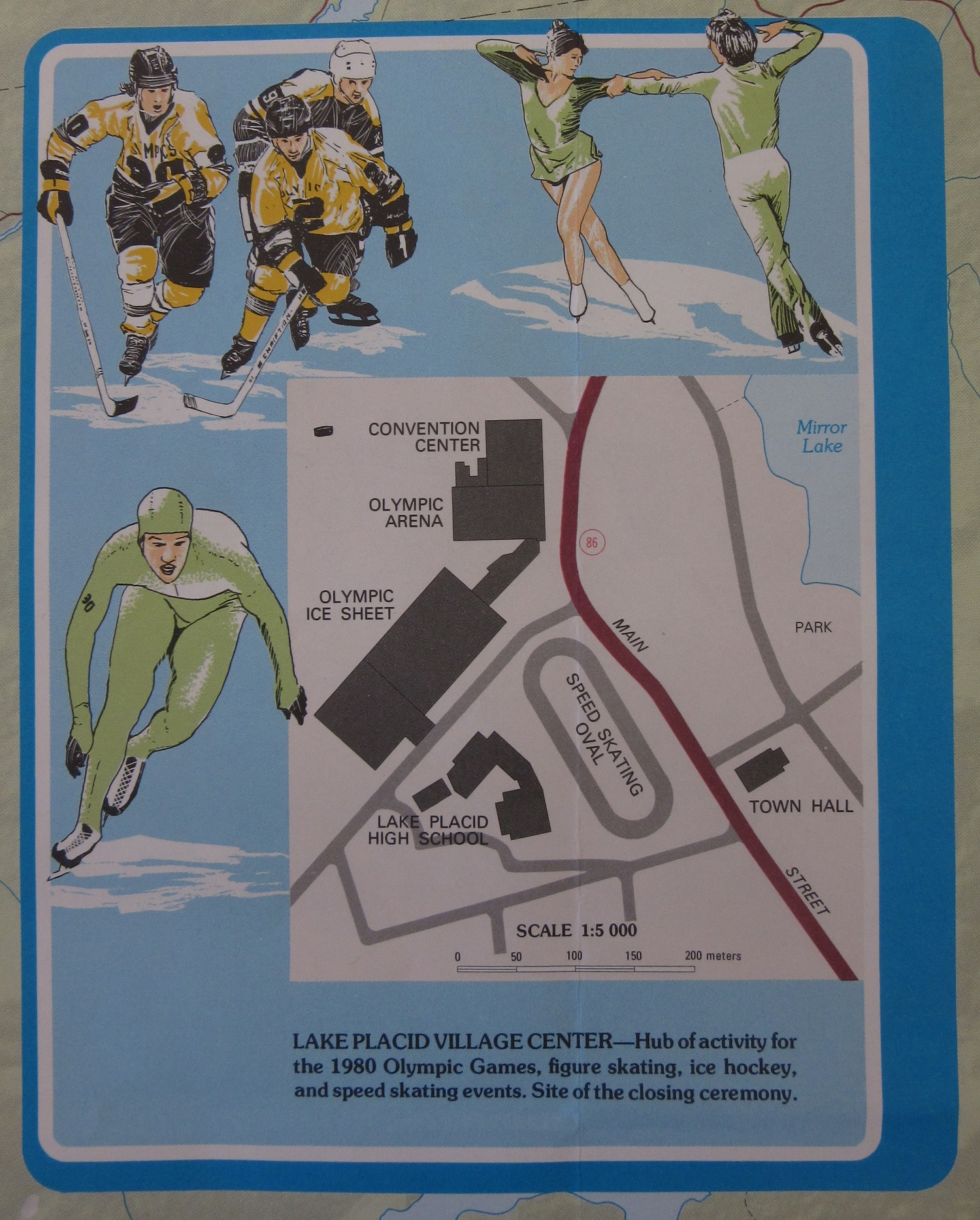
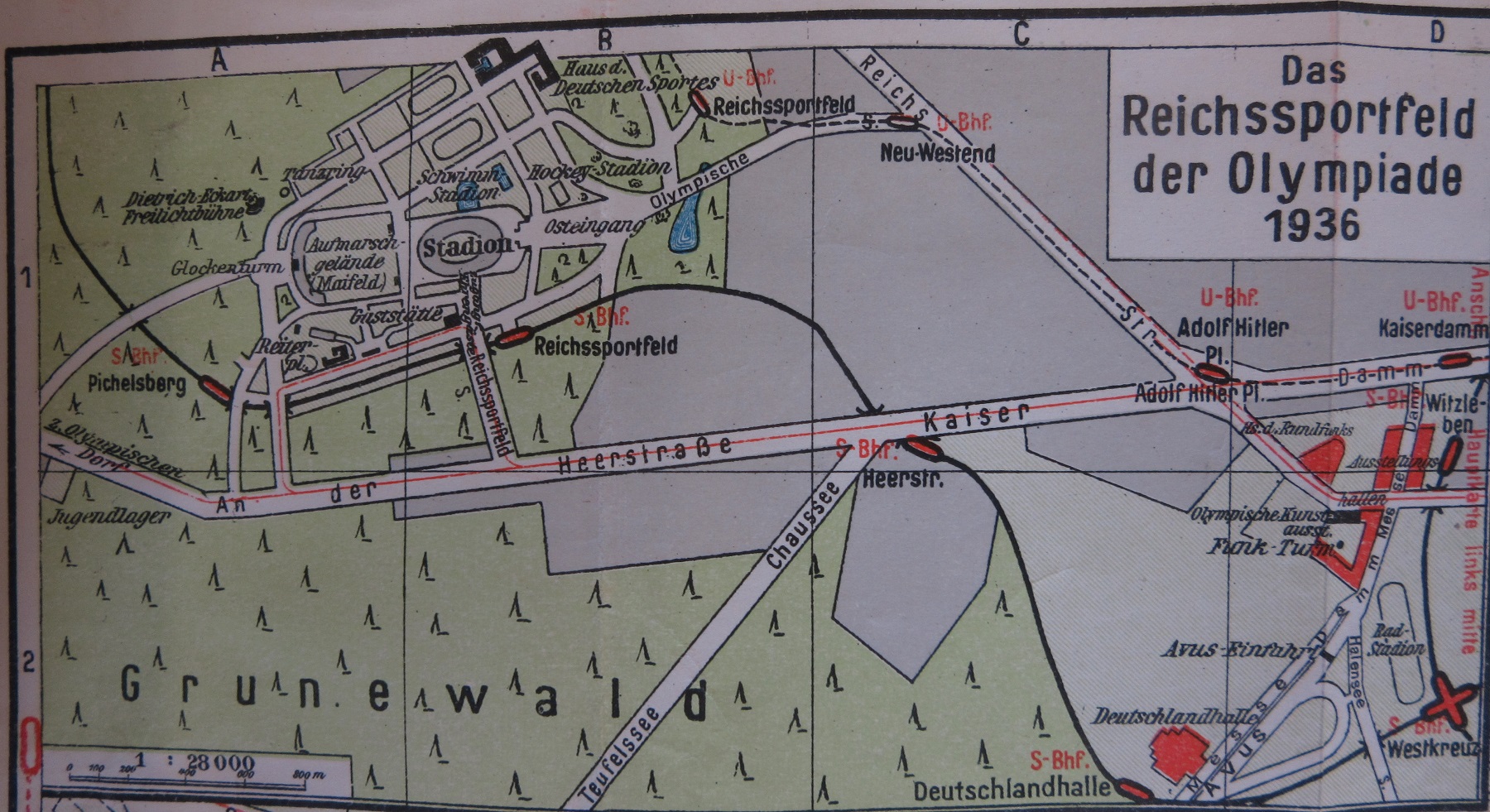
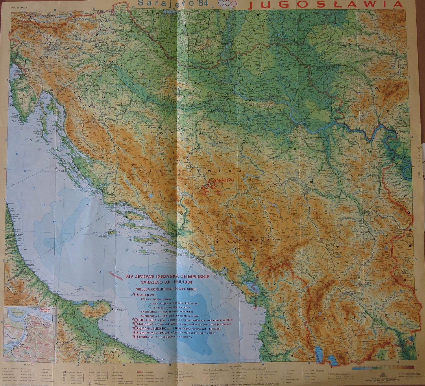
The majority of maps held in the collection are designed for the visitor, and show locations with text and information, promotional items which in the earliest examples were often part of a general map of a city – such as the 1936 map of Berlin, below – though of the 11 maps held on the Olympics in London in 2012 4 deal with the planning and design of the sites. The Lake Placid games were held in the Adirondack National Park, a mountainous range in North-eastern New York State, a popular winter sports destination which had already held a Winter Olympics in 1932. The map is produced by the U.S. Geological Survey, the national mapping agency for the United States and includes insets showing the lay-outs of the separate sporting areas around the village, including the Luge and Bobsleigh, the Down-Hill course and Village and Olympic centres. 
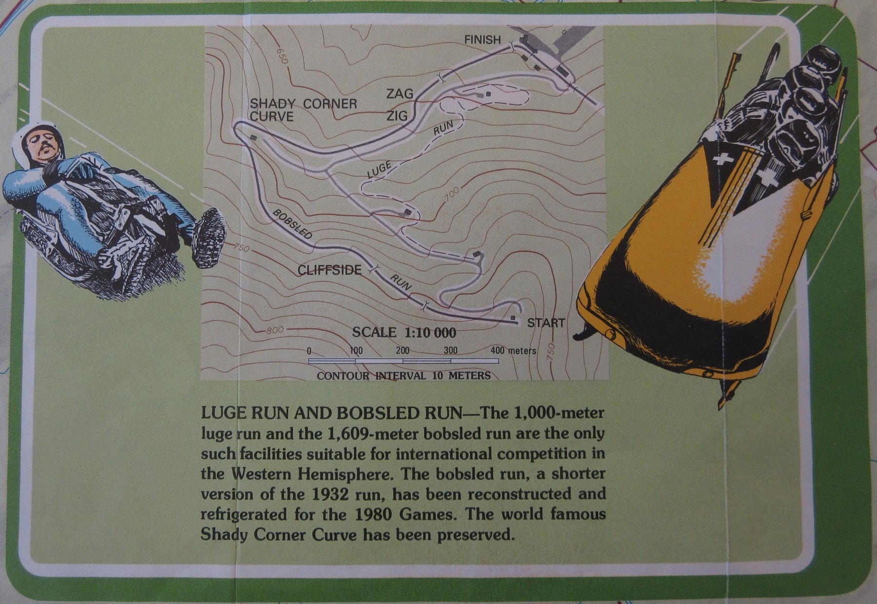
Maps are a valuable accomplement to exhibitions and events and the Library holds, as well as the Olympic maps shown here, maps of World  and Expo Exhibitions. The following maps are of other Olympic Games held through-out the World.

This map of the Berlin Olympics in 1936 (Stadtplan Berlin, 1936, C22:45 Berlin g.3) is an inset on a small atlas of Berlin, designed to fit into the inside pocket of a jacket. The atlas has tourist information in English, German, Italian and French and despite only being in power for three years the changes brought about by the ruling Nazi Partry can already be seen in some of the street names.  Following on from Berlin are maps of Innsbruck for the 1964 Winter Olympics (C4:20 Innsbruck 18), a lovely depiction of the Olympic Park for the ill-fated Munich Olympics in 1972 (C22:45 Munich (45), a map from Yugoslavia for the 1984 Olympics in Sarajevo (C10 (232) ) and to finish two maps of the 1960 Rome Olympics.


The Rome maps are fascinating because as well as having the official map shown above (C25:50 Rome (55) ) we also have a map that once belonged to the film director Michael Winner, who made a film in 1970 set at the Rome Olympics about the Marathon Race. As well as under-lining in red places were filming took place on the map on the inside cover there is a list of the different locations in Rome where filming took place (C25:50 Rome d.5)

Descriptive sandbanks

We are used to seeing maps a certain way; the land in detail with physical features described or shown and generally with north at the top.  On my desk today is a map which turns all that on its head. A chart of the North Sea from the Foreland S to North Bergen, and from the Scaw to the Orkneys and Shetland … By James Thompson, 1777

is a detailed sea chart concentrating on the features at sea, with the land barely getting a look in.

Much is made of the many sandbanks which litter this part of the North Sea with interesting reports, one even describing the Little Fishing Bank as ‘like oatmeal’.


Thompson has also includes several land profiles or “remarkable appearances of land” of coastal features and a descriptive panel to aid the seamen in their navigation. The presence of an identifiable building, such as a church or a distinctive geographical feature were as effective as signposts to mariners.

The other unusual thing about this chart is that for no obvious reason it is oriented with west at the top.

Not a lot is known about John Thompson apart from he described himself as ‘Mariner’ and so was most likely the captain of a vessel crossing the North Sea frequently enabling him the survey the area in such a detailed manner, as shown by the sheer number of soundings. This is in the same vein as Captain James Cook who was doing much the same thing in the Pacific at the time.  It appears that this is Captain Thompson’s magnum opus and is found a small collection of seven charts by sea captains-hydrographers all published in the late 18th century, most by Robert Sayer and John Bennett in London.


A chart of the North Sea, from the Foreland S to North Bergen, and from the Scaw to the Orkneys and Shetland. [1777] (Vet.) 20122 a.13 (3)


Ships

Many maps from the late sixteenth century feature ships and sea monsters in and on the oceans. With a large amount of surface taken up by water cartographers used these images as an embellishment to make the map more attractive, but there are other reasons for such decoration; at the time many people believed in the existence of such creatures so to feature

IMG_0226

monsters from the deep would be as natural as portarying an Elephant in Africa, while the opening up of trade with foreign lands and voyages of discovery made sea travel an important part of late Medieval and Tudor times.

IMG_0214

IMG_0213

This recent addition to the Bodleian collection, Britannicarum Insularum… by Abraham Ortelius,

IMG_0218

has in its top left corner one of the more dramatic images of shipping to be found amongst the maps held. In a cloud of smoke and explosion a sea battle takes place as a smaller ship advances, firing from the bow and flying what appears to be a flag of Denmark.

IMG_0216

Abraham Ortelius was a Flemish cartographer who started publishing maps and atlases in 1564, this map comes from an atlas of ancient and classical history called the Parergon, and shows the British Isles with British tribes and Roman features, including both Hadrian’s and the Antonine

had wall

Walls and was published in 1590. This would date the map to the time of the Spanish Armada, which set sail in 1588. As the Spanish fleet rounded the North coast of Scotland and started to sail down past Ireland fierce storms sunk many of the ships, though there was no battle of the type depicted on Ortelius’s map.

Britannicarum Insularen Vetus Descriptio…, 1590. Ortelius, A. (E) C15 (971)

IMG_0228

This image of a sea-horse off the coast of Iceland comes from a lavishily illustrated copy of Abraham Oretlius’s Theatrum Orbis Terrarum, published in London in 1606. The sea-horse is described as ‘often dothe fisherman great hurt and skare’. The picture of the Mermaid holding the flag of the Isle of Man at the start of this piece also comes from Ortelius.

Douce O. Subt. 15


Kiel Canal, flags and naval expansion

To mark the opening of the Kiel Canal in June 1895 Kaiser Wilhelm II and the German Government held a regatta at the entrance to the canal, and invited representatives from the nations whose flags, pennants and ensigns are shown in the panel on the right of the map featured here, including Britain, Spain, France, the United States and Italy, to take part.

kiel jpg

The map shows the ships of the different nations lying at anchor in the Kiel Fjord. Those with crowned heads of state onboard are indicated by the large crown symbol, ships with lesser members of royalty by a smaller crown.

The Kiel Canal is an important link between the Baltic and North Seas, and when completed enabled German ships to move between the two without making the long and often stormy passage around the coast of Denmark. Two years after the 1895 celebrations Germany began to enlarge its navy. By 1905 it had replaced the navies of both France and Russia as the benchmark in which the strength of the British navy was measured. By 1912 Admiral Tirpitz, Head of the German Naval Office, ‘insisted that Germany could not fight a war at sea until the widening of the Kiel Canal was completed’. In 1914 the canal was widened to finally be able to allow the passage of Dreadnought battleships through from the Baltic to the North Sea.

Der Kieler Hafen - 1895

This map, ‘Der Kieler Hafen : mit den ankerplätzen der zur feierlichen eröffnung des Nord-Ostsee-kanals im Juni 1895 in Kiel anwesenden kriegsschiffe’ was published in 1895 at a scale of  ca.1:20,000 by Lipsius & Tischer in Kiel. The shelf mark for the map is C22:28 (74).

Flies

Maps showing the spread of disease first appeared in the United States towards the end of the 1700s and used spots to showing the location of individual cases of disease. The most famous example of such a map was created by John Snow, in his book On the mode of Communication in Cholera (1855). Originally published in 1849, this later edition dealt with a notorious outbreak of cholera in the Soho district of London the previous year, which killed 616 people.

The Bodleian holds a similar map by Dr H. Acland and shows the outbreaks in 1832, 1849 and 1854 of cholera in the St Clements and St Ebbe’s areas of Oxford. By mapping the deaths in London and Oxford Acland and Snow were able to show that all shared a common link, the local water pump, proving how water was the medium through which cholera spread which as a result improved the sanitation in many areas of poor and working class housing.

acland-map-thumbnail

Map of Oxford, to illustrate Dr. Acland’s Memoir on cholera in Oxford in 1854, : showing the localities in which cholera & choleraic diarrhœa occurred in 1854, and cholera in 1832 & 1849; together with the parts of the town described as unhealthy, by Omerod, Greenhill & Allen, and a writer in the Oxford Herald; the parts remedied since the date of their descriptions; the districts still undrained; the parts of the river still contaminated by sewers, in 1855.                                                                               C17:70 Oxford (15)

Among the many maps showing disease in the collection are a number showing the spread of Tsetse Flies in Central and Southern Africa. Tsetse flies feed on the blood of cattle, which has serious consequences for the lives of farmers in the regions were the flies are wide-spread, as infected animals produce little or no milk, their manure is too weak to fertilize already poor soil and the bites can often lead to the death of the animal. Tsetse Flies also cause sleeping sickness in humans, which can lead to disability or premature death.

Featured here are extracts from two maps. Both show the spread of the Tsete Fly, and are of Zambia and an area of Africa which was called German East Africa up till the end of the First World War, and now covers Burundi, Rwanda and a large part of Tanzania.

tsetse 2

(Reverse of) The Republic of Zambia, Tsetse Fly Distribution, 1968. Ministry of Lands and Mines, Zambia. E43 (200)

Both are conventional thematic maps showing the spread of the flies by shading. What is different from other disease maps in the collection is that both feature proment images of the Tsetse Fly.

tsetse 1

German East Fly Map, 1915, Published by Topographical Section, General Staff, South Africa.     E11 (217)

Both images bring to mind the picture of the fly from Robert Hooke’s famous book Micrographia,

fly RH

first published in 1665. Hooke’s work was the first book to show insects and other minute objects as seen through microscopes and also the first published work to use the term cells.


Planning the Allied invasion of France.

The extracts of the two maps shown here are from a number of maps recently catalogued and added to the collection which were published by Allied Forces to help with the invasion of France, and feature coastal towns on both the North East and South West coast. Both sheets are from earlier published sets by the cartographic wing of the British Army, the Geographical Section, General staff which have been overprinted with additional information on enemy defences.

The Calais map is of particular interest. The defence information was added to the map as late as the 12th of September, just 13 days before the Allies attacked the town. Confirmed information is in blue, unconfirmed in red. Information was gathered from a number of sources, including aerial photogaphy and resistance work. Calais, along with other port towns on the North West coast of France and Belgium, had been heavily defended by the German Army, who believed that any invasion by Allied troops would be at this point.

calais

As well as the large amount of information on the front of the map further details are given on the reverse. As well as a full legend descriptions of defences are given in English and French and diagrams of gun emplacements, as shown here.

gun