Category Archives: Uncategorized

The beauty of the Portolan

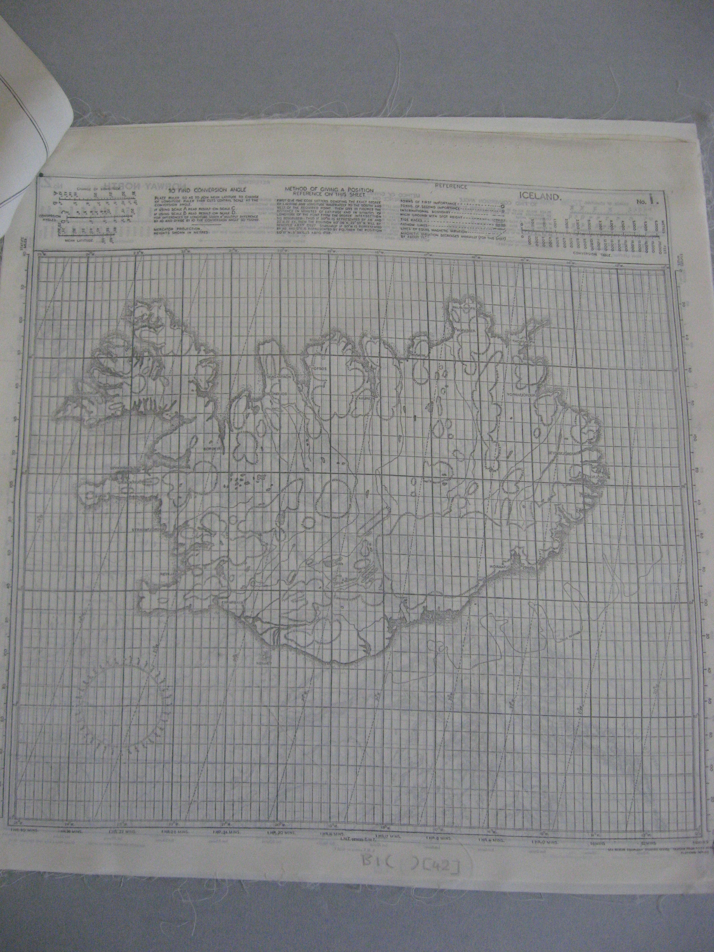
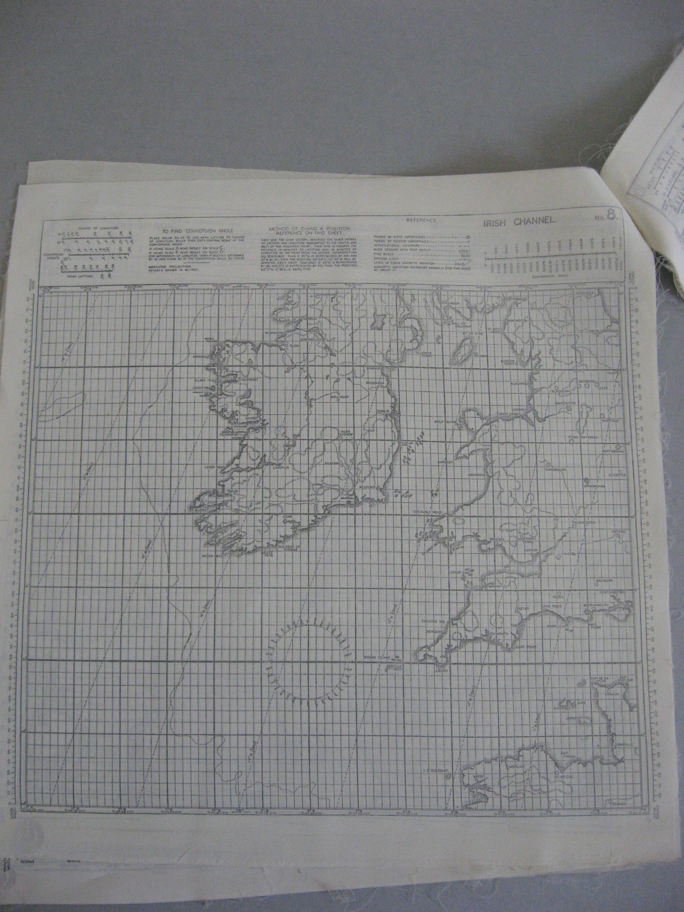
Portolan Charts are navigational aids used by seafarers from the thirteenth century through to the 1800’s, by which time Naval charts had begun to be produced, and published in number.  The majority of portolans are produced on vellum – an animal skin which has been scraped clean and then stretched out on a rack – with some charts attached to boards and folded. Printed charts begin to appear in the early 1500s. Naviagtion is by use of rhumb lines and compass points,  by taking readings of compass directions and speed to determine the course needed to be set.

bodl_Douce390_roll161A_frame17

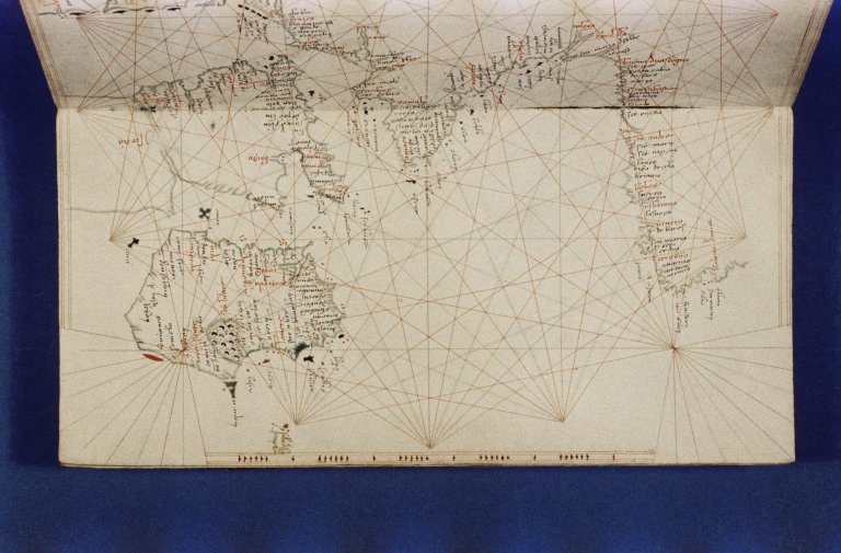
Page of portolan showing coasts of part of Britain, Ireland, France and Northern Spain

Portolans are often objects of great skill and beauty, and are an early and evocative record of the start of discovery by European explorers.  The images shown here are from the earliest Portolan in the Bodleian, dating from the early 1400’s.  This portolan is  drawn onto vellum and then backed onto a wooden board and shows, over seven charts, the areas of the Mediterranean Sea, the European Atlantic coast and the Black Sea.

IMG_0069 - Copy

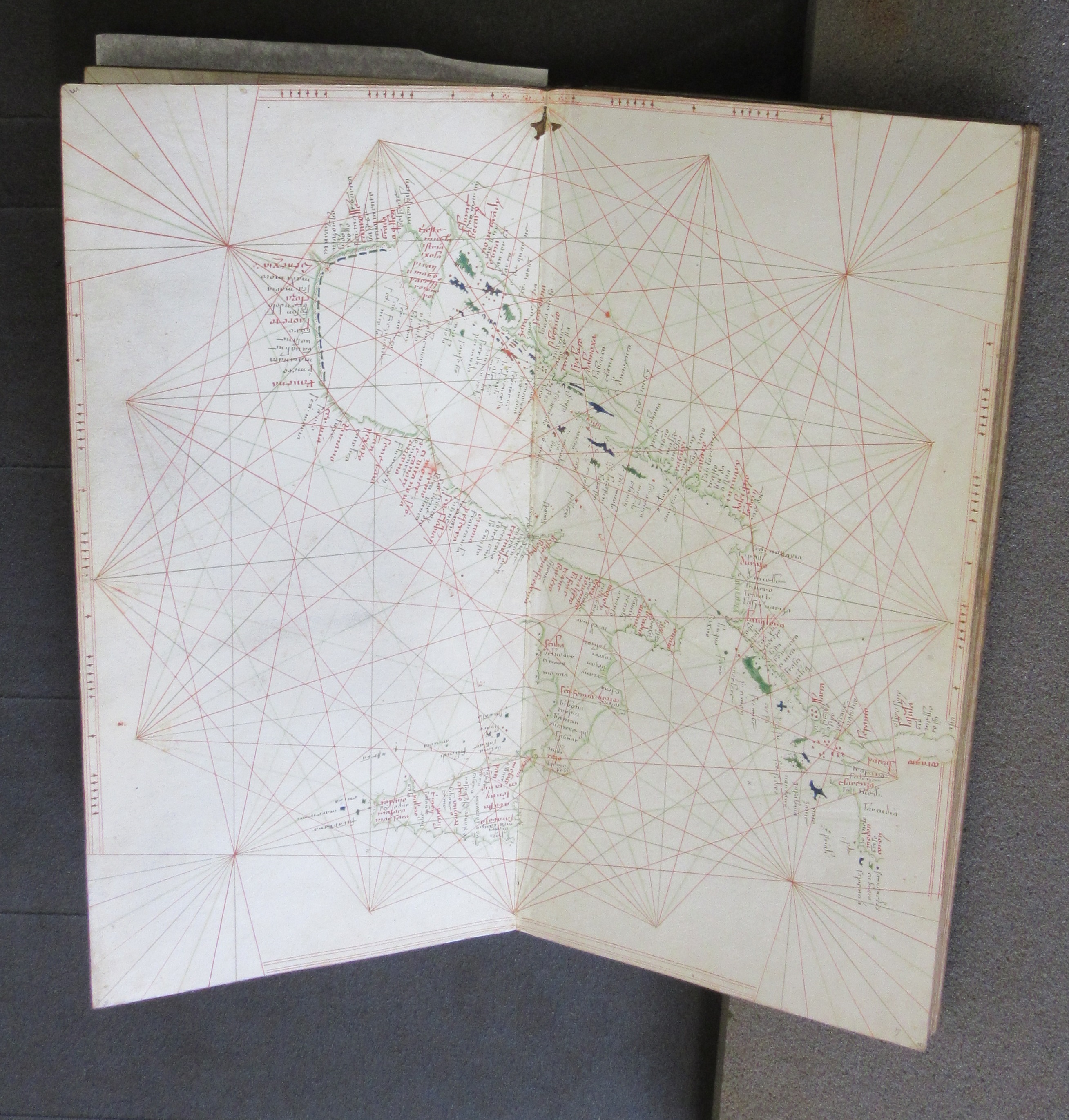
Page of portolan showing Italy and Sicily

Though the portolan gives no details of production it is believed to have been produced in Venice and came to the library in 1834 as part of the Douce collection.

IMG_0063

Front cover

Portolan charts are often heavily decorated. Ships sail the oceans, wonderful creatures inhabit the lands and some feature the Madonna and Child. Compass roses can often be very eleborate, sometimes including gold leaf in the design.

annu

Inside front cover showng Annunciation

While the charts featured in this portolan are not as decorated as later charts held in the Bodleian the cover, front and back inner sleeves are beautifully created works of art. The cover is a wooden board inlaid with ivory and coloured stone while the inner sleeve shows the Annunciation, with the Angel Gabriel telling Mary of the immaculate conception while the back features Saint Mark, patron Saint of Venice and Saint Paul.

saints

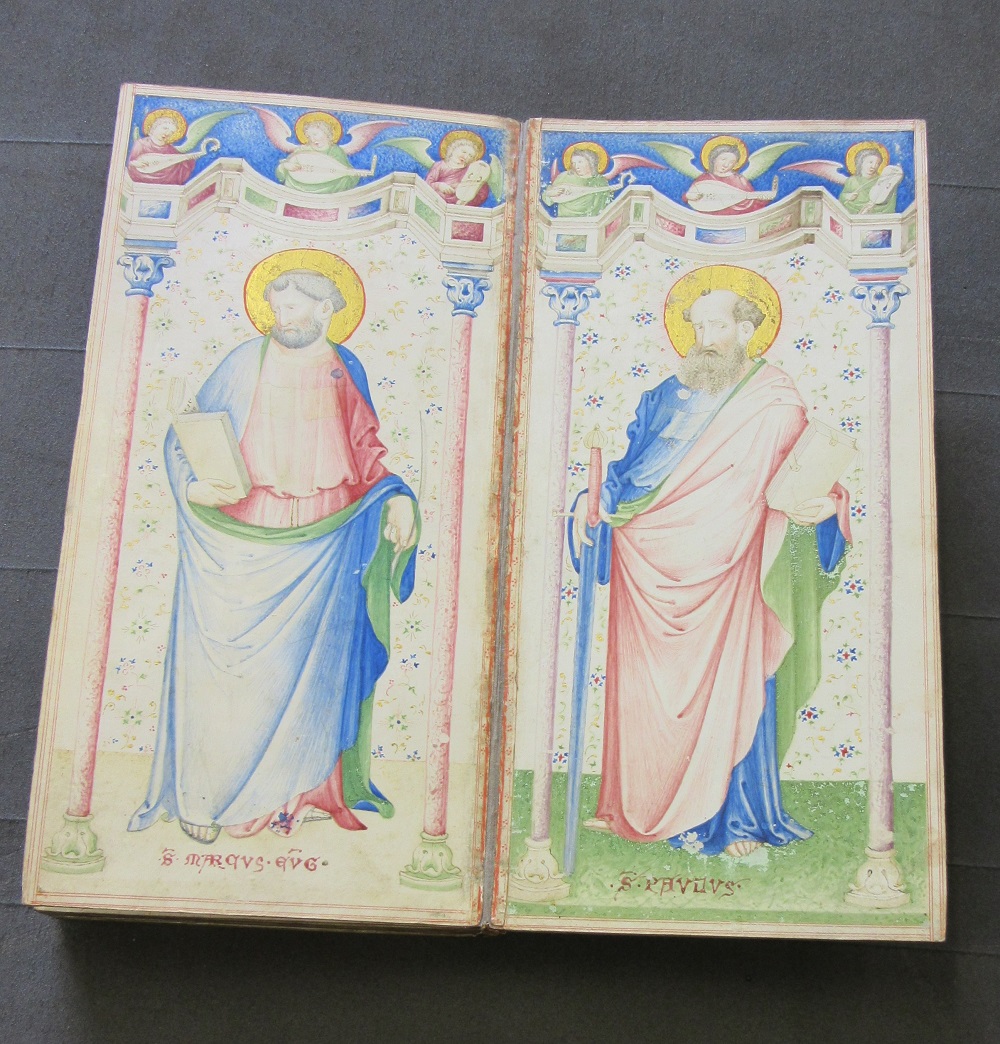
Inside back cover showing Saints Mark and Paul

The portolan was originally enclosed in a leather embossed slip-case, and would have been used by sailors navigating the seas and oceans shown on the maps. The portolan, leather case and notes are now housed separately in a specially made box.
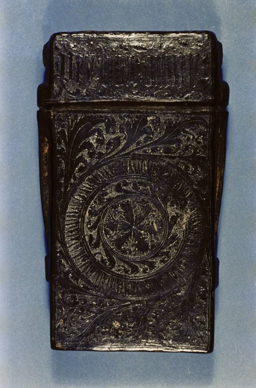
bodl_Douce390_roll161A_frame20

Front of slip-case

Items belonging to Francis Douce were donated to the Library after his death in 1834. Douce was for a time Keeper of Manuscripts at the British Museum so the Bodleian is lucky to have his collection of books, manuscripts and other items, numbering over 19,000 volumes.

Untitled book of seven portolans, early fifteenth century, possibly Venice. MS Douce 390

The Type ‘Q’ Sailing Dinghy

This piece on maps related to the Q Type Dinghy was submitted by a volunteer working in the Map Department

Working as a volunteer in the Map Room in the Weston Library may not be your forte but I can assure you having been doing just that for the last 2 years life is full of surprises. This week we received an embroidered map of London done by soldiers working for the Disabled Soldiers Embroidery Industry set up to help those recovering from action in WW1. Earlier, I was shown documentation about the ‘Q’ Type Sailing Dinghy, an inflatable sailing dinghy used during WW2, which is of particular interest to me as an ex-navigator on maritime Shackletons and Nimrods. One of our primary tasks was Search and Rescue. There were always crews on standby ready to fly and help those in danger at sea whether they be people in ships or yachts in difficulty or aircraft that had ditched. In our aircraft’s bomb bay we carried Lindholme gear which was basically 3 buoyant containers joined by 400 metres of cord, one container had a dinghy in it which would inflate on impact, and the other containers were filled survival rations and equipment. The dinghy had a sea anchor which meant that it would stay roughly where it had been dropped but its position would, of course, be affected by the strength of the local wind and current. The survivors would be rescued by shipping diverted to the scene.

IMG_0274

The philosophy behind the ‘Q’ Type Sailing Dinghy, which, as I have mentioned, was in use in WW2, was somewhat different. The dinghy was packed into similar Lindholme gear and dropped to the survivors. However, rather than the survivors ‘sitting tight’ they were expected to sail the dinghy to the nearest land. To do this the instructions, on silk, were comprehensive and included in the dinghy pack. There was a diagram of a fully rigged dinghy with mast, mainsail, foresail, rudder and keel plus a weather cover. There were instructions about how to rig the 4 piece mast, set the sails, general sailing guidance and advice about when to reef the sails. Attached to these instructions, also on silk, were maps of the eastern Atlantic from Northern Norway to the Cape Verde Islands and Iceland. The maps and instructions were all just 12 x 13 inches pinned together in the top left hand corner. The maps were produced by the Sea Rescue Equipment Drawing office and based on the GSGS 4080 plotting series which uses the Mercator projection and landmass heights are shown in metres. There is a compass rose and the lines of magnetic variation are as in 1942. A variable ruler showing statute miles is included alongside the left hand margin.

IMG_0275

I do wonder how practical the idea of sailing back to land really was. From experience the Atlantic Ocean is rarely smooth and rigging the dinghy would have been a hazardous occupation. One of the instructions was: ‘don’t stand up in the dinghy as you will make it unstable!’ In any survival situation protection from the elements is the most important thing, especially a cold, windy, wet Atlantic. And navigating back to land, well the dinghy had a compass and knowing roughly your location it should be possible to steer he dinghy roughly in the right direction. Perhaps, psychologically, the possibility of being able to sail back was all important with the chance of being picked up by a ship on the way. Or perhaps, when sitting in the dinghy, it was a case of, ‘Give me a map and I am content’ (Wainwright A. 1938).

IMG_0276

Map images from A set of charts showing the coasts of Europe and North Africa, printed on cloth. Published by ‘Sea Rescue Equipment Drawing Office, (F) K1:2 (5)

The following images come from a diagram on the use of the Q type provided by the Royal Air Force Museum. According to Air Historical Branch monograph Air/Sea Rescue issued in 1952 ‘the Q type seems to have been introduced in early 1943 and by the end of that year had been cleared for use in the Whitley, Wellington, Warwick, Lancaster and Halifax – it seems not to have been used in the Lindholme Gear. The lateen rig version replaced a more complex sail plan in 1944’.

dinghy 1

dinghy2

dinghy3


dinghy4


Parallax

Parallax is a way of determining distances and heights by measuring the angles of a certain point from different locations. Once you have the angles from two points you can then work out the distance by working out the third angle of a triangle and measuring the sides. Amongst other uses parallax is the method in which the distance to stars is measured.

Parallax is also the title of a recent donation to the Map Room, Parallax without tears, the determination of heights from vertical airphotographs

parallax 1

and published in the war years by the Royal Canadian Engineers. Using a giant as an example, the booklet teaches how to measure heights by the use of aerial photograph, the giants eyes

parallax 2

becoming the camera eye with pictures taken from different angles of the object to be measured.

parallax 3

Pictorial representation of transport, or nice pictures of ships, planes and trains

Amongst some recent donations to the Map Room have been some maps featuring planes. One appears on an Air Routes map by British European Airways. As well as the air routes and planes

air - Copy

BEA International Air Routes, 1954. C1 (1020)

plane

extract from BEA map

the map also works as a tourist guide, showing areas of interest and local customs and peoples. The map goes as far south as North Africa and far enough east to include the Middle East, to continue the transport theme camel trains are featured

cara - Copy

extract from BEA map

The second image comes from a road map of Queensland from circa 1950, which evokes images of Tintin and dashing adventures.

quensland - Copy

[Extract from] Vacuum Road Map of Queensland, c1950. I3:20 (61)

More planes feature in this extract from a map of the travels of Prime Minister Winston Churchill during the Second World War. The map plots the routes taken by Churchill to the various conferences and meetings between the leaders of the three great allied powers.

church 1


church 2

[Extracts from] Dunkirk to Berlin, June 1940 – July 1945. Journeys undertaken by the Rt. Honble. Winston S. Churchill, O.M., C.H., F.R.S., M.P., Prime Minister of Great Britain in defence of the British Commonwealth and Empire, 1947. B2 (101)

Early maps of railways sometimes included images of steam engines, we give two particularly good examples here

railway 2

Drake’s map of the Grand Junction Railway, 1839. (E)C17:5 (18)

railway

Cheffin’s Map of the English and Scotch Railways (Facs), 1845. (E)C16 (359)

Ships feature heavily in maps of the country and any coastal county published before the coming of the railways, signifying the importance of Britain’s reliance on both trade and naval power.

ships 2

[Extract from] England and Wales…by John Rocque, in four sheets, c1761. Gough Maps England and Wales 34

shiops off isle of wight

[Extract from] Hampshire and the Isle of Wight by E. Bowen, 1767. Gough Maps Hampshire 5

plymouth ships

A geometrical plan…H.M.’s dockyard, nr. Plymouth, 1756. Gough Maps Devon 7

To show that road maps are no a modern invention this extract comes from a 1809 map showing stagecoach routes. There are a large number of stagecoach maps in the Bodleian collection, this is one of the few that actually has the mode of transport featured on the map itself

stage

[Extract from] Bowles Road Director through England and Wales…, 1809. (E)C17 (115)

The final map featured shows a more serious scene. In an extract from a map published circa 1746 and showing events from the Jacobite Rising of 1745 two ships are engaged in battle at

ships 3a

[Extract from] Map showing routes of Prince Charles, c1746. Gough Maps British Isles 23.

close quarters off the South-West coast.


A list of selected accessions to the map collection in June 2015

Map of the ancient glaciers of Sequoia National Park, Sierra Nevada, California. 1965. Published by the U.S. Geological Survey. F6:13 (191)

Topographic map of the Grand Canyon National Park, Arizona. 1927. U.S. Geological Survey, F6:11 (62)

Map of Queensland showing annual rainfall to end of 1899. c1900. I3:20 (54)

Plan of the Church of the Holy Sepulchre, Jerusalem. 1892. Ordnance Survey. D26:20 Jerusalem (45)

Railway administration map of the railway system in the Russian Empire, showing the estimated maximum traffic capacity, based upon the actual traffic during the winter period of 1916-17, 1918. Ordnance Survey. With various insets showing junctions etc. C40 (434).

Mean annual rainfall of Australia…1887. Scottish Geographical magazine. I3 (327)

A diagrammatic map of part of the Tigre Province, Ethiopia, showing positions of rock-hewn churches, 1974. Manuscript map. (MS) E3:20 (22)

Map of the Klondike Goldfields, Yukon District, 1900. Geological Survey of Canada. F4:23 (31)

Brisbane River, Victoria Bridge to Fairway Light, 1902. Harbours and Rivers Department of Queensland. I3:50 Brisbane (15)

First World War mapping and the Bodleian

Trench maps are an important source of information regarding topography, defences and changes in the position of front-lines in the First Wold War. They are also, for those looking back at the war from the distance that 100 years brings, a stark representation of how close enemy forces were to each other. Detailed maps such as the one shown here reveal a no-mans land often less than 100 metres across. At first maps were based on existing French and Belgian pre-war sheets, but problems with marrying up scales and grids used on these sheets meant that by late 1914 the War Office and the Ordnance Survey took over production of trench maps, and from then until the end of the war a large number of sheets of different scales and designs were published to meet the varying demands of the British Army.

The development of trench warfare in late 1914 meant a fairly static front-line position. This, along with increasing importance in the use of artillery, led to both a need for accurate mapping of enemy positions and the time in which to produce the maps. Trenches that did not move and positions that stayed stable for months at a time meant that surveying, mainly by aerial observation and photography, produced maps that were often available before any changes in territory held made them obsolete, though this was not always the case during the major offensives launched later in the war. For instance, a map produced by the War Office for the Passchendaele area went through 9 different editions during the 3rd Battle of Ypres between July and December 1917.

trench map scan

Fonquevillers, 57D N.E., sheets 1 & 2 (parts of), G.S.G.S. 3602. 1917. C1 (3) [1449]

The map featured here, sheet 57D N.E. parts 1 & 2, is one sheet in a large series covering the Western Front in great detail, at a scale of 1:10,000. For security reasons only the front-lines of the British trenches are shown while the full scale of the German trenches are clearly defined in red. Grid numbers and then numbers in circles at junctions and angles of enemy trenches are for artillery purposes.

Forty-one members of staff left the Bodleian Library to take part in the war. Up until the start of 1917 all were safe but by the appearance of the first issue of the Bodleian Quarterly Review for 1917 this was no longer the case. ‘The immunity of the members of staff on military service from serious injury has been sadly broken by the death of Lieut. R.A. Abrams…who fell while gallantly discharging his duty on the Western Front on March 4 last, aged 28’. Abrams and a fellow solider were reconnoitring near La Brayelle Farm, in between Gommecourt and Essarts on the map, when both were killed by enemy fire. Abrams death in action was followed later that year by a second Bodleian employee, Lieut. H.J. Dunn, also 28, on November the 26th.

title

Title page from ‘The Sherwood Foresters in the Great War…’, 1920. 22281 e.1305.

A large number of books were produced in the years immediatly after the War by Battalions detailing the part they played in the conflict. The Sherwood Foresters book can be read as a diary of events set down in chronological order and includes plans and photographs

chapters

to accompany the text. The above plan shows the area in the Trench map shown earlier and is also mentioned in the previous page in the book with reference to the death of Lieut. Abrams.

abr

As well as British produced maps the Bodleian holds maps by the French and German armies of the Western Front and Allied and Turkish trench maps from the Gallipoli campaign in 1916.


Waterloo

This June marks the 200th anniversary of the battle of Waterloo, fought between the 15th to 18th of June 1815. With the defeat of Napeleon by a combined army led by the Duke of Wellington peace was finally restored to Europe after 10 years of fighting following the French Revolution in 1792.

14694_v1

Bataille de Waterloo. PLan de Champs de Bataille de Waterloo dit de la Belle-Alliance. Victoire memorable remportee le 18 Juin 1815, par les armees alliees sous les ordres de S.S. le Duc de Wellington et de S.A. le Prince Blucher de Wahlstadt sur l’Armee Francaise commandee par Napoleon. Published in Belgium in 1816 and comes with sheet of explanatory text, (E) C28:11 (3)

Waterloo has been mapped a number of times since 1815, the Bodleian shows here just two from a number in the map collection, one English and one in French. Both are laid out in a standard cartographic way of depicting armies and formations by using blocks to represent troop positions (coloured depending on Allied or French), topograhy is presented by using hachures to show hills and slopes and the key places are mentioned. The main difference between the two maps is that the french map, published in Belgium a year after the battle, is of the day and hence has to show troop movements throughout the day, indicated here by broken lines and directional arrows. The later English map, concentrating as it does on a particular and crucial point of the battlet, is less cluttered and easier to follow. Both maps come with accompanying text.

14696_v2

Field of Waterloo, towards sunset on June 18th 1815, from ‘A voice from Waterloo..’ published in 1847. The map shows the positions of the opposing forces as the Prussian forces joined the fight and turned the course of the battle away from the French. The map includes, as well as field positions, an index of the key points and events on the day. (E) C28:11 (1)

Waterloo and the wars fought by Napeleon and the French since 1792 feature heavily in literature such as Vanity Fair  and numerous works by Thomas Hardy and indirectly led to the production of the most successful and long-lived of maps, the Ordnance Survey 1” series. Originally published in 1801 as a set of four maps of the Kent coast made in preparation for the supposed French invasion of England the series continues to this day under the guise of the Landranger series.

kent2


kent

General survey of the County of Kent, with part of the County of Essex, done by the surveying draftsmen of his Majesty’s Honourable Board of Ordnance, on the basis of the trigonometrical survey carried on by their orders under the direction of Capt. W. Mudge of the Royal Artillery: F.R.S. 1801. Gough Maps Kent 48


Notoriously false

John Pryer’s map ‘A Pocket Companion of ye Roads of the South Part of Great Britain, called England and Wales…’ is not what it first appears. Originally printed in 1724 the map shows the road system of England and Wales giving distances between major towns and cities and is similar to a host of road and travelling maps published around the same time.

Overprinted onto the original map is additional information tracking the path across the Southern parts of Ireland and England of a solar eclipse on the 11th of May, 1724. Given that the map dates from 1724 there is a chance that this map was published after the eclipse to show the route of the shadow of the Sun, not before. Either way this is the earliest sheet map held in the Bodleian to show the path of an eclipse of the Sun.

eclipse

A Pocket Companion of ye Roads of the South Part of Great Britain…1724. Gough Maps England and Wales 50

Pryer’s map is a copy of an earlier map with the same title by Herman Moll, from 1708. This map went through several editions and was copied, both legitimately and not, a number of times. Moll includes a complaint against copyists in a piece of text on the map

‘Since ye beginning of this new sett of maps now completely finish’d, several ignorant pretenders have started up & with great shew & noise frequently advertised their trifling performances: calling them cheap, curious, useful & correct: as to the first epithet, they are really dear at any price; in ye 2d. place , everybody may see they are wild, confused and poorly engraven; as for their usefulness, they tend only to lead people into errors; and so far from being correct, that the projection of their principal maps is notoriously false’.

It is not recorded whether Pryer is one of Moll’s ‘Ignorant pretenders’, though the lack of any mention of Moll and his map makes it likely that Pryer used Moll without authority. It does bring into question though why he would include the diatribe against unscrupulous publishers and cartographers if he was one himself.

If there is doubt about Pryer and Moll there can be little of Moll’s opinion of one of the most celebrated cartographers of the time, John Ogilby. Ogilby created, with the publication of

ogilby

The road from Oxford to Salisbury…from John Ogilby’s Britannia, circa 1675. (E) C17 (370)

Britannia in 1675, the first road map of Great Britain, and with it introduced the concept of strip maps. In the legend to Moll’s original map, and kept in Pryer’s reprint, is the following

/ Principal cross roads & many not to be found in Mr. Ogilby’s book

This seems a harsh dig at what was, for it’s time, a revolutionary way of showing main post routes and the level of detail involved was far greater than that of other maps of the time, including Moll. Ogilby’s innovative design included mile indicators, side routes and hills (including showing the direction of slope) and was soon taken up by other cartographers in both this country and abroad.

The Eighteenth Century saw an increase in both the publication and quality of maps such as Pryer’s as the growth in both astronomy and scientific knowledge advanced, and with it the ability to predict and plot each eclipse. Previously eclipses were reduced to diagrams in the corners of world maps, such as the example here from John Speed’s ‘Prospect of the World’ atlas for 1627.

sunn

Extract from ‘A new and accurat map of the World, drawn according to ye truest description, latest discoveries & best observations yt have beene made by English or strangers’. John Speed, A prospect of the most famous parts of the World, 1627. Facsimile edition, G1 B1.21L                                           


Cartoon maps

2015 is the two hundredth anniversary of the famous political cartoon by James Gillray showing Napoleon and Pitt the Younger carving up the World.

1280px-Caricature_gillray_plumpudding

The Map Department holds a number of examples of cartoon or satrical maps. Most are designed with a similar intention to the Gillray, that of educating and entertaining at the same time, the maps are based on geographical boundaries but usually have no other topographic features, and instead fill up spaces with figures. This example, from the start of the First World War, is one of the best of this type in the map collection.

European Revue Kill That Eagle 1914.jpg2

European Revue, Kill that Eagle, Published by Geographia in 1914 and drawn by J. Amshewitz. C1 (407)

Despite its initial appearances it has a serious message to convey. Germany looks towards France while Austria, dressed as a clown, clings on desperately while watching horrified as the brown bear of Russia grabs at ankles and talons. Britain prepares to stride across the channel to sort out the mess, ‘Business as usual’ with the Empire in support.

Another example is by the famous Victorian cartoonist Frederick Rose.

angling

Angling in Troubled Waters, 1899. Drawn by Fred. W. Rose, pubished by G.W. Bacon & Co. C1 e.9.

Angling in Troubled Waters shows the troubles caused by the expansionist ideas of the nations of Europe. All have either a fishing rod attached to territorial claims or are in some form of trouble; France fighting amongst itself after the Dreyfus affair, Austria in mourning after the assasination of the Empress Elizabeth in 1898. England, in the guise of John Bull, is the only nation happy with their lot, a common theme in these maps. Carrying a full net of territory Bull has just snagged Egypt on his line. Another famous cartoon map by Rose is ‘Octopus map of Europe’* from 1877, warning of growing Russian influence in Europe.

johnson40-sug-0001-0.jpg2

*The Octopus map of Europe’ by Frederick Rose comes from the Bodleian John Johnson collection, one of the largest and most important collections of printed ephemera in the world, including a number of other cartographic cartoons. This image is from from JJ puzzle pictures folder 1 [28]. information about the John Johnson collection can be found here http://www.bodleian.ox.ac.uk/johnson

Not all cartoon maps are intended for satire though. A book published in 1868 featured maps

cover

Geographical Fun, c1868. Published by Hodder and Stoughton. C1 d.69

drawn by Lilian Lancaster when she was 15, to amuse her younger brother. The book features sketches of Countries according to their characteristics.

england

So England sits serene on her throne, keeping an eye on Europe but content with her Empire and the strength of the Navy, here symbolized by a ship in East Anglia while Germany,

ger

at this time a separate group of states called the North German Federation but soon to join with Prussia to form the German Empire after Prussian victory over France in the 1870 Franco-Prussian war.

pru


A list of selected accessions to the map collection in May 2015

Les Musulmans dans le Monde, c1955. Centre des Hautes Études d’Administration Musulmane,.     B1 (1493)

Freytag’s touristen-wanderkarte der Dolomiten, c1900. C25:24 (41)

Ethno-linguistic distribution of South American Indians, 1967. H5 (296)

Reconnaissance geologic map of the State of Baja California, 1973. Geological Society of America, F7:13 (22)

Tunisia – Libya borderlands, 1943. Produced by Office of Strategic Services, US Army. Map shows German and Allied troop movements with an inset of the Mareth line defences.

tunisia

Grand Océan -Iles Marquises, Baie de Tai O Haé (Ile Nuku-Hava), 1909 (original published in 1849). Dépôt-Général de la Marine. J17:5 (9)

Paul Langhans : Deutsche und Tschechen in NordBohmen, 1899. Published by Justus Perthes. C20:6 (50)

The Czech-Slovaks, c1919. Naval Staff, Intelligence Division. C20 (295)

czech

Official Road Map for Allied Forces Europe [France], 1944? AMS M 305 (USAREUR) C21 (717)

France – ports, 1944. United States Army, Office of Strategic Service No. 3163. C21 (718)

Hydrogeological map of the West Bank, 2004. Palestinian Water Authority, D26:4 (5)

Anglo-Egyptian Sudan – sketch map illustrating article 1 of the treaty between Great Britain and Ethiopia signed at Adis Ababa the 15th day of May, 1902. 1902. Intelligence Division, War Office. I.D.W.O. No 1637. E4:12 (11)