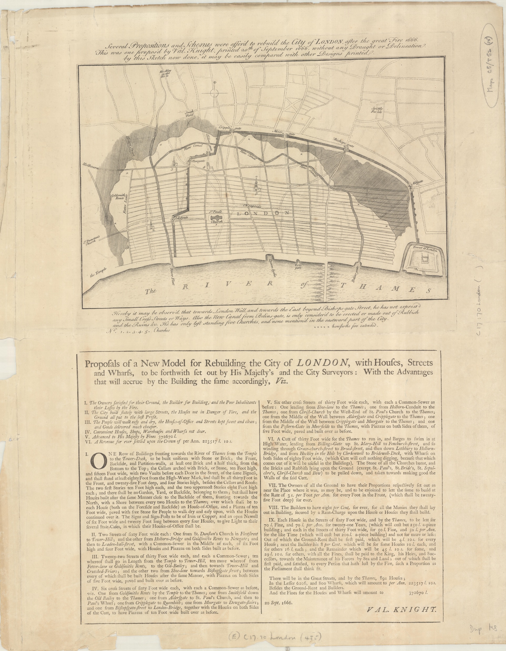
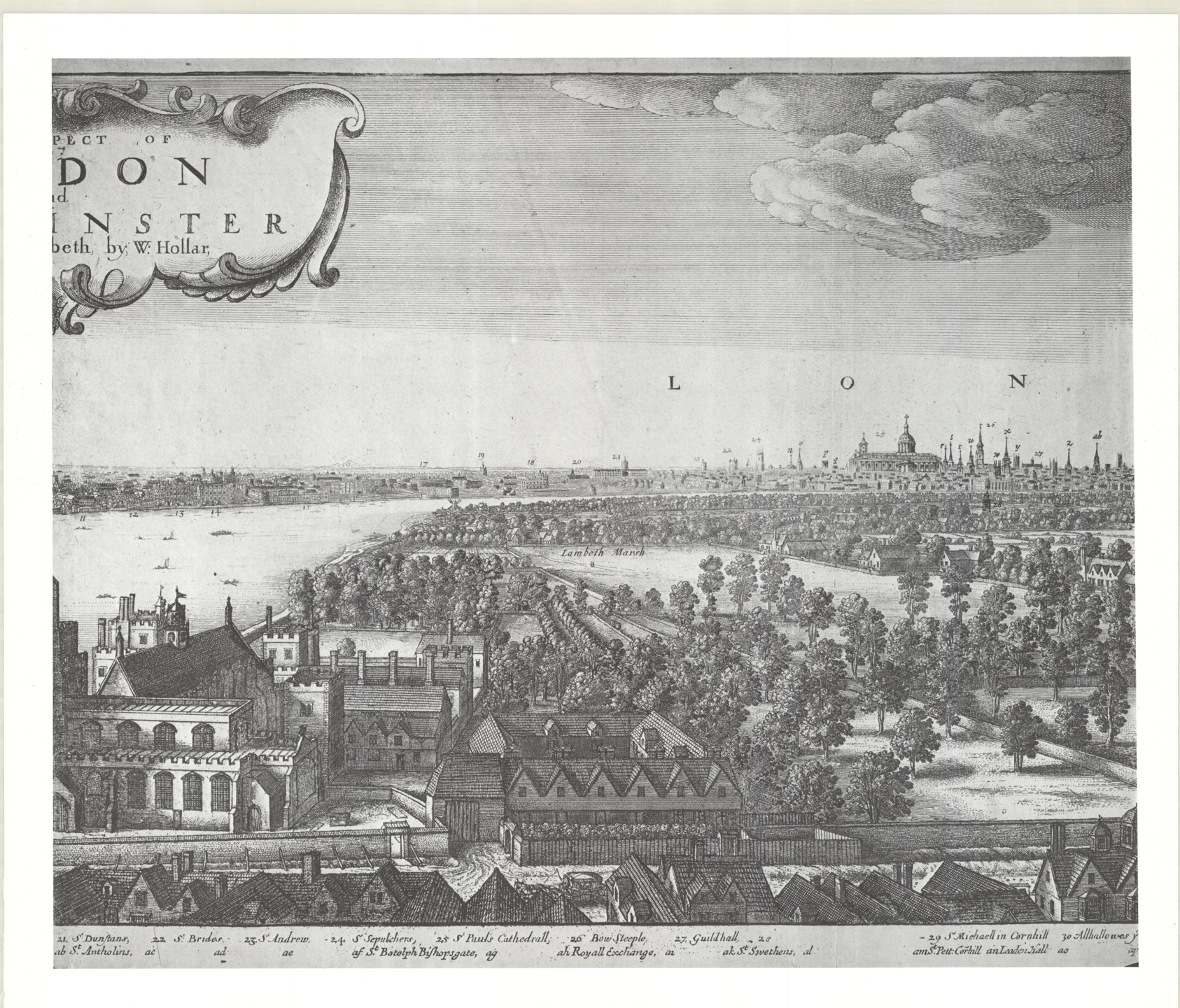
The question of how to show relief on maps has taxed cartographers since the days of Ptolemy. A string of mountains over a landscape, deep shadows, contours, hachures? All have been used to varying degrees of success in the past. Tourist maps and town plans have often used different perspectives in the same image to portray hills and buildings. This dual approach, where there is a need to show both the street layout from a bird’s-eye perspective and prominent buildings from an angle, is an excellent way to make the map look more dramatic while at the same time fulfilling the basic function, that of telling you where things are. This works because the eye isn’t confused by the two different approaches to a view and you can appreciate the ‘artistic licence’ involved to create a pleasing whole. Examples here with this map of Durham from 1754 (Plan of the Parish of Durham, by T Forster, 1754. (E) C17:70 Durham (1) )

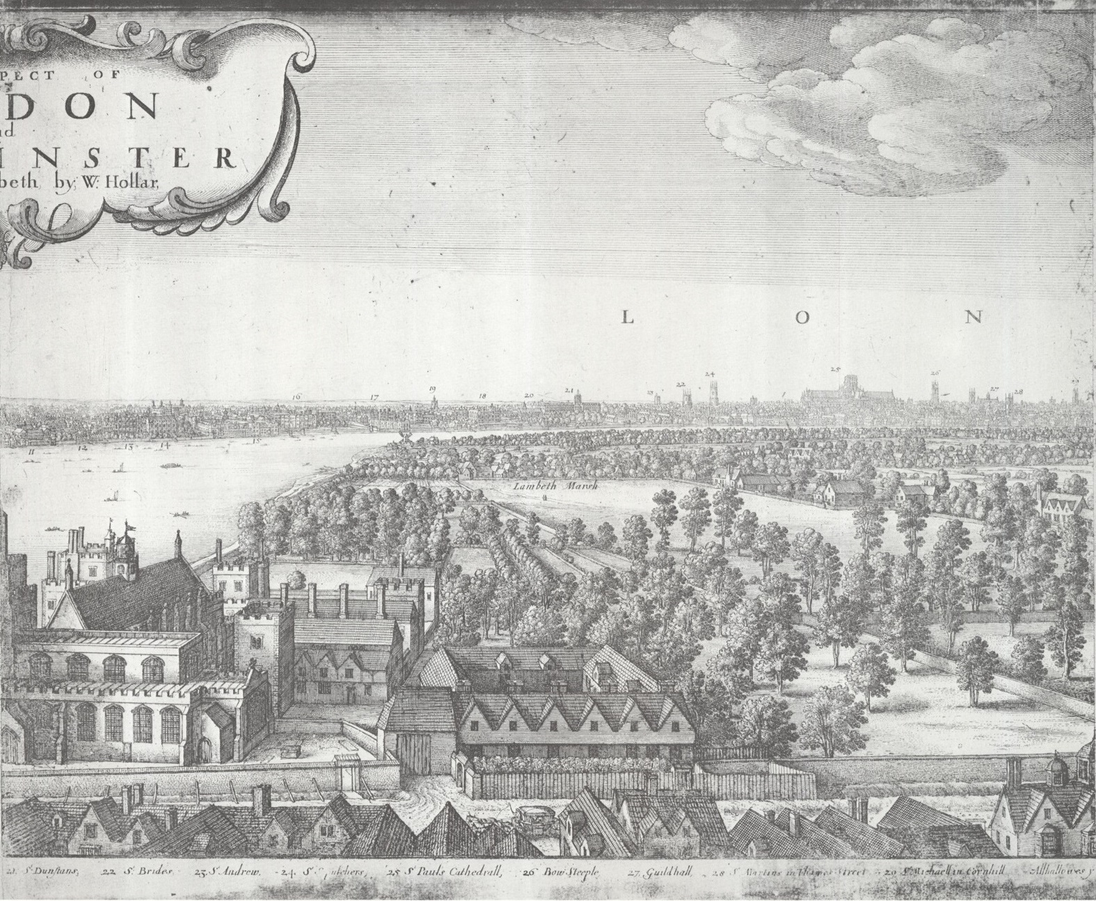
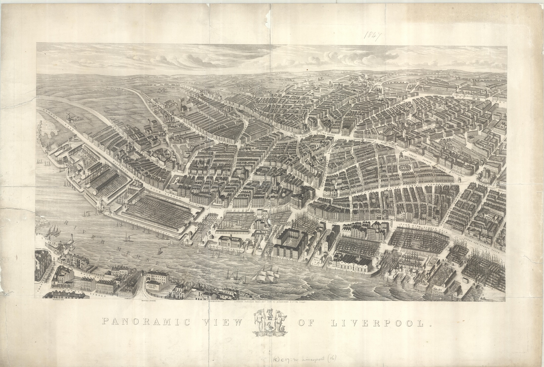
and this beautiful panoramic map of Liverpool from 1847, complete with sailing ships at dock. (Panoramic view of Liverpool, c1847. (E) C17:70 Liverpool (16) ). Panoramas are designed to be looked at at an oblique angle, but they still need to include the information that a ‘normal’ map such as street layout and names include. Both maps also give a nice sense of the hills and landscape surrounding the towns.
Freed from Western rules and conceptions about how to represent perspective this beautiful Japanese map of the port city of Yokohama from 1859 shows the city as it would be viewed on the ground. Different features in the city are viewed from their best vantage point, leading to straight-on, upside-down and sideways views. The distinctive look to this map is partly due to the fact that the cartographer was an established artist. Based in Yokohama Ichigyokusai was famous for a series of woodcuts representing the months of the year, and he brings this style of art to his map.
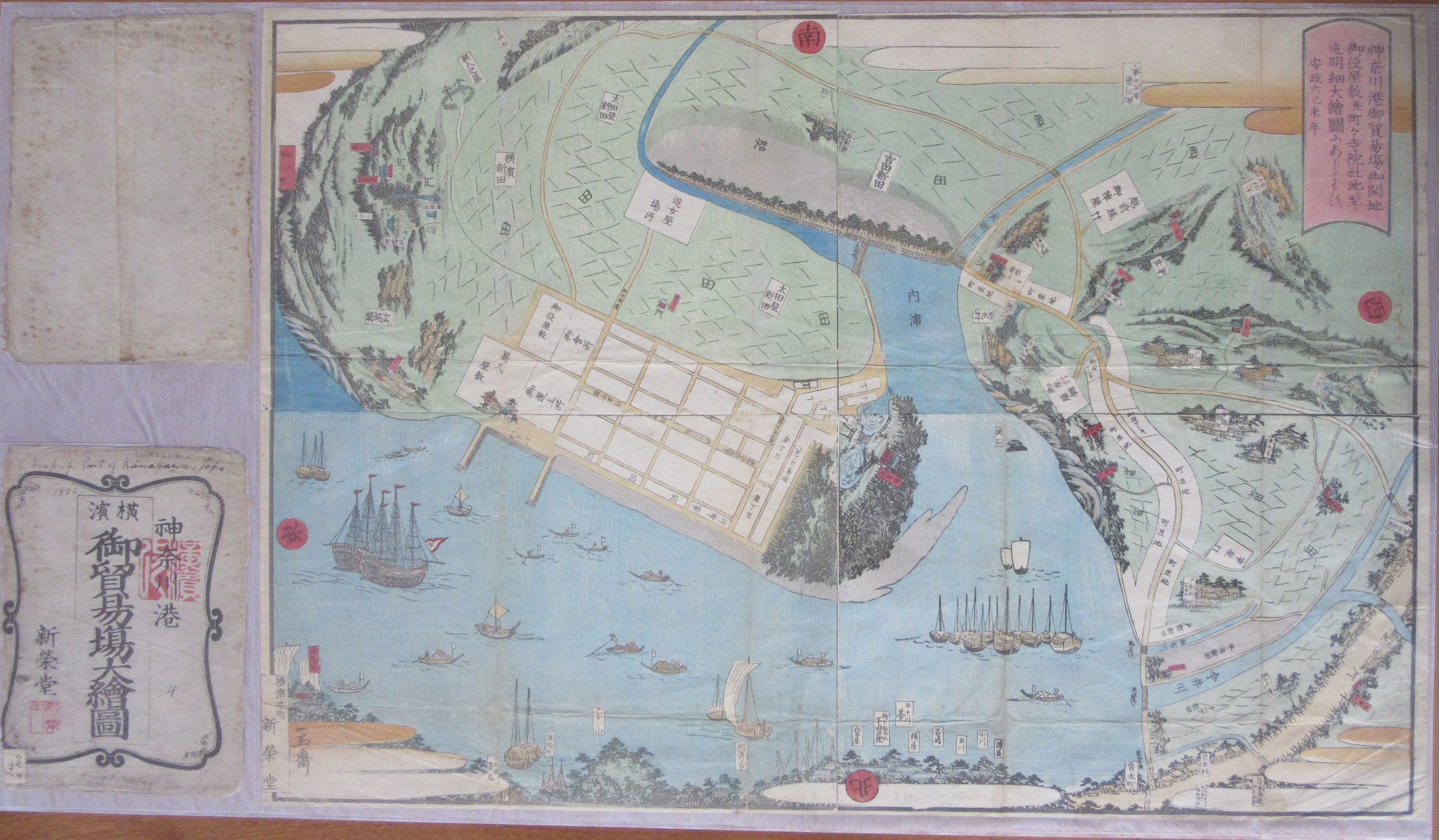
Detailed pictorial map of the port of Kanagawa…6th year of the Ansei period (1859). (E) D20:70 Yokohama (3)*
Yokohama seems to have been a popular place to map, due to its importance as a port city near to Tokyo. It was also one of the first Japanese ports to open up to Western traders. This change from a seclusionist policy to one of open trading after a fleet of American warships sailed into Tokyo Bay in 1853 led to Yokohama changing from a small fishing village to a major port in 1859. To show this change in the role of both the port and Japanese relations with the outside world the cartographer of the next map includes foreign sailing ships in the harbour (flags show ships from France, Russia, the United States and the English Merchant Navy as well as Japan).
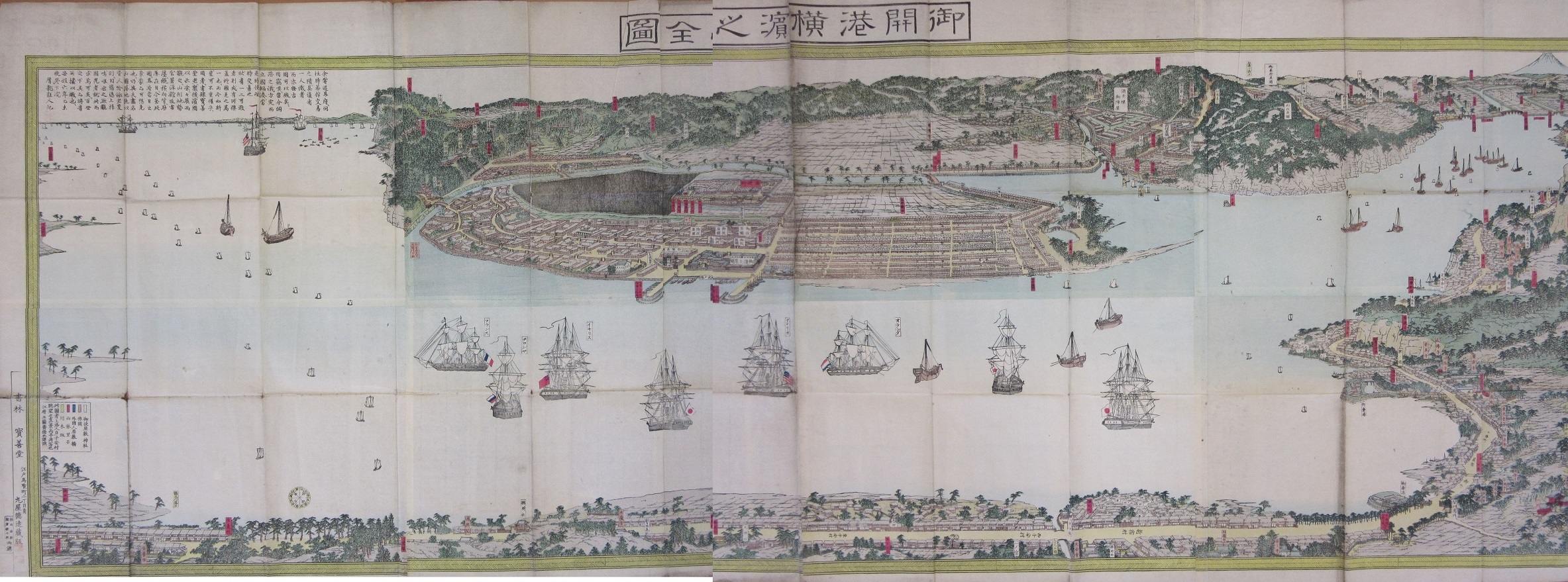
[A map of Yokohama. Bird’s eye view of the town…by Gyokuransai Hashimoto]. 1859. J Maps 3
This second map of Yokohama is a more traditional ‘bird’s eye view’ and unlike the earlier map sticks to one perspective, that of a view from the east. This style of mapping gives a more realistic sense of the hilly landscape surrounding the port city. Mount Fuji is at top right, (the map is long, and has been digitally stitched together).
Switzerland has a well-deserved reputation for good maps, and befitting a land of mountains and valleys the way that Swiss maps portray relief is particularly vivid and life-like. This map of Ticino, the southernmost Canton of Switzerland, is an excellent example of how two different perspectives can be used to show off such dramatic land.

Ticino Suisse meridionale [bird’s-eye view]. 1945. C39:7 (2)
This truly is a ‘bird’s-eye view’, at the bottom of the map we are directly over the city of Locarno but as we look northwards the mountains of the Alps appear in profile, as they would in real life. When relief is portrayed in such a realistic fashion it brings to life such dramatic landscape.
*Kanagawa is one of the 47 prefectures in Japan, a level of administrative division just below National Government. Yokohama is the main city of Kanagawa Prefecture.
With thanks to Alessandro Bianchi, Bodleian Japanese Librarian, for help with the Yokohama maps.

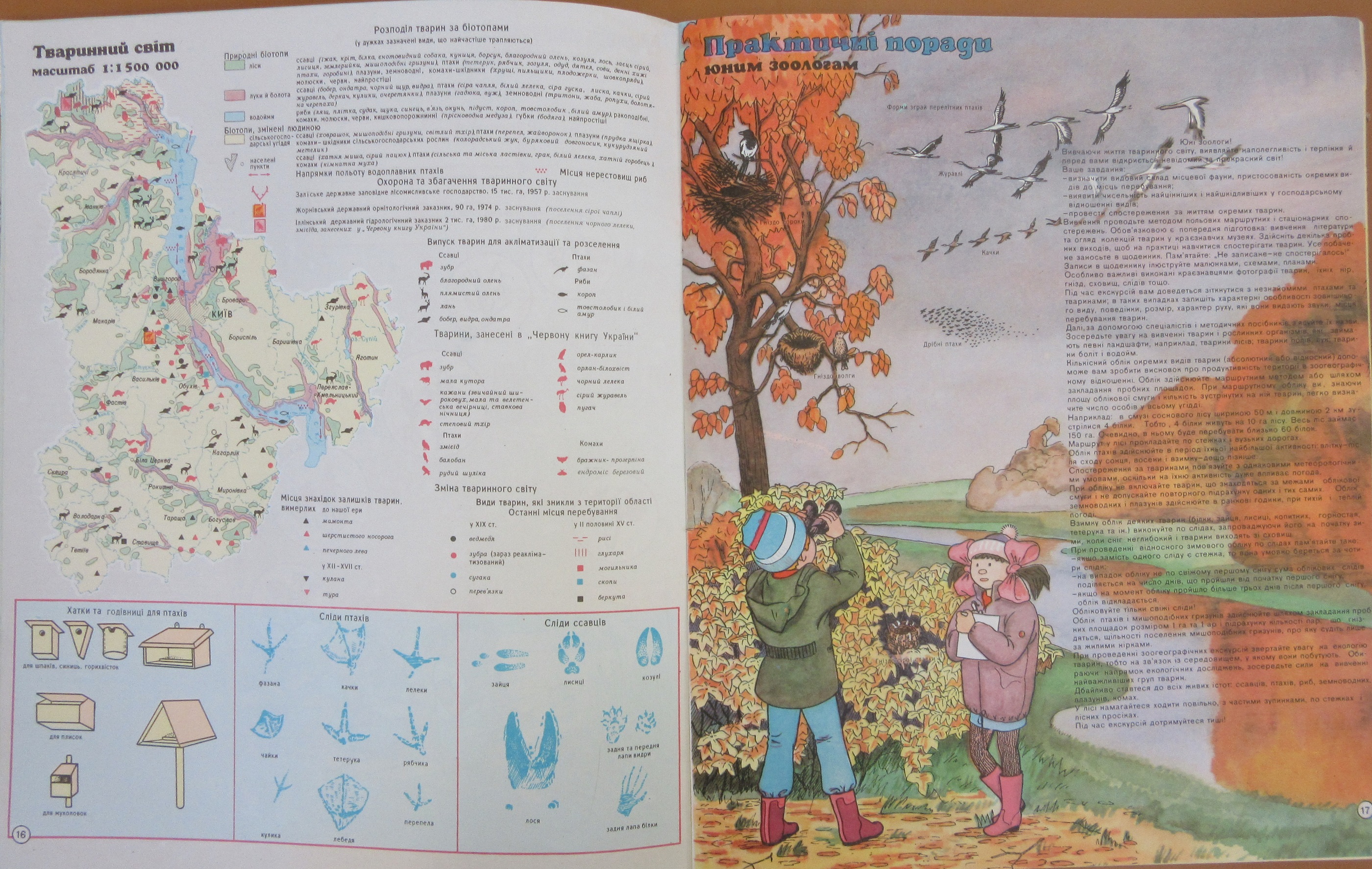

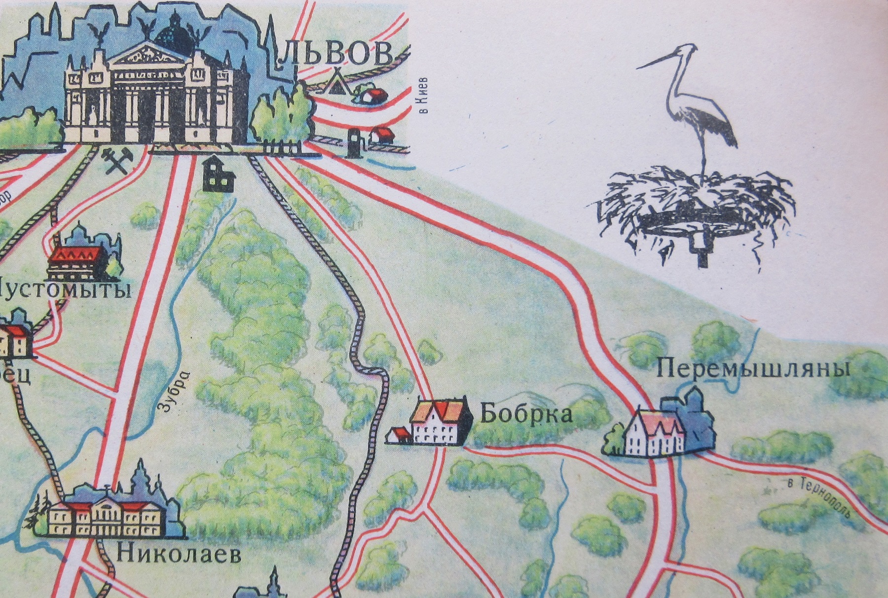
 The atlas also includes illustrations and text on surveying techniques and, shown here, orienteering. Text above the star chart in the top corner shows how you can find north by looking for the Big and Little Dipper in the sky, while notes on the ground explain how studying the landscape can help find direction (мох укривае піеічний біх дерее і каміння, or ‘moss covers the north sides of trees’, for example). And then, finally, the healthy benefits of being a ‘young tourist’.


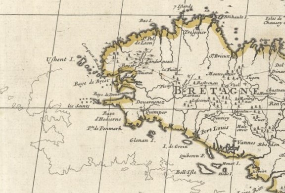
 Despite the text under the main title stating that the map is ‘…is a complete description in French, amended in many places, and distinctly within the limits of the regions’ the area shown covers a region of Western Europe whose border and name dates back to the Roman Empire. The map features a number of compass roses with rhumb lines which would have been used in sailing, though considering how little sea is featured on the map the use of the lines to navigate would have been secondary to sailing close to the coast to complete the journey.