The things you find when you tidy up

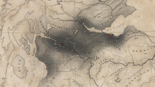
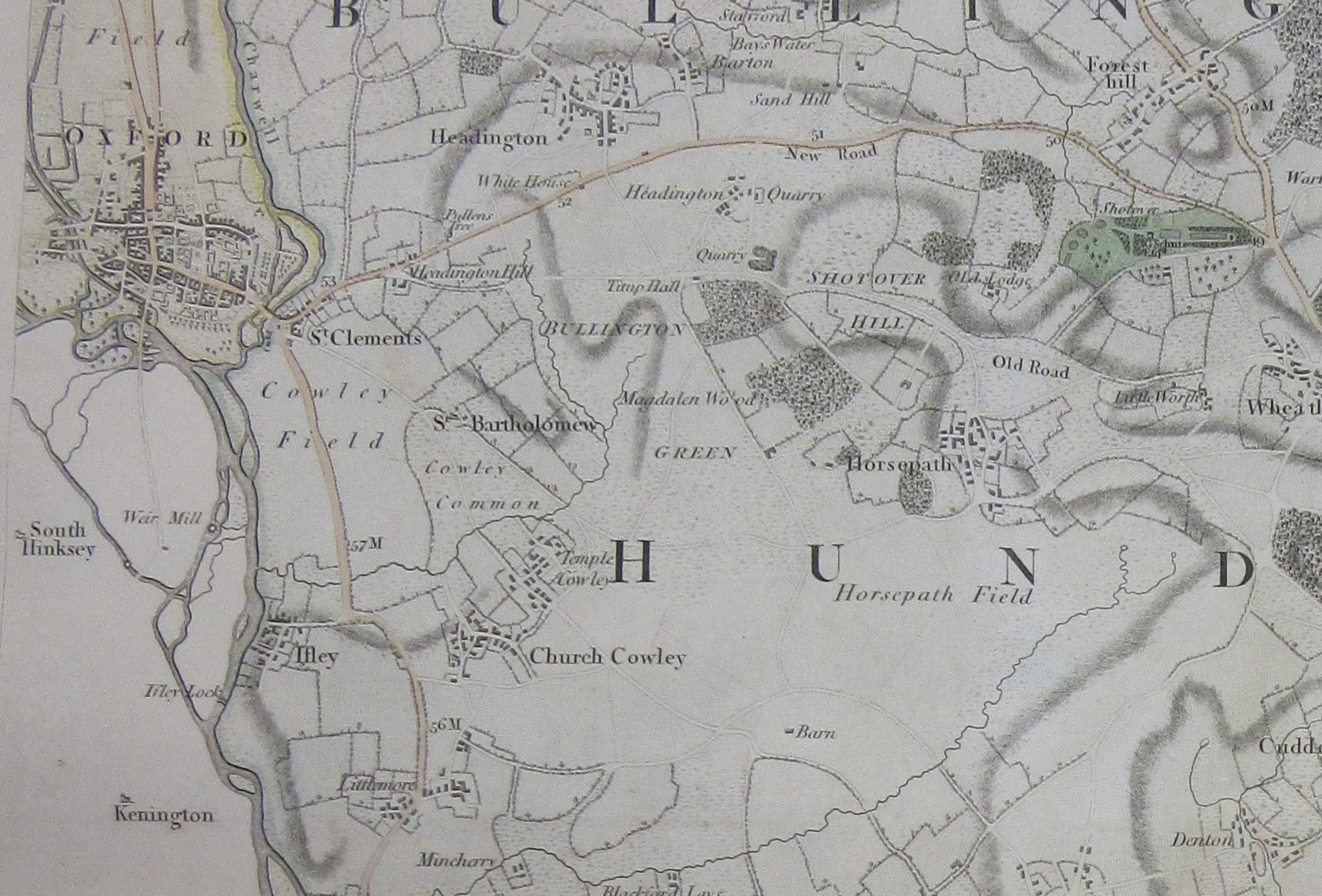
Over a decade ago, the Bodleian Map Room moved its collections out of what was then the New Bodleian Library, for the building to be completely redeveloped into the shiny new Weston Library. Anything uncatalogued was given a barcode and brief record to locate it in the new storage facility in Swindon. It was while tidying up the last few of these that we stumbled across this beautiful panorama of the Grampian Mountains. Everyone loves a panorama, so here it is, showing a view across the Scottish landscape.  The hills grow increasingly faint into the distance.  Settlements can be located by the wisps of smoke rising from them, presumably from peat fires.

In the foreground a picturesque rocky outcrop is surrounded by colourful heather; this is captioned beneath “The summit of Benclach, 2359 feet above the sea.”

It’s described as “A view of the Grampian Mountains, taken from the Summit of Benclach the highest of the Ochill Hills, a station in the Trigonometrical Survey of Great Britain, situated 28 miles north west from Edinburgh.” There’s a lot of cartographic history packed into that title. The Ordnance Survey has origins going back centuries, but the Roy Map of Scotland from the 1740s and ’50s is often seen as the immediate forerunner to the systematic survey of the whole of Great Britain begun at the very end of the eighteenth century. The survey started at the south coast, mapping the country at 1 inch to a mile, and worked northwards. It took decades to cover England and Wales, and the first published maps OS maps of Scotland were later still. However, the initial Trigonometrical Survey which worked its way up Britain, plotting exact locations by a process of triangulation, had reached southern Scotland by the 1810s. The panorama was both drawn and published by James Gardner, previously “employed on the Trigonometrical Survey”.

From 1823 Gardner was established in London as a publisher and seller of maps, and sole agent for the sale of Ordnance Survey maps; he retired in 1840 and the business passed to his son. The mention of his earlier role as a surveyor probably indicates that the view was made to be accurate rather than simply an artwork, and certainly seems to show a pride in being involved in this great scientific endeavour. There is an outline diagram underneath which names the mountains, settlements and other features, making the panorama informative as well as beautiful.

The point of origin is probably Ben Cleuch in the Ochil Hills. There is a note stating that it covers “about 85 degrees of the horizon” – nearly a quarter of a circle, stretched out to a view almost two metres long. The view was engraved by Daniel Havell in London, and printed in colour, a quite early example of a colour lithograph.


A view of the Grampian Mountains, from the Summit of Benclach the highest of the Ochill Hills / delineated and published by J. Gardner … 1820. C18:5 (93)

Making a point

What connects contraband, the Magna Carta, one-upmanship and the sin of earthly desire? The answer is Emanuel Bowen’s map from 1733, A New and Accurate Map of England and Wales’. 

In this map Bowen shows the roads throughout the country, with additional information on either the map or on the accompanying sheets giving distances from London and whether the roads are post, cross or ‘roads not to be found on Mr. Ogilby’s survey’ . If this was all the map did it would be a very good example of a common road map of the time (Bowen had produced earlier road maps that again had a dig at John Ogilby, with his ‘Britannia depicta or Ogilby improv’d’ set of road maps’ atlas). What sets this map apart from all others is the championing of the Members of Parliament that had recently voted against an Excise Bill. Introduced by Robert Walpole, generally regarded as the country’s first official Prime Minister, the Bill was intended to raise taxes on contraband goods while reducing the taxes of the rich landowners, appeasing those who had the power to vote. The idea that tax officers could go into people’s houses looking for such goods proved so unpopular – William Pitt, MP, led the rallying cry with ‘an Englishman’s house is his castle’ – that the Bill was quickly dropped. Bowen dedicates his map to the ‘the 205 members endear’d to their country by so seasonable an interposition in defence of it’s liberties’.  Bowen further emphasises this sense of liberty by evoking an earlier time when the Crown and right of rule was challenged. The arms of the Members of Parliament that voted against the BIll feature on two accompanying sheets, the coats of arms that appear underneath the map are for those Barons who forced King John to sign the Magna Carta in 1215, protecting rights and restricting the power of the Crown. To make the point further Bowen uses symbolism around the cartouche to reinforce this connection between the 1215 and 1733 opposition to the State and Crown

On the left is Liberty, here shown with a staff topped by a Liberty Cap (which dates back to Ancient Rome, and were worn by freed slaves) while on the right is Britannia, holding a copy of the Magna C[h]arta. The chained figure represents man enslaved by earthly desires. Bowen’s opposition to the Bill didn’t do him any harm in the long-run as he eventually became Royal Geographer to George II, despite the King supporting Walpole after the defeat of the Bill and the opposition in both Parliament and on the streets .

The Bodleian has four copies of the Magna Carta, the earliest from 1217, which can be viewed here

The ‘Mr Ogilby’ derided at every opportunity by Bowen is John Ogilby, who in 1675 published the first set of road maps done as a set of strips. Ogilby’s work was revolutionary, but due to reasons possibly nefarious left out some routes, more on his story can be found in an earlier blog here

A New and Accurate Map of England and Wales… Where unto are added… a list of Members… who voted for & against bringing in ye late Excise Scheme. 1733. (E) C17 (540)

A land of silver?

This beautiful map of part of the coast of Brazil has been in the Bodleian’s collections for many years. It was drawn to our attention recently by an enquiry from officials in the city of Fortaleza, part of the area which it represents.

The map is in an unusual style; a planimetric view of the coast from above gradually shifts as we look inland to a bird’s eye view of the mountains outlined against the sky as if in a picture. It shows the area around the fort, built by the Dutch West India Company in 1649 and first named Fort Schoonenborch (the name is spelt in several different ways on this map). The inland areas of forest around the river are beautifully depicted. North is towards the bottom of the sheet, as indicated by the compass rose. The text is in French, with a number of misspellings that suggest it may have been made by someone who was a not a good French speaker; the spelling of “Zud” instead of “Sud” for south in the title for example. The area was disputed by the Dutch and Portuguese, and the fort was handed over to the Portuguese in 1653. They renamed it Fortaleza de Nossa Senhora de Assunção; the area around it is now a substantial city, still called Fortaleza, capital of the north eastern state of Ceará.

The map includes a detailed plan of the fort, a section through and a numbered index locating its features. This would be useful military information. Some water depths are given around the fort; the map would be of practical use for anyone arriving by sea.

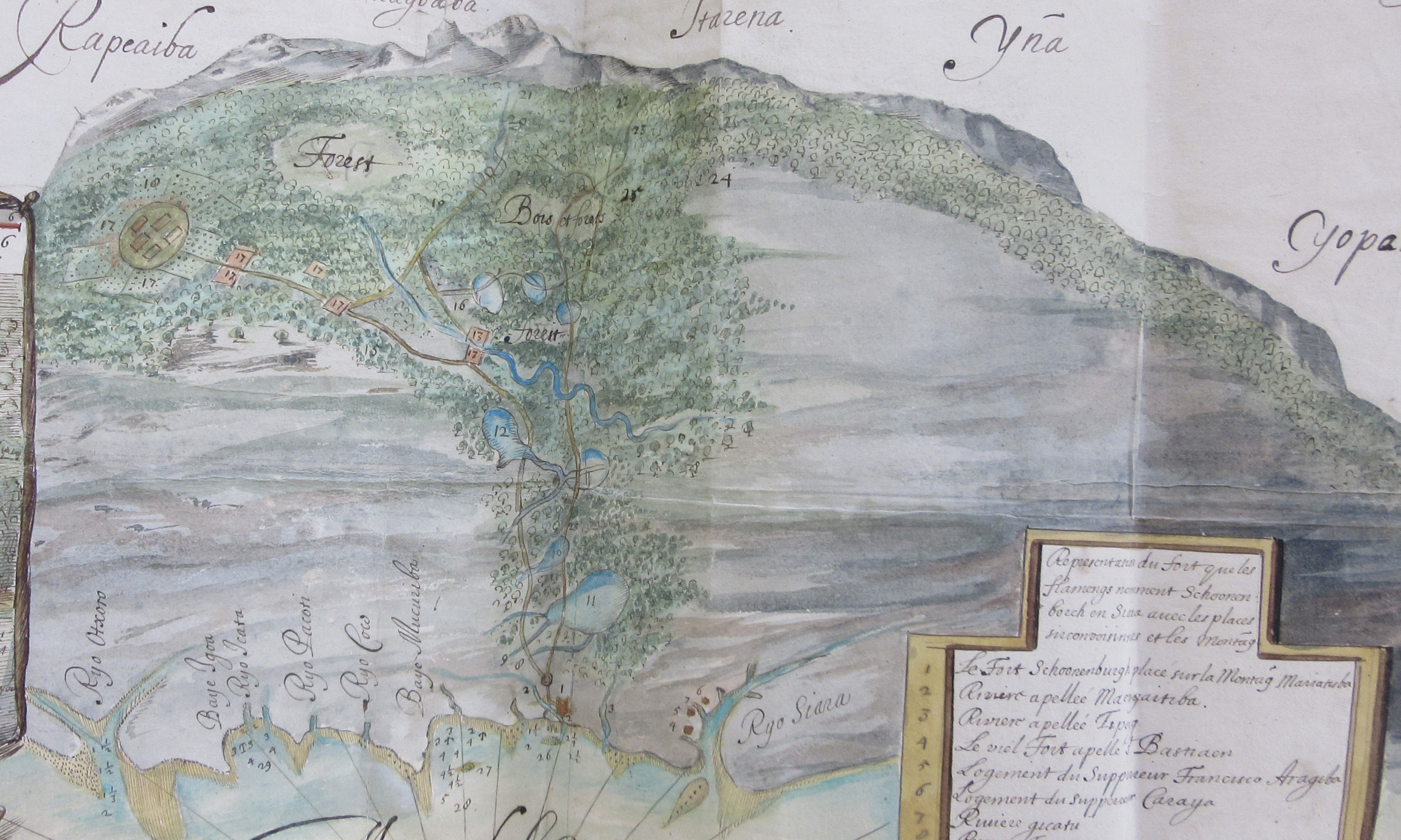
The map was found amongst the papers of Edward Hyde, 1st Earl of Clarendon. Why is this hand drawn map of part of the coast of Brazil amongst the state papers of an adviser to an English king? The answer is in the accompanying written text described as a “Remonstrance concerning advantages for his sacred Majestie”, directed to Charles II. It explains that the map is a “true copy of an original gotten out of the secret cabinet of the Amsterdam West India Company”, and describes the enormous value of silver that exists to be mined in the area. The text appears to come from Balthazar Gerbier (who also refers to himself by the name Douvilly, a reference to a probably invented noble ancestor). At this time Gerbier, formerly a courtier, diplomat and art consultant, had fallen on hard times since the Restoration. He had previously taken part in an unsuccessful expedition to Guiana in search of gold. His extravagant claims regarding silver around Fortaleza do not appear to have been followed up.The hope of finding precious metal was an important part of exploration of the Americas by Europeans. This cartouche from a Dutch printed map of South America, from around the same time, shows South American people apparently smelting metal before well-dressed European gentlemen in ruffs and flamboyant hats; miners can be seen carrying their pick axes uphill in the background.

La description dela contrée de Chiara en Amerique á trois degrez du zud du temp que la Compagnie des Indes Occidentalos la possedoit, et y avoient erigé le fort Schonenbourg. 1649-1653,  MS. Clarendon 92 (f.179a)

Tractus australior Americae Meridionalis a Rio de la Plata per Fretum Magellanicum ad Toraltum. ca 1650. (E) H1:7 (2)

hey, you, get off my cloud…

In an already crowded field this has to be one of the more over the top cartouches.

A cartouche is a decorative part of the map that contains information such as the title, cartographer and other relevant text, and often uses symbolism to portray a meaning rooted in Renaissance thinking. It can also, in the case of this map, include a dedication to a person who is either the patron to the map-maker or subscriber to the map being made, the original crowd-funding. Here’s a guide to what is actually going on with this map of Surrey, dedicated to His Royal Highness William Henry.

Prince William Henry, Duke of Gloucester and Edinburgh (1), grandson to King George II and brother to King George III, is surrounded by the the Nine Muses of Greek mythology, and with Geography, an additional Muse introduced during the Renaissance. The Muses are symbols for knowledge and the arts, and by portraying them and the Prince together the inference is that the Prince, and by association the map-makers, both deserve to be included in such lofty company. Amongst the Muses are Clio, who represents history and is usually shown with a book or a scroll and often a lyre (2), Melpomene, the Muse of Tragedy (3) holding a dagger, Urania, associated with astronomy, usually shown with a globe, compass or armillary sphere (4) and, appropriately, Geography, shown with a telescope and other surveying tools (5). The Muses to the left of Prince William Henry draw his attention to lavish praise given in the cartouche.                                                                                                                                          Amongst this wealth of decoration is something that is easily over-looked but is as important at the time the map was made and now. Because of the lack of female cartographers Mary Ann Rocque deserves her place in the clouds (6). The title of the map is ‘A topographical map of the county of Surrey, in which is expressed all the roads, lanes, churches… the principal observations by the late John Rocque… compleated and engrav’d by Peter Andrews’ and this is the third edition,  from c1775. John Rocque died in 1762 and his wife Mary Ann carried on publishing maps after his death. Even though Rocque surveyed Surrey in preparation for this map it was Mary Ann who was responsible for the printing and selling of the work and it is Mary Ann, ‘his most h[um]ble and oblig’d servant’ who dedicates the map to the Prince. Mary Ann went on to make maps herself, eventually being awarded the title ‘Topographer to HRH the Duke of Gloucester’.

The skill involved in engraving the cartouche is apparent throughout the beautifully coloured map. This extract of the Horsell area shows off the skill involved in engraving such fine detail.

This is the only map that John Rocque and Peter Andrews worked on together though Andrews did further work for Mary Ann Rocque before concentrating on nautical charts. The two different colours on this extract are for separate Hundreds, a county division larger that a Parish. For different reasons Horsell features in an earlier blog post here

A topographical map of the county of Surrey, in which is expressed all the roads, lanes, churches… the principal observations by the late John Rocque… compleated and engrav’d by Peter Andrews. c1775 (E) C17:57 (31)


Going South

The early 20th century was the Heroic Age of Antarctic Exploration with the competition between a handful of men really pushing the boundaries of discovery and survey. Ernest Shackleton was at the forefront of this but it wasn’t until after the Nimrod Expedition which he led from 1907 to 1909 that he was able to write about it.

The Expedition, named after the aging ship, Nimrod, was short on funds, lacking experience and preparations were rushed.  Finally the difficulties were overcome and team were underway southwards. The main target was to be the first men to the South Pole. Once the team arrived in Antarctica there were a range of geographical and scientific objectives to be undertaken but there would be long periods of inactivity due to the season and weather. However, Shackleton had put some thought to what the team could do in the long dark winter months.  He took along a printing press with which all the members of the Expedition wrote a book, Aurora Australis.


The challenges of writing, illustration, printing and binding this work in the frigid temperatures cannot be overstated and became the first book published in Antarctica. Published at ‘The Sign of the Penguin’ (Cape Royds) the extreme cold meant the printing ink became thick and difficult to work.  It can be imagined that to include maps in this work would just be too difficult. However, about one hundred of these volumes were produced and bound by another expedition member, Bernard Day, using recycled horse harnesses and Venesta boards from the packing cases.

Each copy retains stenciling indicating the provisions packed in that case which gives each copy a name.  The lettering on the Bodleian’s copy is “Kidneys”.

An Australian member of Nimrod Expedition, Douglas Mawson, created the maps of the expedition from surveys he and other members undertook. A geologist at the University of Adelaide by profession, he was ideally placed to do this work.

The maps show the Expedition’s Winter Quarters at McMurdo Sound, Cape Royds, and their routes on land and ice.  The style of the maps is attractively spare but almost illustrative. Printed in colour, the depiction of relief is mainly pictorially stippled with the names of the features are a mixture between prosaic (Brown Island, Snow Valley) and commemorational such as Mount Evans, Mount Doorly, both named by Captain Scott during the earlier Discovery Expedition after colleagues. Also notice the Royal Society Range – it’s always good to keep your sponsors onside. The routes show the first ever ascent of Mount Erebus, the second highest volcano in Antarctica, and the route southwards. It is poignant that the route stops not at the South Pole but at the map edge, dated “16.1.09 Lat. 72° 25’ Long. 155° 16’.”. However, this was the furthest south anyone had reached at that time.


The maps were drawn once the party returned to England and were issued in The heart of the Antarctica by Ernest Shackleton which was published in 1909 as a weighty two volume work.

The heart of the Antarctic  2036 d.17,18

Aurora Australis Broxb. 51.14

Counting people

March 2021 is a census month, the 22nd since the first in 1801 (the 1941 census was cancelled due to the war*). United Kingdom censuses initially set out to count the number of people and their employment, it wasn’t until 1841, the date of our map, that names were taken. From the 1851 census onwards information such as disabilities and religion was gathered as well. Here is a map showing information from the 1841 census, the rather wonderfully titled ‘Map of the British Isles, elucidating the distribution of the population, based on the census of 1841. Compiled & drawn by Augustus Petermann’.

Map of the British Isles, elucidating the distribution of the population, based on the census of 1841. Compiled & drawn by Augustus Petermann’. c1847. (E) C15 (157)

The map works by way of shading and spots. The shading indicates the varying degrees of population over the country, with the darker shading showing an area of denser population, while the coloured dots show towns according to population size (red for towns of 100,000 or more and so-on down to a clear dot for towns of under 10,000). It’s not an ideal way to show a large amount of information but gives an immediate idea of where populations are; London, the Midlands, the Manchester-Liverpool and Glasgow-Edinburgh regions, and of how under populated the country-side was, partly by this point as a result of Enclosure Acts forcing people off the land and into the cities and towns. Here’s an extract showing London in more detail

The numbers shown (204 for Sussex for example) shows the average number of people per square mile, or as the map nicely puts it ‘the number of souls to 1 English (statute) mile’. There is also a table listing population per county.

Text on the map explains how geography has played a part in population. ‘Mountains and valleys determine the main features in the distribution of the population, the latter exhibiting naturally the greater masses’. Petermann gives as an example Scotland, and how with a wide range of Mountainous areas most of the population live in-between the Firths of Clyde and Forth, with a 3rd of the total population occupying a 30th of the land mass. Ireland, by comparison generally has smaller mountain groups, and less of them, so there is a more even spread of population.

The 1801 census asked 6 questions. Broadly speaking these were; how many inhabited houses in each Parish, Township or place, and how many families live in each one, how many people in each parish etc, distinguishing between male and female, how many are employed in agriculture, trade, manufacturing and handicrafts, how many baptisms and burials in the years 1700, 1710, 1720 and so-on until 1800, how many marriages between 1754 and 1800 (1754 chosen as the year when a Marriage Act made the year before came into force), and then finally if there were any questions or notes about any of the previous questions.

Augustus Petermann was a celebrated German cartographer, learning his trade in Germany, then Scotland before moving to London to work in 1847. He became a fellow of the Royal Geographical Society and, which accounts for the dedication in the title, ‘Physical-Geographer Royal’ to Queen Victoria.  Unfortunately professional success wasn’t matched in his private life. His first marriage ended in divorce, his second in suicide in 1878.

The Bodleian has a large number of maps and atlases which makes use census information. Census information also began to appear in gazetteers from the 1830s onwards, when, with the availability to compare current to previous figures accurately, population figures for towns could be given. This population map of the Saxony region of Germany is a recent addition to the map collection. Volksdichte-Schichtenkarte des Königreiches Sachsen nach der Zählung vom 1. Dezember 1900 (Population density layers map of the Kingdom of Saxony after the census of December 1, 1900) shows density of population by colour with two insets for the areas around Dresden and Leipzig from an earlier 1846 census. The map uses a technique called isopleth to show the density of population. Isopleth uses lines to show areas of equal value, the lines are similar to contours on a physical map and work on the same principle. The main advantage is that you can see at a glance the heavily populated areas by the colour ranges shown on the graph. That Saxony was, in 1900, a mainly rural area can be seen be the amount of green and brown cover shown.

Volksdichte-Schichtenkarte des Königreiches Sachsen nach der Zählung vom 1. Dezember 1900, C22:25 (74)

*There was a census count in 1966, the first and only time a mid-decade count was made.


Mapping radiation

On the 26th April 1986 technicians at the Chernobyl Power Plant in the Ukrainian SSR turned off the power to the number 4 reactor, hoping to test back-up generators used to keep the cooling waters circulating in case of a power outage. During the test the power-levels dropped to unexpected and dangerous levels. Following instructions that didn’t allow for such a possibility meant that the test proceeded, leading to a chain reaction releasing a huge amount of energy which immediately vaporized the cooling water, caused a devastating steam explosion and then the escape of a large radiation cloud. Wind conditions and proximity to the site meant that most of this radiation fell on the Byelorussian SSR.

This map, made post-independence in 1992, shows the density of pollution caused by Caesium-137 at different levels of contamination (a radioactive isotype that reacts with water, which as a consequence makes it easy to move around the body. It is one of the two most prominent isotypes released after the accident, and will continue to be a major health hazard in the area for the next two hundred years). The strong use of colours, more reminiscent of coloured-layering, is here used to show dramatically the area of contamination. There is also an inset of the area nearest the nuclear site showing strontium and plutonium radiation (Chernobyl is at the bottom centre of the map, Черновыль). What the map doesn’t show, of course, is the human cost to this tragedy. Only the title, ‘…until January 1992’, hints at a lethal problem still in place 6 years after the event. An updated version from 1993 manages to convey this cost though. Text in a number of languages states ‘…a catastrophe broke out – the major break-down of the power unit at the Chernobyl Nuclear Power Station. By its scale, complicity and long-term consequences it is the most severe catastrophe throughout the entire World history of atomic energy use…after the Chernobyl accident Belarus has become the zone of of the ecological disaster‘.  The text is in a number of languages; Russian, English, French, German and Polish, and when you carry on reading you realise why. As well as a map to show the spread of radiation following the accident the map is also a plea for international aid, ‘But the extent of the consequences of the catastrophe of the Chernobyl Power Station is so enormous that, it is regrettably, impossible for Belarus to liquidate them alone. The Republic badly needs medicines…The Byelorussian people, guiltless victims of the severe catastrophe, need the help of the international community.’

This extract comes from the back of the 1993 map, which includes the appeal for international aid. The three maps show the spread of the contaminated cloud between the April 27 and May 1st.

Maps have played a crucial roll in showing the aftermath of the Chernobyl incident. From tracking the contaminated cloud spreading across Eastern Europe to the more long-term mapping of contaminated lands maps have been the most useful medium to show the immediate and long-term effects of the disaster.

The Bodleian holds maps from the International Atomic Energy Agency, the Office for Official Publications of European Communities and the Hungarian Academy Research Centre for Astronomy and Earth Sciences as well as commercial publishers on Chernobyl and there are a number of interesting websites on the disaster, including Chernobyl Exclusion Zone Map – Chernobyl 35 years laterNew mapping of radioactive fallout in Western Europe | EU Science Hub (europa.eu) and  ESA – Mapping Chernobyl fires from space

Карtа Радиационной Обстановки на территории Республики по на Январь 1992 г (Map of the radiation situation on the Territory of the Republic until January 1992) 1992 C403 (101). The 1993 map, Republic of Belarus. Review – topographic map with the data on radiation contamination is at C403 (104). Both maps are at 1:1,000,000


How to make a map Soviet style

On the reverse of a map of Minsk from 1991 there are some interesting and unusual sections. As well as including instructions on measuring distances there are also examples of the same area at different scales (1:1,000,000 going down to 1:10,000 and centring on the village of Borovsty). Shown here are the 1:1,000,000, 1:500,000 and 1;200,000 scale maps as well as two pictures about orientation


Map reading instructions and examples of different scales aren’t uncommon features, what makes this particular map stand out is the little diagram showing the process of making a map, from planning (ПроеКт) through surveying (aerial as well as ground-work) to drawing


and production and finishing with sales. Can the whole exercise be included as proof that the Soviet system still worked despite the Union breaking apart?, the Byelorussian SSR itself declared independence the same year the map was made, becoming Belarus.

The end result of all this work is the main map, made by the Soviet Cartographic Department, the Glavnoe upravlenie geodezii i kartografii, more commonly known as the GUGK (Main Directorate of Geodesy and Cartography). The use of oranges and greens here is a common feature of Soviet maps, immediately recognizable as a product of the GUGK.


Mинск и окрестности (Minsk and surroundings) 1991. C40:12 (40)


Field patterns

Recent work on the Laxton map reminds us how beautiful maps often are, but also how beautiful the patterns made by field systems can be as well.

The central part of the Map of Laxton, 1635, MS. C17:48 (9)  (see notes at end for more information on Laxton)

Fields are a natural part of the landscape, but the dating of the fields can vary greatly depending on where you are. Areas of the West Country still have what is called Ancient Countryside, fields and farm land untouched by Enclosure acts. Fields at the tip of Cornwall on

the Penwith Peninsula are thousands of years old, a crazy pattern with small fields and many angles, utilizing boulders in the landscape too big to move or pre-existing ancient monuments such as standing stones and burial chambers. Due to the construction of these boundaries they are hard to move or alter, and it’s because of this that these field boundaries are, despite their age, still in use today. This type of landscape can also be found in areas as diverse as the Welsh borders and Essex, Sussex, Kent and Surrey. This extract comes from the 2nd edition Ordnance Survey 6 inch map of Cornwall, sheet LXI S.W., 1908. The Ordnance Survey shows fields up to and including maps at a 1:25,000 scale.

Laxton is an example of an Estate map. These are almost always manuscripts, with a cartographer commissioned to survey and produce a map with details such as field size, use and often details of individual field ownership.

Being a one-off often led to a beautifully illustrated and informative map. This example shows the  fields surrounding the Down Hall Estate in Essex (MS C17:28 (38), 1718), and was surveyed by William Cole, who was also a schoolmaster in Colchester. Down Hall Estate (home of Bake Off no less) features in the middle of the map, with details of the kitchen gardens surrounding the house.  Further examples of estate maps can be found here and here

One of the best maps of Oxfordshire, Richard Davis’s map from 1797, falls in-between the old practise of open fields and the new approach, that of Enclosure. This sheet shows the area to the East of Oxford (the county boundary followed the Thames until the 1970s) and has both big open fields and the new, smaller, patterns in place. The map shows the start of a new type of landscape, called Planned Landscape, neat fields with straight lines, without any of the quirks found in older field patterns, which often followed ancient parish boundaries and streams.

with an extract here

A new map of the County of Oxford : from an actual survey; on which are delineated; the course of the rivers and roads, the parks, gentlemens seats, heaths, woods, forests, commons &c. 1797                C17:49 a.1

This blog has been partly inspired but a recent series of programmes on the BBC called Winter Walks. Over 5 episodes people such as Simon Armitage, Baroness Sayeeda Warsi and the Rev. Richard Coles have walked in Yorkshire and Cumbria, holding a portable camera and accompanied by a drone giving aerial views of the incredible landscape and field systems on show. These field patterns can be seen in this Ordnance Survey 3rd edition sheet of Grassington (Yorks CXXXIV N.W., 1910). The field boundaries shown on the map would have been efficient way of using up stones found in the fields when ploughing. Dry-stone walling would also have the benefit of letting the wind through, reducing damage.

Be it from drone footage or walking in the country-side field patterns are revealed as objects of beauty as well as important agricultural features. They are also a chance for us to show off more beautiful maps from the collection at the Bodleian.

* The Laxton map, A Plat and Description of the Whole Mannor & Lordship of Laxton with Laxton Moorehouse in [y]e County of Nottingham and also of the Mannor & Lordship of Kneesall Lying Adiacent to [y]e Aforesaid Mannor of Laxton,   measures 178 x 203.5 centimetres on 9 rectangular pieces covering the villages of Laxton and Kneesall, around a dozen kilometres northwest of Newark-on-Trent. Dating from 1635. Approximately 3,333 separate field strips are shown on the map, which is made from sheep-skin. The area is still farmed using the open-field system, incorporating crop rotation, though to a lesser extent than at the time of the map.                           The Map Librarian at the Bodleian, Nick Millea, talks about the map here

St Petersburg in colour

This large, beautiful map of St Petersburg was recently donated to the Bodleian Map Room. Measuring just over a metre square, it shows the city in great detail. Every building is marked and the layouts of parks and gardens around the city are shown. The fortress on Zayachy Island is shown in detail (below). The water depths in the Neva river and estuary are included. The title makes reference to some of the earlier plans on which the map is partly based, beginning with that of Fedor Shubert in 1828; it was updated from surveys in the 1850s and 1860s. It was published in St Petersburg in 1868.

The reverse of the map carries a handwritten note, “Petrograd”, which would date its acquisition by a previous owner to some time in the ten years from 1914 to 1924. Previously the city had been known as St Petersburg, since its founding by Tsar Peter the Great in 1703 (on the site of an earlier Swedish fort); he made it the capital of Russia, which it remained until 1917. In 1924, shortly after the death of Bolshevik leader Lenin, it was renamed Leningrad in his honour. In 1991 the name reverted to St Petersburg.

The map is delicately coloured in red, green, blue and black. At first glance it appears to be hand coloured as the colouring is so smooth, but closer examination suggests that it was lithographed; very slight offsetting can be seen in places (where the green plate does not exactly line up with the coastline on some of the islands, for example, as can be seen in the detail above).  Colour printing of maps took off in the twentieth century; this is an unusually fine early example.

A final thought: This blog post replaces our Christmas blog post (below) as the 12 days of Christmas are now over in the UK and much of the western world. However, the Christmas season is just beginning in the Russian Orthodox Church, so we would like to wish everyone celebrating a very Happy Christmas!

Plan S. Peterburga : sostavlen na osnovanīi plana Shuberta 1828 g., posli͡edneĭ rekognost͡sirovki Voenno topograficheskago depo 1858 g., gidrograficheskikh kart Nevy i ei͡a ustʹi͡a izdanīi͡a Gidrograficheskago departamenta Morskago ministerstva 1864 g. i rekognost͡sirovok proizvedennykh 1867 i 1868 godakh redaktorom T͡Sentralʹnago statistichesk: komiteta M. Ī. Musnit͡skim / ispolnen v Kartograficheskom zavedenīi A. Ilʹina. S. Peterburg : Kartograficheskoe zav. A. Ilʹina, 1868. C400:50 St Petersburg (24)