Sending cabbies in circles

Joachim Friederichs map of London takes an interesting approach to measuring distances. A series of circles covers the whole map, each one representing ½ a mile in diameter, making it possible, according to the cartographer, to ‘merely count the number of circles between one point and another you have at once the distance travelled’.

The Circuiteer, or distance map of London: invented by J. Friederichs, particularly adapted for cab conveyance c1850. (E) C17:70 London (359)

Measuring distances in maps is a long established practice; from simply putting in distances along roads from point ‘a’ to ‘b’ to concentric circles at a set distance radiating out from a central location to the scale bars and grids so familiar to us from our Ordnance Survey maps. With so many maps of London published Friederichs map stands out with it’s unusual approach.

As well as a distance guide the map serves as a proposal to right what the author sees as a serious case of wrong-doing, the over-charging by Hackney Carriage drivers. In text accompanying the map Frederichs writes ‘The monstrous imposition practised by Cab-Drivers upon the public have long been the subject of general complaint, but of all the plans hitherto suggested to remedy the abuse – and they have been many – not one has been found to ensure. The purpose the Circuiteer, or Distance Map, at least offers  a certain protection against such extortions, as the reader will be enabled to judge for himself, from the following concise explanation.’

The text goes on to give examples of proposed fares, considered reasonable, by mile as opposed to by route, and suggests the buying of pre-paid tickets instead of paying cab fares.

Hackney Carriage fares have featured on numerous maps of the City. This example, A new and exact plan of the cities of London and Westminster & the Borough of Southwark…whereunto are added the rates of Hackney Coachmen and watermen with several other embellishments. By Robert Sayer, 1775. (E) C17:70 London (72),  has, as well as a wonderful map of the City, a small box in the bottom corner giving a ‘Table of Rates’ at both a shilling and eighteen-penny and rates for the Thames watermen. The map also has insets of the major buildings and shows the Ward boundaries.


Centred

This style of mapping, to centre on a major city or town, was a popular form of cartography that dates back as far as the late 1600s (the earliest example in the Bodleian is a map showing the towns within a twenty-mile radius of London from c1686). Often produced within a circle the style had gone out of fashion by the mid-1800s with the arrival of detailed area maps such as the 1st edition of the 1″ Ordnance Survey.

This map of the country 11 miles around the city of Bristol‘ is an excellent example of the genre. It was made by the Devonshire map-maker and mathematician Benjamin Donn, who had moved to the city in 1764 and had set up a subscription to pay for the making of the map in 1767. There are a number of things of note on the map, not least the skill shown in the cartography and engraving (engraving done by the rather unfortunately named R. Coffin) . Market towns – such as Thornbury shown here – have the market days noted which would have been important as these towns were centres for the sale of local produce as well as a place for labourers to gain employment. With the collection of rents and tolls they were also a useful way for the host town to gather funds. Subscribers are named throughout the map at their place of residence, giving a wonderful connection to people alive in the area at the time, such as Mr. Stephens of Titherington. Rich subscribers often appear in a number of the maps of their area, a way not only of helping with the production of the item and hence adding to the knowledge of their location but also, literally, a way of putting yourself on the map. For instance, a Messrs  Hawkins and Harrington appear on our map of Bristol and also of a similar map for Bath (‘A map of 5 miles around the city of Bath’, 1771, (E) C17:54:15). 

Mr. Harrington was a descendent of Sir john Harrington, courtier to Elizabeth I, poet and inventor of the first flushing toilet, which was installed in Kelston Manor (Kelweston on the maps), while Mr. Hawkins was Sir Caesar Hawkins, one of the physicians to both George II and George III.

The map marks distances in miles along the important roads out of Bristol, industrial works and places of worship and has two insets, both intended to show off local landmarks. In the bottom right corner is a plan of the prehistoric Stone Circle at Stanton Drew, which is the second largest in the country after Avebury. With this plan Donn shows his mathematical skills, measuring accurately not only the diameters of the three circles but also the distances between them.

One of the most interesting things on the map though isn’t the most obvious. Tucked away under the legend is this seemingly innocuous note

highlighting the problems that any author had before strict copyright laws of losing sales to  poor imitations or downright plagiarism.

Another example of this type of map is this beautifully coloured map of London by John Fairburn (Fairburn’s map of the country 12 miles round London, 1800, (E) C17:40 (145)). Fairburn uses the same design as Donn, complete with illustrations

and like Donn’s map Fairburn’s is backed with cloth to strengthen the paper and avoid damage caused by folding. The London map is  a second edition though, the first proving popular, as well as profitable, enough to not need subscribers. And to finish, one further example of these ‘Centre’ maps, this time of Oxford by another Benjamin Donn(e), who despite the Jnr. was in fact the nephew of the B. Donn whose map is at the start of this blog (A new map of the country round the city of Oxford…c.1790. (E) C17:49 (78).

‘This map of the country 11 miles round the city of Bristol…’,  1769. (E) C17:31 (33).


A map, a view and an elevation

This beautiful map of the Teign Estuary incorporates three different ways to show off the new bridge across the river linking the village of Shaldon with the important Devonshire port and seaside resort at Teignmouth.

The bridge, completed the year before the map was published, was just over 1,670 feet long, making it the longest wooden bridge in the country at the time. A swing-bridge at the Teignmouth end allowed ships through to the estuary.

The map is a work of self-promotion, designed to show the route of a new road which had been proposed by Roger Hopkins, Civil Engineer and Mineral Surveyor, who designed and built the bridge and made the map. To show off Hopkins skills as an engineer and surveyor the bridge features prominently, not only on the map but both in a portrait

and then in profile; the former to show the beauty of the design within the context of the setting, the latter to show off the surveying and engineering skills of Hopkins.

In the title Hopkins reminds the viewer that it is he that ‘projected, designed and executed…’ the bridge and then goes on, as his ‘most humble servant’, to dedicate the map to the Duke of Clarence, Lord High Admiral of the United Kingdom. As can be imagined the Lord High Admiral was the head of the Royal Navy and the holder was usually drawn from the Royal Family (the current High Admiral is Prince Philip). Three years after the publication of the map the Duke of Clarence became William the IV.

By showing evidence of his surveying and engineering skills with the views of his bridge Hopkins sets out why he is qualified to propose his new road, despite there already being a road from Newton (now Newton Abbot) to Shaldon. Hopkins road would be far more direct, transporting the produce from the mills in the town to the port at Teignmouth. Despite the beauty and surveying and engraving skills on show Hopkins was ultimately unsuccessful, the road only existed on paper and twenty years later the railway came to South Devon, and Newton Abbot was linked to Teignmouth along the northern side of the Teign.

Map of the towns of Teignmouth and Newtonand the country lying between them, showing the advantage of a proposed… road… from actual survey made by R. Hopkins, 1828 (E) C17:25 (41)

Unsung heroes

Engravers can be the unsung heroes or heroines of the map world. Until the nineteenth century, virtually all printed maps were produced by engraving the map on a sheet of copper – or later on, steel – as a mirror image of how the finished map would look. The plate was then inked and the image printed onto a sheet of paper in a printing press. This was incredibly skilled work, but often only very discreetly acknowledged, the engraver’s name appearing in tiny, modest letters in the bottom margin.

While cataloguing a large collection of nineteenth century French sea charts I have encountered some exceptional engravers. One we know only by his surname: Chassant, working in Paris from the late 1830s into the 1860s, was arguably wasted on sea charts. His dramatic portrayal of land relief using hachuring is very striking, as can be seen from this chart showing the old port of  Marseille and the rugged hills to the south in 1845.

When cataloguing these maps we always want to give the engravers their due, but identifying exactly who was responsible for a particular map can be challenging. The case of the Halls was discussed in a recent post – there were possibly quite a few women involved in early engraving. Mme Fontaine, a Paris based engraver of the 1860s and ’70s, is credited on her work simply as “Fontaine”, with no first name or title; research has revealed only that she was a female engraver who specialised in portraying large areas of water.

Around the same time, an engraver called C.E. Collin was also working on charts for the French Dépôt-général de la marine. Engraving was sometimes a family business, and this can make it harder to work out who engraved a particular map. This C.E. Collin appears to have been the youngest of three engravers called Charles Etienne Collin who produced charts for the Dépôt (as well as some other works) between 1789 and the 1870s.  The oldest one usually signed himself “E. Collin”, although he is also also believed to have had the given name Charles. In 1821, a two sheet chart appeared, of which one sheet was described as being “gravé par E. Collin” and the other “par E. Collin père”.  There is some overlap of the map area on the 2 sheets and differences in style suggest that they were made by different engravers. It was unusual for the older E. Collin to call himself “E. Collin père”, so perhaps this was an early collaboration with his son.  In 1829 the younger E. Collin took a different approach, engraving a chart and signing it “gravé par C.E. Collin fils.” Was this yet another young engraving Collin, or was he inconsistent in the use of his initials?  E. Collin père is generally supposed to be be Charles Etienne Collin; perhaps he disliked or rarely used his first name, and his son followed suit?

The second Collin continued to engrave charts into the 1830s. From the late 1840s a third C.E. Collin appears, and he was active into the 1870s. He was probably a grandson or nephew of the first Collin, but it is difficult to be sure exactly where one person’s work stops and the next one begins. Or why they couldn’t come up with a wider range of given names. The third Collin was an exceptionally fine engraver and his charts are really beautiful; one is represented above. In particular, some of his sea charts show a remarkable degree of detail for the land; in the chart above, the patchwork of fields, and even the approximate layout of small villages can be seen. In both these cases, the land information shown would be of use to sailors, helping them to spot landmarks from out at sea. It is also a valuable record of a rural stretch of coast over 150 years ago, since transformed by the growth of the city of Montpellier.

 Plan du port de Marseille et de ses environs. Paris: Dépôt-général de la marine, 1845.

Carte des côtes méridionales de France: Partie comprise entre Cette et Marseille. Paris: Dépôt des cartes et plans de la marine, 1867. B1 a.61/14


I do here, good reader…

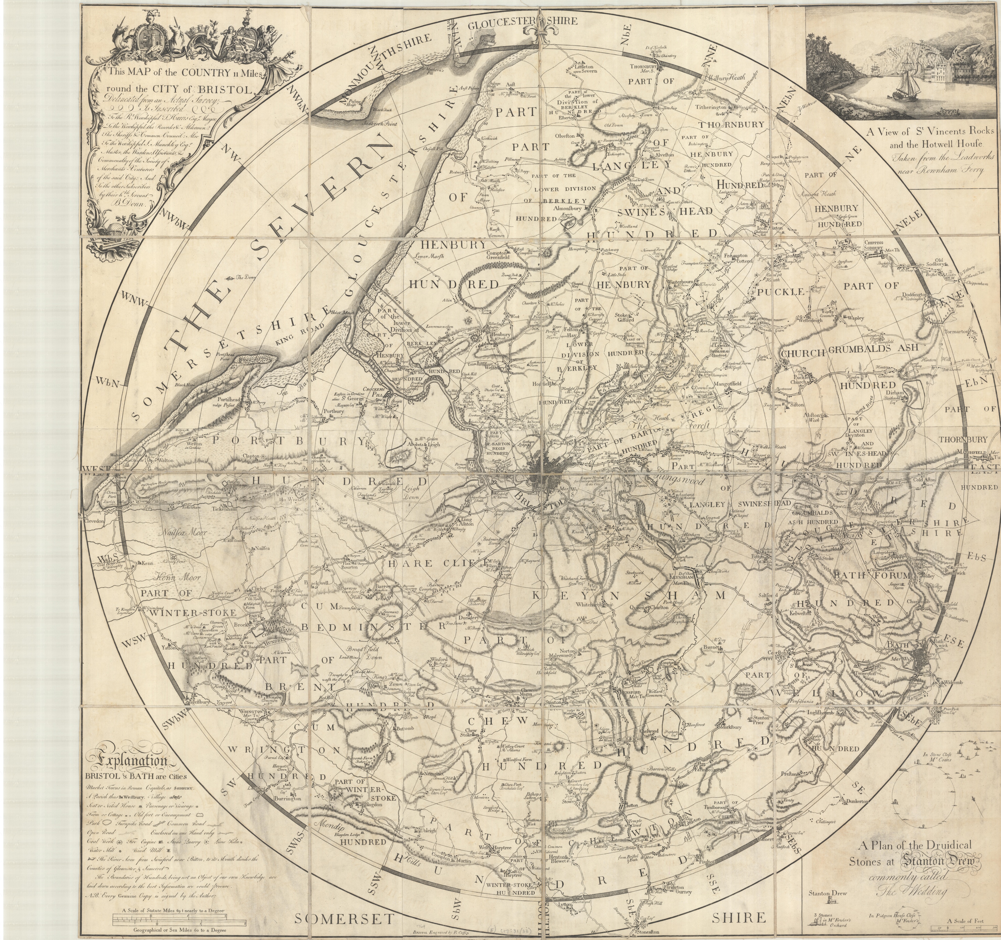
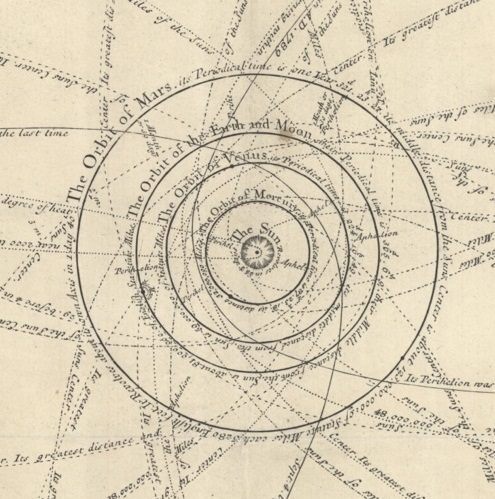
In a time of uncertainty here on Earth it’s reassuring to look to the heavens for a more stable  environment, one in which we can predict what will happen with remarkable accuracy considering the vast expanse of space. This amazing map, ‘A scheme of the Solar System with the orbits of the Planets and Comets belonging thereto, describ’d from Dr. Halley’s accurate table of Comets…founded on Sr. Isaac Newton’s wonderful discoveries, by Wm. Whiston, M.A.’ shows with a great amount of information how a complex system of orbits and planetary bodies  work together and present a predictable path through time and space.

A scheme of the Solar System with the orbits of the Planets and Comets belonging thereto, describ’d from Dr. Halley’s accurate table of Comets…founded on Sr. Isaac Newton’s wonderful discoveries, by Wm. Whiston, M.A., 1712, (E) A1 (3)

William Whiston (1662-1752) was for a time Lucasian Professor of Mathematics at Cambridge University, and he also lectured on Natural Philosophy in London. He produced this map in 1712 with the noted map and globe maker John Senex to illustrate the course of comets as predicted in  work by Sir Edmund Halley and the ground-breaking work on planetary motion set out by Sir Isaac Newton.

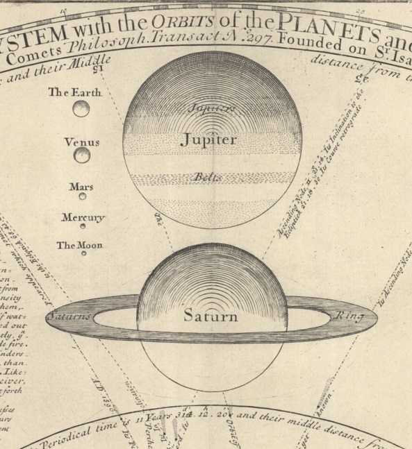
The map shows the orbits of  ‘about twenty one known Comets…’.  according to Halley’s calculations (there are now over 3,000 recorded Comets in the Universe), the orbits of the Planets and, at the top, the relative size of the 6 known primary Planets and the Moon (the size of the Sun is represented by the outer circle of the map of the Solar System).

There is a remarkable amount of explanatory test on the map describing the six Planets and the ten secondary Planets (which we would know call the moons of the Earth, Jupiter and Saturn) and descriptions of the system of Comets and the Sun. Like all good exponents of a new theory Whiston makes a bold claim for his map at the start. ‘I do here, good reader, present thee with a scheme of the Planetary and Cometary World, part of which hath of late been called the Hypothesis of Pythagoras or Copernicus, but is now so certainly known to be the real system of nature that it ought no longer to have that uncertain title of hypothesis applied to it’. It’s amazing how many maps produced around the 1700 and 1800s include some form of claim such as this, or include in the tile ‘A new survey..’ or a variation on that phrase. The text goes on to acknowledge the size of the Universe and then ends with crediting the Creator, ‘As to the Fixed Stars, they are vastly remote from our Planetary and Cometary system but may perhaps every one be the center of another Solar System. Dr. Hook and Mr. Flamsteed think they have discovered their annual parallax and that is about 45″ which will imply there to be 900,000 millions of miles distance from our Sun; or according to Hugenius’s calculation in the like case much further than a bullet shot out of a canon could go in 100,000 years. But of such vast and numberless systems…we know very little, only so much we know of ye Planetary and Cometary World, and of the probability of Fixed Stars…as is sufficient to make us cry out with the Psalmist O Lord, how manyfold are thy works! In wisdom have you made them all!

Robert Hooke (1635-1703) produced most of the surveys of London after the Great Fire of 1666 and went on to try and measure distances to stars using parallax, which takes  the difference in angles of a measured distance seen from two different points. John Flamsteed (1646-1719) was the first Astronomer Royal and wrote star atlases and catalogues which were more detailed than any previously published. Hugenius is the Latin version of the name of the Dutch polymath Christiaan Huygens (1629-1695), one of the leading scientists of his or any other age. One of Huygens many contributions to science was the discovery of Saturn’s ring system and the first of the Planet’s moons after making improvements to the telescope. Hooke and Halley were involved in a wager offered by no less than Sir Christopher Wren while the three were at lunch in 1683 to discover why the Planets orbited the Sun in an ellipse, and not in a circle as suggested by Copernicus. To find the answer Halley travelled to Cambridge to talk to Isaac Newton, at the time Lucasian Professor of Mathematics ( Whiston replaced Newton in the role in 1702). Not only did Newton have the answer to the question but following promoting by Halley wrote his findings up in one of the most important Scientific books ever written, the Mathematical Principles of Natural Philosophy, more commonly known by the first word of the original Latin title, the Principa. In  this book Newton set out his three laws of motion and explains how the orbits of the celestial bodies work and the nature of gravity. Newton’s ideas in the Principa and Halley’s work on comets are the key to Whiston’s map.

John Senex was a noted map and globe maker and uses text at the bottom of the map to 
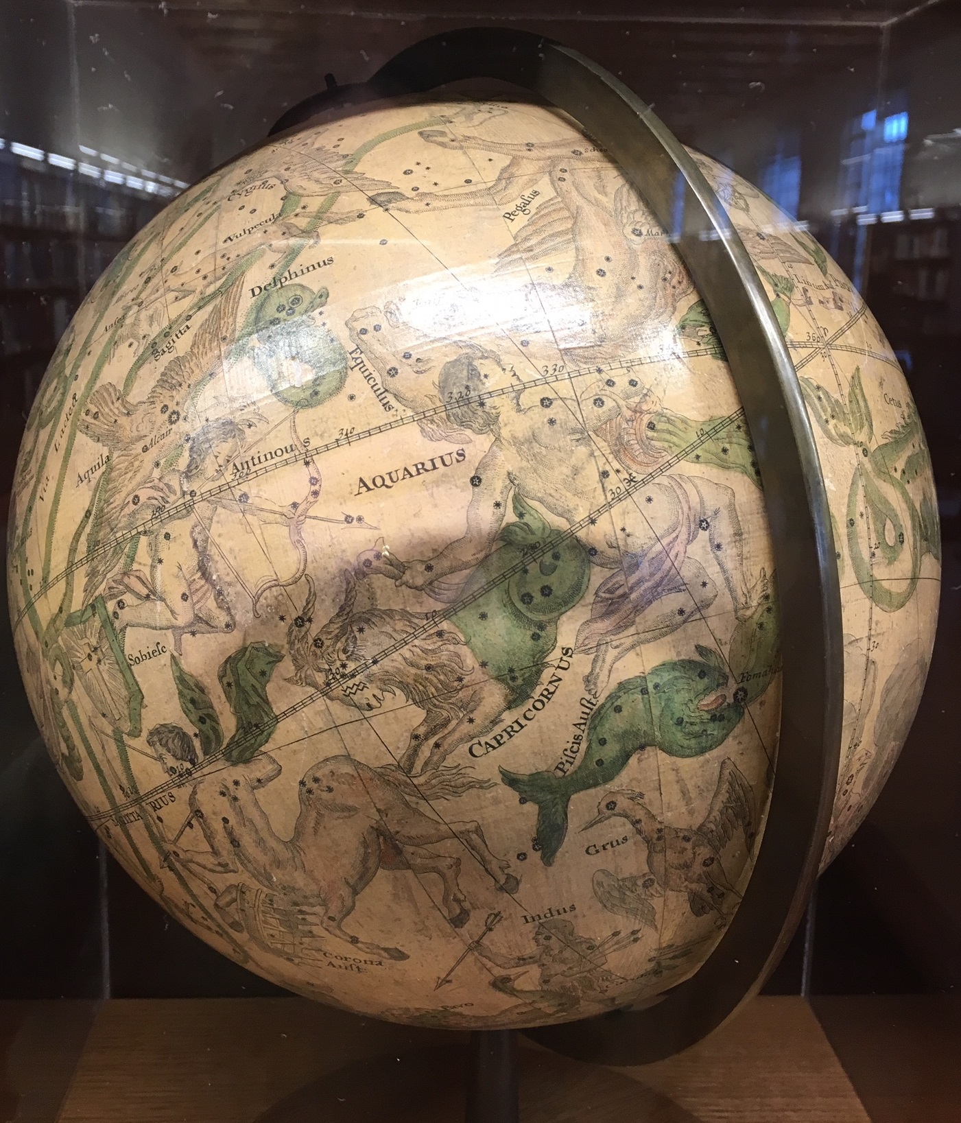
promote his products, extolling the worth of his maps and globes while also warning of the inferior products made by others based on his work. There are two of Senex’s globes on display in the Rare Books and Special Collections Reading Room at the Weston Library (the globe of the heavens  is shown here), possibly the two mentioned in the text ‘ He maketh ye newest globes of 16. 12. & 3 inches diam. and has just finish’d in a most elegant manner a pair of 28 inches diam. fit to adorn public librarys, or of the librarys of the most curious’. Senex has featured on this blog before, first in a

piece about globes (http://blogs.bodleian.ox.ac.uk/maps/2019/01/28/golden-globes/) and then, and more relevant to this piece in a post about a map of South America (http://blogs.bodleian.ox.ac.uk/maps/2019/02/22/a-tale-of-two-maps/) which is dedicated to Halley and marks the point where, during a voyage to map the magnetic variations in the Earth, Halley’s ship the Paramore encountered ice for the first time. Halley then produced a map of the World with the variations shown, which would enable navigators to plot a correct course using a ship’s compass with corrections made according to the variation shown

Halley’s magnetic chart [a facsimile from 1870 of Halley’s  ‘New and correct chart shewing the variations of the compass, 1701] (E) B1 (382)
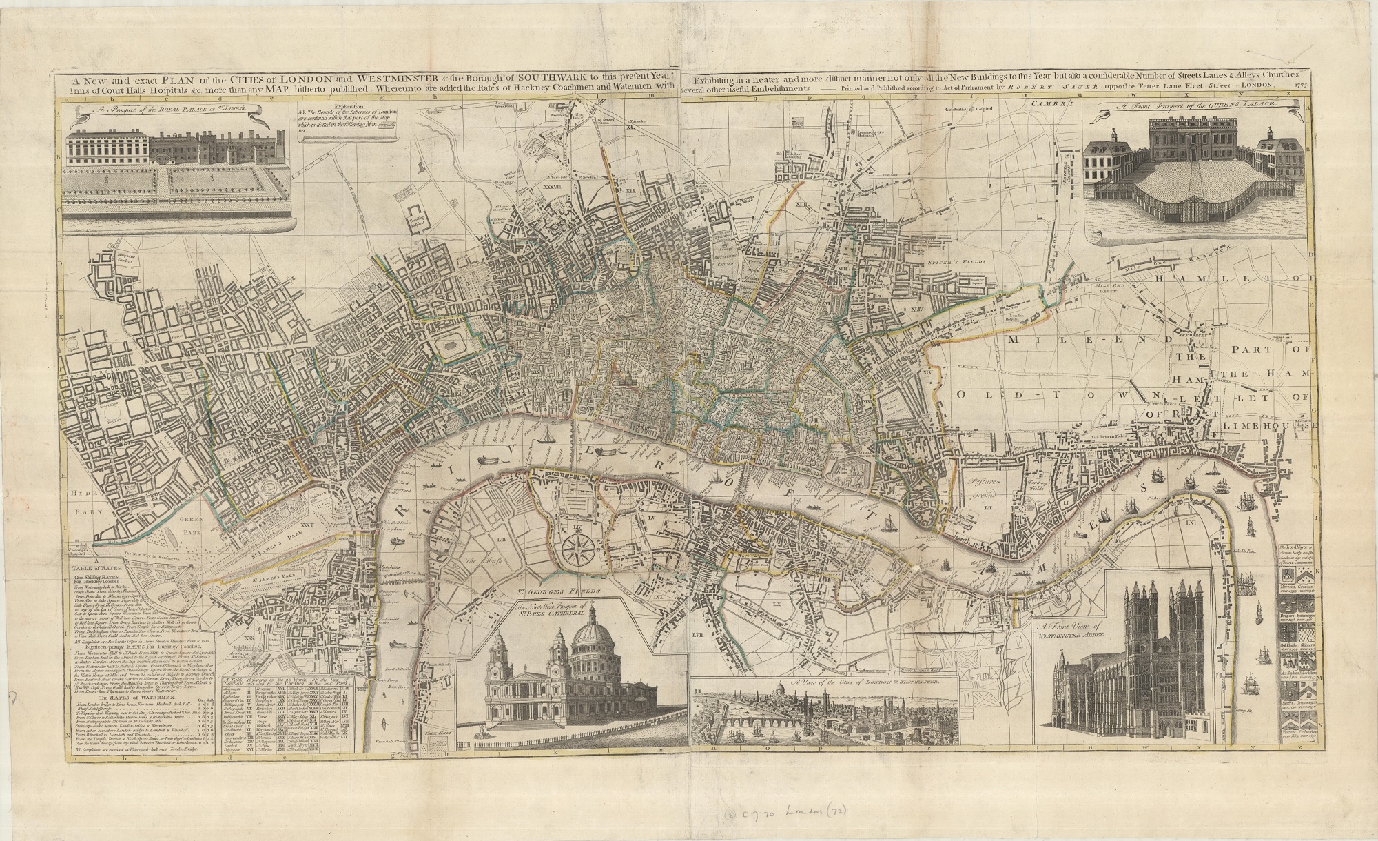
Mr. Gough’s map

The Gough Map of Great Britain isn’t just a treasure of the Bodleian map collection it’s a Bodleian treasure full-stop, and was one of the highlights of our recent map exhibition, Talking Maps, which closed a few weeks before the lockdown.

The map dates from c1390 and is the oldest surviving sheet map of the Country. It’s a manuscript, measuring 115 x 56 cm and drawn on two pieces of animal skin which have been joined together north of Hadrian’s Wall.

This extract shows the area between Hadrian’s Wall on the right and the join of lamb and sheep skin made to get the right sized piece of material needed to draw the map 

The map is orientated with east at the top (so Scotland is at the left and Wales at the bottom), which would have made a long piece of material easy to work on. There are over two hundred rivers shown, some prominently, and over six hundred towns, cities and settlements. The importance of York and London is highlighted with the use of gold leaf while red lines radiate out across the map,  possibly routes with roman numerals giving distances in old French miles. Scotland is poorly mapped, an indication that at the time Scotland was a foreign country, and one with which England was often at war. It is believed that a number of scholars worked on the map, over a considerable period of time, and that some of the earliest writing and work on the map is north of the wall. While Scotland is poorly depicted Calais, an English settlement following a successful siege by Edward III in 1346, is shown in great detail on the edge of the map, across the channel from Kent.

The map has recently undergone some research using 3-D scanning, hyperspectral imagery (gathering a greater amount of detail from across the spectrum than available to the naked eye) and Raman spectroscopy (the study of molecules within the material to get more information on the pigment used). One of the most startling discoveries during this study was the large amount of pin-pricks throughout the map, suggesting that part of it’s making involved laying an older map on top to trace coastal outlines and locations of places.

The name of the map comes from Richard Gough, a collector of prints, plans, maps, drawings and other ephemera that came to the library following Gough’s death in 1809. All we know about the map before this is that Gough bought the map at auction in 1774 for half a crown (12 1/2 pence). The Sheldon Tudor tapestries came to the library in this donation as well, we’ll blog these soon.

The Gough Map came at the end of a century that gave us the most celebrated Mediaeval world map, the Hereford Mappa Mundi.  While the Hereford map is based just as much on theological as well as topographical principles the Gough is purely a map for practical purposes, even if we now aren’t exactly sure what that purpose was, something the exhibition book for Talking Maps makes clear

‘Freed from the shackles of a Christian narrative, the Gough Map’s purpose was not to visualize a pathway through life in accordance with the teachings of the church, but to lead the way in a completely new cartographic direction which remains current in the twenty-first century, where geographical veracity and the primacy of relative position are foremost in the map-maker’s mind.’

There is an interactive web-site for the Gough Map here https://goughmap.uk/map.php

Work on the Gough Map has been funded by the Leverhulme Trust, more information on what studies have taken place can be found here https://blog.history.ac.uk/2019/08/understanding-the-gough-map-the-application-of-physics-chemistry-and-history/

The Gough Map, c1390. MS. Gough Gen. Top. 16.

Rails and Railways

The Reshaping of British Railways seminal report is always remembered but the accompanying maps are generally not.  These rather ordinary maps represent a huge shift in the transportation provision of the country as the railways were contracted.  The maps are stylistically simple but hugely important.

The report authored by Richard Beeching was published in 1963 by the British Railways Board as a response to the government’s requirement to make the aging railway system more efficient.  The streamlining process, as everybody knows, involved cuts to much of the network. Beeching’s proposals closed 5000 miles and over 2300 stations so ending public use of a third of the existing network.  Beeching championed the expansion of the road network and envisioned the loss making rail services being replaced  by bus services.


Three decades later views had changed of railways had changed and large infrastructure projects were planned once more.

The Channel Tunnel carrying a railway direct to continental Europe was an ambitious joint venture with the French and the accompanying rail link was the first high speed link in the country (HS1).  Railways were back in as a fast and efficient way to travel.  The accompanying plans show the difficulties of fitting in new rail tracks into the congested part of London.

Nowadays with the roads congested and the climate suffering some of Beeching’s closures are looking to be reversed.  The Ashington, Blyth and Tyne line in has been granted funds to develop proposals to reopen to aid connectivity in the North East and take pressure off local roads.


Now railway passenger numbers are at record levels so can we look forward to more maps of Beeching reversals?

The Reshaping of British Railways M05.E08183

Channel Tunnel rail link. Plans and sections C17:38A b.1

Drink up

Between July 2019 and this March the Bodleian put on a major map exhibition, Talking Maps, curated by Jerry Brotton and Nick Millea. With the World now spinning on a different axis we thought it would be good to relive some of the exhibition highlights and for the next few months staff will pick personal favourites to include in our Map Department blog.

It seems appropriate (or cruel, depending on whether your glass is half full or half empty) considering the lockdown to start with a map which deals with going to the pub. The Drink Map of Oxford is one of the most popular maps we have, it features in a lot of ‘show and tells’ map staff put on and was a popular subject during our lunch talks when the exhibition was on.

Drink map of Oxford 1883. C17:70 Oxford (7)

Over a simple skeleton plan published in 1883 the location of 319 pubs, breweries, beer houses and other licensed premises are shown using four different red symbols. Most pubs are on the main streets of the city (note how many are on the High Street for instance), while the breweries are close to the castle where there is easy access to water. Beer houses are where residents have applied for a licence to sell alcohol out of their houses to supplement income and are usually on side and residential roads, while other licensed premises are the Wine Merchants and groceries selling to the colleges and the public.

There are some intriguing aspects to this map. The first is the lack of University buildings shown, making this the only one of over 300 maps of the city held at the Bodleian with no hint of a University. There are a couple of reasons for this. Being a skeleton plan buildings aren’t included to keep the map as simple as possible (the railway is there as it is an important part of the city make-up, and also, more importantly, there is a pub in the terminal building as well). The second reason is that students weren’t allowed into the city pubs. Colleges would have had their own bars and some even brewed their own beers. Another aspect to the Drink Map is the wonderful irony in something which shows just where you can get a drink in Oxford but which is published by one a number of Temperance Societies in the city at the time, the rather grandly named Oxfordshire Band of Hope and Temperance Union. Temperance Societies were concerned about the problems alcohol was causing for the Working Class, causing problems such as poverty, crime, the breakdown of the family and church attendance. Text on the back mentions the effect of all this drinking in such a renowned city, ‘drunkenness abounds in our midst, and its attendant evils, crime and pauperism, are ever calling our attention. Can this be wondered at seeing we have up to three hundred places licensed by law for the sale of strong drink?’  The text goes on to make two claims about the city that don’t quite stand up too much investigation. The first is that the city is so overpopulated with drinking establishments that it has 50% more than any other comparable town. While there certainly is a lot in Oxford compared to now there was a lot everywhere. Post Office directories for towns such as Reading show similar numbers. The second claim is that the city magistrates come from the middle and upper class residents who tended to live in the north of the city, and while they were happy to give licences to places in the poor areas aren’t so keen to do so closer to home, hence the disparity between the north and other parts of the city on the map. Like the comparison with other towns this accusation doesn’t stand up when you use the directories. Kelly’s Post Office Directory for Oxford 1883 lists the names and addresses of the 16 magistrates in office for that year, with only a few living in the north of the city. Some magistrates live on the High Street while one even lives next to a beer house in St Clements. What is closer to the truth about the lack of pubs in North Oxford both then and now is that St Johns College owed most of the land and they were putting restrictions in place on the use of land in sale and leasing agreements which included the sale of alcohol.

There is an important companion to the Drink map that makes an equally strong social statement about Victorian Oxford. Dr. Acland’s map of major cholera outbreaks in 1832, 1849 and 1854 to

Map of Oxford to illustrate Dr. Acland’s memoir of cholera in Oxford in 1854… 1854. C17:70 Oxford (15)

accompany a report in 1854 is one of the earliest disease maps published in England. The map shows areas of poor or no drainage, the contaminated sections of river and the individual cases of outbreak and it is the areas of poor drainage that draw comparison with the Drink Map. The areas that feature strongest on the one map, the over-crowded working class districts of Jericho, St Ebbes, St Clements and Osney Island which are all heavily overlaid with red symbols are the same areas shaded to show areas of poor and no sanitation and drainage on the other.

The St. Ebbes area on both the Drink and Cholera maps. Most of this area has been redeveloped and is now the Westgate Shopping Centre.

These are two important maps of the history of the city, coming at a time when the population had grown considerably from the late 1790’s onward’s with the arrival of the canal, the move out of countryside by agricultural labourers following enclosure and the coming of the railway. This increase in population put pressure on the working-class areas with the inevitable problems highlighted in both maps; disease, poor housing, poor sanitation and over-crowding.

These are also wonderful maps full-stop. The cholera plots an illness which was for the time still hard to treat in a city using as their main source contaminated river water while the Drink Map is a serious attempt to highlight an important problem but now, without the social implications involved, looks like a Victorian version of a pub guide.

An anatomical geography?

This first map from John Andrews’ A geographical atlas of England, divided according to its natural, political, civil, ecclesiastical, ancient and modern divisions …  is at first glance hardly recognisable as a map of England and Wales. It shows only the mountain ranges, and the coastlines are missing.  The next map in the atlas is described as a “Map of the rivers, or anatomy of England”; it is coloured to show watersheds, and again divides the country in an unfamiliar way. It is almost as if the first map shows the country’s skeleton, and the second the circulatory system.

The (very long) title ends with the statement that the atlas is ‘for the improvement of youth‘. The  introduction, ‘on the utility of geography’ emphasises the subject’s long antecedents and practical use. The atlas was published in 1809 in the last year of Andrews’ life, when geography was beginning to grow in popularity as an academic subject in Britain.  Andrews had been publishing for over 30 years, producing many maps of English towns and counties, several of the latter in collaboration with others, as well some important maps of North America. Towards the end of his career he published more thematic works, including a historical atlas, and this, A geographical atlas of England. The atlas is a mixture of scientific, historical and general maps.

Most of the maps had been published before–  they have dates mainly from the late 1790s – and some are too large for the binding and had to be folded in; possibly the atlas was cobbled together from existing stock.  But for all that some of the maps are both beautiful and unusual and suggest different ways of looking at the country.  There are also several maps showing the supposed division of South Britain at different periods in history, such as under the Saxon kingdoms and the Roman occupation; these reflect the contemporary vogue for antiquities and early British history, although the sources used for this information were of dubious accuracy. The atlas ends with a map showing pride in Britain’s naval supremacy (above), giving the maritime counties and compass directions from London.

Although the atlas covers England and Wales, the map titles refer only to England or occasionally South Britain. Wales is unaccountably slighted.

A geographical atlas of England, divided according to its natural, political, civil, ecclesiastical, ancient and modern divisions, to which is added a political chart of Europe, to shew the positions of all the sea-ports, promontories and distances, in order to trace the naval and commercial intercourse between Great Britain, Ireland and the continent. In a series of maps, on a plan entirely new. Calculated to illustrate the history of this country, and for the improvement of youth, by John Andrews.  London : Printed for John Stockdale, 1809.  Allen 359.


The art of the Ordnance survey

Sales catalogues aren’t usually the most visually interesting of things, often only giving a list of that years products. What raised up the catalogues of the Ordnance Survey between the wars is the art that illustrated these catalogues, art that was mirrored in the covers of the maps produced by the company.

The covers and art work inside are mainly the work of two artists, who were also responsible for a large number of the most iconic of OS map art. Arthur Palmer joined the OS in 1891 aged 16 and worked for the company until retiring in 1935. Initially employed as a photo-writer (a photo-writer took the negatives created from a draughtsman’s work and tidied up any damage caused by scratches and dust specks which could obscure names and features), then in the Publications division. Palmer was also a gifted artist, and his work features in a number of classic designs, including this cover for a 1″ sheet of Oxford from 1921

and this cover from one of the catalogues of the large scale mapping.

The second artist was Ellis Martin. Martin, unlike Palmer, was employed purely as an artist by the OS to design not just map covers but fonts, promotional material and even company Christmas cards. His designs were less romantic than Palmers and his pen and ink work in particular was of the highest quality, as can be seen by this image of a hiker studying an OS map, a regular feature of Martin’s work. The hiker appears in various guises and as fashions changed so did the image, with the more formal cap and boots of the 1918 designs being replaced by this more practical working attire in 1933. The hiker featured in one of Martin’s most famous covers, that of the ‘Popular Edition’ maps of the 1930s. The use of the hiker, outdoors and ready to walk, is important for a number of reasons. It gives not only an impression of the type of countryside featured on the map inside, even if that is an idealized view, but also is a selling point, this is the ideal map for this type of activity.

Martin’s cover for the 1923 small-scale map catalogue is at the start of this article. A typical Martin scene which evokes both a sense of time and place with a simple design. The lady standing at the back of the car is Martin’s wife, Mabel.

This is another example of a cover by Martin showing his design skills. There is a book on the open shelves in the Map Reading Room on OS art, Map cover art, G24 C16.13.