Here’s a fun fact you might not know – since 1949, the Bodleian Library has maintained a range of presses for the purposes of teaching practical printing. On 23rd February, we were given a much-anticipated peek behind the Schola Musicae door in the Old Schools Quad, home of the Bodleian’s letterpress workshop. As library trainees, the focus of our session was early book printing, giving us an insight into the various processes that would have gone into producing the early printed books that some of us are lucky enough to work with as part of our libraries’ special collections. For purposes of numbers, we were split into two groups; one taking a morning session with Alex Franklin and the other an afternoon session with Richard Lawrence.
Over the three-hour session, we were introduced to three types of printing (letterpress, intaglio and planographic).
Letterpress Printing
The star of the show was the letterpress printing and we got the opportunity to create our own prints. Firstly, we had an overview of the principles of printing and how letterpress printing works, then we got to have a go ourselves!
Arranging the Type
Each set, or ‘font,’ of type is kept in a specially-compartmentalised trays (upper and lower cases), with a layout designed to make it easier to reach for the most commonly-used letters. Having divided up our chosen text, we were each stationed at a font and given a small composing stick to set our type in. Piecing a sentence together from reversed letters takes some getting used to — it’s easy to miss a spelling error or upside-down letter until the proofs have been printed. We worked from left-to-right, using the handy nicks in each piece of type to make sure every piece was pointing the right way.

There is a lot to consider regarding the size of the font and the length of the lines on the pages, the size of the margins… many of the calculations were in fractions of an inch and made our minds boggle! 1/2 inch equals 72 points (the same as font sizes on computers); therefore 1 point equals 1/72 inch. You can see from the image below that our composing sticks had been set to 22 inches, as the 12 point font we were using would fit into it without any gaps remaining — or so we hoped!
Since any wiggle room could allow the type to shift or come loose during printing, we also used metal spacers to fill in the gaps between words and the ends of the lines, using a variety of pieces to keep everything in place as tightly as possible. Alex told us that a group of English MSt students recently visited to set extracts from M. NourbeSe Philip’s Zong in type as a way of considering the text’s interweaving of blank spaces on the page and silenced voices in history. As we learned through setting our own phrases, those empty sections require just as much time and attention as the letters themselves. Richard also discussed the influence of the printer on how a manuscript becomes a printed book. For instance, Mary Shelley’s manuscript of Frankenstein has very little punctuation; this would have been added by the typesetters and printers. What does this mean for interpreting a text?

Once we had finished composing our lines of type, they were secured within a printing frame (forme) by an assortment of wooden blocks (furniture). Since these also have to be tightly fitted (lest we end up with type all over the floor en route to the press), this included pieces that could be expanded or loosened with a small key (quoins). Finally, our type was all set and ready to be used for printing.
Using the Presses
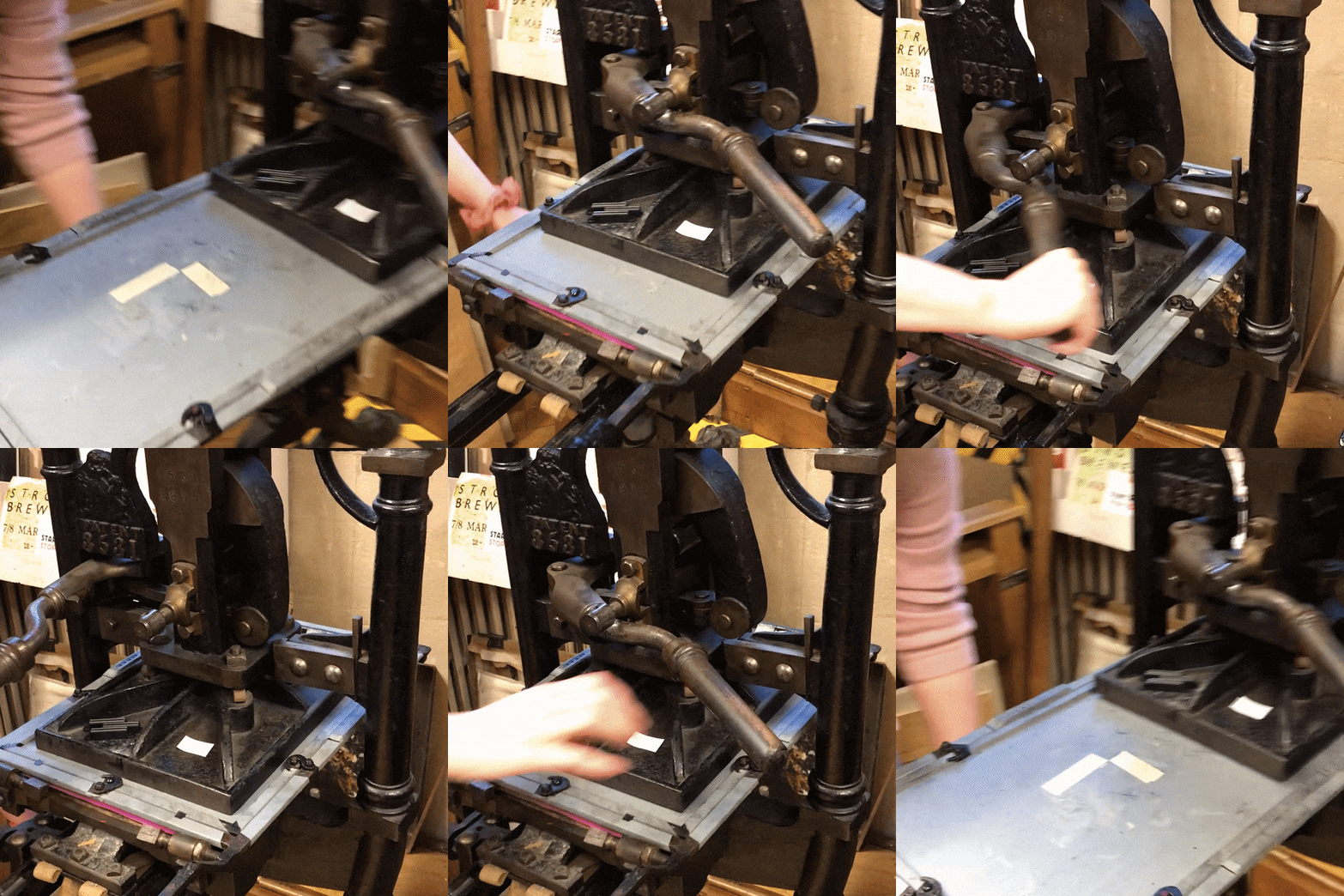
The workshop had many examples of presses that are used for education and for the study of printing and the history of the book. We had a brief demonstration of early printing on a reproduction sixteenth-century printing press, based upon a drawing by Albrecht Dürer. For our printing, we used a Harrild & Sons Albion Press of 1877, originally from Leonard Baskin’s Gehenna Press.

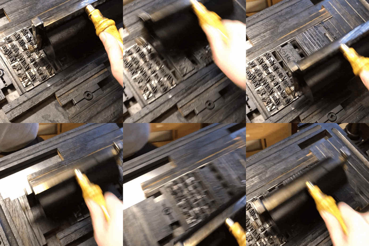
The first step in using the press was preparing our ink. Thick, tacky, and oil-based, it resembled shoe polish or treacle when first scooped out of the container. Although historical methods would call for round leather ink balls, we used a plastic roller to spread it out in an even layer, ensuring the full surface of the roller had been covered. The reason being that the leather ink balls aren’t very economical with ink when you are only printing up a small amount because much of the ink is absorbed by the leather.
Once the block had been inked and the paper positioned and protected from stray ink by a paper fisket, the whole bed was rolled under the flat weight (platen). A quick pull of the operating handle pressed the paper firmly against the inked block, and then it was time for the moment of truth! Examining our proof copies gave us a chance to catch typos and adjust block placements before setting up the printmaking production line in earnest.
Both groups had submitted some initial ideas for their prints in advance. The morning group presented a motley assortment of flowers, cats, and Vasily Grossman, and the afternoon group opted for some classic Tolkien quotes and imagery. Alex took the morning group’s ideas and used them to produce a risograph image incorporating pictures from the Bodleian’s Fox Talbot collection, which we then printed over with lines from Tom Lovatt-Williams’ poem ‘Oxford,’ while the afternoon group paired one of the quotes with a pre-made block of the Oxford skyline.

Intaglio Printing
The workshop holds a variety of presses, and some of us also had the chance to try our hand at using a 19th-century star-wheel etching press for some intaglio printing.
While relief printing involves inking the raised parts of the block, intaglio is almost the opposite: the design is engraved into the plate, and, once the plate has been inked and wiped clean, the image is produced by the ink that remains in these lines.
The plate and paper are tucked beneath layers of blankets, which are then pushed through a set of heavy rollers by turning the wheel. That extra weight helps press the fibres of the paper into the texture of the plate, increasing the accuracy of the print. Dampening the paper helps this process. The result is a fine-lined image, perhaps with some shadowing from residual ink on the surface of the plate.
This section raised some questions about the replicable nature of printing – if someone was to make a print from an original etching by a renowned artist such as Rembrandt, would they then have produced a Rembrandt? Our general consensus was no: even the most historically accurate reproduction would still lack the inimitable individual touch applied through processes such as adjusting placements or applying and wiping away ink.
Planographic Printing
Richard also showed the afternoon group a stone used for lithography, a form of planographic printmaking which uses water- and ink-repelling substances on a flat printing surface to create the final image.
Final Prints
We all really enjoyed the session, and some of us hope to take up Alex and Richard’s offer to return to the workshop at some point in the future.
Recommended Books
We were recommended the following books by our workshop leaders, for those who have been bitten by the printing bug and want to find out more:
- Bolton, Claire, The fifteenth-century printing practices of Johann Zainer, Ulm, 1473-1478 (Oxford, 2016)
- Gaskell, Philip, A New Introduction to Bibliography (Oxford, 1985)
- Moxon, Joseph, Moxon’s Mechanik exercises, or, The doctrine of handyworks applied to the art of printing (1683) [free online]
- Werner, Sarah, Studying early printed books, 1450-1800: a practical guide (Wiley Blackwell, 2019)
More Information
- Printing and book arts at the Bodleian Libraries
- More information about The Bodleian Bibliographic Press, including the types of presses and equipment they have.


Recent Comments