
This blog post documents my experience as a Graduate Library Trainee assisting at the ‘Introduction to Bodleian Libraries Special Collections’ event, held for History of Art undergraduate and graduate students at the Taylor Institution Library in December 2021.

Across the libraries, we hold a myriad of intriguing and unique items. Still, it may be difficult for readers to know how to find these, and where to start. It is here where the then Subject Librarian for Art & Architecture Librarian and Italian Literature & Language, Clare Hills-Nova, was able to draw upon her knowledge of the Bodleian Libraries’ collections to introduce History of Art students to a few of our less well-known holdings.
Since having arrived at the Sackler in September 2021, I have been fortunate to spend plenty of time around visual culture materials. I’ve arranged a Japanese photobook display (in support of the Ashmolean’s Tokyo! exhibition), relabelled items from the WJ Strachan collection, and processed new publications about architects and artists on a broad range of periods and geographic areas. This is a far cry from my undergraduate haunts of law statutes and case reports – albeit a very welcome change. When Clare asked me to support the event she was planning for the History of Art Department’s students, and subsequently attend it, I was more than happy.
Artist interpretations of Dante’s Divine Comedy (14th Century – 21st Century)
The event comprised two parts. The first, held in the Voltaire Room, expanded upon the Taylorian’s exhibition on Dante Alighieri and his Divine Comedy, which my fellow Trainee Malcolm Spencer has so wonderfully discussed. The exhibition’s curator, Professor Gervase Rosser led a presentation here – titled ‘Illustrating Dante’s Divine Comedy – on artists’ interpretations of the themes expressed in the Comedy.

This incorporated a vast range of work and approaches, as Professor Rosser traced the fluctuating reception of Dante’s Divine Comedy through the centuries. The talk (and display) included: a facsimile of one of the earliest illustrated Dante manuscripts of the 1330s; an edition of Doré’s seminal engravings, through which he became considered a ‘master of the visually dramatic narrative’ (Angel, 2014) (see image below, line 2, tile 1); and American artist Leonard Baskin’s compelling illustrations (1969). Also on view were some of the many recent translations of the Divine Comedy — some of them with striking book covers and other illustrative material.


In advance of this, Malcolm and I gathered together items on artists’ engagement with Dante from our libraries.
Among these were a small publication illustrating Geoffrey MacEwan’s paintings, Edouard Goerg’s etchings for Dante’s L’Enfer (Hell), many new translations with images of the Divine Comedy, and the Uffizi’s recent exhibition catalogue, Dante: la visione dell’arte, documenting many of the countless works inspired by Dante and the rest of his literary oeuvre. Books additional to those already on view in the exhibition’s display cases were arranged carefully around the room, framing the exhibition.
Athanasius Kircher’s L’Arca di Noë (Amsterdam, 1675)

The second part of the event took place in the Taylorian’s Room 2, and showcased other works from the Sackler, Taylorian and Weston Libraries’ Special Collections. These works ranged in date and publication location from 17th century Amsterdam to 1970s Tokyo, via 1960s Los Angeles. Here, the earliest work on display was Athanasius Kircher’s (1602-1680) L’Arca di Noë (Amsterdam, 1675). This publication includes, for example, as shown, Kircher’s illustrations of hieroglyphics. Kircher prolifically studied and attempted to decipher Egyptian hieroglyphics – from his translations and commentaries, he became considered ‘one of the greatest polymaths in 17th-Century Europe’ (Klawitter, 2015).
The page on display at the event was a fold-out depiction of the interior of Noah’s Ark, showing Noah’s family members, barrels of food (or beer) and a menagerie of creatures. What struck me in this view was the measurements below the image, giving dimensions of the Ark itself. Beyond being a fascinating detail, this grounds the narrative in reality. For contemporaries, it made the Ark easier to conceive, and its magnificent nature – even including a pair of unicorns – that bit more believable.


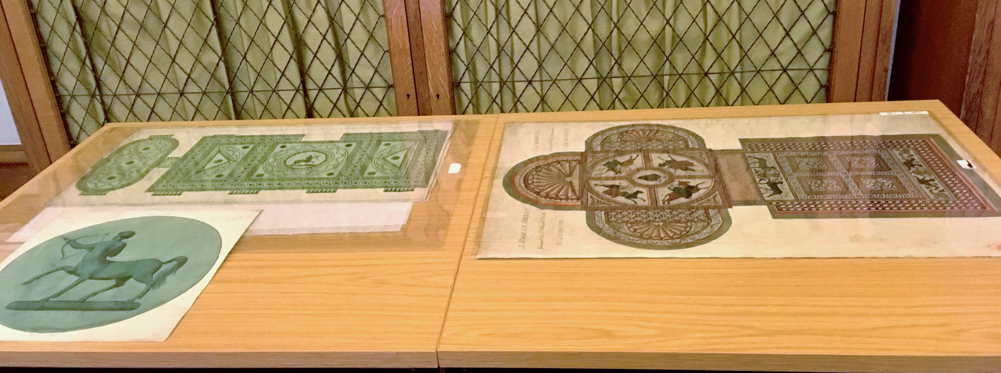
F.G. Haverfield Collection (18th century interpretations of Classical art)
Turning to 18th century England, students could also see examples from the Sackler’s F. J. Haverfield Archive — specifically, from his collection of images of Romano-British pavement mosaics. On display was an illustration of the mosaic found at Littlecote Park, Wiltshire – the ‘Orpheus’ mosaic – alongside Joseph Bonomi’s (1739-1808) original carpet and ceiling designs (1785) for Bowood House, Wiltshire. Bonomi, like many of his contemporaries such as the Adam brothers – John (1721-1792), Robert (1728-1792), and James (1732- 1794) – for whom he worked at various points, was inspired by classical art and architecture. It is thought that Haverfield may have included the Bonomi designs in his image collection because one of their sources of inspiration could have been the mosaics discovered around this time. Indeed, the carpet bears some resemblance in shape and content to the mosaic (and is perhaps why Haverfield included it in his collection). You can find more about these works in a blog post written by former Trainee, Chloe Bolsover. These parallels were instantly compelling. The students could see the physical copies displayed side-by-side, draw comparisons, and possibly gain an understanding of the thought processes underlying Haverfield’s collection.
W.J. Strachan Collection (mid-20th Century)
In the weeks preceding the event, Clare and I had explored the Strachan Collection of mid-20th century artists’ books, made in France, for potential display items. The Strachan Collection comprises over 250 items – with, according to Strachan himself, ‘every ‘ism” from Cubism to neo-realism represented. Therefore, deciding which items to include for the event was a challenge.

Ultimately, we decided to focus primarily on women, non-French and other less well-known artists. Among the selection was Leonor Fini’s beautiful lithographs for Shakespeare’s La Tempête (The Tempest), and Chinese artist Zao Wou-ki’s lithographs illustrating André Malraux’s La Tentation de l’Occident. To me, Wou-ki’s work was especially well-suited for the ‘Show’ aspect of this event: his bright and gestural work seems to capture harsh emotions so succinctly: hard to miss.

Hans Bellmer, a German artist, was also on display. Bellmer is best known for creating a series of life-sized dolls and photographing them. The Nazi Party labelled this work as ‘degenerate’, causing him to flee to France in 1938, where he remained for the rest of his life. His interest in dolls can be seen in his engravings for Les Marionettes, through the somewhat disjointed limbs he illustrated. These are coloured with a distinct blue and yellow. For me, this made Bellmer’s work particularly effective for a Show-and-Tell: viewers can trace the lines of his drawings, and enjoy the unique colours against the brown paper.

Alongside these artists from the Strachan collection was Wifredo Lam’s etchings for L’antichambre de la Nature. Of Chinese and Afro-Cuban descent Lam became familiar with African spiritual rites. It was also at this point that he began to be influenced by Surrealism. In 1938, he moved to Paris and met members of the art and poetry scene. He began to work alongside Picasso and became more interested by Cubism. After the Nazis occupied Paris, Lam returned to Cuba. Here, he combined his multiple artistic influences with his cultural experiences to create works on Afro-Cuban identity. To me, these various influences make Lam’s work so unique and striking. His singular work was therefore very fitting for the event, both to look at and to appreciate the diversity of the 1930s Parisian art scene.

Ed Ruscha’s Every Building on the Sunset Strip (1966)
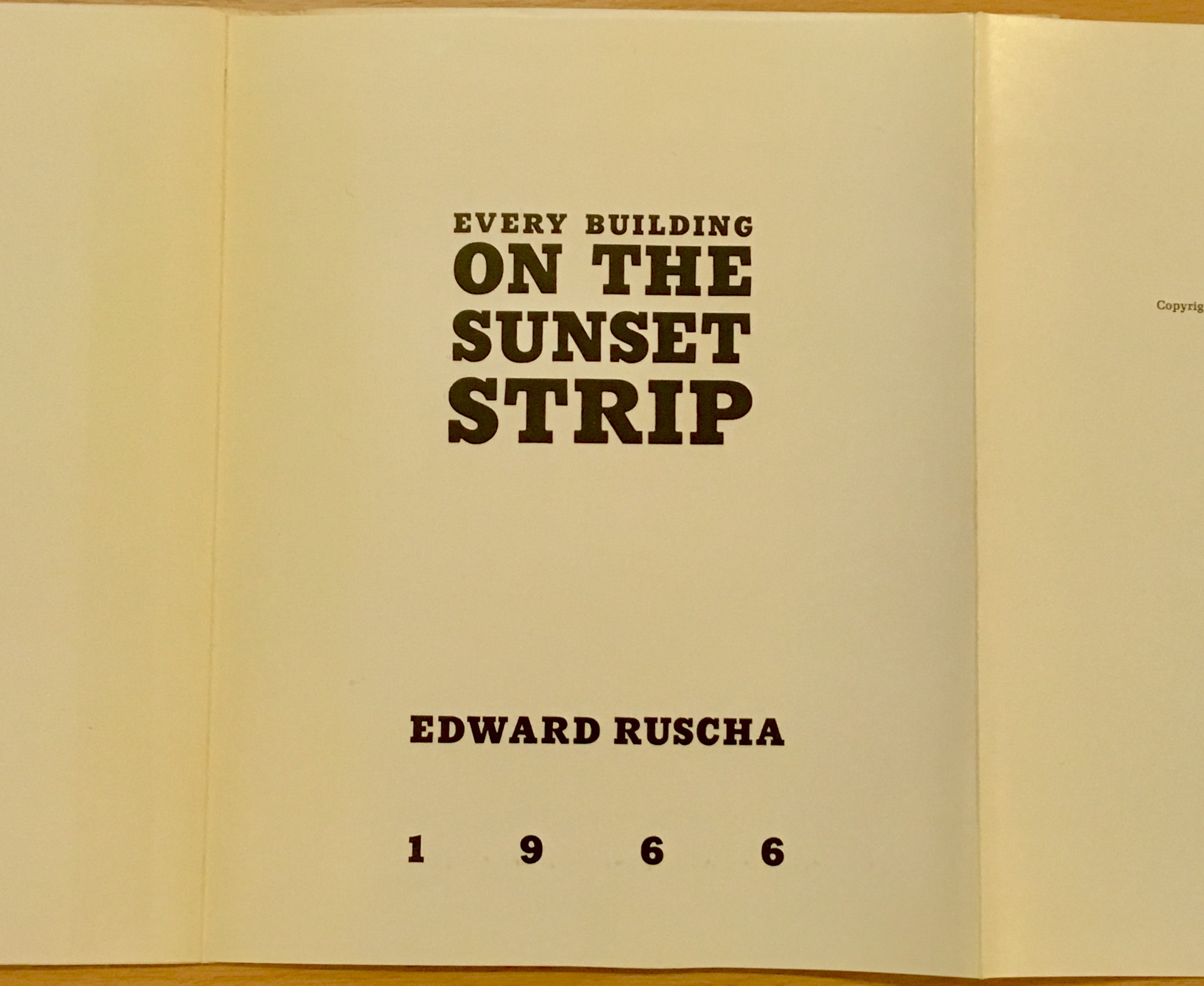

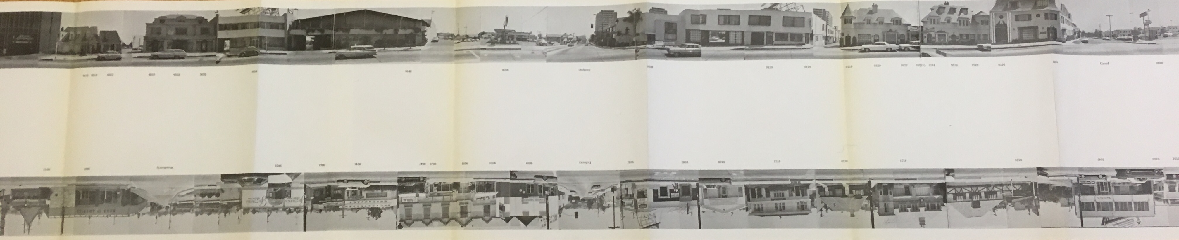
We also showed Edward (Ed) Ruscha’s iconic Every Building on the Sunset Strip (1966). Running through through West Hollywood, Ruscha pasted hundreds of his photographs of the Strip together to create an 8-metre linear image. He shot these photos from his pick-up truck, with a motorized Nikon camera positioned on top. Interestingly, Ruscha opted to set the lens to infinity, bringing everything in each image into equal focus. The result is remarkable, almost like a flattened montage. Every Building on the Sunset Strip arrived in a slim silver slipcase – deceptively, very small (18 cm.). As we unfolded it, we asked our building staff, again and again, to bring in another table to support the length of the ‘strip’. It ended up stretching almost the whole length of the Taylorian’s Room 2! In the images shown here, the viewer can grasp the extent of the Strip, as Ruscha perhaps intended it to be viewed (many museums display it in concertina format).
The Japanese Box (1960s-1970s)
The item I was personally most excited about was The Japanese Box, a facsimile edition (2001) of seminal photographic works produced in post-War Japan. Throughout this Michaelmas term 2021 at the Sackler Library, I worked with a lot of material on Japanese photography, particularly from the 1970s. I created a book display in conjunction with the Tokyo exhibition at the Ashmolean Museum, and a corresponding blog post. Whilst researching for the post, I read a lot about Provoke, a 1960s-1970s avant-garde Japanese photography magazine, and its associated photographers. I developed a real love for the style and telos of this magazine. The photographers tasked themselves with reclaiming ‘documentation’ and they were keen to show life in 1970s Japan beyond the general perception of it as an economic powerhouse and post-war ideal. When Clare told me that the event for the History of Art students would include a box of recently-acquired facsimiles of the three issues of Provoke, alongside monographs by Provoke photographers, I was genuinely thrilled.


As with much of Japanese publishing it was clear that a lot of thought had gone into the design and packaging of this facsimile set. Characteristically, the black box containing the publications was itself striking: it was designed by Karl Lagerfeld. Inside, ‘designer’ plastic bands, labelled ‘The Japanese Box’, carefully held the six publications together. We spread them out on the table, ready for students to examine. Picking each volume up, we could see a rich array of photos of Japan and each artist’s personal experience of living there. This ranged from Nobuyoshi Araki’s photos of his honeymoon in Sentimental Journey (Senchimentaru na tabi), to student protests in Tokyo in Provoke. A few days ahead of the event, Clare asked me to introduce the event’s attendees to the box and its contents. Studying and presenting this set was a highlight of my traineeship. After my presentation several students asked to examine the Box’s contents further, and we discussed the Provoke movement while viewing our favourite images in the set.
Concluding thoughts
At the event itself, the students appeared to be completely immersed in the works we showed. In the Voltaire Room, where Professor Gervase Rosser presented the Dante-inspired work, attendees asked questions about how different artists interpreted the themes of the Divine Comedy. In Room 2, the group lined up along the length of Every Building on the Sunset Strip, pointing at (for example) where pasted pictures cut up cars. L’Arca di Noë invited students to examine the interplay between imagination and reality, whilst others admired the various artists’ books and different mosaic patterns from the Haverfield collection. Although held on the last day of term, the event overran, with many attendees keen to continue examining and discussing the works on display. It was a huge success, and a tribute to the remarkable range of Special Collections held across the libraries. I cannot wait to explore them further.
Izzie Salter
Graduate Trainee, Sackler Library
References
Angel, Sara. “‘Too Many Illustrations, Not Enough Glory’: Known for his Art for Dante’s ‘Inferno,’ Gustave Dore Merited Wider Fame.” Maclean’s (Toronto) 127.23 (2014): 66. Web. (available publicly here)