For the latest episode of BOOKNESS, the Bodleian team speaks to graphic designer, book artist and paper engineer Kevin Steele about his work The Movable Book of Letterforms, which is currently on display in the Bodleian’s Alphabets Alive! exhibition.
The opening currently on display in the Bodleian’s Alphabets Alive! exhibition
I’m always fascinated by the performance of movable books, especially when that actual movement is communicating something, so it’s not just about the final display when everything is open, but it has something to do with the movement
One of the book’s precising constructed pop-up spreads
As somebody that likes things precise… it is sometimes hard to see things change over time… but I guess that is just inevitable that things change like that beyond your control… And it would make me very happy if looking in the future I saw the book was very well used and worn and read
Watch The Movable Book of Letterforms in action below:
Celebrating the 400th anniversary of the First Folio of Shakespeare’s plays, the Bodleian Bibliographical Press offers a type reproduction of the first page of the first play in that book, The Tempest. Two modern typesetters have reproduced the page hand-set in type, recreating the habits, faults and foibles of the original compositors of the First Folio. Below are reflections on the experiment. The printed Tempest sheets are on sale in the Bodleian Shop. Members of the public will have a chance to print their own on Sunday Nov. 19 at the Weston Library; see Event listings for details.
Michael Daniell writes:
‘The Tempest’, the first play in the folio, also happened to be one of 19 Shakespeare plays for which there was probably not an earlier printed version. So one would have expected it to be designed and typeset with great care. As Richard Lawrence and I proceeded with the typesetting, I soon came to realize that what passed for acceptable in 1623 London would not pass muster today.
There is erratic spacing around punctuation and there is no sign that its purpose was to fill out the length of a line. Casting an eye down the left-hand margin of each column showed that there was no consistency in the space used to indent a speaker’s name. Sometimes this seemed to have been so that a word did not have to be broken at the end of the line, but often there was no apparent reason for what we would regard as poor alignment of text. There were instances of awkward work breaks at line ends: en-ter, e-nough, ma-ster, roa-rers, han-ging, drow-ning.
It is known that there were four stages of correction made to this page while it was on the press, the first stage being the correction of the initial letter which had been positioned upside-down. (See Charlton Hinman, The Printing and Proof-Reading of the First Folio of Shakespeare, 1963). The correction of such an obvious mistake suggests that there may have been earlier stages of correction to the main body of the text in galley before it was made up into a page. It is perhaps significant that the other three stages of correction that we know about involved the larger 24-point display lines such as the Act heading, that might have been added last.
After working on the setting of ‘The Tempest’ at the Bodleian Bibliographical Press, I decided to print a further folio page on my own press. I’d read that the first page of ‘The Tempest’ had been set by a particular compositor, identified as Compositor B, who set almost half the pages in the First Folio. I wanted to print a page associated with Compositor A, who only set a quarter of the book. My choice was the first page of ‘1 Henry VI’ as it was distinguished by an elegant tapered block of stage directions. It also had a fine headpiece ornament that was also used to introduce 12 other plays in the book. I checked that my play was also one of the ones that had not been printed previously in quarto, and so might be a fair comparison with the work of Compositor B.
In my typesetting of the ‘1 Henry VI’ page, I found that there were no word breaks, though there were some very tight lines, in one of which Compositor A had resorted to the use of an ampersand. There was the same irregular spacing around punctuation, and the same irregular use of swash italic letters. As these italic letters occur in the speech headings, any inconsistency is particularly conspicuous. Other features of Compositor A’s setting included more frequent use of capital letters introducing nouns, and slightly more consistent indentation of speech headings.
A check of the other plays in the folio showed the same inconsistency in the use of swash italic letters but there were fewer awkward word breaks and the spacing of punctuation points was more as we would expect today. This was also the case when I looked at two other books printed on the Jaggard presses in 1622, William Burton, The Description of Leicestershire and the third edition of Thomas Wilson, A Christian Dictionarie.
The aim of typesetting two pages from the First Folio had been to reproduce the 1622-23 printing as closely as possible. We used 14-point Caslon cast by the typefounder Stephenson Blake, a typeface that comes close in appearance and size to the type used to set the original First Folio. We followed the 17th-century practice of setting the lines without interlinear leading, a process that presents challenges when making corrections or moving lines once they are set as the individual pieces of type all too easily slip from one line to another. The format of the First Folio followed the Golden Mean, 1:1.61. Because of the different size of the type, our efforts were necessarily wider, 1:1.52, but the effect was still striking and I hope would have met with some approval from the original compositors and printers.
Each autumn, university students and members of the public embark on their type-setting and printing journeys in the Bodleian’s letterpress printing workshop. To inspire novice printers with the great typographical achievements of the past, we have chosen examples of fine and ambitious printing from the Bodleian’s Rare Books collections. The selection also includes some ‘bad’ printing, with missing words and upside-down illustrations, also carefully preserved in the library.
An example of ‘good’ printing is an edition of Caesar’s Gallic war printed in 1471 by Nicholas Jenson. The type designed by Jenson, a French printer based in Venice, has been widely admired ever since. Bodleian Library, Byw. adds. 6
Bodleian Library, Byw. adds. 6
Four centuries after Jenson, type designed for the Doves Press in London in 1899 was based directly on Nicholas Jenson’s work. The Doves Press was a private press producing fine books according to the ideals of the Arts and Crafts movement, a reaction to industrialisation and mass-market printing. Bodleian Library, Arch. C c.3
Bodleian Library, Arch. C c.3
The 1481 Florence edition of Dante’s Comedia is in many ways an example of good printing, although it was an ambitious project that was beset by problems. The unfortunate upside-down orientation of this engraving in the Bodleian copy puts this item in the middle, between examples of ‘good’ and ‘bad’ printing. Bodleian Library, Auct. 2Q 1.11
Bodleian Library, Auct. 2Q 1.11
In the next example, shown below, the editor has evidently demanded that the printers explain why the page on the right contained none of the text of this work, Pastregicus’s On the origins of things (Venice, 1547). The half-page of text explains, in Latin, that there was an error on the part of the printer in dividing up the text before starting to print (‘Calcographi omisit enim dividendo’) and reassures the reader that there is nothing missing (‘operi vero nihil deest’). Bodleian Library, Byw. Q 8.24 Making the text fit the intended number of pages is a skill all printers need to acquire.
Bodleian Library, Byw. Q 8.24
This translation of Aristophanes’ Greek plays into Latin shows an unusually careful correction, a word added in type to the margin. The sentence was meant to read: ‘…the whole of which had previously been Greek,’ with ‘graeca’ to be read where the caret symbol indicates. The book was printed by Angelo Ugoleto in Venice in 1501. Bodleian Library, Byw. J 7.25 Mistakes happen, and corrections can be a sign of care as much as of carelessness.
Bodleian Library, Byw. J 7.25
Below, a sixteenth-century edition of meditational poems on the cross demonstrates creative problem-solving and a real challenge to printers. These shape or puzzle poems were first composed in the 9th century by Rhabanus Maurus and at that time, before the invention of printing with moveable type, they circulated as beautiful and lavish manuscripts, allowing the poems within poems to be easily discerned. Thomas Anshelm decided in 1503 that it would be an excellent thing to reproduce the text in print. Attempting to achieve a similar effect to the manuscripts, he used an unusual combination of metal type and xylographic (wood-carved) letters. The black letters nearest to the images are carved into the woodblock. Bodleian Library, Douce M 114
If you take a conventional book… the pages don’t change… but when you come to pop-up engineering… it’s rather like being in a theatre… there are all these different changing viewpoints with the book which is quite unique
Paul’s pop-up gift to the Bodleian, ‘Dies Natalis’, which is on display in the Gifts & Books exhibition until 29th October 2023.
A book is designed to be held… if we think of a book as being conceptually a form of art… I can’t think of any other art form that only really functions when you hold it directly in your hands and your fingers interact with the object
‘Dies Natalis’ opened showing both covers, the spine, and the pages opening up beyond.
And some conservation in action! Paul visited us back in May 2023 to work with our conservation team on some of his other books we have in the Bodleian’s collection, to assess their condition and carry out a few minor repairs.
Paul Johnson in the Bodleian conservation studio making repairs to his work ‘Serenade to Chaucer’ (Rec. a.45).
My books have thousands of individual little parts, and the risk is that one or two of them are going to fall off in transit… and this is always a problem, little pieces coming loose… when we first talked about bits probably falling off, I probably said to you stick it back on anywhere you like!
Paul Johnson and Bodleian conservator Alice Evans discussing the condition of his book ‘From Babylon to Ithaca’ (Rec. a.80).
Useful links and glossary checks in this episode:
Listen to the episode on the University of Oxford Podcasts website here (also available via Spotify and Apple Podcasts)
The Bodleian Library in Oxford has books. Lots of books. But also books that don’t look like books. Books that self-destruct. Books that decay.
Join librarian Jo Maddocks and conservator Alice Evans for a second series of our podcast BOOKNESS where we continue to explore the wonderful world of the Bodleian’s artists’ books and discover what makes a book a book.
In this series Jo and Alice will talking to book artists, print makers and paper engineers who currently have works on display in the Bodleian’s Gifts & Books and Alphabets Alive! exhibitions, focussing on their books that have pop-up and moveable elements…
This podcast is for book lovers, book nerds and book makers.
John Latham, 1921-2006, book artist, Gibson’s Guide.
For students: Tuesday 17 October (Week 2), 1-2 pm, Bahari Seminar Room, Weston Library Art and Ephemera offers an introduction to finding and using artists’ books and ephemera at the Bodleian with Jo Maddocks, Assistant Curator, Rare Books and Annabelle Hondier, Assistant Curator, John Johnson Collection.
Note: your University of Oxford Card or Bodleian Reader Card is essential for access to the Weston Library.
Above is an image of an altered copy of Gibson’s guide to Stephen’s Commentaries on the laws of England (London, 1922), with a substantial shard of glass projecting through the volume, made by book artist John Latham as part of his ‘Skoob’ series. Find it on the Bodleian’s online catalogue, SOLO
Tia Blassingame will be printer in residence at the Bodleian Bibliographical Press from 9 October to 9 November 2023. During this time she will develop existing work (Black: A Handbook), make new work, research with Bodleian Special Collections, and share her practice with Bodleian staff and meet local groups, students, and the public.
Blassingame is a book artist, a printer, publisher (Primrose Press), a curator and an educator. She uses book arts and printmaking (letterpress, pressure printing, digital printing) to create racially-charged images that seduce the reader into nuanced discussions on issues of race and racism.
Tia Blassingame is an Associate Professor of Art at Scripps College, where she teaches Book Arts and Letterpress Printing, and serves as the Director of Scripps College Press. Her artist’s books and prints can be found in library and museum collections across the world. In 2019, Blassingame founded the Book/Print Artist/Scholar of Color Collective, a group that brings Black, Indigenous and People of Color (BIPOC) book artists, papermakers, curators, letterpress printers, printmakers into conversation and collaboration with scholars of Book History and Print Culture to build community support systems. Most recently, Blassingame has co-curated, with writer, book artist, publisher Stephanie Sauer, the NEA and Center for Craft grants-awarded exhibition, Paper Is People: Decolonizing Global Paper Cultures, held at Minnesota Center for Book Arts, (April 14- August 12, 2023) and San Francisco Center for the Book (October 28 -December 22, 2023).
During the period of her residency, Blassingame’s book ‘Mourning/Warning’ will be on display in the Alphabets Alive! exhibition in the Weston Library. As part of this exhibition, on Saturday 14 October, Blassingame will participate in a public engagement event, The ABC of Bodleya bookbinding workshop with Bodleian Conservator Andrew Honey.
On 24 October, 1-2pm, join us for her talk, We Rise (Together): Taking and Making Space for BIPOC Book Arts Creatives, Cultures, and Histories, Lecture Theatre, Weston Library. Tia Blassingame will introduce her work with the Book/Print Artist/Scholar of Color Collective and talk through methods to support and empower BIPOC book and print artists so that they can thrive in the book arts field and beyond.
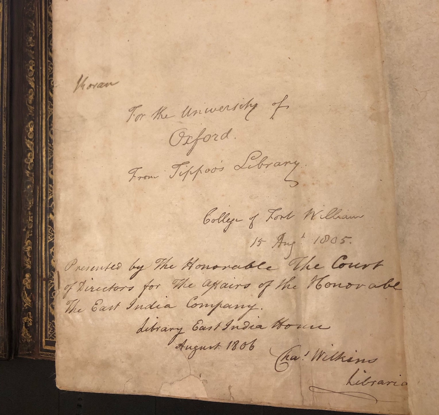
Inscription in MS. Bodl. Or. 793, from the librarian of the East India House Library to the Bodleian Library, 1806
by Devika
‘Tipu’s Tiger,’ the striking Indian automaton of a tiger mauling a red-coated European man, is now held in the V&A Museum. It was taken from the palace of the ruler of Mysore during the East India Company’s capture of Seringapatam on 4 May 1799. Equally remarkable and valuable was Tipu Sultan’s library, seized in the same battle, during which Tipu was killed. Even in the history of this raid the Bodleian Library was invoked to set the standard based on which Tipu’s own library was assessed.
Captain David Price, prize agent for the Bombay Army, was one of the individuals tasked with making a selection of the texts to be presented by the army to the court of directors of the East India Company. :
The library and depôt of manuscripts, was a dark room, in the S.E. angle of the upper virandah of the interior quadrangle of the palace. Instead of being beautifully arranged, as in the Bodleian, the books were heaped together in hampers, covered with leather; to consult which, it was necessary to discharge the whole contents on the floor. The selection, which we completed, with all the care and discrimination in our care to bestow, extended, in the whole, to the number of 300, and something over, all of them manuscripts of the choicest description; whether for matter, beauty of penmanship, or richness of decoration … We did not take any account of the remainder, or bulk, of this princely library. But I should conceive that it must have contained, altogether, from 3 to 4,000 volumes, or about ten times the number of our selection. (Price, Memoirs, pp. 445-6)
Looking back on the event as he wrote his memoirs, Price chose the Bodleian Library, in which books were stored on shelves, as a contrast to the arrangement of books in Tipu’s library, from which, according to his perception and his narrative, books could be plundered. The reference reflects the Bodleian’s position within British imperial thought. Price poses the Bodleian as the ideal library as opposed to the preservation practices of Seringapatam, although another officer has written about the excellent condition of the records and the system Tipu Sultan had in place for the management of the library (“Curious Particulars”, p. 266)
It seems there was something more than monetary value that made Captain Price and other officers select items from Tipu’s collections. Joshua Ehrlich argues that Tipu Sultan’s library is key to understanding the power aspirations of both British soldiers and the Sultan himself. Tipu amassed a library of great value, some of which he acquired through plunder. This brings us to the collection item bestowed upon the University of Oxford, after the plunder of the Seringapatam library by Company soldiers.
Manuscripts from the raided library in Seringapatam (Srirangapatna, Karnataka, India today) would come to enrich the collections of libraries in Britain, including the Bodleian, in part as gifts from the Company.
An inscription (pictured) inside this Safavid Persian Qur’an (MS. Bodl. Or. 793) states that it was presented by the East India Company directors as a gift to the University of Oxford in 1805. Other Qur’ans from Tipu’s library were also given as gifts to Cambridge University, St. Andrews University and the Crown. The choice of institutions of national importance to receive these significant books was done ‘evidently hoping to garner goodwill,’ [Ehrlich, p. 490]
A digital facsimile of this Quran can be seen in Digital Bodleian, where it is described as ‘From the library of Tipu Sultan, Fath ʻAli, Nawab of Mysore, r. 1753-1799.’ Link to digital item
However, this brief statement and the earlier language of ‘gifting’ in the East India Company’s inscription within the book provide provenance descriptions that gloss over the Company’s forcible seizure of Tipu’s library. These neutral statements ignore the episodes of violence in the book’s history, which go back even farther: Tipu’s own plunder of other libraries. It is the power aspirations of those who seized the books which historian Joshua Ehrlich recounts in his history of Tipu’s library. (See: The East India Company and the Politics of Knowledge, Cambridge University Press, 2023)
Below is a comment on the Qur’an from Professor Sadiah Qureshi, Sassoon Visiting Fellow at the Bodleian Libraries in 2023:
‘Muslims regard the Qur’an as the revealed word of God requiring ritual ablution and many special acts of respect when handling and reading. Seeing the Qur’an reduced to an object, especially plundered loot, within any collection is deeply distressing, and should be a thing of the past.’
This case study prompts us to ask the following questions:
– Who has the right to present an item as a gift? Is it a gift if it is a spoil of war or violence? How do the means of acquisition complicate the provenance of an object?
– How are an institution’s handling and display practices informed by the historical provenance and religious and cultural significance of the item? What idea does the presence or lack of said practices convey about the institution?
References:
Sims-Williams, Ursula. “Collections Within Collections: An Analysis of Tipu Sultan’s Library.” Iran :Journal of the British Institute of Persian Studies 59.2 (2021): 287-307.
Price, David. Memoirs of the Early Life and Service of a Field Officer, on the Retired List of the Indian Army. England: W. H. Allen, 1839. Digital copy available from the Bodleian Libraries
Ehrlich, Joshua. “Plunder and Prestige: Tipu Sultan’s Library and the Making of British India.” South Asia 43.3 (2020): 478-92.
“Curious Particulars Relative to the Capture of Seringapatam.” The Edinburgh Magazine, or Literary Miscellany, 1785-1803 (vol. 15, January 1800): 260-66. Digital copy available from the Bodleian Libraries
Conserving a Mughal Album from the Shahjahan period (MS. Douce Or. a. 1.) by Julia Bearman, Senior Paper Conservator, Bodleian Library.
Bequeathed to the Bodleian Library in 1834 by antiquary and bibliophile Francis Douce, MS. Douce Or. a. 1 is the earliest album within the Libraries’ Mughal collection. The album was assembled in the 17th century for a member of the Mughal Imperial family and contains 41 pictures and 53 calligraphic panels within decorated lacquered boards.
MS. Douce Or. a. 1 has been the recent focus of treatment in the Bodleian Libraries conservation studio. Fragilities to the painted images became evident in 2019 during an assessment of its condition to determine whether it could be lent for an exhibition abroad. Thanks to the generous support from a group of donors the conservation treatment went ahead and is due for completion in 2023.
MS. Douce Or. a. 1, fols. 56a/55b.Ms. Douce Or. a. 1, fols. 11a/10b.
Each folio is made from several sheets of paper pasted together to form a thick sheet and burnished to create a smooth surface. The corners were found to be fragile where they had been touched repeatedly over the centuries causing them to break and delaminate. The conservation treatment included stabilizing these areas by adhering a very thin (3.5g/m2) Japanese paper to them.
The condition of the paint layer on both the paintings and calligraphies was examined under a stereo microscope at magnifications of up to 40x. This revealed not only paint loss but also actively unstable miniscule flakes of paint beginning to lift away from the paper beneath. The securing of these unstable flakes to prevent further losses was of primary importance.
Julia Bearman viewing MS. Douce Or. a 1 under the microscope.
To stabilize the paint, a liquid adhesive was introduced under the edges of each unstable flake using an exceptionally fine tipped brush and a steady hand, whilst viewing the manuscript through the microscope. Within the field of conservation there are a number of adhesives suitable for the consolidation of painted media and the one chosen for this project was the polysaccharide JunFunori®, which is the purified form of Funori, a Japanese adhesive made from the red algae genus Gloiopeltis furcate.
MS. Douce Or. a. 1, fol. 42a and Paint flakes after stabilization. MS. Douce Or. a. 1, fol. 42a.
The microscope was also a useful tool to view the boards, and revealed layers of paper, gesso, paint, gold and lacquer. The lacquered boards require further study in order to understand how they were produced and to understand their ageing process and their conservation issues.
Lacquered boards, MS. Douce Or. a. 1
The materials and techniques of traditional Persian lacquered bookbinding will be explored with Prof. Dr. Mandana Barkeshli, a conservation scientist and academic, and her colleague Dr. Hamid Malekian, during a forthcoming workshop for conservators and a public lecture.*
*Persian lacquered bookbinding: A journey through its layers and conservation challenges, by Prof. Dr. Mandana Barkeshli takes place on Tuesday 27 June 11-12pm at Weston Library, Bodleian Libraries. Book your place here.
The Bodleian Libraries gratefully acknowledge support from these donors for the conservation of this album:
Lady McNeice Charitable Foundation
Davidson Family Charitable Trust
Jan Hall
Rafaël Biosse Duplan
Clive C R Bannister
Anonymous donors
The Lucida uses a projected laser line and two tiny cameras to record the form of each surface of the seal. Bodleian Library, Sigill. Aram. V.
An essay by John Barrett, Senior Photographer, Bodleian Libraries, about discoveries from the ARCHiOx imaging project, which has been funded by the generous support of the Helen Hamlyn Trust. See also: ARCHiOx: research and development in imaging – The Conveyor
By far the earliest collection of originals to be recorded for the ARCHiOx project originate from the Achaemenid Empire, and date to between 500 and 400BC. The following image shows a clay seal, or letter-bulla, bearing the impression of the seal of Aršāma, a Persian prince and regional governor. It is one of eight seals, which would have accompanied letters sent to the steward of Aršāma’s estates in Egypt. The impression made on this example, and six other bullae from the collection were made using the same cylindrical seal. Lost to time, this incredibly intricately carved tool would have been rolled over the surface of each of these tiny clay seals, which measure little more than four centimetres. The clay which forms these seals is unfired and consequently these small originals are incredibly fragile. In some cases, the seals are held together by the string which would have attached them to the letters they accompanied. Recording such vulnerable originals is of great importance to ensure their preservation.
A one-hundred-megapixel medium format digital camera has been used to photograph the four source images. In place of the custom flash modules, each seal has been illuminated using a studio flash unit. The flash unit is moved to an equidistant position to the original at 90 degrees from the previous location, and the process repeated.
Recording the seals in this way has made it possible to capture them at over six and a half million pixels per square inch, but at this resolution the depth of field is extremely shallow. Focus stacking is a technique whereby multiple images are photographed from a static position with an incremental adjustment made to the focus between exposures. The resulting stacks of images are then combined in software. In this way the depth-of-field is extended and the recording appears absolutely sharp from top to bottom. Perfect alignment of the four focus-stacked source images to enable photometric stereo processing is the most challenging element within the process.
An impression of the seal of Aršāma from Sigill. Aram. V.
The final recordings are incredibly impressive. Every tiny detail of the impression, historic repair and even the fingerprints of the maker are clearly visible. These features can be explored using a 3D viewer within GIS software. Moving over the surface of the recording is similar to flying over the surface of a desert landscape, where each granular element becomes a geographical feature. This new method of recording represents an important advance in imaging for the purposes of preservation. The recordings of the seals will allow researchers to study originals in a way that has never before been possible.
In the left-hand example below, the shaded representation of the recorded surface has been generated by positioning a virtual light source at 60 degrees from the surface on which the original rests. In addition, other shaders can be applied, as shown in the right-hand example, which uses a spectrum of colour to represent height.
A different perspective. Two renders of the surface of Sigill. Aram. VIII made with data recorded with from the Selene. Left: a greyscale shaded render. Right: a heat map, using a spectrum of colour to represent variations in height.
Recording the seals in this way has made it possible to capture them at over six and a half million pixels per square inch, but at this resolution the depth of field is extremely shallow. Focus stacking is a technique whereby multiple images are photographed from a static position with an incremental adjustment made to the focus between exposures. The resulting stacks of images are then combined in software. In this way the depth-of-field is extended and the recording appears absolutely sharp from top to bottom. Perfect alignment of the four focus-stacked source images to enable photometric stereo processing is the most challenging element within the process.
Combining focus-stacking and photometric stereo. Though the thickness of the seal is a mere 7.5mm, limited depth-of-field due to recording at such a high magnification only allows for acceptably sharp capture of the top 2mm. The benefits of focus stacking are particularly notable at the edges of the seal as they taper down. Left: single exposure. Right: focus-stacked image. Sigill. Aram. V.
Every tiny detail of the impression, historic repair and even the fingerprints of the maker are clearly visible. These features can be explored using a 3D viewer within GIS software. Moving over the surface of the recording is similar to flying over the surface of a desert landscape, where each granular element becomes a geographical feature. This new method of recording represents an important advance in imaging for the purposes of preservation. The recordings of the seals will allow researchers to study originals in a way that has never before been possible.
3D views of the reverse of Sigill. Aram. VIII. The wonderfully preserved string from this letter bulla still holds a fragment of parchment from one of the letters to which it was originally attached.
The image below shows one of the fourteen parchment letters from the Aršāma collection. The Aramaic text is reasonably well preserved, and has been almost fully transcribed. The letter suggests that Aršāma valued not only horses, two of which feature on his seal, but also three-dimensional artworks. Addressed to Nakhthor, the steward of his estates in Egypt, Aršāma commissions the production of statues to be made by a sculptor believed to be Hinzani.
A letter addressed by Aršāma, Persian Satrap of Egypt to Nakhthor the steward of his estates in Egypt. An excerpt of the text is translated as follows. …‘And let him make statues (on) which there shall be horsemen (?), and let him make a statue of a horse with its rider, just as previously he made before me, and other statues. And send (them), and let them bring (them) to me at once, with haste’… Pell. Aram. III.
So it seems fitting that we should carry out Aršāma’s request, albeit two and a half millennia later. Producing a scaled-up three-dimensional facsimile of the fifth seal using the data recorded with ARCHiOx technology. Firstly, the Lucida scanner was used to record the general shape of the seal from each orientation. This volumetric data provided a base, over which the higher resolution, higher frequency data recorded with the Selene could be overlaid.
With the photometric stereo and laser recordings combined, elevated printing was then used to construct the facsimiles at four times the original size. Several variations were made in order to assess which might be most useful for the purposes of study. Firstly, an uncoloured version was made, showing only the volume of the seal. Two coloured versions followed, the first printed with a shaded render in order to enhance the debossed design, and the second printed with the albedo (colour) image recorded from the original seal.
Left: Two, scaled-up, 3D printed facsimiles of Sigill. Aram. V, made in the print rooms at Factum Arte, Madrid. Right: The two tiny facsimiles in the centre of the group are printed at actual size. Variations of enlarged facsimiles were produced, either uncoloured or with renders printed on their surface.
A far greater challenge would be to create a facsimile of the lost cylindrical seal which was used to make the impressions in the seven bullae. Though the fifth, seventh and eighth seals provide much of the design, some elements are clearly incomplete. A collated line drawing from Christopher J. Tuplin and John Ma’s book, Aršāma and his World: The Bodleian Letters in Context reveals two important missing elements from the design. In the drawing, the horse to the left of the soldier holding a spear appears complete. Crucially so too does the inscription above the horse. With the assistance of Professor Tuplin, these additional details were explained. Another seal bearing a partial impression, made using the same cylinder is held in the collections of the Persepolis Fortification Archive in Chicago. A photograph of this seal was used by Eduardo Lopez from Factum Arte in order to incorporate the missing elements into the digital reconstruction.
The lost cylindrical seal, remade. The design from the collated recordings 3D printed onto flexible plastic before being glued to a cylindrical base. An impression in plasticine demonstrates that the facsimile is capable of creating incredibly similar designs to those found on the original bullae.
Prior to producing the facsimile, the 3D recording was inverted so that the embossed design would be capable of creating an impression similar to those from the original bullae. Though limited by the resolution of the 3D printer, the facsimile cylindrical seal is indeed a usable tool and capable of making impressions which look very similar to those which were ordered to be made by Prince Aršāma, two and a half thousand years ago.