The Bodleian Centre for the Study of the Book offers a prize to an undergraduate or postgraduate student of the University of Oxford for a collection of books or other printed materials.
The prize will be of two parts: a payment of £600 to the winner, and an allowance of £300 for a book to be purchased for the Bodleian Library’s collections, selected by the winner in co-operation with the Bodleian’s Curator of Rare Books.
Lucy Bayley, Academic Engagement with Special Collections
The simplest forms can carry the most profound and difficult messages. Beyond the Pale is a new display of prints in the Proscholium (entrance hall of the Old Bodleian Library, Oxford) responding to the ‘black square’.
Linda Parr, Black Album, monotype 1/1, Hawthorn dense black ink on Somerset smooth paper, 2022. (Prize winner)
Beyond the Pale consists of responses invited by the Bodleian Bibliographical Press in parallel to a historical display taking place in the Weston Library – Foreshadowed – curated by Andrew Spira, exploring precursors to Kasimir Malevich’s Black Square (1915), a painting created to bring art history to an end. In Foreshadowed, items drawn from Bodleian Special Collections range from Robert Fludd’s 17th-century representation of the universe as a black square, to the black pages used in mourning the death of a monarch, to use of black pages in 19th-century magazines as an absurdity, a negation of meaning.
As a contemporary equivalent, the prints in Beyond the Pale connect to a range of themes. There are expressions of mourning, of personal loss, of grief for the environment, or anger at political conflict and repression, or playful encouragements to recalibrate our vision of ‘black’. These simple shapes are far from static or lifeless. Several embody references to arts and performance-music, ceramics, drawing, reading, and printing itself. Others, with an inviting tactile surface, tempt the viewer to transgress the square.
Bridget Bowie, Unfaded, collograph, 2022.Emily Lucas, Motion on Curved Paths, Monoprint, ink, collage and stitch on printed encyclopaedia paper, 2022. Emily Lucas Art.
Historically, the black square appeared in publications as an expression of mourning. In the prints displayed in Beyond the Pale, there is likewise a theme of melancholy prompted by the black square as a space for reflection. Bridget Bowie’s collograph Unfolded, printed onto the pages of an old book with personal significance, for example, shows the black square as a space to reflect on the loss of a close friend. “I am interested in how we process our emotional responses to loss, places, objects of significance, and the passage of time. I don’t attempt to replace things, but explore how we can find the positive in what remains.”
The pages of a book have also become the basis for the monoprint Motion on Curved Paths by Emily Lucas. Printed on encyclopaedia paper with elements of stitching, at the top you can make out the line, ‘there is a terrible tendency to talk about it.’ For John McDowell, the use of a text as well as a connection to melancholy is made through the pooling of ink from 17th-century printed text of Robert Burton’s The Anatomy of Melancholy. In this case the black square has been transformed into a single solid black circle, laid sequentially in the book.
For others, the black square becomes a reflection on political conflict and censorship. Elizabeth Fraser has responded to the Russian invasion of Ukraine in February 2022. Bomb-like ornaments are nestled in the gaps of a wall of black rectangles created from the backs of woodtype. Another sea of black forms is evoked in a linoblock print by Anouska Brooks. In Corrine Welch’s printed and embroidered scroll, the black square or rectangle stands for redaction in public documents. Welch has created a reverse redaction of Priti Patel’s UK and Rwanda Migration and Economic Development Partnership, in Kigali on 14 April 2022. Welch writes:
‘The speech is digitally printed onto fabric and made into a scroll to illustrate the performative nature of the announcement of this conspicuously ‘tough approach’ to immigration. The reverse redaction is created by hand-embroidered tally marks revealing the hidden reality of the message. The tallies represent the thousands of individuals whose lives will be impacted by this unworkable and unethical policy.’
Elizabeth Fraser, NO TO WAR, letterpress, black ink on 400gsm white Somerset Velvet paper, 2022. Frauhaus Press.Anouska Brooks, Untitled, lino block print, 2022.Corinne Welch, The Hand of Friendship, fabric scroll – digital print and hand embroidery, 2022. (Prize winner)
Many of the printmakers – William Alderson, Marina Debattista, John Christopher and Jemima Valentine and Harrison Taylor, included – have taken direct inspiration from Kasimir Malevich. Harrison Taylor’s block print recalls the cracking paint on the surface Malevich’s ‘Black Square’. Bringing ideas of wounding and healing, the page has been torn and stitched back up. There is a purposeful imperfection in the black revealing the texture of the print and giving it an elusive quality. For John Christopher and Jemima Valentine-Lake the reference to Malevich is a playful one, reimagining the artist not as a modernist but as someone who ‘secretly loved ornaments’.
John McDowall, Atramentum, digital print, perfect bound book, 144 pages, Popset oyster 120gsm. Cover, Colorplan pale grey 270gsm, 2022.
Isobel Lewis, Black, book with letterpress type, 2022. The Kelpie Press. Each page is printed with a word evoking black: NIGHT, EBONY, INKPaul Hatcher, Evolutions, letterpress and relief printing on hand-made paper, 2022. Allamanda Press.
For some the black square is a playful encouragement for both maker and reader. Isobel Lewis’s flag book, picutred above, is made to be handled. Created in letterpress, it’s filled with different words for black. Read it through or fan it out into different forms. Turn the pages of Paul Hatcher’s booklet Evolutions and see changes in the medlar block as he carved into, and printed with it. Patrick Goossens visualises the printing of the black square on a hand-press, portraying the press itself. Using etching, Claire Bayley imagines one black square seeping ink into a white square.
This sense of action is interpreted through references to performance by other artists. In The Mile Long Lane As Measured By My Body, by Alice Hackney the artist’s body becomes an imprint into a black square. Each layer of black is created by the view every quarter of a mile on the walk very familiar to the artist. For Sarah Bodman, it was a performance event during the pandemic in 2020 that led to Inside Stories, one page from her experimental book project Read With Me.
Alice Hackney, The Mile-Long Lane As Measured By My Body, aquatint and red crayon on fabriano 2022. Recent graduate of Ruskin School of Art.
There are connections to ceramics (Graeme Hughes takes inspiration from a 3rd BC greenware bowl from the Ashmolean Collection), to film (Sophia Missaghian-Schirazi’s print is a proposal for a fictional movie poster called Sprig Thief), and to music. Linda Parr reimagines an alternative Black Album, referencing artist Richard Hamilton’s famous cover for the Beatles’ White Album. In a more whimsical way, Heidi Mozingo takes the black square to be the rests in music composition, as well as the rectangle form of the music stand, referring to Mozart’s statement that ‘the music is not in the notes but in the silence in between.’
Winning entries are: Linda Parr, Black Album, Monotype 1/1, Hawthorn dense black ink on Somerset smooth paper, 2022, Corinne Welch, The Hand of Friendship, fabric scroll – digital print and hand embroidery, 2022, and Harrison Taylor, Untitled, woodcut and stitching on paper, 2022.
The judges for Beyond the Pale: Chris Fletcher, Tinashe Mushakavanhu, Jo Maddocks, Patrick Wildgust, Andrew Spira and Peter Lawrence
Chiara Betti, DPhil student on the Collaborative Doctoral Partnership scheme
Most of us imagine libraries as repositories of books, manuscripts, and paper things. However, library collections are much more diverse than this. For example, the Bodleian Library not only preserves precious manuscripts and printed books but holds prints, paintings, printing plates and blocks, and even embroidery samples. And until the beginning of the twentieth century, you could also find marble sculptures and wax seals in the Bodleian collections.* However, libraries have sometimes struggled with the practicalities and the purpose of preserving objects such as printing surfaces, which are after all the tools used to make books, rather than books themselves. Why should libraries preserve printing plates? How can they be understood and integrated with the rest of the collections?
My doctorate focuses on the unique collection of printing plates amassed by the British antiquary Richard Rawlinson (1690–1755). The antiquary’s life mission was to preserve artefacts, manuscripts, books, and curiosities of historical relevance in the hope that future generations might learn from those objects. Thanks to contemporary accounts, we know that his London house was so crammed with objects of any sorts that he resorted to living in the attic, with the result that he could not even hear visitors knocking at his door!
Rawlinson was an extremely generous collector and often lent items from his collections. Shipping printed reproductions of those items was much more straightforward. While still an undergraduate at St John’s College, Oxford, Rawlinson commissioned his first engraved copper plate from Michael Burghers (c.1647/8–1727), an engraver for the Oxford University Press, in 1710. Rawlinson could reach a much wider audience with impressions from a single copper plate, with fewer risks of never seeing his possessions returned.
In many aspects, Rawlinson’s commitment to reproducing and documenting valuable artworks and manuscripts can be seen as an antecedent of modern digitisation campaigns of museum and library collections. Echoing his mission to “collect and preserve”, the Bodleian Library has embarked on a crucial project that will produce many dozens of super-high-resolution images of some of the library’s treasures. ARCHiOx –Analysis and Recording of Cultural Heritage in Oxford – is a collaborative project that originated from the partnership of the Bodleian Libraries and the Madrid-based Factum Foundation. Since February 2022, the Bodleian’s Imaging Studio has been photographing items selected by the Bodleian curators and staff, starting with the Rawlinson copper plates. For a detailed description of the digitisation process, the reader is invited to refer to John Barrett’s recent blog about ARCHiOx. In brief, John and his team are creating 3D recordings that allow us to study in detail and measure the objects photographed. This imaging technique, which can capture textural details, represents a significant step forward in the study of printing plates and, in general, of the materiality of objects.
Why should we preserve and study printing equipment? Copper printing plates (and woodblocks and lithograph stones) are a repository of information about the manual processes of creation and revision, often not acquirable from the impressions. Three examples here, images of copper plates obtained with the help of John Barrett in the Bodleian Imaging Studio, will elucidate how they help us to learn more about our print collections.
The Invidia plates: two sides to a story
Views of Rome on three small copper plates. From left to right: Anonymous, Tempio Fortuna Verile, 18th century. Engraved copper plate. Rawl.Copperplates g.17; Anonymous, Cerchio di Antonino Callo, 18th century. Engraved copper plate. Rawl.Copperplates g.21; Anonymous, Trofei di Mario, 18th century. Engraved copper plate. Rawl.Copperplates g.19.
The above three small plates giving views of Rome are from a series of twelve copper plates copied after much larger Italian engravings depicting the same subjects. However, these three plates have more in common than one might expect. Their reverse is etched with an old design, indicating that they were formerly part of the same larger copper plate that was then re-used and cut up to make new engravings. The other side of these plates shows a naked female figure with Medusa-like hair, a man dressed in Elizabethan fashion, and another man with a hat standing in front of a building. If we place the three plates next to one another as in a jigsaw, a new image appears. In this case, technology provides a more efficient alternative to manually aligning the plates.
A digital restoration of an etching of Invidia (Envy) from the reverses of Rawl.Copperplates g.17, g.19 and g.21. No extant print made using this side of the plate has yet been identified. The etched lines are extremely shallow, measuring 0.029mm in depth.
The image above was obtained by stitching together the images of the three reverses, and the results are impressive. This image can be used to run online searches to try to identify other impressions of this plate or designs from which it was copied. So far, even with these methods, I have not found any impressions, but my research continues with the hope of solving the mystery of this “puzzle plate”. The absence of impressions might even suggest that the plate was made for decorative purposes rather than printing. It is hoped that further research will shed light on the route of this copper plate from the ‘Invidia’ design to the small views of Roman sites shown above. These tools for printmaking had an industrial history, linking one engraver and publisher to another through the re-use of materials.
The De Passe family: portraying royalty
The Rawlinson collection of plates features many famous engravers from the 17th and 18th centuries, including members of the famous Dutch family De Passe.
Willem De Passe, Portrait of King James I and Henry Prince of Wales, 1621. Engraved copper plate. Rawl.Copperplates c.34.
Copper plates like the portrait of King James I and Henry Prince of Wales have an enormous historical value as not many 17th-century printing plates survive today. The engraved portraits are representations of monarchy attempting to assert its importance. The printing plates let us look behind the techniques and materials that were used to achieve this.
Digitising these objects ensures their preservation while making them accessible to a broader audience. In fact, while studying the objects in the flesh is irreplaceable and essential for the researcher, the reality is that accessing printing plates is not always straightforward. On average, printing plates are much heavier than books, and, unlike most books, their handling requires gloves (to prevent oils from our skin corroding the metal) and much care. High-resolution images enhance the possibilities for the study of these objects.
Studying mezzotint plates: seeing through time
William Faithorne the younger after John Closterman, Portrait of Madame Plowden, 1690–1725. Mezzotint on copper. Rawl.Copperplates c.43.
A favoured method for making print portraits was the mezzotint process. Mezzotint plates rarely survive because of the limited number of impressions they can yield. The few existing examples in the Rawlinson collection confirm that the plates are too worn out to see the details of the images on them. However, the images produced by ARCHiOx slightly improve our chances of studying the way these plates were made. For instance, the plate with the portrait of Madame Plowden is hardly legible with the naked eye because it is extremely worn out and is covered with a thick layer of dirt and residual ink. Thanks to the advanced imaging provided by ARCHiOx, we can decipher the image and see that many details were etched into the plate to enhance the delicate shading provided by the mezzotint process.
Science and Humanities
Those familiar with copper plates will be aware of how challenging it is to study them, even when you have them in your hands. They are often preserved in a poor state, with residual ink in the engraved lines or evident signs of oxidisation which obscures the image. However, once printing plates have undergone a process of cleaning and conservation, the polished copper is highly reflective, making it almost impossible to photograph it. Advanced imaging techniques such as those developed by ARCHiOx allow us to observe and study printing plates in unprecedented detail. Moreover, the presence of ink in the grooves is no longer an issue – if anything, it is an advantage as a perfectly polished surface would not be suitable for this kind of photography.
Copper plates belong to the category of “difficult objects” preserved by libraries and archives. They are not printed material, nor really 2D artworks, and often fall beyond the expertise of the curators and conservators. As a result, printing technologies are sometimes left out of catalogues and digitisation programmes, making it difficult for a researcher to obtain information through the usual library channels. My research and the valuable work of the Bodleian Imaging Studio and the Digital Bodleian will finally close a gap, starting with the Rawlinson copper plates, just one of the collections of printing surfaces held by the Bodleian Libraries.
The results obtained by ARCHiOx will transform this research. The ARCHiOx imaging not only produces high-resolution images but enables researchers to measure details on the objects’ surfaces. For instance, it is possible to measure the distance between engraved lines as well as their depth. Thanks to the generous support of SHARP (Society for the History of Authorship, Reading and Publishing), which allows me to conduct detailed analyses of some of the Rawlinson copper plates, we have been able to compare the accuracy of the ARCHiOx technology to that of optical 3D microscopes. For example, using the Alicona Infinite Focus 3D Profilometer at LIMA (Engineering Science, Oxford), I measured the distance between parallel lines on copper plates engraved by various artists to establish the differences in techniques and skills. The same measurements were taken on the ARCHiOx, and the results are consistent with those of the 3D profilometer.
3D image of a section of Rawl.Copperplates e.65 obtained with the Alicona Infinite Focus 3D Profilometer. The scale on the right shows the depth of the engraved lines.Depth profile of the same section of Rawl.Copperplates e.65 showing the varying depth of the engraved lines.
The results so far obtained with ARCHiOx and the Engineering Department are promising. They will reshape our understanding and appreciation of print technologies as tools for researching book and art history, the history of collecting and heritage science.
With thanks for his assistance in writing this article:
John Barrett, Bodleian Library’s Senior Photographer and ARCHiOx Technical Lead for the Bodleian.
* Transfer of the seals and seal matrices to the Ashmolean: Bodleian Library, ‘Index to Rawlinson [Monastic] Matrices, [C18]’. Library Records e. 382; Bodleian Library, ‘Transfers to the Ashmolean and Other Institutions (1863)’. Library Records d. 1180. Marbles: https://collections.ashmolean.org/collection/search/per_page/25/offset/25/sort_by/relevance/object/45098 Also see Jeremy Coote, ‘An ‘Unimportant’ Inscription: The Antiquarian and Institutional History of a ‘Muscovite’ Cup in the Rawlinson Bequest of 1755’, The Bodleian Library Record, 30 (nos 1-2 April to October), (2017), pp. 16-40
This blog was prompted by Chiara Betti’s doctoral research on the Rawlinson copper plates. Readers with an interest in Chiara’s research are encouraged to contact her at chiara.betti@postgrad.sas.ac.uk. The research is funded by the AHRC through the Collaborative Doctoral Partnership. See: https://www.glam.ox.ac.uk/early-modern-copper-plates-bodleian-libraries
How does it change our understanding of a book when we come physically close to the materials it was created from? How does it change your perception to reflect not just on the words but the skills, processes, individuals, practices and modes of production that are enfolded into how a book was written, created, published, circulated and collected?
Courses and workshops in the Bibliographical Press at the Bodleian bring to life the technical and material history of books. A course on fiction or literature can, for example, be brought together with an opportunity to learn about the mechanical and material processes. This can be way to place historical, theoretical, structural reflections in a material-based physical and social reality. One example of this combined historical and material-based approach to learning are recent events on Tristram Shandy.
On 27 May, in The Making of Tristram Shandy, Dr. Helen Williams, Associate Professor of English Literature and a British Academy Innovation Fellow, Northumbria University and Dr.Elizabeth Savage, Senior Lecturer in Book History and Communications, Institute of English Studies, University of London gave a lecture (in person and online) on the visual, physical and conceptual features of this unique book.
The following day in the Bibliographical Press a workshop took place with three specialists, Louise Brockman (paper marbler), Peter Lawrence (wood engraver) and Richard Lawrence (letterpress). Students were introduced to some of the skills and techniques that went into the making of the Tristram Shandy and working collectively, with the eighteenth century book as the historic starting point, the group created a concertina publication.
Both events were organised by Centre of the Study of the Book and Novel Impressions, a project run by Helen Williams (Northumbria University) and funded by the British Academy Rising Star Engagement Awards, which provides a series of research- and practice-led events that aim to create a network of early career researchers, printers, and curators producing print workshops for public audiences inspired by eighteenth-century literature. This particular event was supported by the Institute of English Studies, the Bodleian Library, and Book and Print Initiative.
During the workshop, we spoke to Richard, Louise and Peter about the skills they use in marbling, engraving and letterpress, and how they approached devising the workshop. Highlights from our conversation are shared below.
MeEt the practitioners
Louise Brockman, Paper Marbler
Selected editions of Tristram Shandy feature marbled pages. Dr. Helen Williams (left), Louise Brockman (right) demonstrates marbling techniques. Photo (c) John Cairns
Can you talk us through the process of creating a marbled page for a publication? What materials do you use?
I use gouache paints, as I like the bright opaque colours. These paints are floated on a tank containing a ‘seaweed size’, a powder that has been blended with hot water to make a slightly gelatinous liquid. The paints are then manipulated into patterns using a stylus or comb to make a pattern and picked up on a sheet of paper that has been pre-treated with a mordant (a substance that allows dyes or paints to stick to paper or fabric).
For a specific publication I would discuss the requirements with the customer and come up with a selection of designs based on their pattern and colour preferences.
photo (c) John Cairns
In Tristram Shandy, Laurence Sterne commissioned marbled pages, these appear in different ways in different editions [see below]. What did you notice about the marbling in these publications?
In the copies that I have seen I have noticed that patterns are quite simple. This makes commercial sense if you are producing many pages, as to make a complicated design would entail more time and effort with more possibility of wastage.
Marbled page in Lawrence Sterne, ‘The life and opinions of Tristram Shandy, gentleman’, volume 3., London: Printed for C. Cooke, 1793, Bodleian Library, Dunston B 1628 (v. 3).Hand-drawn ‘marbled’ page in Laurence Sterne, ‘The life and opinions of Tristram Shandy, gentleman’, Dublin: printed for H. Saunders, 1761, Bodleian Library, Harding M 245.
How did you develop an approach to marbling for this workshop based on Tristram Shandy?
If you observe the pages in Tristram Shandy you can see the fold lines. This is vey unusual, so rather than marbling the whole page, which is what paper marblers do on the whole, only the middle section of the page has been marbled. The folding was a way to keep the rest of the page away from the tank and remain blank. I did quite a few tests on the best way to carry this out and found that the marbling was more successful with the sheet folded out of the way completely. I tried pressing a sheet after marbling and drying and the fold lines were still visible, I suspect this was probably how the pages were folded and marbled in Tristram Shandy, as the lines around the marbling are pretty crisp on the copies I have seen and, as mentioned previously, the folds are still visible.
Because of this the workshop attendees had the experience of their first ever marbled sheet being carried out in a slightly more complicated way than it would normally be. They all managed very well and we produced some lovely papers during the session.
photo (c) John Cairns
Peter Lawrence, Wood Engraver
Peter Lawrence, demonstrating wood engraving to students at the workshop. Photo (c) John Cairns
Can you tell us about the sorts of wood that would have been used for engraving in the eighteenth century?
Traditionally, the wood of choice has always been boxwood. Thomas Bewick, at the end of the 18th century, pioneered working on the cross-section of boxwood blocks which being so slow growing and therefore with its rings so tightly packed together, could replicate the hardness of metal. This meant he could engrave in all directions across the grain and produce fine marks not possible with woodcuts that are cut with broader tools on softer, long-grained wood.
Boxwood ‘rounds’, cut across the trunk, are not large. That means a rectangular block cut from the centre will only be a few centimetres across. To make a larger print, blocks are glued together, which is therefore more costly. Many current engravers work on lemonwood blocks, which has a slightly more open grain. Lemonwood blocks are generally larger, and so cheaper to make into larger composite blocks.
All blocks are made ‘type-high’ to sit on the press and be printed in the same pass as metal type. Apart from the fact that boxwood was cheaper than metal to use, it was the fact that text and images could be printed together in publications in the 19th century, without the expense of tipping-in separate intaglio printed images, that made wood engraving so attractive.
photo (c) John Cairns
What kind of tools would be needed?
There are five basic wood engraving tools – spitstickers, gravers, tint tools, round and square scorpers. Each has a particular use, or more than one use, in producing lines and stipples. They have different shaped pointed ends and each come in a series of sizes… To print by hand we just need, in addition, a small roller, a thick book, some talc, a spoon and some Japanese paper.
photo (c) John Cairns
There are what could be wood engravings in ‘Thomas Shandy’. What did you notice about them?
Not being familiar with the diagrams in Shandy, I assumed from their date, the mid-18th century, that they would be woodcuts. However, having copied and created a couple of lines myself, I know that with wood engraving those tight curves would certainly have been easier. So the jury is out, but I’d say they are more likely to be wood engravings. They are certainly relief prints, the woodblocks sitting within the page of type.
The printed lines have a varying thickness. The engraver would have copied exactly the drawing supplied by Sterne which, if done with a metal pen nib, would have naturally created a variation in thickness due to varying pressure. Of course a skilled engraver could have ‘corrected’ that variation had he/she been asked to.
How did you develop an approach to wood engraving for the workshop that replicated the process that might have been used at the time?
Each student was supplied with a block, just over the width of one of the plotlines. I showed them two lines that I had cut, copying the originals. The students each drew a line across the width of their block. I supplied a range of tools. The idea was to cut either side of their line, first with a fine tool, then clearing more with a broader tool. We only needed to cut enough wood away to reveal the line, but it became obvious to everyone how much effort there was to clear the backgrounds for the original blocks. The wood around the lines has to be lowered enough not to pick up ink in the printing. With a wooden press, using dampened paper this was probably more more difficult than with later iron presses.
Plotlines in Laurence Sterne, ‘The life and opinions of Tristram Shandy, gentleman’, Third Edition, Dublin: printed for D. Chamberlaine, and S. Smith, 1760, Bodleian Library, Vet. A5 f.2902-2903.
Richard Lawrence, Letterpress Printer
Richard Lawrence showing students how to use the letterpress. Photo (c) John Cairns
What are some of the unique features of Tristram Shandy, from the perspective of the letterpress?
Most of what appears in Tristram Shandy had been done in other books before, but it was highly unusual to do these things in a ‘novel’. Examples include various small illustrations incorporated in the text. One of the more challenging things is the black page. Laying down that much ink using a wooden handpress is a challenge which explains why it was not very black. Similarly the marbled page is a challenge of logistics to provide that many copies.
What would it take to put together a single sheet in a publication in the eighteenth century ?
What size paper do you have? What size machine do you have? How many pages will the sheet be folded into? These three questions give the basic dimensions of line length etc. Is it possible to print work and turn to reduce the number of impressions? What type do you have enough of for the publication? (Not always anything but Hobson’s choice). Are there any special sorts (accented characters etc.)? And what will you do about them? Are there any illustrations to incorporate? Who will produce them?
What do students learn from setting type?
They perhaps learn what a slow and fiddly business it is and that type is responsible for the look of the page. It also limits how many pages can be printed at any one time. It is also the most expensive part of the equipment of a printer. Students might also learn that compositors (typesetters) do alter small details of the author’s work (spelling, italicization, etc.)in the course of their work. (Sterne may have been an exception in requiring the compositors to adhere to his manuscript more closely.)
Typesetting might also bring home to students that the people printing a book have all sorts of concerns about the process that means they are largely divorced from the content. While there might well be some element of craft pride in doing a good job, printers printed because they got paid, not for the love of the words/text.
photo (c) John Cairns
Can you tell us about the idea for the concertina publication?
Peter Smith, a wood engraver who works from a studio at St Bride Foundation in London, came up with the idea before the pandemic and was gracious enough to allow it to be used by this group. It is ingenious because it only involves printing one side of a sheet so eliminating the usual drying time required before printing the reverse of a sheet.
Finished ‘lines’ in concertina publication, created by workshop leaders and participants.
***
For more information about courses and workshops in the Bibliographical Press, please contact bookcentre@bodleian.ox.ac.uk.
Selected editions of The Life and Opinions of Tristram Shandy, Gentleman are currently of view in Sensational Books, 27 May – 4 December 2022, Weston Library.
Students from Yale-NUS selected five items to illuminate an encounter with Shakespeare’s Sonnets
A choice of 5 items following our journey through the collection of sonnets by William Shakespeare (1564-1616) at the Bodleian Library
The dedication in the 1609 edition
Shake-speares Sonnets. Neuer before imprinted.At London : By G. Eld for T[homas]. T[horpe]. and are to be solde by William Aspley. 1609. This was the first edition, while Shakespeare was alive.
First page of the 1609 editionThe 1609 edition showing sonnets 56 through 59, with parts of sonnets 55 and 60.
_________________________________________
The 1640 edition showing part of Sonnet 54, and Sonnet 57 and part of Sonnet 59
Poems, written by W. Shakespeare Printed at London by Tho. Cotes, and are to be to be sold by Iohn Benson, dwelling in St. Dunstans Church-yard. 1640
The editor has added titles to the sonnets. This sets up your expectation of what the poem is about. We noticed that in the first edition the sonnets are just numbered, with no titles.
_________________________________________
Sonnet 57 printed in 2016 by Michael Hurley, Titivilus Press
Sonnet 57 (2016). Michael Hurley, Titivilus Press, Memphis, Tennessee, 2016 Black type with a coloured half border, 27 cm. height. On the verso is a reproduction of the Droeshout portrait of Shakespeare, from the First Folio edition of his plays.
Before we saw the first edition, this is what we thought a Shakespeare book ‘should’ look like, with old-fashioned type and decorative borders.
Sonnet 61 fully linocut by Rosie Fairfax-Cholmeley, Oxford, in 2016
Sonnet 61 (2016). Linocut by Rosie Fairfax-Cholmeley, 2016
This combines image and the text, all printed from linocut. The words of the sonnet are incorporated into a beautiful image.
_________________________________________
Sonnet 110 (2016). Pixel Press, Stoke Newington, London, 2016. A moveable. The words of the dedication and a closed eye are seen at first, but when you move the tab, the eye opens and the words of the sonnet appear in windows.
Sonnet 110 by Pixel Press, Stoke Newington, London
“It’s cool!”
Blinking eye moveable in Sonnet 110 from Pixel Press, Stoke Newington. gif by Adam Koszary
The Yale-NUS edition of Four Sonnets, 2022. Printed at the Bodleian Bibliographical PressThe Yale-NUS course ‘Manuscripts, the Printing Press, and the Preservation of Knowledge,’ 2022
A photo-essay by the Bodleian’s Senior Photographer and ARCHiOx Technical Lead for the Bodleian, John Barrett
From plate to print: Left to right, albedo, normal map, depth map, shaded render, composite and original print. A copper plate portrait of antiquarian, Anthony Wood, recorded as never before, captured using the latest in three-dimensional recording technology. Rawl. Copperplates e. 65.
Producing objectively accurate images from the books and manuscripts in the Bodleian’s collections to enrich our growing digital archive is the primary focus of the Imaging Services department. On occasion, requests from curators or clients may require our photographers to use specialist imaging techniques such as recording originals using ultra-violet light or infrared cameras. However, for the most part the aim is not to reveal hidden details, but to produce faithful digital reproductions.
In contrast, the aim of a new research and development project now underway in the Bodleian’s Imaging Studio is to record items from the collections in three dimensions, using entirely new technology, in the expectation that discoveries will be made through recording surface detail at extremely high resolution.
Almost invisible when photographed conventionally, the fine etching on the reverse of Rawl. Copperplates g. 21 is revealed. This composite digital image combines a shaded render of the surface of the plate, layered with an albedo (colour) image. The image depicts Invidia (Envy). No extant print made using this side of the plate has yet been identified. The etched lines are extremely shallow, measuring 0.029mm in depth. The plate measures a little over 10cm.
ARCHiOx –Analysis and Recording of Cultural Heritage in Oxford–is a collaborative project, bringing together the Bodleian Libraries and the Factum Foundation. Based in Madrid, the Factum Foundation specialise in high-resolution 3D imaging and have worked in cultural heritage institutions throughout the world, producing exceptional, three-dimensional facsimiles of artworks and artefacts.
During this one-year project, experts from the Factum Foundation will provide equipment and training in the use of new technologies and assist in exploring ways in which the output from the project can surfaced in Digital Bodleian. As the project progresses it is hoped that through the collaboration between technicians at the Bodleian and the Factum Foundation, solutions to improve and streamline the technology will be identified.
With generous funding support from the Helen Hamlyn Trust, the ARCHiOx project will continue until January 2023. Thereafter the technology will remain at the Bodleian making it possible to provide high-resolution 3D capture as an ongoing service.
Unlike perhaps more widely-known 3D capture techniques such as photogrammetry, the two state-of-the-art machines used for ARCHiOx use different principles for recording volume and are specifically designed for the capture of low-relief surface texture. This makes them well suited to the recording of the primarily flat, but texturally rich originals from the Bodleian’s collections. This high-resolution, low-relief capture has been termed ‘2.5D’ rather than 3D.
The 2.5D data produced during the project will serve two purposes. Shaded renders make it possible to view the surface texture of an original while removing their visible tone and colour. This allows for academic research from originals that contain textural details which are difficult to see and cannot be adequately recorded using traditional photographic techniques. Alternatively, the data may be used to produce 3D facsimiles from items within our collections, allowing the material nature of the original to be reproduced.
An example of a shaded render. Without the colour and tone of the original, the shaded visualisation shows only the surface texture of the original. A section of an 18th-century copper printing plate, Rawl. Copperplates e. 59, featuring Archbishop William Laud.
The Selene is an entirely new solution for capturing 2.5D data and is being used for the first time in the Bodleian. Using computational methods to extract very detailed information about the surface of an object,the Selene records multiple 2D source images, each captured with meticulously positioned lighting. The Selene was designed by Factum Foundation engineer, Jorge Cano and uses a principlecalled photometric stereo. Captures generated with the Selene during the last two months have proved that the technology is capable of recording surface relief at an incredible 25 microns, or 0.025mm. This is over three times the resolution of any technology previously used to capture cultural heritage material by the Factum Foundation.
The Selene Photometric Scanner capturing one of the Lister copper printing plates in the Bodleian Library.
Taking two weeks to build and refine, the Selene was installed by designer Jorge Cano and engineer Matt Marshall in the Bodleian’s Imaging studio, in early February. The Selene uses a high resolution camera and four custom flash units, which together can be moved horizontally over the surface of the original. Multiple customised electronic modules synchronise the movement of the motorised guides with the triggering of each sequence of flashes. The Selene captures a series of image tiles at a resolution of 1040 pixels-per-inch. The number of tiles, which is dependent on the size of the original can be programmed allowing for fast, automated capture.
Factum Foundation engineer and designer of the Selene, Jorge Cano, begins the assembly of the Selene Photometric Scanner in the Bodleian Imaging Studio.Jorge Cano, testing and modifying the Selene Photometric Scanner, the only machine of its kind.
Unlike the laser recording system which has been used successfully for over a decade by the Factum Foundation, the Selene not only generates surface data, but can also capture colour. This is hugely beneficial as not only does it make it unnecessary to capture the original twice but, due to being produced using the same source images, the shaded render showing surface texture and the colour image, known as the albedo, can be aligned perfectly to easily create a composite from the two.We believe this composite image can be of great value to researchers, containing an exceptional level of detail and a real sense of the material nature of the original.
A composite image, layering a shaded render of the texture with a shadowless colour image (albedo). This combination produces an image which shows every engraved line. (Lister Copperplates 858)
Created from multiple source images, each lit from different angles, the albedo is an exceptionally evenly illuminated and shadowless recording. In some casesthe albedo has a notable advantageover images produced using traditional lighting methods, which for 2D capture typically require just two primary light sources. For originals with an uneven and highly reflective texture such as varnished paintings, creating an albedo may offer an effective solution for reducing unwanted highlights in reproductions.
Factum Foundation engineer Matt Marshall installing custom flash units to the Selene.
Employing a very different principle to the Selene, the Lucida is a close-range, non-contact recording system that captures high-resolution surface texture datathrough the use of a laser and two tiny cameras. This is a well-established solution for 2.5D capture, having been used by the Factum Foundation since 2011 during projects including the recording of the Tomb of SetiI, in Egypt. The Lucida is capable of scanning taller originals,orthose with greater vertical variation than the Selene and has been used extensively to produce data suitable for the manufacture of remarkably accurate 3D facsimiles. Height data captured with the Lucida is incredibly accurate, though the resolution of the Lucida is significantly lower than the Selene in all three dimensions.
The Factum Foundation’s Lucida expert, Carlos Bayod Lucini (right), describes the technology behind the Lucida 3D Scanner to Bodley’s Librarian Richard Ovenden (left) and PhD researcher Chiara Betti. Photograph: Nick Cistone
The Lucida was installedat the Bodleian’s imaging studio by Factum Foundation expert Carlos BayodLucini.The data generated from the Lucida has been vital in two ways. Comparing data between the two technologies has made it possible to determine an accurate elevation factor, allowing height measurements to be correctlyestimated and recorded for depth maps produced with the Selene. Through combining the two data sets by overlaying the high frequency information generated with the Selene, and the more reliably recorded gentle, but taller gradients measured with the Lucida,it has also allowed for the production an incredibly accurate depth map, using the combined strengths of the two recording systems. This technicallyambitiousprocess is an important achievement in 2.5D capture and will make it possible to create 3D reproductions at higher resolution and with more accuracy than previously achieved by the Factum Foundation.
Factum Foundation technician Celeste Anstruther modifies and tests the Lucida 3D Scanner
A selection of 18th–century copper printing plates are amongst the first of the Bodleian’soriginals to be captured with the Seleneand Lucida. Primarily from the Rawlinson collection, the plates include portraits of antiquarian Anthony Wood and 17th century Archbishop William Laud, as well as scenes, architecture and antiquities. Plates from the Lister and Gough collections, the latter featuring portraits made from drawings attributed to William Blake, have also been recorded for the project. Perfect for 2.5D capture using photometric stereo technology, copper printing plates have relatively flat surfaces and very shallow, highly detailed engraved lines. The notable plates chosen for capture were selected by Co-ordinator of the Centre for the Study of the Book, Dr Alexandra Franklin and Chiara Betti, a PhD student at the University of London specialising in the research of the Bodleian copper plate collections on a Collaborative Doctoral Partnership,with advice from researchers who have worked on the Bodleian’s rare collections of copper plates and the associated publications. As well as recording each plate’s text and illustrations, it is hoped that images produced during the project will reveal evidence of corrections, alterations, and degradation through use.
A portrait of Edward III, from Gough Copperplates d. 107. The design is identified as the work of William Blake. These derivatives were processed using source images captured with the Selene. Left to right, shaded render, composite and albedo.
Notoriously difficult to capture using traditional photographic techniques, copper printing plates provide a number of challenges for the photographer hoping to record their surface. There is little consistency in the material nature of the copper plates in our collections. While some plates have been cleaned and are highly reflective with little change to their original colour and lustre, others, still bearing corrosion on their surfaces, reflect back virtually nothing and when reproduced, images may lack tonal variation and detail.
When photographing flat metal objects, the risk of capturing the reflections of the photographic equipment and the necessity to position the primary light source extremely close to the lens typically mean that a case-by-case approach is required. This is a very different methodology when compared to the recording of paper and parchment originals, where a consistent workflow and continuous measurement is essential.
Using the Selene as an alternative to traditional photography has proven extremely successful, allowing us to record at a level of detail never previously achieved, and without having to navigate the complications previously associated with capturing metallic originals.
A tile image from Rawl. Copperplates e. 104. This composite was made by overlaying a shaded render and one of the colour, source images. The detailed engraving and colour would be extremely challenging, or perhaps impossible to reproduce using traditional photographic techniques.
Though capture of the source images using the Selene Photometric Scanner is relatively fast, currently the workflow required for processing the images is slow and reasonably complicated. A number of software applications are required to generate the final derivative images, and one of the goals for ARCHiOx is to develop a more streamlined process.
Producing a normal map is the initial step in the process of creating useful derivatives such as shaded renders. Normal maps are commonly used in CGI and computer game design. Though the normal map is a 2D image, 3D information can be derived from the normal map because instead of simply recording a colour, each pixel represents a direction relative to the recorded surface of an original. An entirely flat surface positioned parallel to the camera would be recorded on the normal map as a line, perpendicular to the original. As the angle of the surface of the original changes, so too do the angles of the recorded lines, known as normal vectors. Recording these normal vectors pixel-by-pixel makes it possible to map the surface of the original. The direction of the normal vectors are defined by each pixel’s red, green and blue content. Given that a copper printing plate is almost flat, the normal map represents the surface with an almost uniform purple colour.
A normal map produced with the images captured using the Selene. The starting point for producing useful derivatives, such as shaded renders.
Using the normal vectors from the normal map, a depth map can be generated. This two-dimensional greyscale image uses tonal range to store elevation values. It is processed at 16bits which allows for far more increments between tones to be recorded than in a standard 8bit image. Through applying a Gaussian blur to the depth map, a derivative whichrecords thegentle gradients over a wider area of anoriginal can also be made. In the workflow which has been established for the project, it is fromthe depth map that shaded renders can be created, using mapping software.
Normal map to depth map integration. The angles of the normal vectors transform the flat profile of the normal map into a three dimensional surface. Diagram: Jorge Cano
In ordinary use, a geographic information system, or GIS application, can be used to create topographic maps and 3D visualisations of landscapes using aerial imagery. By greatly increasing the scale factor, the same software can be used to map the tiny variations captured with the Selene and Lucida. The light direction and intensity can be configured, processing the depth map in to a highly detailed shaded view of the surface of the original. This shaded render can then be exported as a 2D image.
Though shaded renders provide an exceptional visualisation of the texture of an original, allowing researchers to virtually relight shaded renders for themselves is extremely useful as changes in the direction and height of the light can reveal details which may be hidden when recorded in a single shaded image. In the case of the copper plates, engraved lines will either appear darker or lighter depending on the direction and height of the light. As well as developing viewers capable of displaying and merging image layers produced during the project, Richard Allen, Andy Irving and Tim Dungate from the Bodleian Digital Library Systems and Services hope to develop tools that will permit this virtual relighting from the derivatives created from the 2.5D recording systems.
Virtually relit. Four snapshots of a real-time application written in Java. Using a normal map file as the source, it is possible for researchers to define the position of a virtual light source by simply moving the mouse pointer over the image. A section of Rawl. Copperplates e. 104.
One of the most important elements in developing the Selene is to establish an accurate elevation scale factor. Height measurements are estimated when recording an original usingthe photometric stereo principle, and an elevation scale factor must first be assigned to the resultant depth map in order for accurate measurements to be made from it. Comparing data from the Selene against data generated with a high-accuracy measuring device like the Lucida, or from an optical profilometer, has been essential in determining the correct scale factor.
John Barrett (left) and Jorge Cano analyse a depth map using mapping software at the Factum Arte workshop, Madrid. The depth of a single engraved line can be determined by generating a cross section and measuring the vertical difference between peak and trough. Assigning an accurate elevation scale factor is essential prior to this analysis. Photograph: Matt Marshall
In order to reveal details from originals with extremely shallow relief, it has been useful to increase the scale factor and in doing so, exaggerate differences in relative height. For instance, it has only been possible to produce usable shaded renders from many of the mezzotint printing plates captured for the project by increasing the scale factor.
An extremely difficult test for 2.5D capture. A small section of a beautiful mezzotint copper plate, Rawl. Copperplates c. 41. The Selene manages to record the incredibly fine surface texture, but the detail in the shaded render can only be discerned by exaggerating the elevation scale factor. Left to right, shaded render, albedo and composite.
Creating and sharing an archive of detailed shaded renders will no doubt be extremely useful for researchers, but given that the data recorded for ARCHiOx is truly three-dimensional, the exciting possibility of creating accurate 3D facsimiles from items within our collections is entirely feasible.
For over twenty years, the Bodleian have archived hundreds-of-thousands of digital images, captured from our collections. Through the use of technologies like the Selene and Lucida, we now have the capability of reproducing items more accurately than ever, not just as a two-dimensional representations, but as tangible 3D recreations.
This next-level development in preservation is not only important for the conservation of the original. Faithfully reproduced, three-dimensional reproductions will allow students to have a less restrictive, more hands-on experience of some of the more delicate and difficult to access items in our collections. 3D facsimiles may also be used as a substitute for originals while temporarily unavailable due to being exhibited or undergoing conservation treatment.
Truly three-dimensional. Two 3D views of the recorded surface of Rawl. Copperplates e.65, generated using mapping software. The second example shows a layered view, using the albedo and a shaded render. The depth of each engraved line, measured at around 60 microns, can clearly be seen.
Recreating an accurate and functional printing plate using data captured with the new photometric system is a demanding test for the Selene, but even more so for the elevated printing technology used to create the 3D facsimile. While the Selene is able to record over 1000 pixels for every linear inch of original, Factum Arte’s state-of-the-art large-format 3D printer is limited to around half of this resolution. Though this resolution has proved to be entirely adequate for the elevated printing of reproductions of artworks, the incredibly fine and often geometrically complex engraved details of copper plates are much harder to reproduce.
Commissioned by antiquarian Richard Rawlinson, Rawl. Copperplates e.65 is a copy of an earlier printing plate and features a wonderful portrait of local Oxford antiquarian Anthony Wood, whose manuscript and book collections are held at the Bodleian. A print from the new plate, engraved in 1709 by Michael Burghers, appears in Rawlinson’s own copy of his work, ‘The Life of Mr. Anthony a Wood’.
So, not for the first time, though perhaps for the first time in 313 years, a new copy of the Anthony Wood plate would be remade, inked and pulled through a printing press. This time however, the copy would be made using the very latest digital technology, in Factum Arte’s print room in Madrid.
A facsimile plate being 3D printed in the Factum Arte workshop, Madrid.
In order for the facsimile to be durable enough to be pulled through the printing press, it was initially necessary for the plate to be backed to a copper sheet. Having prepared and inserted a base, the 3D files were then uploaded to the elevated printer. The recently installed custom Canon Arizona printerdepositsmultiple layers of resin as the print head repeatedly travels over the base. These incredibly fine layers, measuring between just 2 and 4μmare hardened using ultra-violet light. Not only can the printer create texture, it can also reproduce the original’s colour. The process is time consuming, taking several minutes to build even the shallow relief of the printing plate.
The facsimile plate is made using an elevated printing process. Layers of resin are hardened using ultra-violet light.
With the elevated printing complete, the final challenge would be toprint from the facsimilein order that comparisons could be made to the original prints from the Bodleian’s collections. Eager to produce the first prints, founder of the Factum Foundation, Adam Loweused both a modern press and a replica Goya press to produce a preliminary batch of 2022 editions. The prints are impressive, reproducing the incredibly fine cross hatching surrounding the central portrait. This is an impressive achievement given that it is the first time that a printing plate has been produced using the new photometric stereo recording system. It is likely that differences between the quality of the original prints and the reproductions can mostly be attributed to the limitations of the 3D printing technology rather than the 3D data generated by the Selene, but future developments in both technologies will no doubt lead to increased accuracy.
Founder of the Factum Foundation, Adam Lowe, prepares the facsimile plate for printing.The inked facsimile.The print is pulled through a replica Goya press.
Having now captured dozens of the Bodleian’s 18th-century copper printing plates for the ARCHiOx project, it has been a pleasure to show visitors to the Bodleian’s Imaging studio both the originals and the newly recorded digital renditions. The results from the Selene have generated a great deal of excitement from curators, conservators and researchers. Coming at the same time as the doctoral research of Chiara Betti, and following publications by Anna Marie Roos, Jeremy Coote, and Mark Crosby, this project extends the library’s efforts to make these previously neglected relics of printing and book history accessible to researchers.
This technology has enormous potential for the capture of cultural heritage material and has greatly exceeded the expectations of all involved in the project. But equal to the enthusiasm for the new technology and its output, visitors have universally expressed a greater appreciation of the skill and dedication of the engravers who made and printed from the original copper plates. These items deserve to be recorded as perfectly as technology will allow. In doing so these wonderful objects can be shared digitally for the research and enjoyment of everyone.
A composite of a Rembrandt portrait captured with the Selene for Agnews Gallery, London.
But recording a selection of the Bodleian’s copper printing plates is only the initial focus of ARCHiOx. Now that the technology has been proven and refined, other collections which will benefit from 2.5D capture can be recorded. From a Rembrandt portrait to a volume of Japanese Ukiyoe prints, and a mysterious collection of incised palm-leaf manuscripts, the Selene and Lucida will be used to reveal further exciting discoveries and record originals as never before.
Developments and output from the project will be recorded in a future post.
A Ukiyoe woodblock print from Nipponica 373. Albedo and shaded render.
Text and images (unless otherwise credited) by John Barrett, April 2022
With thanks for their assistance in writing this article:
Jorge Cano, designer and engineer for Factum Arte and the Factum Foundation. Jorge is the designer of the Selene, has established the photometric stereo workflow used for ARCHiOx and has been responsible for my training with this exciting new technology.
Chiara Betti, researcher of the Rawlinson copper plate collection. The working title of Chiara’s thesis is ‘The Rawlinson copper plates at the Bodleian Libraries’. Readers with an interest in Chiara’s research are encouraged to contact her at chiara.betti@postgrad.sas.ac.uk. The research is funded by the AHRC through the Collaborative Doctoral Partnership. See: https://www.glam.ox.ac.uk/early-modern-copper-plates-bodleian-libraries
The incredible work of the Factum Foundation is documented on their website www.factumfoundation.org
This exciting project has been made possible through the generous funding support of the Helen Hamlyn Trust.
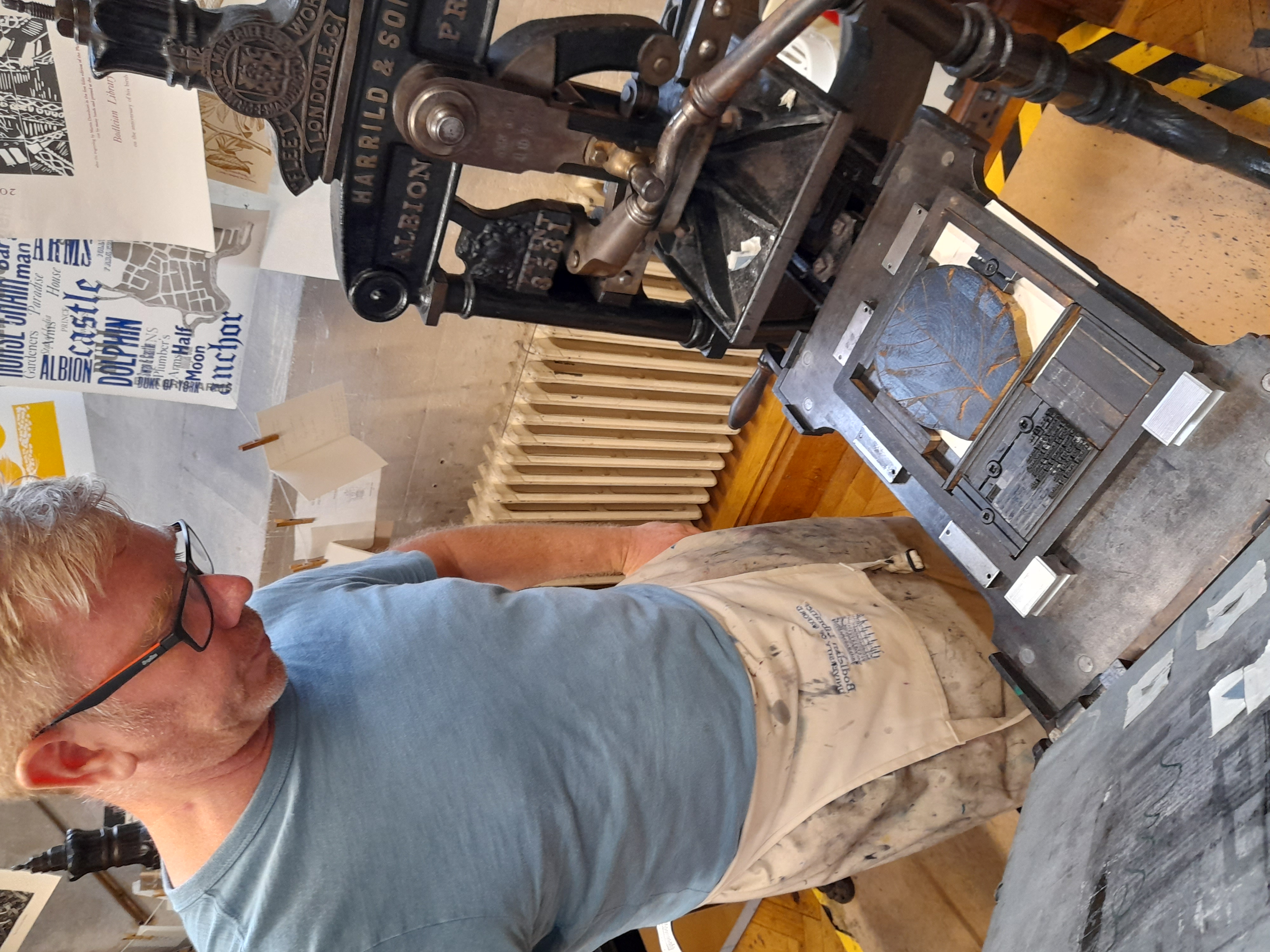
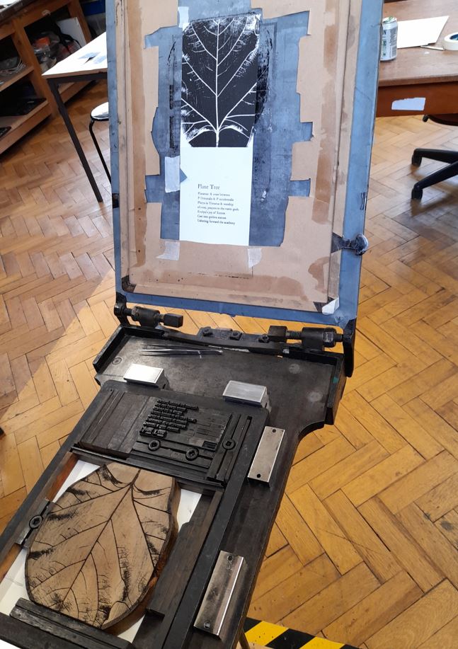
by Elena Trowsdale, an English Literature and Language Finalist at Brasenose College on placement in Special Collections. Elena has been identifying some examples of ‘nature prints’ in Bodleian collections.
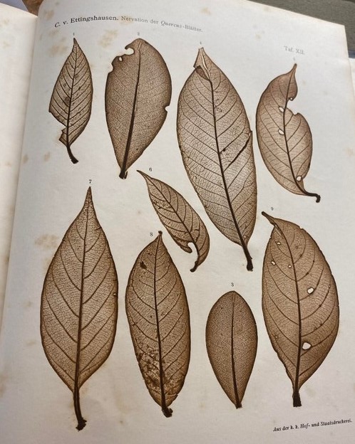
Fig 1: From Constantin von Ettingshausen’s ‘Über die Nervation der Blatter Bei der Gattung Quercus’ from volume two of Denkschriften der Mathematisch-naturwissenschaftlichen classe der Kaiserlichen akademie der wissenschaften..
Beginning 25th July 2021, the Oxford Botanic Garden has been celebrating its 400th anniversary. The Bodleian Libraries have been collaborating with the Garden to identify historical books containing depictions of scientific specimens. Recently I spent a week in the Weston Library for Special Collections, investigating books which feature specimens depicted using a technique called ‘nature printing’. Related to this topic, there will be an event during summer 2022 entitled ‘Capturing Nature’, created by designer and printmaker Pia Östlund.
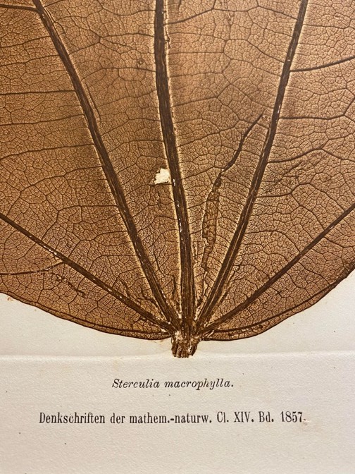
Nature printing, otherwise known as Naturselbstdruck [Nature’s self-printing], is an intriguing form of printing which is often breathtakingly lifelike. Using this method, prints are taken directly from the natural object itself such as a leaf, flower or even occasionally a bat. Alois Auer’s specific technique of nature printing, depicted in The Discovery of the Natural Printing Process: an Invention … (1853), involves impressing the natural object into a lead plate. Making a printable surface was done by electroplating the impression to create a copper plate, which was used to create the print on paper. This is an intaglio technique, where the ink rests in the shallow grooves of the lead plate rather than on the higher surfaces. However, in my investigations I have chosen to also study nature prints which fit the definition more loosely. Out of the examples I have found, some are taken from directly applying ink to the natural item, some may incorporate photographic printing techniques and others are facsimiles of nature prints, made from woodcuts which used the original nature print as their primary reference. Some prints are hand coloured, others use coloured ink, and some are drawn upon after they have been printed.
In my investigations, I have found nature printed items dating back to Johann Hieronymus Knipof’s work in 1757. Some are more intricate than others, partially because some have used wet subjects and some dry, dry subjects tending to be easier to print accurately. My personal favourite is the work of Constantin von Ettingshausen. A compilation of his works in three volumes is housed in the Radcliffe Science Library. I ordered this to the Weston Library reading room and examined it closely, finding extremely intricate leaf prints which detailed their structure and veins perfectly.
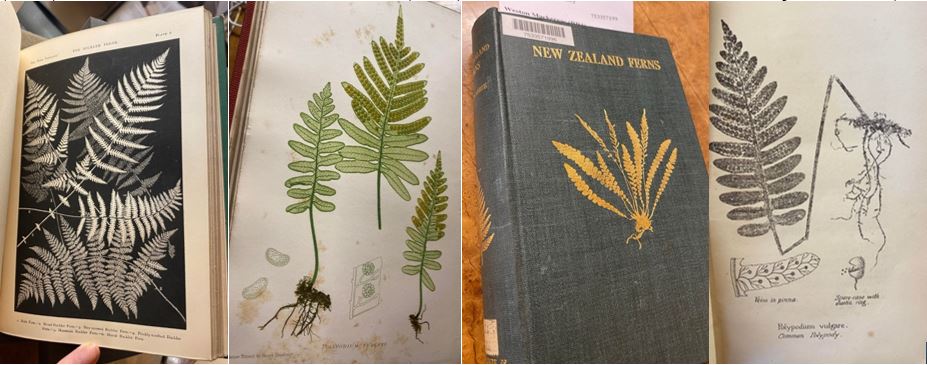
To compare different ways in which nature printing have been used and adapted, Francis Heath’s Fern Paradise (1875) can be compared with Thomas Moore’s Nature-Printed British Ferns (1859), H.B. Dobbie’s New Zealand Ferns (1930) and Peter Hutchinson’s Ferns of Sidmouth (1862).
Figure 2: Left to Right, plate 6 from Francis George Heath’s Illustrated Edition of The Fern Paradise (1875), print from Thomas Moore’s The Octavo Nature-Printed British Ferns (1859), cover of H.B. Dobbie’s New Zealand Ferns (1930) and first print from Peter Orlando Hutchinson’s The Ferns of Sidmouth (1862).
All of these books depict ferns using different, contrasting techniques- all of which fall under the blanket term of nature print. In his work, Heath discusses how his plates of ferns are originally taken from nature prints made through applying a fern to a plate of ink, which is why they appear like negative images of the blank space the fern creates. Then, Heath sent his nature prints to a printing house where they were turned to woodcuts. Moore’s ferns are seemingly direct nature prints, made using different coloured inks applied to the plate the ferns were imprinted onto, then with some additions such as the yellow seeds. The most intriguing aspect of Dobbie’s fern study is its cover, which has a gold embossed fern pressed into its binding. This fern appears exactly like a nature print, meaning a nature print was probably the reference image used by the embosser. Hutchinson’s fern is less detailed than the others. It was made by lithography and the fern was likely not dried out. Each of these techniques creates a different visual way to understand these objects, useful to scientists at the time as well as being aesthetically and historically meaningful to current researchers.
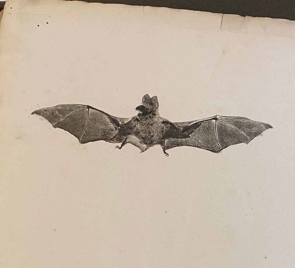
Fig 3: The final page of Henry Smith’s Specimens of nature printing from unprepared plants (1857).
Then, perhaps the most shocking example of nature printing I have found is Henry Smith’s Specimens of nature printing from unprepared plants (1857). This book’s final page is a nature print of a bat’s wingspan. This bat was obviously compressed it could be printed but remains incredibly detailed. From looking online, I have found that Smith’s other works contain other nature prints of animals, including multiple snakes. I find this way of preserving the likeness of animals to be slightly unsettling, yet extremely beautiful and evocative.
During my time researching nature printing in the Bodleian collections, I was granted the privilege of spending a morning at the Bodleian bibliographic press with Richard Lawrence. We decided to experiment with nature printing techniques and printed a variety of items including a leaf and some insects. We used the classic method of imprinting a natural object onto a piece of soft lead, covering this with ink, wiping away the excess, then printing this lead plate.. The Natural History Museum of Oxford were kind enough to provide me with some waste specimens to be used as printing subjects.
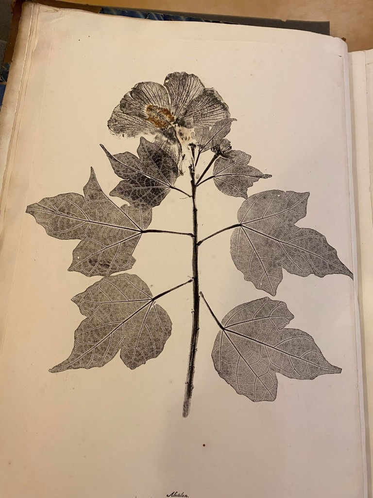
Fig 4: Mine and Richard’s nature print of a leaf. From right to left: subject, lead plate, initial print, final print.
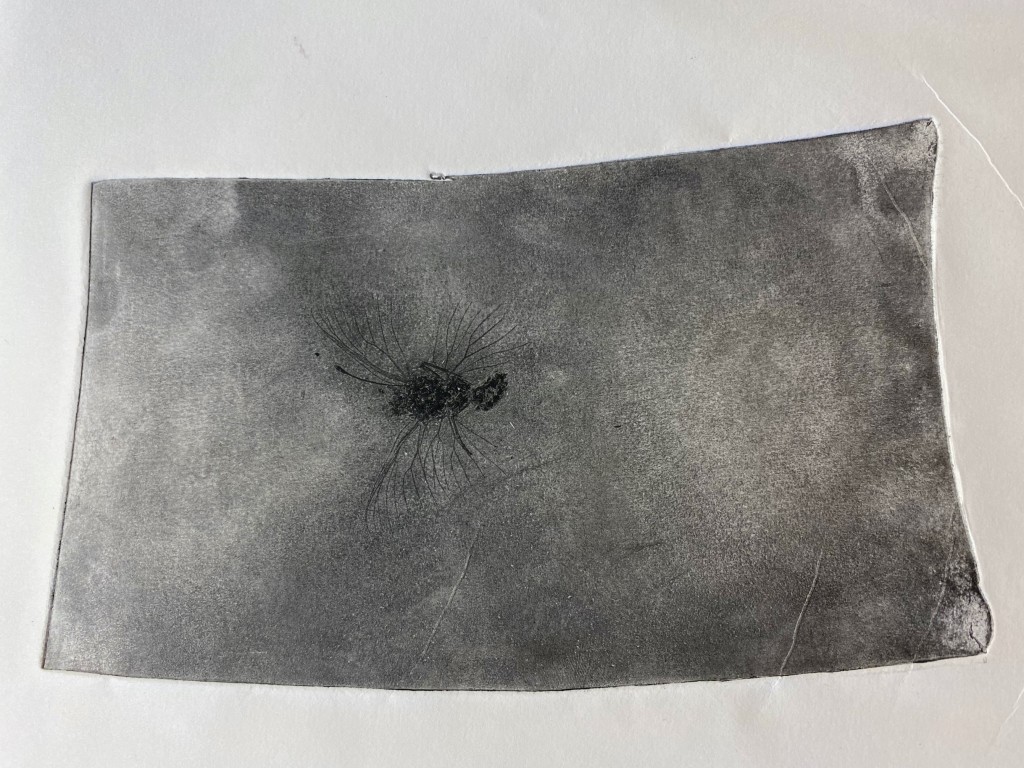
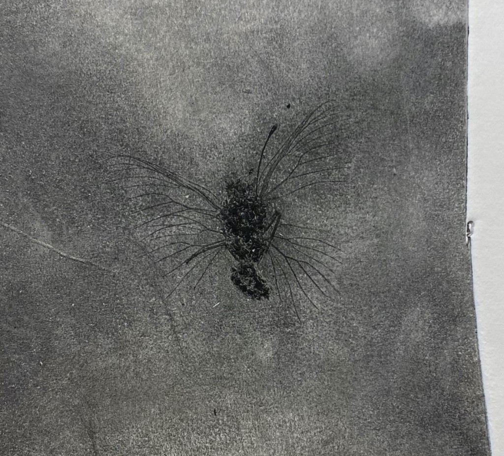
We quickly realised that dried leaves were much easier to print than insects. The printing objects needed to be flat and dry to avoid distortion within the press. However, we did manage to make some semi-successful butterfly prints.
Fig 5: Mine and Richard’s Butterfly plate.
This was an incredible process to have the chance to attempt. I now have a newfound respect for the nature printers of the past as this form of printing requires a huge amount of precision and technical skill. On 18 July 2022 visitors will be able to see this fascinating printing method demonstrated as part of the Oxford Botanic Garden programme.
All of the items I have referenced are accessible to order on SOLO and I will include the links to their web pages below. While I hoped to find more examples of nature printing across the many Bodleian collections, I am satisfied with the dozen or so that I managed to successfully locate. However, it is likely that many more examples exist in the collections but have not yet been located or catalogued. Hopefully, in the future, more of these beautiful items will be accessible for further study.
Fig 6: Page from Henry Smith’s Specimens of nature printing from unprepared plants (1857).
Thanks to Matthew Zucker, for the view of a list of his own collection of nature-printed books, and for advice on the history of nature printing.
Hanquart, Nicole and Régine Fabri, ‘L’impression naturelle : une technique originale au service de l’illustration botanique. L’exemple des Chênes de l’Amérique septentrionale en Belgique du Belge Julien Houba (1843-1926)’, In Monte Artium (Journal of the Royal Library of Belgium), vol. 7 (2014), pp. 57-78. <https://www.brepolsonline.net/doi/10.1484/J.IMA.5.103285>
In this blogpost, artist Hermeet Gill shares the inspiration behind her work made in response to the major Bodleian exhibition, Melancholy: A New Anatomy. The work is on view during February 2022 at the Weston Library, Oxford
Printing the segments of a ‘star chart’ for ‘accident of birth | stars the cause,’ by Hermeet Gill, at the Bodleian Bibliographical Press workshop
This artwork, created in response to the exhibition Melancholy: A New Anatomy, is inspired by Robert Burton’s interest in astrology. In The Anatomy of Melancholy, Burton writes that “a physician without the knowledge of stars can neither understand the cause or cure of any disease”. Today, astrology is held in opposition to science and evidence-based approaches, nonetheless, it intrigues me – this system built upon scientific observation, geometry, and mathematics, to make sense of human lives.
Astrology claims to predict a person’s character and life path based on the position and alignment of planets at the time and place of their birth. However, the exact time and place of our birth also determines who we are born to and our wider circumstances, earthly constellations of contexts which also predict much about our experience of life, including our mental health. Predict, but not determine.
Three star charts, one actual and two hypothetical, reflect a family history in which three previous generations (in the UK, Uganda and India) in turn designated a different place for my birth. Each unrealised life path left ink-smudge imprints on my life experience: in my genetic makeup, in the consequences of forced migration events, and in cultural legacies.
The tactile qualities of the process of letterpress printmaking inspired this work. Many thanks to Richard Lawrence, Superintendent of the Bodleian Bibliographical Press, where the piece was created.
Hermeet Gill is an Oxford-based artist, inspired by ideas, systems and data and how these can be structured and combined. She has recently completed commissions for the University of Oxford’s Wytham Woods, Arts at the Old Fire Station and Oxford’s Library of Things. Originally trained in engineering, she had a career advising organisations, including on innovation and has worked with the Science Museum, London and TED. Hermeet has been printing at the Bodleian Bibliographical Press since 2016.
Hilary Term, Fridays, 2:15 pm Registration required:https://forms.office.com/r/FSXrV1W98u
YOU MUST BE REGISTERED 24 HOURS BEFORE THE SEMINAR TO RECEIVE A LINK TO ATTEND ONLINE
In-person seminars, if offered, will meet in the Lecture Theatre, Weston Library.
21 Jan. (Week 1) [ONLINE ONLY] Mercedes García-Arenal (Madrid, CCHS-CSIC), ‘The European Quran: the role of the Muslim Holy Book in writing European cultural history’
28 Jan. (Week 2) [ONLINE ONLY] Renae Satterley (London, Middle Temple), ‘On Robert Ashley (1565-1641)’s use of collections in Oxford in the 17th century’
4 Feb. (Week 3) [ONLINE ONLY] Laura Cleaver (London, UCL), ‘Henry White (1822-1900): Collector of Second-Rate Manuscripts?’
11 Feb. (Week 4) [ONLINE ONLY] Riccardo Olocco (Bolzano), ‘The trade in type in Venice in the early decades of printing’
18 Feb. (Week 5) [ONLINE ONLY] Brian Cummings (York), ‘Bibliophobia’
25 Feb. (Week 6) Katarzyna Kapitan, ‘The Virtual Library of Thormodus Torfæus, reconstructed from Danish and Icelandic collections’
4 Mar. (Week 7) [IN PERSON ONLY] Lisa Barber, ‘The Goldsmiths’ Register and other record books of various London Livery Companies’
11 Mar. (Week 8) Alexandra Franklin and Andrew Honey, ‘Bodleian Materials for the teaching of Book History’
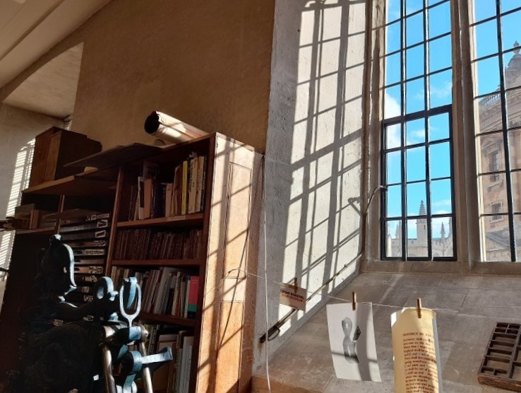
The Bodleian Libraries are home to a letterpress workshop for teaching and experiments, and a place for drop-in printing throughout the year at the printing press in the public foyer of the Weston Library. These activities are integrated with teaching at the University of Oxford, outreach to higher education, schools, and the public, and with the library’s continuing interest in creativity in the book arts.
Art
Ana Paula Cordeiro (left) and Merve Emre in conversation