We are pleased to announce that David Armes will be Printer in Residence at the Bodleian Bibliographical Press for one month during the coming academic year 2019-20.
David Armes is a visual artist working with print, language and geography. His work is frequently site-specific and considers how sense and experience of place can be represented, with source material including automatic writing, anonymous conversations and oral history. He works primarily with letterpress printing on paper and the final forms can vary in shape and size from large scroll installations to broadside prints to artists’ books and chapbooks. Through using what was once an industrial print process, he is interested in where the multiple meets the unique, where the ephemeral meets the archival. Recent residencies have been at Zygote Press fine art print studio (Cleveland, USA; 2018), Wells Book Arts Center (New York, USA; 2017), BBC Radio Lancashire (Blackburn, UK; 2017) and Huddersfield Art Gallery (West Yorkshire, UK; 2016)
The Printer in Residence programme draws together community and University members with an interest in printing and the book arts, to use the Bibliographical Press workshop at the Bodleian Library. During the residency in October-November 2019, David Armes will work on a new iteration of his ‘text landscape’ series, present a lecture and lead a public workshop, to be advertised on the Bodleian Libraries website.
The residency programme is supported by a private donation to the Bibliographical Press.
The 2017-18 Colin Franklin Prize for book-collecting has been awarded to Ekaterina Shatalova (Keble College), for her collection of works by and about Edward Lear (1812-1888), the poet and illustrator famous for limericks in A Book of Nonsense, and for poems recounting the nautical adventures of The Owl and the Pussycat and the Jumblies (‘who went to sea in a sieve’). Writing about her collection, Shatalova recalls first encountering the nonsense poetry of Lear and other English writers in a Russian translation. Her research at the University of Oxford is on the subject of nonsense poetry, and the special challenges of translating the mixture of verbal and visual forms in this genre. As part of the Prize, Shatalova has consulted with librarians on the purchase of a book for the Bodleian’s Rare Books collection. The next competition for the Colin Franklin Prize will be announced in October, 2018.
About the Colin Franklin Prize: The prize is offered in honour of Colin Franklin, the distinguished author, book collector and bookseller who has over many decades encouraged numerous young book collectors at the University. It is funded by Anthony Davis. The prize follows the tradition of similar prizes awarded at Cambridge and London and at universities in the United States and Canada. It is intended to encourage book collecting by undergraduates and graduate students of the University by recognising a collection formed by a student at the university. The prize is announced each year in October. For information see: www.bodleian.ox.ac.uk/csb/prizes
This year’s Lyell Lectures, given by David Pearson, explore the individual ownership of books at a time when libraries like the Bodleian were less established, and access to the written word depended more significantly on private libraries. Ownership of books grew steadily through the seventeenth century, in the country as well as the city, across all sectors of society. How big were people’s libraries then, what did they contain, and why did they own them? In his lectures, David Pearson explores these themes not only for academics and professional people, but also for women as well as men, for farmers as well as doctors.
Here is a selection of books now in Bodleian collections, but formerly owned by individuals in the 17th century, chosen by Pearson to illustrate points in his lectures.
Different approaches
We have a very different set of values today around which texts are interesting, or important, and we have a respect for the preservation of original evidence which was not shared by earlier generations. Nowadays, we would treat a 1477 imprint presented to Archbishop Thomas Rotherham (1423-1500) with considerable respect; when it arrived in the Bodleian in the 17th century as part of Selden’s library, it was bundled up with a group of later pamphlets, put into a workaday binding, and cropped by the binder so that Rotherham’s arms are partly cut away.
BB 19(3) Art. Seld
George Carew’s handsome books
The second lecture explores the theme of Books for use and books for show, asking how far people valued their books as objects for display at least as much as things to read. George Carew, Earl of Totnes (1555-1629) was a soldier and statesman; he had his books strikingly bound in hand-painted and gilded vellum, with his coat of arms, and they are usually clean and crisp internally, with little evidence of having been read. Were they books for use, or for show?
4o M.63.Art.Seld
Anne Clifford’s Arcadia
Although book ownership among women was widespread in the 17th century, property owning laws of the time mean that it is much less well-documented than is the case for men. Lady Anne Clifford (1590-1676) is one exception to that rule, as we have paintings, diaries and surviving books which reflect her private library and active reading. This copy of The Countesse of Pembroke’s Arcadia was Lady Anne’s and has her marginalia, and a note in her hand that she read it in 1651.
J-J Sidney 13
The humbler sort
Not all books, in the 17th century, sat on the shelves of scholars, aristocrats, or professional men; contemporary markings show that books of all kinds, but particularly Bibles, devotional books, histories and practical manuals lived in less educated households. This late 15th-century Latin Bible began its life in clergy use but during the 17th century it passed through several Welsh families (Evans, Jones, Williams) who left all kinds of notes, drawings and scribbles in its margins.
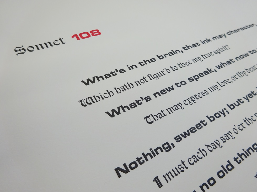
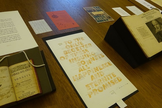
Russell Maret, 2017 printer-in-residence at the Bodleian, led a seminar looking at old and new printings of Shakespeare. Participating were some of the printers who had contributed to the Bodleian’s new collection of Shakespeare’s sonnets printed in 2016. The group discussed questions of fidelity to the early printed texts, artistic interpretation, and personal responses to the poems.
The seminar examined new and old: the earliest edition of Shakespeare’s Sonnets (1609) and the First Folio edition of his plays (1623), and a selection of the 2016-printed sonnets, each presenting one 14-line poem in a different format including:
Number 81: with a delicate decoration of gothic arches
Number 74: resembling an obituary broadside, aptly commemorating the 400th anniversary of Shakespeare’s death
Number 62: alternating lines of black and red giving original and modernized spelling
Number 50: in a wooden Old West wrapper
Number 25: on coloured paper with a calligraphic Spanish translation curving around the printed English
Number 15: on red paper, text set in Perpetua, with lines 6 and 7 picked out in Mila Script, and a flower-seed illustration
Number 3: fully linocut, with the last two lines depicted as a reflection in water
Number 27: in old style; type-written; and in binary code
Numbers 5&6: using a facsimile of the Doves Press type, referencing the Doves Press 1909 edition of the Sonnets
Number 28: several copies on beer-mats in two colours
This last sparked thoughts of adjourning the seminar, but there was some work to do first. The printers’ expertise was put to work at the Bodleian’s Bibliographical Press to make a keepsake of the occasion; lines from King Lear in three colours, with unlocked type interpreting loosening coherence.
Bodleian Libraries MS. Lincoln College Lat. 16, f. 166r
Coline Blaizeau, M.St. in Medieval and Modern Languages, University of Oxford
MS. Lincoln College Lat. 16 is a fourteenth-century English manuscript which has been held at the Bodleian Library since 1892, when it was deposited from Lincoln College, Oxford. It is composed of a commented Apocalypse of St John in Latin (ff. 1-138), and a commented Apocalypse of St John in French which also features numerous illustrations (ff. 139-181).
This Apocalypse in French, generally known as the French Prose Apocalypse so as to distinguish it from the French Verse Apocalypse, survives in around forty manuscripts. Despite its popularity and dissemination in the Middle Ages, this text has been largely overlooked by modern criticism, and fundamental questions remain unanswered concerning its date, author, origin and transmission.
Bodleian Libraries MS. Lincoln College Lat. 16, ff. 154v-155r
This has caught the attention of Dr Daron Burrows, associate professor in medieval French at the University of Oxford, who argues that a critical edition of the French Prose Apocalypse – other than Paul Meyer’s, based mainly on the manuscript BnF 403[i] – is essential to our understanding of this text.[ii]
Through the ‘Apocalypse in Oxford’ project in particular, Burrows proposes to take a close look at MS. Lincoln College Lat. 16 as well as four other manuscripts containing the French Prose Apocalypse: MS. Bodley 401, MS. Douce 180, MS. Selden supra 38, and MS. University College 100.
More information can be found on the website http://apocalypse.bodleian.ox.ac.uk/.
My own work is a contribution to this project. In proposing the diplomatic transcription, edition, and palaeographical commentary of an excerpt from MS. Lincoln College Lat. 16, I hope to advance at my humble level our comprehension of the French Prose Apocalypse.
Bodleian Libraries MS. Lincoln College Lat. 16, f. 170r
Bodleian Libraries MS. Lincoln College Lat. 16, f. 170v
Bodleian Libraries MS. Lincoln College Lat. 16, f. 171r
The chosen excerpt consists of ff. 170r-171r and offers a translation from Latin to French of the passage of the Whore of Babylon as well as its accompanying exegesis.
The writing is clear, as can be seen on the pictures above, yet greater care seems to have been given to the illustrations – a rather typical feature of French Prose Apocalypse manuscripts, which meant that I had to pay particular attention to scribal errors and imperfect correction. Segments of the text are often missing, and the other manuscripts of our corpus had to be used to fill in the gaps.
[i] Paul Meyer, L’Apocalypse en français au XIIIe siècle (Bibl. nat. fr. 403): introduction et texte (Paris: Firmin Didot, 1901).
[ii] Daron Burrows, ‘Vers une nouvelle édition de l’Apocalypse en Prose’, in Anglo-français: philologie et linguistique, ed. by Oreste Floquet and Gabriele Giannini (Paris: Classiques Garnier, 2015), p. 31.
A guest post from Stefan Matter (Freiburg/Schweiz)
Abstract: Early printed books of hours are distinguished by their extensive border schemes, executed in text and images, which have hitherto scarcely been studied. They are, however, integral components of these prayerbooks, and offer insights to their readers into complex interconnections of salvation history. In the following reflections it is argued that the prints can only be understood when all of their component parts are considered together in their interplay. If this is undertaken systematically, they can provide insights into the practice of prayer in their age.
When the Parisian printers of the 1470s started to take Books of Hours to press, these had already been standardised in terms of their prayers and corresponding illustrations. To upgrade the most popular book of lay devotion, printers added cycles of lavish border illustrations – to a degree that previously had only been seen in the most exclusive of manuscripts for princes. The thematic range of these marginal compositions is considerable: from catalogues (e.g. virtues, Sibyls, sacraments) via narrative sequences (e.g. passion, Job, prodigal son) to the adaptation of independent text-image-groups which brought with them their own traditions (e.g. Danse Macabre, 15 signs of the Last Judgement, Biblia Pauperum).
Even though the illustrations have always been regarded as essential for understanding Books of Hours, this specific phenomenon has rarely been described and barely understood, despite the fact that such decorated Books of Hours can provide significant insight into contemporary reading habits and devotional practices. This makes it necessary to take into account all parts of the books equally.[1]
The Book of Hours combines prayer texts which allowed the owners, who in late fifteenth-century were mainly laypeople, to keep regular Hours following the monastic model.[1] The main text is the Little Office of the Blessed Virgin Mary which usually is supplemented by the two Hours of the Cross and the Holy Spirit. These three offices were often noted down exactly as they were said, weaving the offices together by having the single hours follow each other directly. The prayer sections formed thus – i.e. the start of each Hour of the officium parvum as well as one at the start of each of the two small offices – are usually marked by large-scale images which provide a more abstract link to the topic of the texts; thus the images for the Office of the Blessed Virgin Mary show usually either a Life of the Virgin or the Passion.
The printed Books of Hours add to these already complex text-image-relations the border decoration with their own text-image-combination. These usually connect in some way to the main body of the text – the Office of the Blessed Virgin Mary preferably is framed by the Biblia pauperum; the Office of the Dead by scenes from Job or a Danse Macabre –, but rarely do the border cycle match exactly the units of the central text unit. If the primary text ends earlier, the cycle in the border is either repeated or different marginal illustrations are used. In addition, the border cycles are used by printers over the years in different editions which results in a constant shift in the alignment of border cycles and the central text on the page. The intentional or serendipitous juxtapositions on the opened double-spreads encourage contemplation and meditation on the combined elements.
I would like to demonstrate the reading experience by looking at a Book of Hours printed by Philippe Pigouchet in the early 1490s and now held by the Bodleian Library.[2] Its content in a simplified form can be summarised as follows:
Main Body of the Text
Border Decoration (Main Topic)
a1–a8
Printer’s device, Almanac, Anatomical man, Calendarium
Works of the Month and Zodiac
b1–c2
Evangelia
St John’s Passion
Creation
Passion
c3–h3v
Officium parvum BMV (incl. Offices for the Holy Cross and Holy Ghost)
Biblia pauperum
Christ adored with antiphons and responses
h3v–i2r
Seven Penitential Psalms
David
i2r–i7r
Letania
Animals in foliage (also at other places between cycles)
Christ adored with antiphons and responses
i7v–m1v
Vigil for the Dead
Job
Sibyls
mi1v–p4r
Suffragia (m1v–o2r)
Prayers (o2v–p4r, partly French)
Biblia pauperum
p4v
Colophon
I would like to discuss briefly under these aspects three consecutive double-spreads and will open the Bodleian Book of Hours at the end of the first and longest Hour, the Matins for the Hours of BMV (e3v/e4r, figure 1). Here, the Office of BMV is framed by a Biblia pauperum-cycle, which in its main scenes taken from the New Testament. These have a clear Mariological focus, from the birth of Mary to her assumption – the last Hour of the Officium parvum is in the main text also illustrated by the coronation of Mary. The Matins ends on a verso-page whose lower third is empty except for the caption announcing the following Office of the Cross. On the facing page, the depiction of the crucifixion takes up the whole page; the beginning of the invitatorium of the Office of the Cross is placed in a small cartouche within the image. Christ on the cross is thus doubly present on the open spread since the Biblia pauperum-cycle on the margins just reached the point of the nailing to the cross. Main text and borders converge in such a way that the two events of the passion follow each other in correct chronological order and can be viewed simultaneously in one opening. The nailing to the cross is further contextualised within the history of salvation by two typologically related scenes from the Old Testament.[1]
Turning over one page (figure 2), this narrative thread continues since now the border of the verso page (e4v) shows the crucifixion in slightly modified form from the previous large scale depiction since the mourning women under the cross are replaced by Longinus with the lance. This is supported by the creation of Eve (Immisit dominus soporem in adam) and by Moses beating water out of the rock. The main text for this page consists of the full Matins for the Office of the Cross, i.e. the first verse of the hymn for the Hour Patris sapientia veritas divina which talks about arresting Christ. This in turn had been a topic in the margin, including its typological antecedents, a few pages previously: e1v. The Collect for the Officium which is repeated at every hour starts with the words: Iesu christe fili dei vivi pone passionem crucem et mortem tuam inter iudicium tuum et animam meam. It seems remarkable that the complete text of the first Hour of the Office of the Cross coincides precisely with the crucifixion in the Biblia pauperum-inspired marginal decorations. As mentioned above, the shifting process of aligning margins and body of the book would make this quite hard to plan, and due to the scarcity of research on this, I am not yet able to determine whether this coincidence is a common one. In any case, the Bodleian copy achieves a rare harmony of the two text-image-cycles in the body and the margin of the Book of Hours. The following recto-page (e5r) shows a full-page rendering of Pentecost as opening illustration for the Office of the Holy Spirit which then takes up all of the following verso-page (e5v).
Finally, the last of the three double-spreads (figure 3) surrounds the text of the Officium on the one hand by the Descent from the Cross and its typological figures (e5v), on the other hand with the Nativity for the Prime of the Office of the Blessed Virgin Mary (e6r). The Matins of the Office of the Holy Spirit can be vaguely related via the text of the hymn with the Nativity, but another link is much more obvious: Mary and Joseph are clearly looking not towards the Christ child lying on the floor or towards the angel flying between them but more or less out of the picture across the page to the Descent from the Cross. Metal cuts allow a careful positioning of sight lines, and even if this detail should have been taken over from the exemplar, these cross-glances constitute a striking connection between the two image cycles. The Christ child with his halo featuring a cross is framed by Mary and Joseph in the same way as the crucified is flanked by Mary and John. Again, the vertical axis of typological references on the page of the book complements the horizontal line created in the act of reading across the double-spread and its text-image-ensemble.
In this way, nearly every opening of the prayer book offers a complex interplay of texts and images, inside and outside the main body of the pages. This comes on top of the composite nature of the Offices which incorporate psalms, antiphons, and lessons and are anchored through further short texts within the liturgy. A new framework is created which is not simple ‘decoration’ but has to be regarded as crucial part of the print products. To show this in more detail must be the focus of a more in-depth study.
Stefan Matter did his doctorate on the Nazarenes, and was granted his Venia legendi for a study on texts and images about the medieval concept of love (Reden von der Minne, Tübingen 2013). After research fellowships held in Oxford, Tübingen, Bremen, Bern and Wien, he is currently based at the Universität Freiburg/Switzerland and is pursuing a research project on German prayer books.
[1] The two typological scenes (Thubalkain prepares iron tools; Isaias is sawn apart) are only extant in the 50-folio xylographic edition which provided the source for the marginal illustration. On the exemplar cf. Berthold Kress, ‘The Block-book Biblia pauperum as a Source for Printed Borders in France, Germany and England’, in Tributes to Jean Michel Massing: Towards a Global Art History, ed. by Mark Stocker and Philip Lindley (Turnhout, London: Brepols, 2016), 119–31.
[1] Roger S. Wieck, Prayer for the People. The Book of Hours, in A History of Prayer: The First to the Fifteenth Century, hg. von Roy Hammerling, Brill’s Companions to the Christian Tradition, 13 (Leiden/Boston: Brill, 2008), pp. 389–440, provides a survey of content and form.
[2] GW 13073; the Oxford copy (Bod-Inc. H-165) however is not fully identical with the copy of ULB Bonn (Inc. 568, g) listed under the same number; this applies to the page breaks (e.g. f2v ff.) but especially to a number of the border illustrations (e.g. h3v). Cf. also Horae B.M.V., I, No. 8.
[1] Mary Beth Winn has been the main scholar to discuss the border illustrations in various essays, but without discussing how the different elements of printed Books of Hours relate to each other; for a summary cf. her article: ‘Printing and Reading the Book of Hours: Lessons from the Borders’, Bulletin of the John Rylands University Library of Manchester, 81 (1999), 177–204. – and now also the excellent survey by Caroline Zöhl, ‘Die zentrale Rolle der Marginalien und der Reichtum des Bordürendekors im Stundenbuchdruck’, in Horae B.M.V. 365 gedruckte Stundenbücher der Sammlung Bibermühle 1487–1586, ed. by Heribert Tenschert and Ina Nettekoven, 9 vols., Katalog Antiquariat Heribert Tenschert, 50; 75 (Ramsen: H. Tenschert, 2003–2015), IX, 4145–218, and the magisterial discussion of Books of Hours in Cristina Dondi, Printed Books of Hours from Fifteenth-Century Italy. The Texts, the Books, and the Survival of a Long-Lasting Genre, Biblioteca di Bibliografia Italiana, 204 (Florence: Olschki, 2016).
Das besondere Kennzeichen früher gedruckter Stundenbücher sind
umfangreiche Bordürenprogramme in Text und Bild, die bislang noch kaum
untersucht wurden. Sie sind allerdings integraler Bestandteil der Gebetbücher
und bieten den Lesern Einblicke in komplexe heilsgeschichtliche
Zusammenhänge. Die nachfolgenden Überlegungen argumentieren, dass ein
Verständnis der Drucke nur möglich ist, wenn man alle in ihnen enthaltenen
Bestandteile in ihrem Zusammenwirken betrachtet. Tut man dies konsequent,
so vermögen sie Einblicke in die Gebetspraxis ihrer Zeit zu geben.
Als die Pariser Drucker ab den späten 1470er-Jahren daran gingen, mit dem
Stundenbuch das populärste Buch in Laienhand des Mittelalters in gedruckter
Form herauszugeben, reicherten sie die zu dieser Zeit schon stark
konventionalisierte Sammlung von Gebeten und sie begleitenden Bildern mit
Randleisten-Zyklen von einem Umfang an, wie sie in Manuskripten bis dahin
nur die wertvollsten Fürstengebetbücher enthalten hatten. Deren thematisches
Spektrum ist beträchtlich. Es reicht von Katalogen (z.B. Tugenden, Sibyllen,
Sakramente) über erzählende Folgen (z.B. Passion, Hiob, Geschichte vom
verlorenen Sohn) bis hin zur Adaption von eigenständigen, bereits über eine
längere Tradition verfügenden Text-Bild-Ensembles (z.B. Totentanz, 15
Vorzeichen des Jüngsten Gerichts, Biblia pauperum).
Obwohl in der Stundenbuchforschung gerade der Bildschmuck immer schon
im Vordergrund gestanden hat, ist dieses Phänomen bislang noch kaum
beschrieben und erst ansatzweise verstanden.1 Dabei vermögen die solcherart
ausgestatteten Stundenbücher aufschlussreiche Einblicke in die Lese- und
Gebetspraxis ihrer Zeit zu geben, nimmt man sie in all ihren Bestandteilen
genau in den Blick.
Das Stundenbuch vereinigt Gebetstexte, die den Besitzern – im späten 15.
Jahrhundert sind das überwiegend Laien – ein regelmässiges Stundengebet
nach dem Vorbild der Geistlichen erlauben.2 Haupttext ist dabei das kleine
Marienoffizium, welches in aller Regel ergänzt wird von den beiden Tagzeiten
vom Heiligen Kreuz und vom Heiligen Geist. Diese drei Offizien werden häufig
so aufgezeichnet, wie sie auch gebetet wurden, nämlich so, dass die einzelnen
Gebetsstunden direkt aufeinander folgen, die Offizien also ineinander
verwoben werden. Diese dabei entstehenden Texteinschnitte – also der
Beginn einer jeder Hore des Marienoffiziums wie auch je einmalig der Beginn
der beiden kleinen Offizien – werden üblicherweise mit grossformatigen
Bildern markiert, die mit den Themen der Texte in einer eher abstrakten
Beziehung stehen (so zeigen die Bilder zum Marienoffizium üblicherweise
entweder ein Marienleben oder die Passion).
Zu dieser an sich schon komplexen Text-Bild-Relation treten in den gedruckten
Stundenbüchern nun auch noch die Randleisten mit ihren Texten und Bildern.
Diese weisen zwar meist einen Bezug zum Haupttext auf – das Marienoffizium
wird beispielsweise gerne von der Biblia pauperum gerahmt; das Totenamt
von Hiob-Szenen oder einem Totentanz –, kaum einmal allerdings passt der
Umfang eines Randleisten-Zyklus exakt zu dem der dazu passenden Haupttext-
Einheit. Endet der Haupttext früher, wird entweder der Zyklus in den
Randleisten wiederholt oder es werden andere Bordüren verwendet. Die
Randleisten-Zyklen werden überdies von den Druckern über Jahre in
verschiedenen Auflagen verwendet, was dazu führt, dass die Korrelation der
einzelnen Bordüren mit bestimmten Passagen (oder Bildern) des immer wieder
neu umgebrochenen Haupttextes nicht konstant bleibt, ja im Grunde von
Ausgabe zu Ausgabe variiert. Trotzdem ergeben sich immer wieder – gewollt
oder zufällig – Kombinationen von Texten und Bildern auf den
aufgeschlagenen Doppelseiten, die zur Betrachtung Anlass geben, zum
Meditieren einladen.
Ich möchte diese Leseerfahrung anhand eines heute in der Bodleian Library
aufbewahrten Stundenbuches andeuten, welches von Philippe Pigouchet in
den frühen 1490er-Jahren gedruckt worden ist.3 In stark vereinfachter Form
kann dessen Inhalt so zusammengefasst werden.
Ich möchte unter diesem Gesichtspunkt in aller Kürze drei aufeinanderfolgende
Doppelseiten vorstellen und schlage dazu das Oxforder Stundenbuch am Ende
der ersten und längsten Gebetshore auf, der Matutin der Marienzeiten
(e3v/e4r). Das Marienoffizium wird hier von einem Biblia pauperum-Zyklus
gerahmt, der in seinen neutestamentlichen Hauptszenen von der Mariengeburt
bis zur Marienkrönung ebenfalls einen mariologischen Akzent besitzt – auch die
letzte Gebetsstunde des Officium parvum wird mit einer Marienkrönung
bebildert. Die Matutin endet auf einer verso-Seite, deren unteres Drittel bis auf
die Ankündigung des Kreuzoffiziums leer bleibt. Auf der gegenüberliegenden
recto-Seite ist eine ganzseitige Kreuzigungs-Darstellung zu sehen, in einer
kleinen Kartusche im Bildfeld ist der Beginn des Invitatoriums des
Kreuzoffiziums eingetragen. Christus am Kreuz ist auf der aufgeschlagenen
Doppelseite jedoch gleich doppelt dargestellt, denn der Biblia pauperum-
Zyklus in den Randleisten ist hier nämlich auf der verso-Seite gerade bei der
Kreuzannagelung angelangt. Haupttext und Bordüren treffen sich damit
dergestalt, dass diese beiden Passionsereignisse in chronologisch richtiger
Reihenfolge aufeinander folgen und zusammen auf einer Doppelseite zu sehen
sind. Die Kreuzannagelung wird überdies durch zwei alttestamentliche Typen
heilsgeschichtlich kontextualisiert.4
Schlägt man eine Seite um, so werden diese Fäden weitergesponnen, denn
jetzt ist in der Bordüre der verso-Seite (e4v) die Kreuzigung zu sehen (in einer
leicht von der grossformatigen Darstellung abweichenden Form, indem die
Stelle der trauernden Frauen unter dem Kreuz durch Longinus’ Stich mit der
Lanze eingenommen wird), sekundiert von der Erschaffung Evas (Immisit
dominus soporem in adam) und Mose, der Wasser aus dem Felsen schlägt. Im
Haupttext dieser Seite ist die vollständige Matutin des Kreuzoffiziums zu lesen,
also die erste Strophe des Stundenliedes Patris sapientia veritas divina, in
welcher von der Gefangennahme die Rede ist (in den Randleisten dargestellt
und typologisch kontextualisiert einige Seiten weiter vorne: e1v), dazu die in
jeder Gebetsstunde dieses Offiziums wiederholte Kollekte mit den
Anfangsworten: Iesu christe fili dei vivi pone passionem crucem et mortem
tuam inter iudicium tuum et animam meam. Dass der vollständige Text der
ersten Hore des Kreuzoffiziums ausgerechnet mit der Kreuzigungsdarstellung
der Biblia pauperum-Randleisten zusammenfällt, ist unter den angedeuteten
Umständen der Buchherstellung nicht selbstverständlich und durch die
schlechte Erschliessung des Materials vermag ich vorderhand nicht zu sagen,
ob dies häufiger vorkommt – in der vorliegenden Ausgabe jedenfalls greifen an
dieser Stelle die beiden Text-Bild-Zyklen perfekt ineinander. Die recto-Seite
(e5r) zeigt mit der ganzseitigen Darstellung der Pfingstszene das
Eröffnungsbild des Heilig-Geist-Offiziums, welches seinerseits auf der
darauffolgenden verso-Seite (e5v) ebenfalls vollständig Platz findet.
Diese letzte der drei Doppelseiten (Abb. 1) umgibt diesen Offiziums-Text
einerseits mit der Kreuzabnahme und den entsprechenden typologischen
Verweisen (e5v), andererseits mit dem Weihnachtsbild zur Prim des
Marienoffiziums (e6r). Die Matutin des Hl.-Geist-Offiziums lässt sich zwar über
den Hymnentext vage mit der Geburtsszene in Verbindung bringen, viel
deutlicher aber ist eine andere Verbindung: Maria und Joseph schauen in
auffälliger Weise nicht etwa zum vor ihnen auf dem Boden liegenden Kind
oder zum zwischen ihnen schwebenden Engel, sondern gewissermassen nach
links aus dem Bild heraus und damit zur Kreuzabnahme am
gegenüberliegenden Ende der aufgeschlagenen Doppelseite. Die
Blickrichtungen sind in den Metallschnitten dieses Druckes stets sehr sorgfältig
behandelt, und selbst wenn dieses Detail aus einer Vorlage übernommen sein
sollten, stellen die Blicke auf dieser Doppelseite eine sinnfällige Verbindung
zwischen den beiden Bildzyklen her. Das Christuskind mit dem auf den Tod am
Kreuz verweisenden Kreuznimbus wird von Maria und Joseph überdies in
derselben Weise betend gerahmt, wie der Gekreuzigte von Maria und
Johannes. Auch hier wieder ergänzt dazu die (auf der Buchseite) vertikale
Achse der typologischen Bezüge die in lesender Weise horizontal und über die
Schrift vermittelte Verbindung von Text und Bild der Doppelseite.
Es ergibt sich auf diese Weise auf beinahe jeder Doppelseite ein komplexes
Zusammenwirken von Texten und von Bildern sowohl innerhalb wie ausserhalb
des Schriftspiegels. Die in sich schon kompositen Offizien – im Kern bestehend
aus Psalmen und Lektionen, welche mit Antiphonen, Responsorien und
weiteren Kurztexten liturgisch kontextualisiert werden – erhalten auf diese
Weise eine zusätzliche Rahmung, die nicht als ‘Buchschmuck’ marginalisiert,
sondern als zentraler Bestandteil der Drucke angesehen werden sollten. Dies
im Detail darzustellen muss einer ausführlicheren Untersuchung vorbehalten
bleiben.
Stefan Matter wurde mit einer Arbeit über die Nazarener promoviert und hat sich mit einer Untersuchung über Minnereden und Minnebilder des Mittelalters habilitiert (Reden von der Minne, Tübingen 2013). Er ist nach Forschungsaufenthalten in Oxford, Tübingen, Bremen, Bern und Wien derzeit Assistent am Lehrstuhl für Germanistische Mediävistik der Universität Freiburg/Schweiz und forscht zur deutschsprachigen Gebetbuchliteratur.
1 Bislang hat sich vor allem Mary Beth Winn in verschiedenen Aufsätzen mit
den Randleisten beschäftigt, ohne sich allerdings die Frage zu stellen, wie
diese verschiedenen Inhalte der gedruckten Stundenbücher auf einander
Bezug nehmen; vgl. den zusammenfassenden Artikel: ‘Printing and
Reading the Book of Hours: Lessons from the Borders’, Bulletin of the John
Rylands University Library of Manchester, 81 (1999), 177–204. – Vgl. jetzt
den vorzüglichen Überblick von Caroline Zöhl, ‘Die zentrale Rolle der
Marginalien und der Reichtum des Bordürendekors im Stundenbuchdruck’,
in Horae B.M.V. 365 gedruckte Stundenbücher der Sammlung Bibermühle
1487–1586, hg. von Heribert Tenschert und Ina Nettekoven, 9 Bde.,
Katalog Antiquariat Heribert Tenschert, 50; 75 (Ramsen: H. Tenschert,
2003–2015), IX, 4145–218.
2 Einen Überblick über Inhalt und Form vermittelt etwa Roger S. Wieck,
Prayer for the People. The Book of Hours, in A History of Prayer: The First
to the Fifteenth Century, hg. von Roy Hammerling, Brill’s Companions to
the Christian Tradition, 13 (Leiden/Boston: Brill, 2008), S. 389–440.
3 GW 13073; allerdings ist das Oxforder Exemplar (Bod-Inc H-165) nicht
gänzlich identisch mit dem unter der selben Nummer geführten in der ULB
Bonn (Inc. 568, g), und zwar sowohl was den Umbruch betrifft (z.B. auf f2v
ff.) als auch insbesondere, was die Randleisten betrifft (an zahlreichen
Stellen, z.B. h3v). Vgl. auch Horae B.M.V., I, Nr. 8.
4 Die beiden Typen (Thubalkain fertigt Eisenzeug an; Jesaias wird lebendig
zersägt) sind der 50-bll. xylographischen Ausgabe eigen, nach der also die
Randleisten gearbeitet sind. Zur Vorlagenwahl vgl. Berthold Kress, ‘The
Block-book Biblia pauperum as a Source für Printed Borders in France,
Germany and England’, in Tributes to Jean Michel Massing: Towards a
Global Art History, ed. by Mark Stocker and Philip Lindley (Turnhout,
London: Brepols, 2016), 119–31.
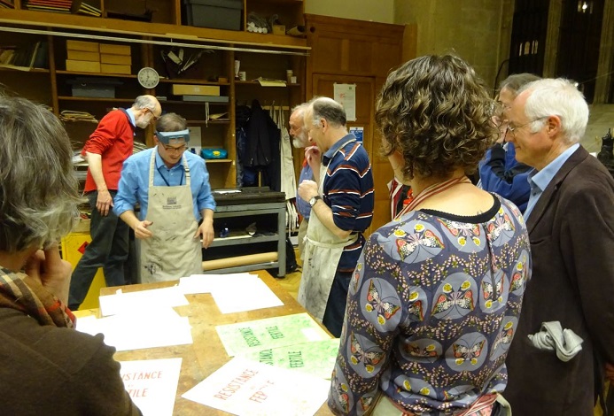
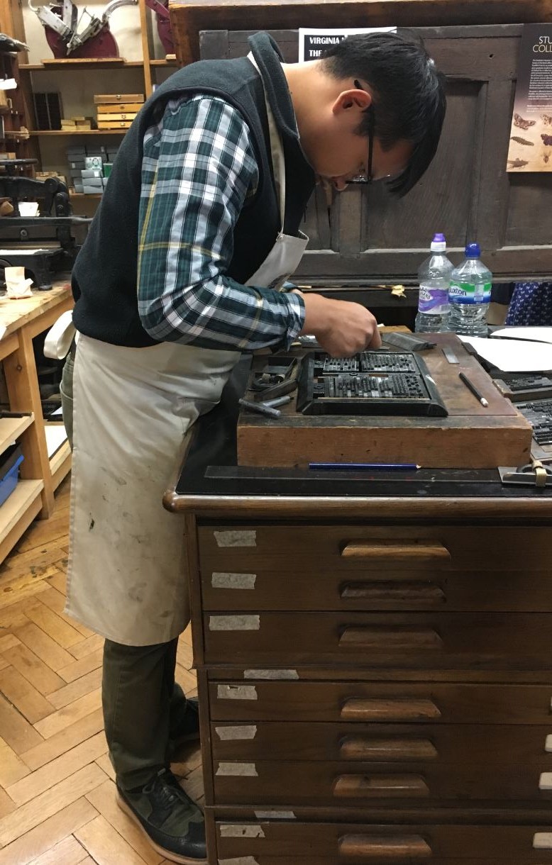
Participants in the print-a-thon, with Dr Nicola Wilson (right)
Proofreading …
Corrections
One sheet finished
from Dennis Duncan:
Early in 1917, Virginia and Leonard Woolf walked into the Excelsior Printing Supply Co on Farringdon Road and bought themselves a printing press. The press, a small handpress which they installed on a table in their dining room in Richmond, came with instructions and some cases of type. The whole lot came to £19.5s.5d. That May they began work on their first publication, Two Stories (one by Leonard, one by Virginia), with Virginia setting the type and Leonard operating the press. Twenty-one years later, when Virginia finally withdrew from the company, the Hogarth Press had published 440 titles, including work by T. S. Eliot, E. M. Forster, Katherine Mansfield, Vita Sackville-West, Freud, and H. G. Wells, not to mention much of Virginia’s own most significant writing.
“Books are not turned out of moulds like bricks. Books are made of tiny little words, which a writer shapes, often with great difficulty, into sentences of different lengths, placing one on top of another, never taking his eye off them, sometimes building them quite quickly, at other times knocking them down in despair, and beginning all over again.”
-Virginia Woolf, “How Should One Read a Book?” (1925)
To celebrate the centenary of the Hogarth Press, then, it seemed like a good idea to think about the role that printing played in shaping Woolf’s writing. And since the Bodleian Bibliographical Press is equipped not only with the kind of handpress the Woolfs used for their first publications, but also with the same typeface, we had an ideal opportunity to put ourselves into Virginia’s shoes for a day.
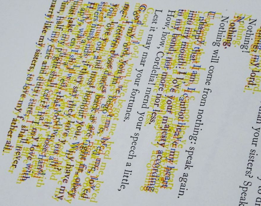
One of the earliest Hogarth publications was Hope Mirrlees’s Paris: A Poem, dated 1919 (or rather 1916: Virginia placed the final ‘9’ upside-down and didn’t catch the error until after printing, correcting it in pen in all copies). It is a wonderful and unjustly overlooked piece of modernism, and with its wild typography – different alignments, passages in caps and italics, a block of music inserted into the text – posed a considerable challenge to Virginia’s recently-acquired skills as a typesetter. Just the thing then for a public print-a-thon.Working in half-hour shifts, our team of printers – from absolute beginners to advanced setters – set out to print as much of Mirrlees’s poem as we could in a single day. Breaking for lectures by Dr Nicola Wilson (Reading) and Dame Hermione Lee (Oxford) about the Woolfs and the Hogarth Press, we ended up with a respectable eight pages, about a third of the poem.
“I’m the only woman in England free to write what I like. The others must be thinking of series’ & editors”
(Diary of Virginia Woolf, Vol. 3, September 1925)
“So,” I asked one of our volunteers, “now that you’ve set a page of type, how do you think the experience of being a printer might have influenced Virginia as a writer?”
“Write fewer words!”
A useful and hard-won insight.
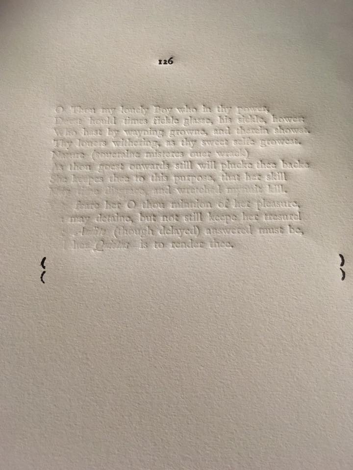
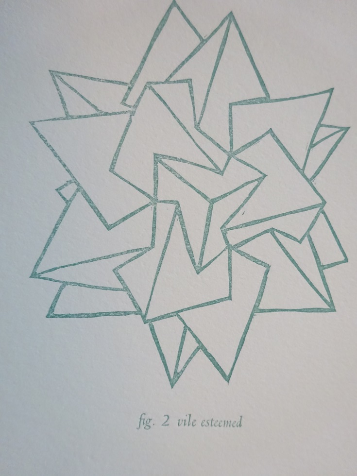
Vile or vile esteemed? Look hard for the ‘missing’ lines in Sonnet 126. More to come on these sonnets, with notes of their making, in a later blogpost.
Sonnet 121, Rebecca Elliot, Meekling Press, Chicago
Sonnet 121, fig. 1: vile. Rebecca Elliot, Meekling Press, Chicago
Sonnet 121, fig. 2: vile esteemed. Rebecca Elliot, Meekling Press, Chicago
Sonnet 122, Kirilka Stavreva, Cornell
Sonnet 122 [colophon], Kirilka Stavreva, Cornell
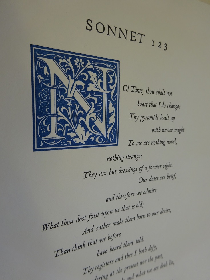
Sonnet 123, Book Arts League/ Gregory Robl, Colorado
Sonnet 124, IMPRIM17/Les petites allées Nathalie Rodriguez & Michel Bon, Rochefort-sur-mer, France
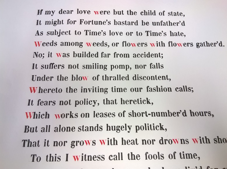
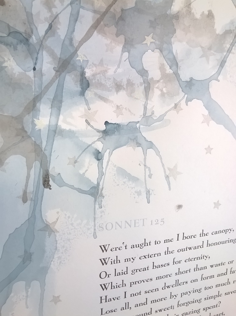
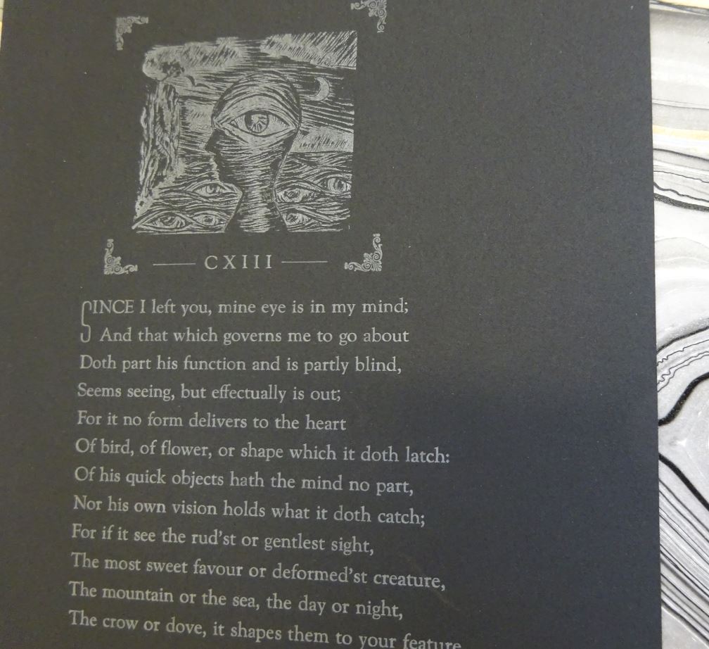
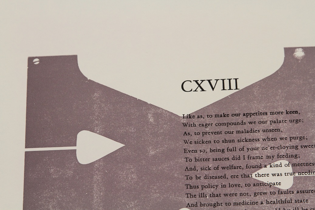
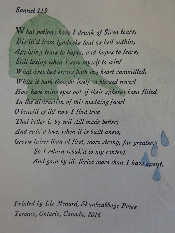
In 2016, the 400 year after William Shakespeare’s death, the Bodleian Library asked printers around the world to print his sonnets afresh. These are the results.

 Different approaches
 George Carew’s handsome books
 Anne Clifford’s Arcadia
 The humbler sort


![Sonnet 122 [colophon], Kirilka Stavreva, Cornell](http://blogs.bodleian.ox.ac.uk/theconveyor/wp-content/uploads/sites/113/2017/03/Sonnet-122-colophon.jpg)