Woodblock, acquired for the Bodleian Bibliographical Press in 2024
Andrew Honey (Bodleian Libraries and English Faculty)
An unexpected recent discovery on Etsy (of all places) of a wood-block which I bought for the Bodleian Bibliographical Press throws new light on items in the Bodleian’s collections and their place in the study of the history of printing. The block is a facsimile of the letter K, a 19th-century copy of a letter from a woodcut alphabet dating from 1464. It was used in 1839, in the printing of A Treatise on Wood Engraving, historical and practical. With upwards of three hundred illustrations, engraved on wood, by John Jackson published by Charles Knight.
The Treatise explains the model for this facsimile block.
“There is in the Print Room of the British Museum a small volume of wood-cuts, which has not hitherto been described by any bibliographer […] it consists of an alphabet of large capital letters, formed of figures arranged in various attitudes.”
Our block – K – has four figures. A man is kneeling, holding a ribbon on which are written the words ‘mon ♥ aues’ (with my heart) while presenting a ring to a standing woman. These two figures form the stem of the letter, while two men fly out to form the arm and leg of the K. The description of the printed image in the Treatise states “the above is a fac-simile of the cut referred to, the letter K, of the size of the original.”
The facsimile ‘K’ woodblock and the illustration it printed, in the 1839 book ‘A treatise of wood-engraving’; Bodleian Library, Jessel d.58 , p.135.
The original is a letter K from a Netherlandish woodcut grotesque alphabet of 1464. There are now two surviving copies of that printed alphabet at the British Museum, but only one of these was known in 1839 when the Treatise of Wood-engraving was published.
The Treatise describes both the unusual printing method and the water-based ink of the original alphabet print. It relates these to the printing of blockbooks, a subject of fascination to printing historians because these printed texts from carved blocks, without moveable type.
“There is only one cut on each leaf, the back being left blank as in most block-books, and the impressions have been taken by means of friction. The paper at the back of each cut has a shining appearance when held towards the light [… and] the ink is merely a distemper or water-colour, which will partly wash out by the application of hot water, and its colour is a kind of sepia.”
The Treatise reproduced three letters from the alphabet – K, L & Z – in brown ink, the only coloured ink in the book, explaining: “the colour of the above […] will give the reader, who had not had an opportunity of examining the originals, some idea of the colour in which […] are printed; which in all of them is a kind of sepia”.
Our information about the block might have ended there had the real author of the Treatise not fallen out with both John Jackson the wood-engraver and Charles Knight the publisher. William Andrew Chatto (1799–1864) was clearly so angered by the absence of his name on the title page that he responded with a densely written, privately printed, 36-page Third Preface! As well as being extremely rude about Jackson – “an illiterate, ignorant man”, Chatto gives the names of the real contributors:
“of the numerous copies of old wood-cuts contained in the work, not a single one has been either drawn or engraved by Mr. John Jackson [… Jackson and Knight had supressed] the name of Mr. F[rederick]. W[illiam]. Fairholt, the artist by whom all ‘the elaborate fac-similes’ of old wood-cuts contained in the work – except two – were copied and drawn on the block. The best of the copies of old wood-cuts, […] were engraved by a young man named Stephen Rimbault, at that time a pupil of Mr. Jackson’s”.
He also notes that the size of the book as originally planned meant that the reproduction is not an exact facsimile.
“It is in consequence of the work having been originally intended to be printed in demy octavo, that most of the cuts now appear so small when compared with the size of the page. It is from this cause that the so-called fac-similes for the […] Alphabet […] want the outer border-line at the sides”.
Bodleian Library, MS. Ashmole 1504, fol. 45v.
If the grotesque alphabet stirred interest when it was rediscovered in or before 1819 it appears to have stirred even greater interest when it was first produced in the 15th century. There are near contemporary woodcut [now at the Kunstmuseum Basle, Inv. X.1881-1882] and copper engraved versions, as well as our kneeling man and woman adapted as a stand-alone letter ‘I’ in a German manuscript of 1467 and drawn copies in the Nuremberg chronicle now at the Newberry Library. The interest was not short lived and the Bodleian has a finely painted copy of A, B, C & D dating from c.1520-30 in MS. Ashmole 1504, described in a 1845 catalogue as ‘Book of patterns of an illuminator of MSS’. This wasn’t the only English interest: the ‘S’ was adapted and used as an initial by the London printer John Rastell in 1530 and continuing interest is witnessed by two further sixteenth-century manuscript copies; a complete version as part of the Macclesfield Alphabet Book (British Library, Additional MS 88887) and a partial version from the 1540s-1560s now at the National Art Library.
The story will continue ….
Further reading
A Treatise on Wood Engraving, historical and practical. With upwards of three hundred illustrations, engraved on wood, by John Jackson (London, 1839).
William Andrew Chatto, A third preface to “A treatise on wood engraving, historical and practical”: exposing the fallacies contained in the first, restoring the passages suppressed in the second, and containing an account of Mr. John Jackson’s actual share in the composition and illustration of that work (London, 1839)
Campbell Dodgson, Grotesque Alphabet of 1464: Reproduced in facsimile from the original woodcuts in the British Museum (London, 1899).
Collage Comparison poster, detail. Collage Comparison Symposium and Julia Utreras
by Devika
Methods of reading and understanding archives are constantly evolving. The question of ‘whose voices?’ are heard in archival materials has encouraged attention to gaps and silences. With the project ‘We Are Our History,’ the Bodleian Libraries have found guidance from researchers inside and outside academia on new approaches to archives. The symposium ‘Collage Comparison,’ (September 29-30, 2023, St Anne’s College Oxford and Bodleian Libraries) was devised by the Oxford Comparative Criticism and Translation (OCCT) Research Centre, using collage as a method of bringing archival materials into dialogue with each other. The two-day symposium brought together artists, practitioners, and scholars from a range of disciplines within Oxford and beyond—from English, Modern Languages, and History of Art to Ethnomusicology, Visual Anthropology, and Curatorial Studies.
Organisers Dr Joseph Hankinson, Dr Tinashe Mushakavanhu and Dr Georgia Nasseh explored how collage, conceptually and practically, can provide a new and decolonised rhetoric for understanding translation and archival work.
Understanding Archives Differently with Collage
On the first day, the group was guided in creative collage-making by artist Sofia Yalla. The session led by Yalla explored how professional archives relate to personal archives, with participants being given either a ‘construction’ or a ‘deconstruction’ kit, having to connect and collaborate in these two processes of selecting and building an archive.
The choice of collage as the focal point for exploration was deeply rooted in its historical ties to the African continent and its diaspora. With its delicate balance of appropriation and expropriation, fragmentation, and juxtaposition, collage played a pivotal role in the artistic expressions of writers like Kojo Laing and M. NourbeSe Philip. From the start, the symposium used the potential of collage as a model, with participants’ self-introductions woven into a conversation ‘performed’ by all the participants, rather than standing as separate, individual statements.
On the second day, the symposium worked with an archive held in the Bodleian, the archive of the Anti-Apartheid Movement. In this workshop hosted by Dr Mushakavanahu, it was fascinating to observe the different creations by individuals interacting with the same document. Participants sitting side-by-side and creating collage (from photographs of the archival materials) became a true example of diversity: difference, similarity, and juxtaposition of perspectives in the archives. The need to understand how one set of texts could mean something entirely different for different communities–multiple understandings of the same texts–is an advantage, not a limitation.
Digital Collage and Future Accessibility
Discussion during the symposium explored how academic work informed the aesthetics of collage and considered future accessibility to the created material. The Zine created by attendees as part of their final morning in the Symposium will be available on the Collage Comparison website. The Zine exemplifies many of the ideas discussed above; most importantly, the potential collage holds as a technique towards interacting with archives – digitally or in person.
See Collage Comparison for description of the symposium aims and images of the workshop in progress.
Dr Tinashe Mushakavanhu will lecture on ‘Cut/Copy/Paste: Collage as a form of reading and writing the archive’, on Tuesday 24 January at 1 pm, in the Weston Library, Broad Street, Oxford. Registration required: https://visit.bodleian.ox.ac.uk/waoh-conversations
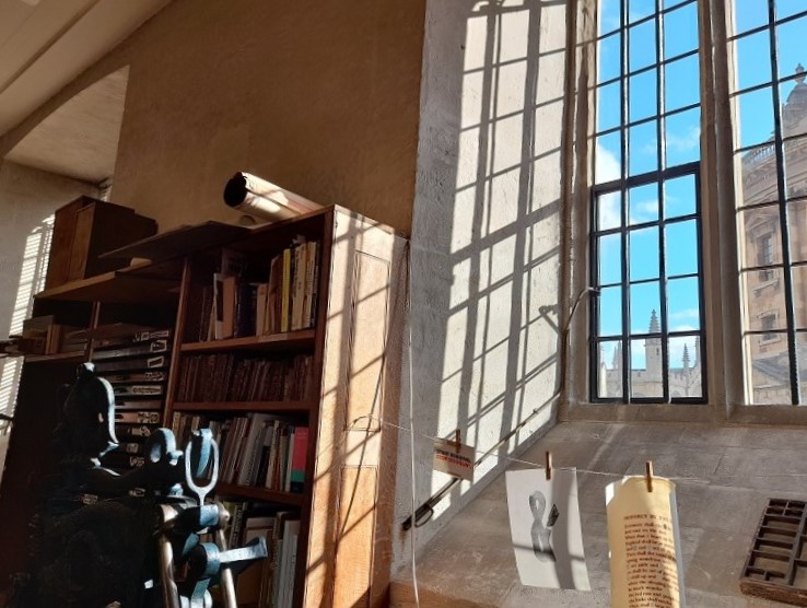
Each autumn, university students and members of the public embark on their type-setting and printing journeys in the Bodleian’s letterpress printing workshop. To inspire novice printers with the great typographical achievements of the past, we have chosen examples of fine and ambitious printing from the Bodleian’s Rare Books collections. The selection also includes some ‘bad’ printing, with missing words and upside-down illustrations, also carefully preserved in the library.
An example of ‘good’ printing is an edition of Caesar’s Gallic war printed in 1471 by Nicholas Jenson. The type designed by Jenson, a French printer based in Venice, has been widely admired ever since. Bodleian Library, Byw. adds. 6
Bodleian Library, Byw. adds. 6
Four centuries after Jenson, type designed for the Doves Press in London in 1899 was based directly on Nicholas Jenson’s work. The Doves Press was a private press producing fine books according to the ideals of the Arts and Crafts movement, a reaction to industrialisation and mass-market printing. Bodleian Library, Arch. C c.3
Bodleian Library, Arch. C c.3
The 1481 Florence edition of Dante’s Comedia is in many ways an example of good printing, although it was an ambitious project that was beset by problems. The unfortunate upside-down orientation of this engraving in the Bodleian copy puts this item in the middle, between examples of ‘good’ and ‘bad’ printing. Bodleian Library, Auct. 2Q 1.11
Bodleian Library, Auct. 2Q 1.11
In the next example, shown below, the editor has evidently demanded that the printers explain why the page on the right contained none of the text of this work, Pastregicus’s On the origins of things (Venice, 1547). The half-page of text explains, in Latin, that there was an error on the part of the printer in dividing up the text before starting to print (‘Calcographi omisit enim dividendo’) and reassures the reader that there is nothing missing (‘operi vero nihil deest’). Bodleian Library, Byw. Q 8.24 Making the text fit the intended number of pages is a skill all printers need to acquire.
Bodleian Library, Byw. Q 8.24
This translation of Aristophanes’ Greek plays into Latin shows an unusually careful correction, a word added in type to the margin. The sentence was meant to read: ‘…the whole of which had previously been Greek,’ with ‘graeca’ to be read where the caret symbol indicates. The book was printed by Angelo Ugoleto in Venice in 1501. Bodleian Library, Byw. J 7.25 Mistakes happen, and corrections can be a sign of care as much as of carelessness.
Bodleian Library, Byw. J 7.25
Below, a sixteenth-century edition of meditational poems on the cross demonstrates creative problem-solving and a real challenge to printers. These shape or puzzle poems were first composed in the 9th century by Rhabanus Maurus and at that time, before the invention of printing with moveable type, they circulated as beautiful and lavish manuscripts, allowing the poems within poems to be easily discerned. Thomas Anshelm decided in 1503 that it would be an excellent thing to reproduce the text in print. Attempting to achieve a similar effect to the manuscripts, he used an unusual combination of metal type and xylographic (wood-carved) letters. The black letters nearest to the images are carved into the woodblock. Bodleian Library, Douce M 114
John Latham, 1921-2006, book artist, Gibson’s Guide.
For students: Tuesday 17 October (Week 2), 1-2 pm, Bahari Seminar Room, Weston Library Art and Ephemera offers an introduction to finding and using artists’ books and ephemera at the Bodleian with Jo Maddocks, Assistant Curator, Rare Books and Annabelle Hondier, Assistant Curator, John Johnson Collection.
Note: your University of Oxford Card or Bodleian Reader Card is essential for access to the Weston Library.
Above is an image of an altered copy of Gibson’s guide to Stephen’s Commentaries on the laws of England (London, 1922), with a substantial shard of glass projecting through the volume, made by book artist John Latham as part of his ‘Skoob’ series. Find it on the Bodleian’s online catalogue, SOLO
Chiara Betti, DPhil student on the Collaborative Doctoral Partnership scheme
Most of us imagine libraries as repositories of books, manuscripts, and paper things. However, library collections are much more diverse than this. For example, the Bodleian Library not only preserves precious manuscripts and printed books but holds prints, paintings, printing plates and blocks, and even embroidery samples. And until the beginning of the twentieth century, you could also find marble sculptures and wax seals in the Bodleian collections.* However, libraries have sometimes struggled with the practicalities and the purpose of preserving objects such as printing surfaces, which are after all the tools used to make books, rather than books themselves. Why should libraries preserve printing plates? How can they be understood and integrated with the rest of the collections?
My doctorate focuses on the unique collection of printing plates amassed by the British antiquary Richard Rawlinson (1690–1755). The antiquary’s life mission was to preserve artefacts, manuscripts, books, and curiosities of historical relevance in the hope that future generations might learn from those objects. Thanks to contemporary accounts, we know that his London house was so crammed with objects of any sorts that he resorted to living in the attic, with the result that he could not even hear visitors knocking at his door!
Rawlinson was an extremely generous collector and often lent items from his collections. Shipping printed reproductions of those items was much more straightforward. While still an undergraduate at St John’s College, Oxford, Rawlinson commissioned his first engraved copper plate from Michael Burghers (c.1647/8–1727), an engraver for the Oxford University Press, in 1710. Rawlinson could reach a much wider audience with impressions from a single copper plate, with fewer risks of never seeing his possessions returned.
In many aspects, Rawlinson’s commitment to reproducing and documenting valuable artworks and manuscripts can be seen as an antecedent of modern digitisation campaigns of museum and library collections. Echoing his mission to “collect and preserve”, the Bodleian Library has embarked on a crucial project that will produce many dozens of super-high-resolution images of some of the library’s treasures. ARCHiOx –Analysis and Recording of Cultural Heritage in Oxford – is a collaborative project that originated from the partnership of the Bodleian Libraries and the Madrid-based Factum Foundation. Since February 2022, the Bodleian’s Imaging Studio has been photographing items selected by the Bodleian curators and staff, starting with the Rawlinson copper plates. For a detailed description of the digitisation process, the reader is invited to refer to John Barrett’s recent blog about ARCHiOx. In brief, John and his team are creating 3D recordings that allow us to study in detail and measure the objects photographed. This imaging technique, which can capture textural details, represents a significant step forward in the study of printing plates and, in general, of the materiality of objects.
Why should we preserve and study printing equipment? Copper printing plates (and woodblocks and lithograph stones) are a repository of information about the manual processes of creation and revision, often not acquirable from the impressions. Three examples here, images of copper plates obtained with the help of John Barrett in the Bodleian Imaging Studio, will elucidate how they help us to learn more about our print collections.
The Invidia plates: two sides to a story
Views of Rome on three small copper plates. From left to right: Anonymous, Tempio Fortuna Verile, 18th century. Engraved copper plate. Rawl.Copperplates g.17; Anonymous, Cerchio di Antonino Callo, 18th century. Engraved copper plate. Rawl.Copperplates g.21; Anonymous, Trofei di Mario, 18th century. Engraved copper plate. Rawl.Copperplates g.19.
The above three small plates giving views of Rome are from a series of twelve copper plates copied after much larger Italian engravings depicting the same subjects. However, these three plates have more in common than one might expect. Their reverse is etched with an old design, indicating that they were formerly part of the same larger copper plate that was then re-used and cut up to make new engravings. The other side of these plates shows a naked female figure with Medusa-like hair, a man dressed in Elizabethan fashion, and another man with a hat standing in front of a building. If we place the three plates next to one another as in a jigsaw, a new image appears. In this case, technology provides a more efficient alternative to manually aligning the plates.
A digital restoration of an etching of Invidia (Envy) from the reverses of Rawl.Copperplates g.17, g.19 and g.21. No extant print made using this side of the plate has yet been identified. The etched lines are extremely shallow, measuring 0.029mm in depth.
The image above was obtained by stitching together the images of the three reverses, and the results are impressive. This image can be used to run online searches to try to identify other impressions of this plate or designs from which it was copied. So far, even with these methods, I have not found any impressions, but my research continues with the hope of solving the mystery of this “puzzle plate”. The absence of impressions might even suggest that the plate was made for decorative purposes rather than printing. It is hoped that further research will shed light on the route of this copper plate from the ‘Invidia’ design to the small views of Roman sites shown above. These tools for printmaking had an industrial history, linking one engraver and publisher to another through the re-use of materials.
The De Passe family: portraying royalty
The Rawlinson collection of plates features many famous engravers from the 17th and 18th centuries, including members of the famous Dutch family De Passe.
Willem De Passe, Portrait of King James I and Henry Prince of Wales, 1621. Engraved copper plate. Rawl.Copperplates c.34.
Copper plates like the portrait of King James I and Henry Prince of Wales have an enormous historical value as not many 17th-century printing plates survive today. The engraved portraits are representations of monarchy attempting to assert its importance. The printing plates let us look behind the techniques and materials that were used to achieve this.
Digitising these objects ensures their preservation while making them accessible to a broader audience. In fact, while studying the objects in the flesh is irreplaceable and essential for the researcher, the reality is that accessing printing plates is not always straightforward. On average, printing plates are much heavier than books, and, unlike most books, their handling requires gloves (to prevent oils from our skin corroding the metal) and much care. High-resolution images enhance the possibilities for the study of these objects.
Studying mezzotint plates: seeing through time
William Faithorne the younger after John Closterman, Portrait of Madame Plowden, 1690–1725. Mezzotint on copper. Rawl.Copperplates c.43.
A favoured method for making print portraits was the mezzotint process. Mezzotint plates rarely survive because of the limited number of impressions they can yield. The few existing examples in the Rawlinson collection confirm that the plates are too worn out to see the details of the images on them. However, the images produced by ARCHiOx slightly improve our chances of studying the way these plates were made. For instance, the plate with the portrait of Madame Plowden is hardly legible with the naked eye because it is extremely worn out and is covered with a thick layer of dirt and residual ink. Thanks to the advanced imaging provided by ARCHiOx, we can decipher the image and see that many details were etched into the plate to enhance the delicate shading provided by the mezzotint process.
Science and Humanities
Those familiar with copper plates will be aware of how challenging it is to study them, even when you have them in your hands. They are often preserved in a poor state, with residual ink in the engraved lines or evident signs of oxidisation which obscures the image. However, once printing plates have undergone a process of cleaning and conservation, the polished copper is highly reflective, making it almost impossible to photograph it. Advanced imaging techniques such as those developed by ARCHiOx allow us to observe and study printing plates in unprecedented detail. Moreover, the presence of ink in the grooves is no longer an issue – if anything, it is an advantage as a perfectly polished surface would not be suitable for this kind of photography.
Copper plates belong to the category of “difficult objects” preserved by libraries and archives. They are not printed material, nor really 2D artworks, and often fall beyond the expertise of the curators and conservators. As a result, printing technologies are sometimes left out of catalogues and digitisation programmes, making it difficult for a researcher to obtain information through the usual library channels. My research and the valuable work of the Bodleian Imaging Studio and the Digital Bodleian will finally close a gap, starting with the Rawlinson copper plates, just one of the collections of printing surfaces held by the Bodleian Libraries.
The results obtained by ARCHiOx will transform this research. The ARCHiOx imaging not only produces high-resolution images but enables researchers to measure details on the objects’ surfaces. For instance, it is possible to measure the distance between engraved lines as well as their depth. Thanks to the generous support of SHARP (Society for the History of Authorship, Reading and Publishing), which allows me to conduct detailed analyses of some of the Rawlinson copper plates, we have been able to compare the accuracy of the ARCHiOx technology to that of optical 3D microscopes. For example, using the Alicona Infinite Focus 3D Profilometer at LIMA (Engineering Science, Oxford), I measured the distance between parallel lines on copper plates engraved by various artists to establish the differences in techniques and skills. The same measurements were taken on the ARCHiOx, and the results are consistent with those of the 3D profilometer.
3D image of a section of Rawl.Copperplates e.65 obtained with the Alicona Infinite Focus 3D Profilometer. The scale on the right shows the depth of the engraved lines.Depth profile of the same section of Rawl.Copperplates e.65 showing the varying depth of the engraved lines.
The results so far obtained with ARCHiOx and the Engineering Department are promising. They will reshape our understanding and appreciation of print technologies as tools for researching book and art history, the history of collecting and heritage science.
With thanks for his assistance in writing this article:
John Barrett, Bodleian Library’s Senior Photographer and ARCHiOx Technical Lead for the Bodleian.
* Transfer of the seals and seal matrices to the Ashmolean: Bodleian Library, ‘Index to Rawlinson [Monastic] Matrices, [C18]’. Library Records e. 382; Bodleian Library, ‘Transfers to the Ashmolean and Other Institutions (1863)’. Library Records d. 1180. Marbles: https://collections.ashmolean.org/collection/search/per_page/25/offset/25/sort_by/relevance/object/45098 Also see Jeremy Coote, ‘An ‘Unimportant’ Inscription: The Antiquarian and Institutional History of a ‘Muscovite’ Cup in the Rawlinson Bequest of 1755’, The Bodleian Library Record, 30 (nos 1-2 April to October), (2017), pp. 16-40
This blog was prompted by Chiara Betti’s doctoral research on the Rawlinson copper plates. Readers with an interest in Chiara’s research are encouraged to contact her at chiara.betti@postgrad.sas.ac.uk. The research is funded by the AHRC through the Collaborative Doctoral Partnership. See: https://www.glam.ox.ac.uk/early-modern-copper-plates-bodleian-libraries
Students from Yale-NUS selected five items to illuminate an encounter with Shakespeare’s Sonnets
A choice of 5 items following our journey through the collection of sonnets by William Shakespeare (1564-1616) at the Bodleian Library
The dedication in the 1609 edition
Shake-speares Sonnets. Neuer before imprinted.At London : By G. Eld for T[homas]. T[horpe]. and are to be solde by William Aspley. 1609. This was the first edition, while Shakespeare was alive.
First page of the 1609 editionThe 1609 edition showing sonnets 56 through 59, with parts of sonnets 55 and 60.
_________________________________________
The 1640 edition showing part of Sonnet 54, and Sonnet 57 and part of Sonnet 59
Poems, written by W. Shakespeare Printed at London by Tho. Cotes, and are to be to be sold by Iohn Benson, dwelling in St. Dunstans Church-yard. 1640
The editor has added titles to the sonnets. This sets up your expectation of what the poem is about. We noticed that in the first edition the sonnets are just numbered, with no titles.
_________________________________________
Sonnet 57 printed in 2016 by Michael Hurley, Titivilus Press
Sonnet 57 (2016). Michael Hurley, Titivilus Press, Memphis, Tennessee, 2016 Black type with a coloured half border, 27 cm. height. On the verso is a reproduction of the Droeshout portrait of Shakespeare, from the First Folio edition of his plays.
Before we saw the first edition, this is what we thought a Shakespeare book ‘should’ look like, with old-fashioned type and decorative borders.
Sonnet 61 fully linocut by Rosie Fairfax-Cholmeley, Oxford, in 2016
Sonnet 61 (2016). Linocut by Rosie Fairfax-Cholmeley, 2016
This combines image and the text, all printed from linocut. The words of the sonnet are incorporated into a beautiful image.
_________________________________________
Sonnet 110 (2016). Pixel Press, Stoke Newington, London, 2016. A moveable. The words of the dedication and a closed eye are seen at first, but when you move the tab, the eye opens and the words of the sonnet appear in windows.
Sonnet 110 by Pixel Press, Stoke Newington, London
“It’s cool!”
Blinking eye moveable in Sonnet 110 from Pixel Press, Stoke Newington. gif by Adam Koszary
The Yale-NUS edition of Four Sonnets, 2022. Printed at the Bodleian Bibliographical PressThe Yale-NUS course ‘Manuscripts, the Printing Press, and the Preservation of Knowledge,’ 2022
Hilary Term, Fridays, 2:15 pm Registration required:https://forms.office.com/r/FSXrV1W98u
YOU MUST BE REGISTERED 24 HOURS BEFORE THE SEMINAR TO RECEIVE A LINK TO ATTEND ONLINE
In-person seminars, if offered, will meet in the Lecture Theatre, Weston Library.
21 Jan. (Week 1) [ONLINE ONLY] Mercedes García-Arenal (Madrid, CCHS-CSIC), ‘The European Quran: the role of the Muslim Holy Book in writing European cultural history’
28 Jan. (Week 2) [ONLINE ONLY] Renae Satterley (London, Middle Temple), ‘On Robert Ashley (1565-1641)’s use of collections in Oxford in the 17th century’
4 Feb. (Week 3) [ONLINE ONLY] Laura Cleaver (London, UCL), ‘Henry White (1822-1900): Collector of Second-Rate Manuscripts?’
11 Feb. (Week 4) [ONLINE ONLY] Riccardo Olocco (Bolzano), ‘The trade in type in Venice in the early decades of printing’
18 Feb. (Week 5) [ONLINE ONLY] Brian Cummings (York), ‘Bibliophobia’
25 Feb. (Week 6) Katarzyna Kapitan, ‘The Virtual Library of Thormodus Torfæus, reconstructed from Danish and Icelandic collections’
4 Mar. (Week 7) [IN PERSON ONLY] Lisa Barber, ‘The Goldsmiths’ Register and other record books of various London Livery Companies’
11 Mar. (Week 8) Alexandra Franklin and Andrew Honey, ‘Bodleian Materials for the teaching of Book History’
The Bodleian Centre for the Study of the Book offers a prize to an undergraduate or postgraduate student of the University of Oxford for a collection of books or other printed materials.
The prize will be of two parts: a payment of £600 to the winner, and an allowance of £300 for a book to be purchased for the Bodleian Library’s collections, selected by the winner in co-operation with the Bodleian’s Curator of Rare Books.
Students are also welcome to join the Oxford Bibliographical Society which presents talks and library visits, in person and online: https://www.oxbibsoc.org.uk/become-a-member
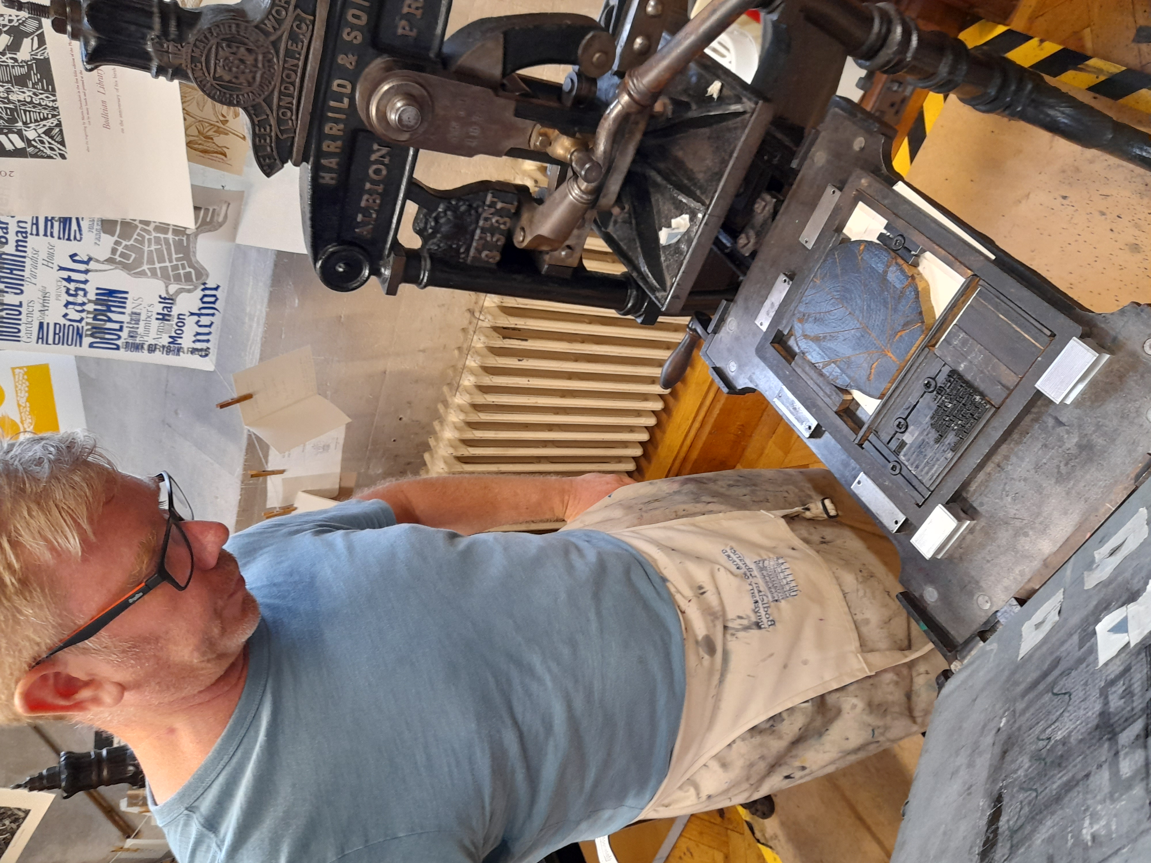
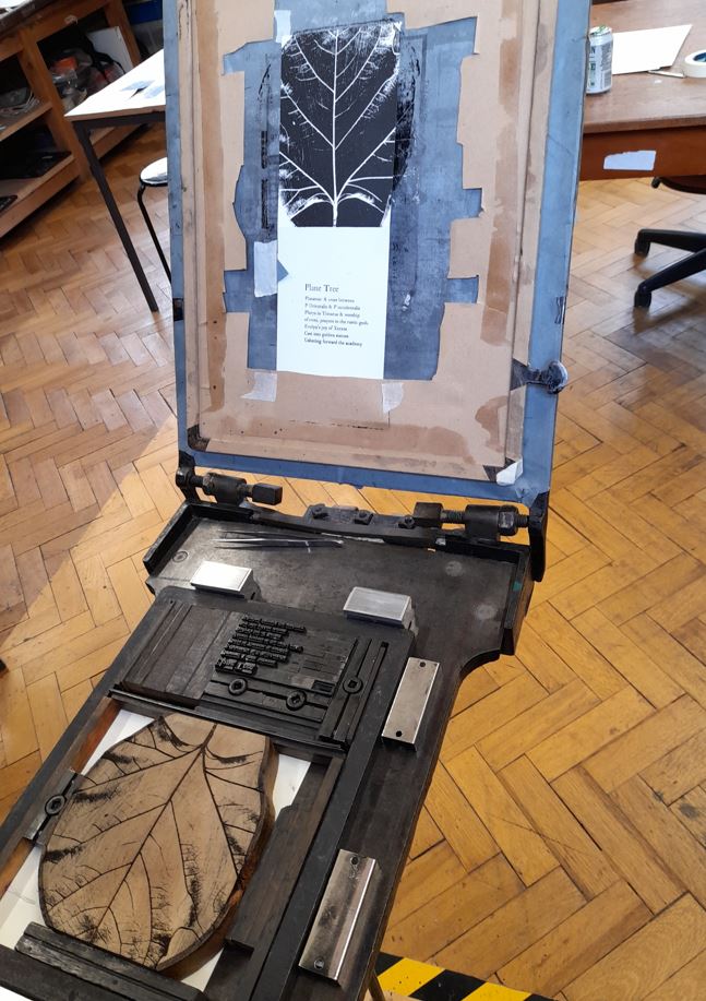
The replica press in the Weston Library, Broad Street, Oxford
Ink + type + paper = print
Drop-in, no need to book; come along and print a keepsake.
Saturday 6 November 2021, 11am-1 pm
Saturday 18 December 2021, 11am-1 pm
Saturday 8 January 2022, 11am-1 pm
The Bodleian Libraries are home to a letterpress workshop for teaching and experiments, and a place for drop-in printing throughout the year at the printing press in the public foyer of the Weston Library. These activities are integrated with teaching at the University of Oxford, outreach to higher education, schools, and the public, and with the library’s continuing interest in creativity in the book arts.
Art
Ana Paula Cordeiro (left) and Merve Emre in conversation