Today, April the 25th, is the fiftieth anniversary of the Carnation Revolution*, when a military coup by left-leaning officers in the Portuguese army overthrew the Estado Novo, the anti-liberal, anti-socialist nationalist party that had been in power since 1933.

Il Portogallo…, c.1974. C32 (211)
This map hints at the Fascist style of art prevalent in Italy and Germany around the Second World War but the text around the helmet, ‘Il Portogallo non sara’ il Chile d’Europa’ (Portugal will not be the Chile of Europe), is anti-fascist, this was the slogan of the revolution and refers to the hope that this mostly peaceful coup (4 were killed on the 25th by government forces) wouldn’t run the same course as the take-over by forces loyal to Augusto Pinochet in Chile the year before, which resulted in deaths, disappearances and executions in the thousands.
This way of using a part of the body to portray something separate is called anthropomorphism. Considering the shapes of many countries and the amount of maps with some sort of allegory in their cartouches (see here and here) it’s surprising that there aren’t more maps like this. One notable example is Europa Prima pars Terrae in forma Virginis which comes from Heinrich Bunting’s Itinerarium et chronicon ecclesiasticum totius sacræ Scripturæ, a book of woodcut maps first published in 1581 of the Holy Land. Despite appearances this Queen represents Mary the Virgin, not the Virgin Queen Elizabeth.

From Itinerarium et chronicon ecclesiasticum totius sacræ Scripturæ, 1597. B 7.3. Th
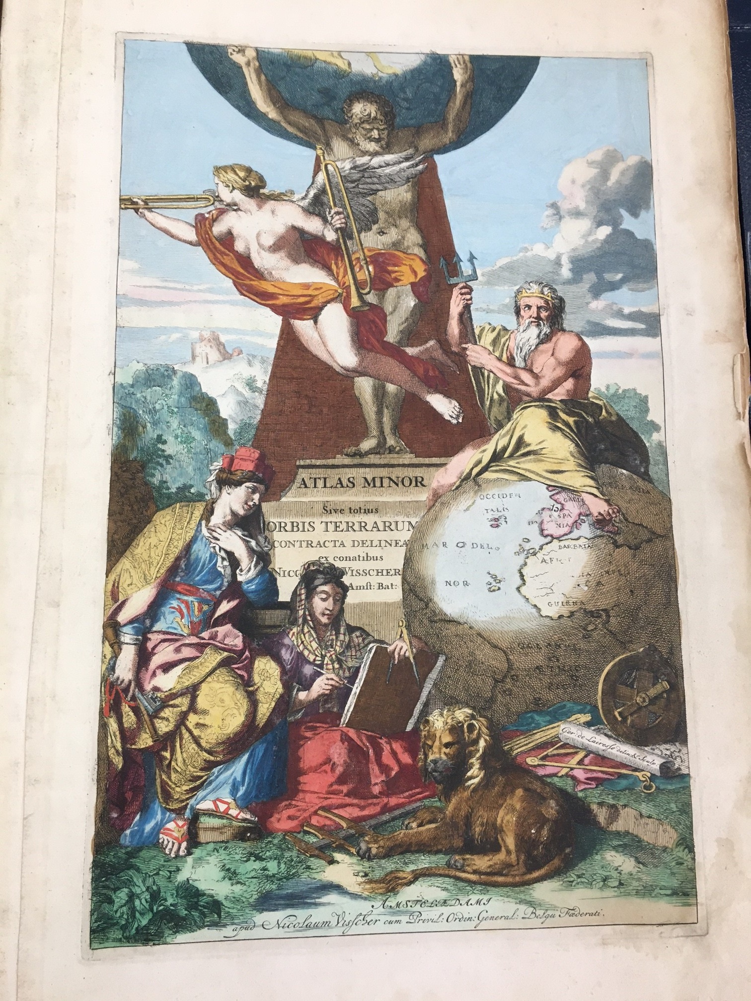
The use of women to depict the four known continents was a common cartographic motif, with each continent represented by an idealized version of a female. Europe, as was the thinking of the time, is often depicted as the dominant continent, often portrayed as being above the rest, though that’s not the case in this dramatic example from Joan Blaeu’s Grand atlas, from 1663-67.

From Grand atlas, by Joan Blaeu. 1663-67. Map Res 45
Here Europe is the figure in the blue and red dress, centre left, and carrying a sceptre. America stands behind her, Asia is in pink with Africa behind. All four have their associated animals; Europe leading a horse, Asia a camel, Africa an elephant and America an armadillo, which usually narrows down this figure to Mexicana. The figure in green is Cybele, the Greek Goddess of the Earth, symbol of eternity. Her crown is made of the walls of a city and she is often shown holding a key sitting in a chariot drawn by lions, who are themselves symbols of imperial power (we bloggged about lions here). Cybelle is also the protector of cities, hence the crown made up of city walls, she appears in an earlier blog in this guise here
Here’s a lovely variation on the theme, this time the four continents represented by putti, winged spirits that were often found on maps. Here Europe faces us holding a crown, behind is Africa holding a scorpion, Asia has his back to us with an incense burner and America peeps out from behind the pillar. This image comes from Carel Allard’s Atlas Contractus from 1703, and it is Allard we see confidently staring out of this frontispiece while pointing at the map he has made

From Atlas Contractus, 1703. Map Res 18
*So called because of the carnations handed out to soldiers by the people on the streets